What do you think about this photo?
Do you have questions or curiosities about this image? Do you want to ask something to the author, give him suggestions for improvement, or congratulate for a
photo that you really like?
You can do it by joining JuzaPhoto, it is easy and free!
There is more: by registering you can create your personal page, publish photos, receive comments and you can use all the features of JuzaPhoto.
With more than 260000members, there is space for everyone, from the beginner to the professional.
|
|
sent on 12 Novembre 2011 (14:23) | This comment has been automatically translated (show/hide original)
I am no expert in pp, but I really like the shot: good light which made it almost translucent parts ... non sono un esperto di pp, ma a me lo scatto piace molto: buona la luce che ha reso quasi traslucide alcune parti... |
|
|
sent on 12 Novembre 2011 (15:39) | This comment has been automatically translated (show/hide original)
Hello Tamara, I think the best shots if the contrasts a bit with layers and add a slight contrast
Cyrus ciao Tamara, credo la foto migliori se la contrasti un po con i livelli e aggiungi una leggerissima mdc
Ciro |
user1338
|
sent on 12 Novembre 2011 (15:52) | This comment has been automatically translated (show/hide original)
Proper observation of Cyrus, but eye whites, with curves can act in a less invasive and at the same time making a slight counter them, or with levels and then a layer mask to work in a selective way wherever you want.
I'm not a magician in pp but usually work well.
The photo is good.
Hello. ;-) Giusta l'osservazione di Ciro, occhio però ai bianchi, con le curve puoi agire in modo meno invasivo e nello stesso tempo contrastare facendo una leggera esse, oppure con livelli e in seguito una maschera di livello per lavorare in modo selettivo dove vuoi.
Non sono un mago nella pp ma di solito lavoro così.
La foto è buona.
Ciao. |
user1338
|
sent on 12 Novembre 2011 (16:41) | This comment has been automatically translated (show/hide original)
Hello Tamara, I can still see mixed colors, maybe the compression created the problem, even as I notice a sharp decline compared to the first.
Hope you do not offend other gate, I tried to do something on the fly, I pulled a hair light, I figure contrasts better radius 0.3 threshold 70 because I worked on a small jpeg, tiff but I give the range 0.5 to threshold 70-80 or more based on the occurrence understand it because it is too start seeing grain and artifacts and I countered with a hair brightness, contrast, working on contrast.
Hello. ;-)
img412.imageshack.us/img412/8128/gal5304177550133bis.jpg Ciao Tamara, la vedo ancora impastata nei colori, forse la compressione ha creato il problema, addirittura come nitidezza noto un decadimento rispetto alla prima.
Spero non ti offendi altrimenti cancello, ho provato a fare qualcosa al volo, ho tolto un pelo di luminosità, ho dato contrasta migliore raggio 0,3 soglia 70 perchè ho lavorato su un jpeg piccolo, ma sul tiff io do raggio 0,5 e soglia 70-80 o più in base all'occorrenza lo capisci perchè se è troppo cominci a vedere grana e artefatti e ho contrastato un pelo con luminosità contrasto lavorando su contrasto.
Ciao.
img412.imageshack.us/img412/8128/gal5304177550133bis.jpg |
|
|
sent on 12 Novembre 2011 (17:27) | This comment has been automatically translated (show/hide original)
Good image, I'm not an expert pp me neither, so I stick to what I said
hello Buona immagine,non sono un esperto di pp neanche io,per cui mi attengo a quanto già detto
ciao |
|
|
sent on 12 Novembre 2011 (17:56) | This comment has been automatically translated (show/hide original)
'cause I be offended? but ... you are very grateful :-).
so far I used DPP for RAW and TIFF where convertivo in working with lightroom.PS always made me fear also hate PP.
in fact the one you posted and 'more' contrasted and legible from the one posted by me.
guys like made the conversion for the web? I've done it, if I'm not mistaken directly from RAW.
thanks Dipi and Virginiofuser for your help :-)
Tamara perche' dovrei offendermi?anzi...te ne sono molto grata  . .
finora usavo DPP per il RAW dove convertivo in tiff e lavoravo con lightroom.PS mi ha sempre fatto paura,inoltre odio la PP.
in effetti quella che hai postato e' piu' contrastata e leggibile da quella postata da me.
ragazzi come fatte la conversione per il web?io l'ho fatta ,se non mi sbaglio direttamente dal RAW.
grazie Dipi e Virginiofuser per il vostro aiuto
Tamara |
user1338
|
sent on 12 Novembre 2011 (18:38) | This comment has been automatically translated (show/hide original)
I will save in Raw or Tiff Psd to the limit and then resize the image to the web, I do it in two steps, if you want a final image with the longer side 900pixel the first resizing I use 1800 and then unsharp mask (radius 0 , 5 factor 70.80 ..)
then do the second resizing to 900 and still unsharp mask this time half of the beam (0.3) and a little less factor.
Then convert it into a jpeg directly from file-save as etc.. Of course, I make sure that the color profile is srgb ..
There is a save feature for web but I personally do not use it, I found images mixed with artifacts but you is worth trying the same .. you never know.
Always ready if you need .. for what little I know ..
Hello, ;-) Io salvo il Raw in Tiff o al limite Psd e poi ridimensiono l'immagine per web, io lo faccio in due passaggi, se voglio un immagine finale con il lato maggiore 900pixel il primo ridimensionamento faccio 1800 e uso poi maschera di contrasto (raggio 0,5 fattore 70,80..)
poi faccio il secondo ridimensionamento a 900 e ancora maschera di contrasto questa volta la metà del raggio (0,3) e un pò meno fattore.
Poi converto in jpeg direttamente da file- salva con nome ecc. Ovviamente mi assicuro che il profilo colore sia srgb..
C'è la funzione salva per web ma personalmente non la uso, mi ritrovavo immagini impastate con artefatti ma ti vale la pena provare lo stesso..non si sa mai.
Sempre pronto se hai bisogno..per quel poco che so..
Ciao, |
|
|
sent on 12 Novembre 2011 (18:47) | This comment has been automatically translated (show/hide original)
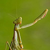
Hello Tamara, nice capture and good composition, background tone is pleasant. I think it is a good picture slightly unbalanced between the areas in light and shadow, maybe it would take a lower exposure.
Since the light areas are not burned you can recover some of the details, with a single command PS "Lights / shadows", holding no shadows and bringing the lights to 80 (attenuation). Even so the picture acquires balance, you could do much more complex things, but they are still within my reach.
To give the picture a feeling of sharpness use some procedures found on the web, are very complex and rarely used. A simple program created to eliminate the grain was detected also excellent for donate sharpness, it is obvious that the particular minimum a little is lost, however, is so simple that one is persuaded to use it. The trick is not to try to eliminate grain and sharpness simultaneously, otherwise you lose the details that are tooevident and the photos becomes a sort of dress unnatural.
The program is Neat-Image, still using the demo (filter plug-in for PS) waiting to buy the license.
The demo limits imagines to be addressed in size, max. 1024 pixels.
I'll give you your image treated with these two commands. Saving version for the web, I do it with PS "save for web", JPG format by adjusting the compression until you have the desired weight Mbits (it is very fast and allows you to adjust the compression almost continuously). Of course I forgive intrusiveness package but is sometimes better than a thousand words. Obviously I'm ready to delete the image if you ask me.
www.juzaphoto.com/shared_files/uploads/gal6617_6099_50498.jpg
Sincerely, John.
Ciao Tamara, bella cattura e buona composizione, sfondo in tono è piacevole. Ritengo sia una buona foto leggermente sbilanciata tra le zone in luce e quelle in ombra, forse ci sarebbe voluto una minor esposizione.
Dato che le zone in luce non sono affatto bruciate si posso recuperare parte dei particolari, con un solo comando di PS "Luci/ombre", tenendo le ombre a zero e portando le luci ad 80 (attenuazione). Già così la foto acquista equilibrio, si potrebbero fare cose molto più complesse, ma non sono ancora alla mia portata.
Per donare alla foto una sensazione di nitidezza utilizzo alcune procedure ritrovate su web, sono molto complesse e le utilizzo raramente. Un semplice programma nato per eliminare la grana si è rilevato ottimo anche per donare nitidezza, è ovvio che i particolari minimi un poco si perdono, però è talmente semplice che uno è invogliato ad utilizzarlo. L'accortezza è non cercare di eliminare grana e dare nitidezza contemporaneamente, altrimenti i particolari che si perdono sono troppo evidenti e la foto acquista una sorta di veste innaturale.
Il programma è Neat-Image, utilizzo ancora la demo (filtro plug-in per PS) in attesa d'acquistare la licenza.
La demo limita l'immagina da trattare nelle dimensione, max. 1024 pixel.
Ti propongo la tua immagine trattata con questi due comandi. Il salvataggio della versione per il web, lo faccio con PS "salva per web", formato JPG regolando la compressione fino ad avere il peso in Mbits voluto (è molto veloce e permette di regolare la compressione in modo quasi continuo). Ovviamente mi perdonerai dell'invadenza, ma proporre è certe volte meglio di mille parole. Ovviamente sono pronto a cancellare l'immagine se me lo chiedi.
www.juzaphoto.com/shared_files/uploads/gal6617_6099_50498.jpg
Cordialmente Giovanni.
|
|
|
sent on 12 Novembre 2011 (18:55) | This comment has been automatically translated (show/hide original)
another question, I have set the color profile to sRGB and work with this? there 'a difference?
for resizing I used the method proposed Juza, but I'll 'also experiment with save as to see if there are differences in quality.' I use the filter "better contrast" with radius from 0.2 to 0.3 at 120 % -130% of the entire file, and then begin to decrease the values ??in each resizing.
John I did not offend me, rather reprocessed images posted here and make me better understand and help me migliorarmi.interessante the Neat-Image, I 'in network information.
Dipi and thanks John for your kindness and availability ':-)
Tamara un altra domanda,io ho impostato il profilo colore a sRGB e lavoro con questo?c'e' qualche differenza?
per il ridimensionamento ho usato il metodo che propone Juza,ma faro' anche delle prove con salva con nome per vedere se ci sono differenze di qualita'.io uso il filtro "contrasta migliore" con raggio 0,2-0,3 al 120%-130% al file intero,poi comincio a diminuire i valori in ogni ridimensionamento.
Giovanni io non mi offendo,anzi le immagini rielaborate e postate qua mi fanno capire meglio e mi aiutano a migliorarmi.interessante il Neat-Image,cerchero' in rete informazioni.
grazie Dipi e Giovanni per la vostra gentilezza e disponibilita'
Tamara |
|
|
sent on 12 Novembre 2011 (19:11) | This comment has been automatically translated (show/hide original)
Hello Tamara limitation of commands PS, contrasts, contrasts better etc., is to act on all the parts of the image, often creating artifacts. These commands should be applied to create masks that identify the parts to fight and preserve the surrounding areas. Only after you apply these commands contrast masking are effective only on the parts that we have chosen to fight.
You have viewed the image that you have proposed? You think it's balanced and clear?
Sincerely, John.
Ciao Tamara la limitazione dei comandi di PS, contrasta, contrasta migliore ecc, è quella di agire su tutte le parti dell'immagine, creando spesso artefatti. Questi comandi andrebbero applicati creando delle maschere che individuano i particolari da contrastare e che preservano le zone circostanti. Solo dopo aver applicato queste mascherature i comandi di contrasto si rivelano efficaci sulle sole parti che noi abbiamo scelto di contrastare.
Hai visionato l'immagine che ti ho proposto? Pensi che sia equilibrata e più nitida ?
Cordialmente Giovanni.
|
|
|
sent on 12 Novembre 2011 (19:18) | This comment has been automatically translated (show/hide original)
is John, I observed bene.il caterpillar bought more 'readability' and 'more' balanced as luce.mi like your version :-)
ok! I understand the procedimento.vedro 'tonight with more' tranquility 'if I can rework this again, maybe try different things to see how far I can push.
thanks-1000 John :-)
Tamara si Giovanni,l'ho osservata per bene.il bruco ha acquistato piu' leggibilita' ed e' piu' equilibrata come luce.mi piace la tua versione
ok! ho capito il procedimento.vedro' stasera con piu' tranquilita' se riesco a rielaborare questa da capo,magari provare varie cose per capire fin dove posso spingere.
grazie-1000 Giovanni
Tamara |
user1338
|
sent on 12 Novembre 2011 (21:36) | This comment has been automatically translated (show/hide original)
John your version is beautiful, very vivid and detailed. ;-)
Tamara Sorry if I got in the way, for the color profile, AdobeRGB1998 is a very wide color space has so many shades is suitable to process the photo or print. Developing a Tiff or Psd I save it with this color preference.
When you convert to jpeg you have to choose the color profile, if you print RGB is recommended, but if you post on the web or share with other sRGB is preferable because it is less wide and is supported by all monitors, as opposed to RGB, if you look an RGB image with a monitor is not able to support it will not have a perfect color rendering.
If by Cs go to Edit - Color mode will have the option to change the profile before saving in jpeg and then return to RGB when you want.
This in substance and I hope you did not get confused.
Hello. ;-) Giovanni la tua versione è bellissima, molto viva e dettagliata.
Scusa Tamara se mi sono messo in mezzo, per il profilo colore, AdobeRgb1998 è uno spazio colore molto ampio dispone di moltissime sfumature è indicato per elaborare la foto o per la stampa. Elaborando un Tiff o Psd io lo salvo con questa preferenza colore.
Quando converti in jpeg devi scegliere te il profilo colore, se stampi è consigliabile Rgb, se però devi postare su web o condividere con altri è preferibile il sRgb perchè è meno ampio ed è supportato da tutti i monitor, al contrario del Rgb, se guardi un immagine Rgb con un monitor non è in grado di supportarlo non avrai una resa colore ideale.
Se con Cs vai su Modifica - Impostazione colore avrai la possibilità di cambiare il profilo prima di salvare in jpeg per poi tornare in Rgb quando vuoi.
Questo nella sostanza e spero di non averti confuso le idee.
Ciao. |
|
|
sent on 12 Novembre 2011 (21:36) | This comment has been automatically translated (show/hide original)
The picture is rich in detail and well exposed! Also good composition. The advice dipi09 are very valid. With a good contrast and contrast the result is a really beautiful shot. For the record, I use the method Juza and are very satisfied smsrt sharpen and save for web ... A greeting and congratulations ;-) Limmagine è ricca di dettaglio e molto ben esposta! Ottima anche la composizione. I consigli di dipi09 sono validissimi. Con una giusta mdc e contrasto ne viene fuori un gran bello scatto. Per la cronaca, io utilizzo il metodo juza e sono molto soddisfatto: smsrt sharpen e salva per web... Un saluto e complimenti |
|
|
sent on 13 Novembre 2011 (2:13) | This comment has been automatically translated (show/hide original)
I start to make things clear, also because 'things are importanti.ho contralateral side of PS and work directly on channel sRGB.gli video Juza I'm studying them trying to put into practice what I learn but it is not' easy.
Thanks again and you Dipi Tore :-)
a greeting, Tamara comincio a fare chiarezza,anche perche' sono cose importanti.ho controlato su PS e lavoro direttamente su canale sRGB.gli video di Juza me li sto studiando cercando di mettere in pratica quello che apprendo ma non e' facile.
grazie di nuovo Dipi e a te Tore
un saluto, Tamara |
|
|
sent on 13 Novembre 2011 (8:29) | This comment has been automatically translated (show/hide original)
the processed version is much more convincing than the original
however, if they are taken, basic, is not a "bad" post-production can give a good hand if not miracles, at least for now, can not get them
however, for what concerns me a "good" there is everything
hello la versione elaborata è molto più convincente dell'originale
comunque se lo scatto,di base, non è "cattivo" la post produzione può dare una valida mano in caso contrario miracoli,almeno per ora, non riesce a farli
comunque per quello che mi riguarda un "brava" ci sta proprio tutto
ciao |
|
|
sent on 13 Novembre 2011 (13:09) | This comment has been automatically translated (show/hide original)
With the advice has already been said! however, remains a good basic shooting! Con i consigli è già stato detto tutto! però rimane di base un buon scatto!! |
|
|
sent on 13 Novembre 2011 (13:27) | This comment has been automatically translated (show/hide original)
Great nice shot especially for the transparency of the caterpillar which is really all to enjoy!
HELLO Gran bello scatto soprattutto per la trasparenza del bruco che è davvero tutta da gustare!
CIAO |
|

Publish your advertisement on JuzaPhoto (info) |

 macro insetti
 JuzaPhoto contains affiliate links from Amazon and Ebay and JuzaPhoto earn a commission in case of purchase through affiliate links.


 Resize to fit window