What do you think about this photo?
Do you have questions or curiosities about this image? Do you want to ask something to the author, give him suggestions for improvement, or congratulate for a
photo that you really like?
You can do it by joining JuzaPhoto, it is easy and free!
There is more: by registering you can create your personal page, publish photos, receive comments and you can use all the features of JuzaPhoto.
With more than 260000members, there is space for everyone, from the beginner to the professional.
|
|
sent on 18 Aprile 2024 (11:53) | This comment has been automatically translated (show/hide original)
Excellent toning in b/w very 80s style. Congratulations.
David Ottimo viraggio in b/n molto stile anni 80. Complimenti.
Davide |
|
|
sent on 18 Aprile 2024 (11:59) | This comment has been automatically translated (show/hide original)
“ high light in my opinion lends itself very well to this bn so decisive „ Fully agree, a bn of great effectiveness and image of great expressiveness, very well composed and with the gem of the cloud in the sky almost black.
congratulations.
Greetings.
Roberto “ luce alta secondo me si presta molto per questo bn così deciso „ Pienamente d accordo, un bn di grande efficacia ed immagine di grande espressività, molto ben composta e con la chicca della nuvola nel cielo quasi nero.
Complimenti.
Un saluto.
Roberto |
|
|
sent on 18 Aprile 2024 (12:27) | This comment has been automatically translated (show/hide original)
What a sight!
stupendous. What perspective and diagonal lines to guide you. Che spettacolo!
Stupenda. Che prospettiva e linee diagonali che ti guidano. |
|
|
sent on 18 Aprile 2024 (12:47) | This comment has been automatically translated (show/hide original)
Spectacular image and perfect B&W!
Hi
Franco
Immagine spettacolare e B&W perfetto !
Ciao
Franco
|
|
|
sent on 18 Aprile 2024 (14:08)
Wow, I really love the "grain" look of this picture, also the square framing with white edges is quite classy ! |
|
|
sent on 18 Aprile 2024 (14:31) | This comment has been automatically translated (show/hide original)
Beautiful composition, good graphic rendering, for this type of image the hard light is often perfect.
Congratulations, bye Bella composizione, buona resa grafica, pe questo tipo d'immagini la luce dura spesso è perfetta.
Complimenti, ciao |
|
|
sent on 18 Aprile 2024 (15:54) | This comment has been automatically translated (show/hide original)
As always, congratulations for the excellent composition but this time for me there is a "but".
I like your b/w toning, the strong contrast image works well in this setting and light condition but personally I find it a bit beyond for my taste. Maybe what I perceive is due to a too strong micro-contrast that makes pumice seem to me not very three-dimensional.
However, they are trifles and strictly personal opinions, and I find that it is still a very successful shot.
I can't always just compliment you :-D Come sempre complimenti per l'ottima composizione ma questa volta per me cè un "ma".
Mi piace il tuo viraggio in b/n, l'immagine a forte contrasto funziona bene in questa ambientazione e condizione di luce ma personalmente lo trovo un pò oltre per i miei gusti. Forse quello che percepisco è dovuto ad un troppo forte micro-contrasto che mi fanno sembrare la pomice poco tridimensionale.
Sono comunque bazzecole e opinioni strettamente personali, e trovo che sia comunque uno scatto molto riuscito.
Non posso farti sempre solo i complimenti |
|
|
sent on 18 Aprile 2024 (16:28) | This comment has been automatically translated (show/hide original)
... Even if you already know my thoughts, Tone09 pulled me out of embarrassment! :-D :-D
In this image there are all your photographic skills, from the taste and elegance in the composition, to the care in the post, to the fact that you can shoot and render the places well even in the least photogenic moments (par excellence) of the day. But I can't fully appreciate this b&w toning, so strong and decisive, so much so that it makes the sky completely black: I prefer 50 shades of gray to just black and white... :-D :-D
In my opinion, this kind of images work less in landscapes, more in urban environments where there are strong chiaroscuro and important architectural elements, but of course it is a completely personal opinion! ;-)
Hello, Alberto. ...Anche se sai già il mio pensiero, Tone09 mi ha tirato via dall'imbarazzo!
In questa immagine ci sono tutte le tue abilità fotografiche, dal gusto e l'eleganza nella composizione, alla cura nella post, al fatto che riesci a scattare e rendere bene i luoghi anche nei momenti meno fotogenici (per antonomasia) della giornata. Però questo viraggio in b&n così spinto e deciso, tanto da rendere il cielo completamente nero, non riesco ad apprezzarlo fino in fondo: preferisco 50 sfumature di grigio al solo bianco e nero...
Secondo me questo tipo di immagini funzionano meno nei paesaggi, di più negli ambienti urbani in cui ci siano dei forti chiaroscuri e degli importanti elementi architettonici, ma ovviamente è un parere del tutto personale!
Ciao, Alberto. |
|
|
sent on 18 Aprile 2024 (19:01) | This comment has been automatically translated (show/hide original)
Unlike Tone09 and Alberto, I agree with your choice that aims to emphasize the shapes and graphics of the landscape.
While guidelines are important in color photography, they can be the key to a good bn image, and the stronger they are, the less the scene is intent on depicting a recognizable scene, and the more it becomes a visual statement.
A graphic photography, essential, "cold" yet very powerful on a narrative level.
congratulations Al contrario di Tone09 e Alberto, io condivido la tua scelta che mira ad enfatizzare le forme e il grafismo del paesaggio.
Sebbene le linee guida siano importanti nella fotografia a colori, possono essere la chiave per una buona immagine in bn e più forti sono, meno la scena è intenta a rappresentare una scena riconoscibile e più diventa una dichiarazione visiva.
Una fotografia grafica, essenziale, "fredda" eppure molto potente a livello narrativo.
Complimenti |
|
|
sent on 18 Aprile 2024 (20:16) | This comment has been automatically translated (show/hide original)
Thank you, I was pleased to read your impressions.
I understand the perplexity, but Viola
was right to emphasize the shapes and graphism of the landscape.[ /quote] This is exactly the purpose of this stylistic choice.
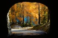
The pumice stone field is a huge expanse of twisted clusters, all white with a few streaks of orange. To get some shadows out of the veins of the stone and give some shapes to the rocks, I worked like crazy with the dodge and burn. A landscape so hard and severe in its forms that this type of development suggested to me.
A curiosity Alberto, but what is it that bothers you only the sky so black?
Thanks again
Hi
Simone
Vi ringrazio,mi ha fatto piacere leggere le vostre impressioni.
Capisco le perplessità ma ha detto bene Viola
“ enfatizzare le forme e il grafismo del paesaggio. „ questo è esattamente lo scopo di questa scelta stilistica.
Il campo di pietra pomice è un enorme distesa di ammassi contorti tutti bianchi con qualche striatura di arancio. Per tirar fuori un pò di ombre dalle venature della pietra e dare un pò di forme alle rocce ho lavorato come un matto con il dodge and burn.Un paesaggio così duro e severo nelle forme che mi ha suggerito questo tipo di sviluppo .
Una curiosità Alberto, ma cos'è che ti disturba solo il cielo così nero?
Grazie ancora
Ciao
Simone
|
|
|
sent on 18 Aprile 2024 (20:26) | This comment has been automatically translated (show/hide original)
Yes, the black sky especially... Then even the "duo-tone" landscape leaves me perplexed, because it seems too abstract and I can't decipher it well, but as I said it can be a limit of mine (and of Tone09 :-D ) due to pure personal aesthetic taste... ;-)
Hello, Alberto Si, il cielo nero soprattutto… Poi anche il paesaggio così “duo-tone” mi lascia perplesso, perché mi sembra troppo astratto e non riesco a decifrarlo bene, ma come dicevo può essere benissimo un limite mio (e di Tone09 ) dovuto al puro gusto estetico personale…
Ciao, Alberto |
|
|
sent on 18 Aprile 2024 (22:35) | This comment has been automatically translated (show/hide original)
A fantastic pdr, a composition and a b/w :-) Un pdr, una composizione ed un b/n fantastici |
|
|
sent on 19 Aprile 2024 (7:33) | This comment has been automatically translated (show/hide original)
Beautiful realization, congratulations Bellissima realizzazione, complimenti |
|
|
sent on 19 Aprile 2024 (8:11) | This comment has been automatically translated (show/hide original)
A wound in bn is much "deeper" than a color one!
Congratulations, Commissioner!
:-P Un ferita in bn è molto più "profonda" di una a colori!
Complimenti Commissario!
 |
|
|
sent on 19 Aprile 2024 (10:13) | This comment has been automatically translated (show/hide original)
Magnificent
Hello Corrado Magnifica
Ciao Corrado |
|
|
sent on 19 Aprile 2024 (14:57)
Ciao Simone... per scelta non commento più nessuno per evitare discussioni e fraintendimenti come accaduto in passato... e mi limito al "mi piace" come unica forma di apprezzamento...
Ma nel tuo caso vista l'amicizia, i trascorsi e il parere richiesto ti diro la mia...
Sintetizzerei con un mi piace... ma non mi convince al 100%..!!
Composizione inattaccabile, perfetta soprattutto sulla diagonale lingua nera - nuvola azzeccatissima... quello che mi lascia un po perplesso è il trattamento del file...
Mi spiego... al primo colpo d'occhio mi risulta molto "confusa" nella parte centrale... le luci "sparano" troppo e vanno a devastare completamente la texture delle rocce in quella parte di immagine, che, al contrario, dovrebbero "guidare" verso lo sfondo....
Sfondo che qualche problemino lo tiene pure lui...
Il cielo nero non mi disturba più di tanto, ma l'eccessivo contrasto, mi fa risaltare subito all'occhio la mancanza di messa a "fuoco/distorsione ottica" della parte alta delle rocce orizzontali, soprattutto nell'angolo a Sx...
Magari una "passata" in Topaz per recuperare il dettaglio dello sfondo potrebbe giovare, ma forse anche solo non "calcare troppo la mano" potrebbe bastare nel recupero di un filo di dettaglio...
Detto ciò.. è chiaro che stiamo "spaccando il capello" a una foto molto bella, ma so che con te lo posso fare...!!!
Approfitto per farti i complimenti per tutta la galleria, anche se mi ha procurato grossi problemi di "caduta della mascella" ogni volta che hai pubblicato una foto..!!!
Spero ci si trovi qualche volta, magari con Fabrizio, per qualche "dritta" su questo tuo ultimo viaggio...
Un caro saluto...
Paolo Ciao Simone... per scelta non commento più nessuno per evitare discussioni e fraintendimenti come accaduto in passato... e mi limito al "mi piace" come unica forma di apprezzamento...
Ma nel tuo caso vista l'amicizia, i trascorsi e il parere richiesto ti diro la mia...
Sintetizzerei con un mi piace... ma non mi convince al 100%..!!
Composizione inattaccabile, perfetta soprattutto sulla diagonale lingua nera - nuvola azzeccatissima... quello che mi lascia un po perplesso è il trattamento del file...
Mi spiego... al primo colpo d'occhio mi risulta molto "confusa" nella parte centrale... le luci "sparano" troppo e vanno a devastare completamente la texture delle rocce in quella parte di immagine, che, al contrario, dovrebbero "guidare" verso lo sfondo....
Sfondo che qualche problemino lo tiene pure lui...
Il cielo nero non mi disturba più di tanto, ma l'eccessivo contrasto, mi fa risaltare subito all'occhio la mancanza di messa a "fuoco/distorsione ottica" della parte alta delle rocce orizzontali, soprattutto nell'angolo a Sx...
Magari una "passata" in Topaz per recuperare il dettaglio dello sfondo potrebbe giovare, ma forse anche solo non "calcare troppo la mano" potrebbe bastare nel recupero di un filo di dettaglio...
Detto ciò.. è chiaro che stiamo "spaccando il capello" a una foto molto bella, ma so che con te lo posso fare...!!!
Approfitto per farti i complimenti per tutta la galleria, anche se mi ha procurato grossi problemi di "caduta della mascella" ogni volta che hai pubblicato una foto..!!!
Spero ci si trovi qualche volta, magari con Fabrizio, per qualche "dritta" su questo tuo ultimo viaggio...
Un caro saluto...
Paolo |
|
|
sent on 19 Aprile 2024 (17:35)
Grazie di nuovo a tutti.
Paolo, per fortuna che non commenti più nessuno,spero almeno tu ti sia sfogato
Non so che dire, sulle texture devastate come dici tu onestamente non ne rilevo, si c'è una punta al centro più chiara di tutto il resto ma perfettamente leggibile. Sullo sfondo hai ragione soprattutto sui bordi un pò al limite perché la transizione tra il cielo e la roccia bianca è stata una vera lotta al computer e alla fine quello è stato il massimo che sono riuscito a fare con le conoscenze e capacità che ho con photoshop.il risultato finale credo che Comunque sia più che accettabile.
È proprio il posto che è difficile da fotografare in pieno giorno.tieni presente che quella sensazione di confusione che hai citato tu io l'ho vissuta dal vivo camminando tra quelle formazioni di pomice così strane, un posto unico tanto da essere considerato tra i più suggestivi di tutta la Puna.
Ti ringrazio per le tue osservazioni e per l'interesse che hai sempre dimostrato nei miei confronti.
Ps.sono stato alla mostra di Fabrizio, foto bellissime, non sapevo che bazzichi da quelle parti, o forse non me lo ricordavo.. spero davvero prima o poi di incontrarci spero davvero prima o poi di incontrarci
Un saluto
Simone Grazie di nuovo a tutti.
Paolo, per fortuna che non commenti più nessuno,spero almeno tu ti sia sfogato
Non so che dire, sulle texture devastate come dici tu onestamente non ne rilevo, si c'è una punta al centro più chiara di tutto il resto ma perfettamente leggibile. Sullo sfondo hai ragione soprattutto sui bordi un pò al limite perché la transizione tra il cielo e la roccia bianca è stata una vera lotta al computer e alla fine quello è stato il massimo che sono riuscito a fare con le conoscenze e capacità che ho con photoshop.il risultato finale credo che Comunque sia più che accettabile.
È proprio il posto che è difficile da fotografare in pieno giorno.tieni presente che quella sensazione di confusione che hai citato tu io l'ho vissuta dal vivo camminando tra quelle formazioni di pomice così strane, un posto unico tanto da essere considerato tra i più suggestivi di tutta la Puna.
Ti ringrazio per le tue osservazioni e per l'interesse che hai sempre dimostrato nei miei confronti.
Ps.sono stato alla mostra di Fabrizio, foto bellissime, non sapevo che bazzichi da quelle parti, o forse non me lo ricordavo..spero davvero prima o poi di incontrarci
Un saluto
Simone |
|
|
sent on 19 Aprile 2024 (18:01) | This comment has been automatically translated (show/hide original)
Congratulations for this flawless photo in every aspect. To applause Complimenti per questa foto ineccepibile in ogni suo aspetto. Da applauso |
|
|
sent on 19 Aprile 2024 (19:52) | This comment has been automatically translated (show/hide original)
To me, these images are a take-it-or-leave-it image. Of course, the different interpretations are all there! :-P
I also don't like black skies but for me here the choice of the author is all there is. One may disagree, of course, but it is a legitimate interpretation.
To me, the glance gives back a very impactful image, where the handwriting is the master.
Best regards Simone.
mark Per me queste immagini sono del tipo “prendere o lasciare”. Ovviamente le interpretazioni diverse ci stanno tutte!
Anche io non gradisco i cieli neri ma per me qui la scelta dell'autore ci sta tutta. Si può non essere d'accordo, certo, ma è una legittima interpretazione.
A me il colpo d'occhio restituisce un'immagine molto d'impatto, dove la grafia la fa da padrona.
Un caro saluto Simone.
Marco |
|
|
sent on 20 Aprile 2024 (7:55) | This comment has been automatically translated (show/hide original)
Rosamaria, thank you
Marco, you said it right “ where handwriting is the master „
I am convinced that to appreciate this kind of elaboration, as well as the color ones that I proposed in the gallery, you need to be able to mentally detach yourself from the classic vision of the landscape where details, lights and colors must be as coherent as possible with the reality seen at the time of the shot.
Hi
Simone Rosamaria ti ringrazio
Marco hai detto bene “ dove la grafia la fa da padrona „
Sono convinto che per apprezzare questo genere di elaborazione, così come quelle a colori che ho proposto in galleria, bisogna riuscire a staccarsi mentalmente dalla visione classica del.paesaggio dove dettagli,luci e colori devono essere il più coerenti possibile con la realtà vista al momento dello scatto.
Ciao
Simone |
|

Publish your advertisement on JuzaPhoto (info) |


 JuzaPhoto contains affiliate links from Amazon and Ebay and JuzaPhoto earn a commission in case of purchase through affiliate links.


 Resize to fit window


![[en]](shared_files/layout/country_flags/flag_196.jpg)