What do you think about this photo?
Do you have questions or curiosities about this image? Do you want to ask something to the author, give him suggestions for improvement, or congratulate for a
photo that you really like?
You can do it by joining JuzaPhoto, it is easy and free!
There is more: by registering you can create your personal page, publish photos, receive comments and you can use all the features of JuzaPhoto.
With more than 260000members, there is space for everyone, from the beginner to the professional.
|
|
sent on 31 Maggio 2023 (7:14) | This comment has been automatically translated (show/hide original)
Very nice perspective and tonal plans, congratulations.
Hello Massimo Molto bella per prospettiva e piani tonali, complimenti.
Ciao Massimo |
|
|
sent on 31 Maggio 2023 (9:06) | This comment has been automatically translated (show/hide original)
It looks like the effect of a founder in a scene. Excellent choice of the canvas that "sticks" the house in the background.
Very nice, congratulations.
Hello Nando Sembra l'effetto di un fondògrafo in una scena. Ottima la scelta del tele che "appiccica" la casa allo sfondo.
Molto bella, complimenti.
Ciao Nando |
|
|
sent on 31 Maggio 2023 (9:35) | This comment has been automatically translated (show/hide original)
Splendid in everything, the low shooting point makes the difference combined with the time with the right lights, apt the idea of cutting the sky / the superfluous. Hello Splendida in tutto, il punto di ripresa basso fà la differenza abbinato all'orario con le giuste luci, azzeccata l'idea di tagliare il cielo/il superfluo. Ciao |
|
|
sent on 31 Maggio 2023 (9:55) | This comment has been automatically translated (show/hide original)
very nice Alberto! I really like the depth of field and bokeh! molto bella Alberto! Mi piace moltissimo la profondità di campo ed il bokeh! |
|
|
sent on 31 Maggio 2023 (12:48) | This comment has been automatically translated (show/hide original)
Very well "seen": pleasant colors and careful composition, an example of how you can effectively use a long focal length in landscape photography.
Greetings.
Roberto Molto ben "vista": gradevoli i colori e curata la composizione, un esempio di come si possa efficacemente utilizzare una focale lunga in fotografia di paesaggio.
Un saluto.
Roberto |
|
|
sent on 31 Maggio 2023 (13:24) | This comment has been automatically translated (show/hide original)
Colors and PDR, out of the ordinary.
Really great shot.
Congratulations Alberto.
Greetings.
titian
Cromie e PDR, fuori dal comune.
Davvero ottimo scatto.
Complimenti Alberto.
Un saluto.
Tiziano
|
|
|
sent on 31 Maggio 2023 (13:28) | This comment has been automatically translated (show/hide original)
Congratulations Alberto,
beautiful pdr, focus and sequence of planes of different colors.
Hello and good day,
Paul Complimenti Alberto,
bellissimo il pdr, la messa a fuoco e la sequenza di piani di diverso colore.
Ciao e buona giornata,
Paolo |
|
|
sent on 31 Maggio 2023 (16:04)
Grazie a tutti, sono contento che abbiate apprezzato questa proposta!
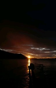
“ azzeccata l'idea di tagliare il cielo/il superfluo „ Il cielo non si poteva vedere! Ma non era comunque funzionale all'immagine che avevo in mente; volevo che il pioppeto in controluce rappresentasse una sorta di "incendio" che divampava dietro al rudere... Ma non era comunque funzionale all'immagine che avevo in mente; volevo che il pioppeto in controluce rappresentasse una sorta di "incendio" che divampava dietro al rudere...
“ Il re del verticale deluderà i propri sudditi „ No, dai, con il formato quadrato accontento sia i sudditi del verticale che quelli dell'orizzontale!
“ Ma i graffiti è roba recente o ci sono sempre stati? „ Purtroppo ci sono già da tempo, anzi, forse sono aumentati... Non mi piacciono in generale, soprattutto mi sembrano uno sfregio a monumenti della memoria come questo, tuttaviain questo caso potrebbero anche rafforzare il significato dell'immagine...
“ un esempio di come si possa efficacemente utilizzare una focale lunga in fotografia di paesaggio „ Grazie Roberto; io trovo che non ci sia una regola particolare per il paesaggio... La focale va scelta in funzione di ciò che si vuole fotografare e su cosa si vuole porre l'attenzione...
Ciao, Alberto. Grazie a tutti, sono contento che abbiate apprezzato questa proposta!
“ azzeccata l'idea di tagliare il cielo/il superfluo „ Il cielo non si poteva vedere! Ma non era comunque funzionale all'immagine che avevo in mente; volevo che il pioppeto in controluce rappresentasse una sorta di "incendio" che divampava dietro al rudere...
“ Il re del verticale deluderà i propri sudditi „ No, dai, con il formato quadrato accontento sia i sudditi del verticale che quelli dell'orizzontale!
“ Ma i graffiti è roba recente o ci sono sempre stati? „ Purtroppo ci sono già da tempo, anzi, forse sono aumentati... Non mi piacciono in generale, soprattutto mi sembrano uno sfregio a monumenti della memoria come questo, tuttaviain questo caso potrebbero anche rafforzare il significato dell'immagine...
“ un esempio di come si possa efficacemente utilizzare una focale lunga in fotografia di paesaggio „ Grazie Roberto; io trovo che non ci sia una regola particolare per il paesaggio... La focale va scelta in funzione di ciò che si vuole fotografare e su cosa si vuole porre l'attenzione...
Ciao, Alberto. |
|
|
sent on 31 Maggio 2023 (16:40) | This comment has been automatically translated (show/hide original)
They have already said it all. Great for me too!
Hello Alberto! Hanno già detto tutto. Ottima anche per me!
Ciao Alberto! |
|
|
sent on 31 Maggio 2023 (20:39) | This comment has been translated
Very nice! |
|
|
sent on 31 Maggio 2023 (21:41) | This comment has been automatically translated (show/hide original)
Beautiful Alberto, congratulations
Hello
Renato Bellissima Alberto, complimenti
Ciao
Renato |
|
|
sent on 31 Maggio 2023 (22:01)
E va bene, se proprio insisti...
Partirò da un'analisi tecnica
Il formato quadrato si presta ad immagini molto equilibrate. Poiché questo tipo di inquadratura non ha direzione, tende ad attirare lo sguardo verso l'interno e questo mi porta a pensare che tu abbia voluto costringerci ad entrare nella scena per invitarci ad andare in profondità nell'analisi della fotografia.
La scelta del tele è stata utile non solo per comprimere i piani, ma anche per permetterti di isolare il soggetto utilizzando una messa a fuoco selettiva.
Il soggetto si trova in posizione decentrata. Ciò ti ha consentito di far apparire lo scatto più naturale creando, allo stesso tempo, un rapporto semplice, ma definito con lo sfondo.
Veniamo al colore, perché anche questo rappresenta un elemento cruciale nella composizione
L'arancione è un colore caldo, che avanza, dinamico, in genere associato alla vitalità, perché trasmette energia.
Tu stesso hai sottolineato il tuo scopo “ volevo che il pioppeto in controluce rappresentasse una sorta di "incendio" che divampava dietro al rudere... „
Il verde, che occupa gran parte dell'inquadratura, è un colore freddo, che retrocede, tranquillizza e che suggerisce speranza e nuovi inizi.
Ecco, a questo punto, la mia interpretazione
Quel rudere mi ricorda una vecchia barca in balia delle onde, o una persona anziana costretta a destreggiarsi in una nuova giovane realtà, ancora immatura e incapace di comprendere lo stato d'animo di un saggio, ormai "spento", privo di forze e di volontà. E' un mondo in cui non si riconosce più.
Forse, però, in mezzo a quella gioventù spumeggiante, lo spirito potrebbe tornare ad illuminarsi... ma probabilmente sarebbe solo un'illusione.
Un trucco, un graffito può rappresentare un "tocco", un incontro tra generazioni, può "svecchiare" in parte l'aspetto esteriore, ma la sostanza non cambia: quella casa solitaria, benché strutturata, è ormai fragile e indifesa in un mondo fluido, liquido.
Il suo cuore è rabbuiato. E va bene, se proprio insisti...
Partirò da un'analisi tecnica
Il formato quadrato si presta ad immagini molto equilibrate. Poiché questo tipo di inquadratura non ha direzione, tende ad attirare lo sguardo verso l'interno e questo mi porta a pensare che tu abbia voluto costringerci ad entrare nella scena per invitarci ad andare in profondità nell'analisi della fotografia.
La scelta del tele è stata utile non solo per comprimere i piani, ma anche per permetterti di isolare il soggetto utilizzando una messa a fuoco selettiva.
Il soggetto si trova in posizione decentrata. Ciò ti ha consentito di far apparire lo scatto più naturale creando, allo stesso tempo, un rapporto semplice, ma definito con lo sfondo.
Veniamo al colore, perché anche questo rappresenta un elemento cruciale nella composizione
L'arancione è un colore caldo, che avanza, dinamico, in genere associato alla vitalità, perché trasmette energia.
Tu stesso hai sottolineato il tuo scopo “ volevo che il pioppeto in controluce rappresentasse una sorta di "incendio" che divampava dietro al rudere... „
Il verde, che occupa gran parte dell'inquadratura, è un colore freddo, che retrocede, tranquillizza e che suggerisce speranza e nuovi inizi.
Ecco, a questo punto, la mia interpretazione
Quel rudere mi ricorda una vecchia barca in balia delle onde, o una persona anziana costretta a destreggiarsi in una nuova giovane realtà, ancora immatura e incapace di comprendere lo stato d'animo di un saggio, ormai "spento", privo di forze e di volontà. E' un mondo in cui non si riconosce più.
Forse, però, in mezzo a quella gioventù spumeggiante, lo spirito potrebbe tornare ad illuminarsi... ma probabilmente sarebbe solo un'illusione.
Un trucco, un graffito può rappresentare un "tocco", un incontro tra generazioni, può "svecchiare" in parte l'aspetto esteriore, ma la sostanza non cambia: quella casa solitaria, benché strutturata, è ormai fragile e indifesa in un mondo fluido, liquido.
Il suo cuore è rabbuiato. |
|
|
sent on 01 Giugno 2023 (0:13) | This comment has been automatically translated (show/hide original)
I find it simply wonderful in all
Bravo Alberto
Cc La trovo semplicemente meravigliosa in tutto
Bravo Alberto
Cc |
|
|
sent on 01 Giugno 2023 (6:18) | This comment has been automatically translated (show/hide original)
Excellent Pdr, very functional choice of selective maf, the colors certainly highlight the different planes on which the story takes place.
Congratulations
Elizabeth Ottimo Pdr, molto funzionale la scelta della maf selettiva, i colori senz'altro evidenziano i diversi piani su cui si svolge il racconto.
Complimenti
Elisabetta |
|
|
sent on 01 Giugno 2023 (6:42) | This comment has been translated
Excellent! |
|
|
sent on 01 Giugno 2023 (7:55)
Non ho mai capito i graffitari perché il 99% dello loro scritte sono indecifrabili e personalmente non so mai a cosa si riferiscono, quindi per me è solo un vilipendio alla storia, alla cultura, a ciò che i nostri nonni hanno costruito con tanta fatica, all'armonia della natura... come in questo caso che non si capisce una beata mazza di cosa c'è scritto... quindi oltre alla schifezza e all'oltraggio il deludente lavoro non servirà mai a nulla se non imbrattare ciò che di affascinante c'è stato...
è ormai fragile e indifesa in un mondo fluido, liquido si, lo so io di che cosa!!!
L'immagine è super ricercata e davvero ben fatta e proposta. Certo che su di un 16/9 non è di facile visualizzazione, infatti la sto guardando su un 4/3!!!
Avrei solo croppato un pelo sotto perché mi sembra un poco esagerato la sfocatura, nel senso che mi sembra che appesantisca... Giusto invece il taglio sopra ben congeniale!
Il resto è perfetto, scritta a parte!
Un caro saluto!
Ciaooo! Non ho mai capito i graffitari perché il 99% dello loro scritte sono indecifrabili e personalmente non so mai a cosa si riferiscono, quindi per me è solo un vilipendio alla storia, alla cultura, a ciò che i nostri nonni hanno costruito con tanta fatica, all'armonia della natura... come in questo caso che non si capisce una beata mazza di cosa c'è scritto... quindi oltre alla schifezza e all'oltraggio il deludente lavoro non servirà mai a nulla se non imbrattare ciò che di affascinante c'è stato...
è ormai fragile e indifesa in un mondo fluido, liquido si, lo so io di che cosa!!!
L'immagine è super ricercata e davvero ben fatta e proposta. Certo che su di un 16/9 non è di facile visualizzazione, infatti la sto guardando su un 4/3!!!
Avrei solo croppato un pelo sotto perché mi sembra un poco esagerato la sfocatura, nel senso che mi sembra che appesantisca... Giusto invece il taglio sopra ben congeniale!
Il resto è perfetto, scritta a parte!
Un caro saluto!
Ciaooo! |
|
|
sent on 01 Giugno 2023 (9:12) | This comment has been automatically translated (show/hide original)
Beautiful landscape! Stupendo paesaggio! |
|

Publish your advertisement on JuzaPhoto (info) |


 JuzaPhoto contains affiliate links from Amazon and Ebay and JuzaPhoto earn a commission in case of purchase through affiliate links.


 Resize to fit window


![[en]](shared_files/layout/country_flags/flag_196.jpg)