What do you think about this photo?
Do you have questions or curiosities about this image? Do you want to ask something to the author, give him suggestions for improvement, or congratulate for a
photo that you really like?
You can do it by joining JuzaPhoto, it is easy and free!
There is more: by registering you can create your personal page, publish photos, receive comments and you can use all the features of JuzaPhoto.
With more than 260000members, there is space for everyone, from the beginner to the professional.
|
|
sent on 05 Dicembre 2022 (11:12) | This comment has been automatically translated (show/hide original)
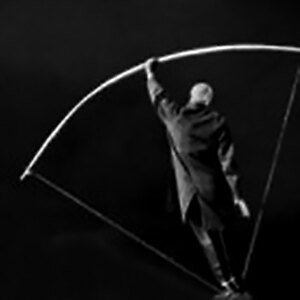
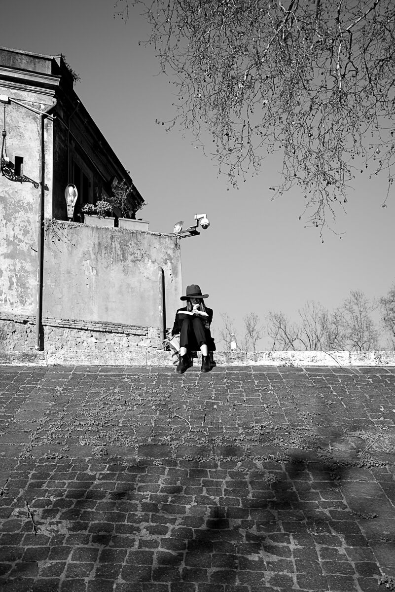
The photo I interpret it like this:
The girl is under the watchful eye of the surveillance camera, and defends herself holding a wide hat.
Personally I have become very sensitive to this type of surveillance: here these devices have been mounted everywhere, even where there has never been the slightest problem. They bother me a huge amount and most of them I would throw down with stones :-/
The photo is therefore interesting, even if formally perhaps it lacks a bit of cleanliness and graphic attention.
An idea to carry on (if my interpretation is the right one :-) )
Greetings to all,
Roberto La foto io la interpreto così:
La ragazza sta leggendo (un momento di intimità privata), ma si trova sotto l'occhio vigile della telecamera di sorveglianza.
Si difende quindi dall'intrusione tenendo un largo cappello.
Personalmente sono diventato molto sensibile a questo tipo di sorveglianza: da noi di questi apparecchi ne hanno montati ovunque, anche dove non c'è mai stato il minimo problema. Mi danno un fastidio enorme e la gran parte la tirerei giù a sassate 
La foto è quindi interessante, anche se formalmente forse manca un po' di pulizia e di attenzione grafica.
Un'idea da portare avanti (sempre che la mia interpretazione sia quella giusta  ) )
Un saluto a tutti,
Roberto |
user236140
|
sent on 05 Dicembre 2022 (12:27) | This comment has been automatically translated (show/hide original)
ha ha ha at
first glance I thought of a pigeon scare
:-D
In addition, the dark clothing makes the knees disappear, giving it a very funny picture of a dwarf look
for the little I understand of composition, the subject should have been more to the side, that is, not in the center
ha ha ha
a prima vista ho pensato a uno spaventa-piccioni

inoltre, l'abbigliamento scuro fa sparire le ginocchia, dandole un aspetto da nanerottolo
foto molto buffa
per il poco che capisco di composizione, il soggetto avrebbe dovuto stare più di lato, ovvero non al centro
|
|
|
sent on 05 Dicembre 2022 (17:05) | This comment has been automatically translated (show/hide original)
Skylab80 I share the first part of the analysis, for the second I have some doubts, you would tell me better what is missing in the composition and graphic cleanliness. Thank you
Skylab80 condivido la prima parte dell'analisi, per la seconda ho qualche dubbio, mi diresti meglio in cosa manca nella composizione e nella pulizia grafica. Grazie
|
|
|
sent on 05 Dicembre 2022 (17:09) | This comment has been automatically translated (show/hide original)
“ for the little I understand of composition, the subject should have been more to the side, ie not in the center „
Not necessarily the subject must be positioned on the sides (golden section) but can also be positioned in the center, even the center is a strong point in the composition, but you choose in relation to the idea and the other elements of the composition, in this case placing it in the center would have removed it from the position under the camera; Put on the right it would have created an unsightly empty space between human figure and structure, on the left it would have overlapped the structure and, not least in the street not always, almost never I would say, it is possible to establish the position of the subject.
Thanks for the ride “ per il poco che capisco di composizione, il soggetto avrebbe dovuto stare più di lato, ovvero non al centro „
Non necessariamente il soggetto deve essere posizionato ai lati (sezione aurea) ma può essere anche posizionato al centro, anche il centro è un punto forte nella composizione, ma si sceglie in relazione all'idea e agli altri elementi della composizione, in questo caso posizionarlo al centro lo avrebbe tolto dalla posizione sotto la telecamera; messo a destra avrebbe creato un inestetico spazio vuoto tra figura umana e struttura, a sinistra si sarebbe sovrapposto alla struttura e, non ultimo nella street non sempre, quasi mai direi, è possibile stabilire la posizione del soggetto.
Grazie del passaggio |
|
|
sent on 05 Dicembre 2022 (18:02) | This comment has been automatically translated (show/hide original)
“ I agree with the first part of the analysis, for the second I have some doubts, would you tell me better what is missing in the composition and graphic cleanliness „
Mah ... dunno... It seems to me a setting made a bit at random: too many dice at the bottom, the branch that enters at the top right, the house on the left cut where it happens, the subject put little in evidence (too small, it is lost), no interesting proportion.
That is, sorry if I tell you, but it is difficult to understand what you want to show and the whole image has no charm and does not encourage you to stop and look at it. “ condivido la prima parte dell'analisi, per la seconda ho qualche dubbio, mi diresti meglio in cosa manca nella composizione e nella pulizia grafica „
Mah... boh... mi sembra un'ambientazione fatta un po' a caso: troppi dadi in basso, il ramo che entra in alto a destra, la casa a sinistra tagliata dove capita, il soggetto messo poco in evidenza (troppo piccolo, si perde), nessuna proporzione interessante.
Cioè, scusa se te lo dico, ma si fa fatica a capire cosa vuoi mostrare e l'insieme dell'immagine non ha fascino e non invoglia a fermarsi a guardarla. Considerazioni personali, ovviamente...
Però mi piace molto l'idea. E' da sviluppare 
(grazie per l'80, mi piacerebbe avere 21 anni in meno... e sarebbero già troppi ) |
|
|
sent on 05 Dicembre 2022 (18:05) | This comment has been automatically translated (show/hide original)
At first glance the photo did not tell me anything but looking at it again I caught the message of video surveillance (if this is the message)
In my opinion in B / W would be more interesting and I would also try a 4: 3 or square format. For me ok the subject in the center Di primo acchitto la foto non mi ha detto nulla ma guardandola di nuovo ho colto il messaggio della videosorveglianza (se è questo il messaggio)
Secondo me in B/N sarebbe più interessante e proverei anche un formato 4:3 o quadrato. Per me ok il soggetto nel centro |
|
|
sent on 05 Dicembre 2022 (18:53) | This comment has been automatically translated (show/hide original)
Yes, I'm not a fan of the rule of thirds, or the golden ratio, pre-established formats or anything either.
The subject at the center can be there, why not?
But you need something that highlights it, that makes you understand where the gist of the photo lies. It's hard to say what, you have to look for and compose before shooting. After that you can no longer recover much ...
I repeat, BEAUTIFUL IDEA 8-) Sì, nemmeno io sono un fan della regola dei terzi, o della sezione aurea, dei formati prestabiliti o altro.
Il soggetto al centro ci può stare, perché no?
Però serve qualcosa che lo metta in risalto, che faccia capire dove sta il succo della foto. E' difficile dire cosa, bisogna cercare e comporre prima dello scatto. Dopo non si riesce più a recuperare granché...
Anche (e soprattutto) la luce può contribuire alla messa in evidenza del soggetto.
I colori invece spesso e volentieri contribuiscono a distogliere l'attenzione, soprattutto se il soggetto è... piccolo e nero
Ripeto, BELLA L'IDEA  |
|
|
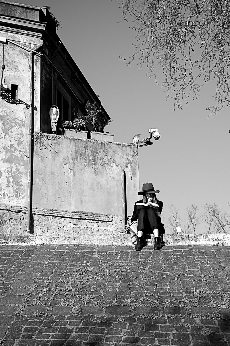
sent on 05 Dicembre 2022 (19:29) | This comment has been automatically translated (show/hide original)
Here it is in BN[IMG2]
4402198[/IMG2] Eccola in BN
|
|
|
sent on 05 Dicembre 2022 (19:30) | This comment has been automatically translated (show/hide original)
Thanks for the comments and criticisms, both welcome and very useful Grazie per i commenti e le critiche, entrambi graditi e utilissimi |
|
|
sent on 05 Dicembre 2022 (19:55) | This comment has been automatically translated (show/hide original)
The "problem", in my opinion, is not the positioning of the subject, but the distance of the subject.
It is lost, it evaporates. Too many elements on the outline.
In my opinion a stronger cut would be needed to give emphasis to the girl Il "problema ", secondo me non è il posizionamento del soggetto, ma la lontananza del soggetto.
Si perde, evapora. Troppi elementi al contorno.
A mio parere servirebbe un taglio più strong per dare enfasi alla ragazza |
|
|
sent on 05 Dicembre 2022 (20:38) | This comment has been automatically translated (show/hide original)
I agree with Arconudo and skylab.... for myself problem of the photo of Andrea taiana. Too wide the frame and too many elements introdotti.in this kind of photo in my opinion you have to be as essential as possible. Better the bn.
Honestly, beyond any purely technical aspect, I find the scene uninteresting
Concordo con Arconudo e skylab....per me stesso problema della foto di Andrea taiana. Troppo ampia l'inquadratura e troppi elementi introdotti.in questo genere di foto secondo me bisogna essere il più essenziali possibile. Meglio il bn.
Onestamente, al di là di qualsiasi aspetto puramente tecnico ,trovo la scena poco interessante
|
|
|
sent on 06 Dicembre 2022 (10:58) | This comment has been automatically translated (show/hide original)
“ Maybe I exaggerate? „
'n little :-D but that's okay ;-)
Thank you “ Forse ho esagerato? „
'n pochetto ma va bene così
Grazie |
|
|
sent on 06 Dicembre 2022 (16:53) | This comment has been automatically translated (show/hide original)
I find it interesting. I
waited to see her at
Pc.A I like, maybe I would have cut a little' down but not so much as Skylab59, but beautiful camera that seems to spy on what the girl reads.
To me the central composition in this case does not bother. La trovo interessante.
Ho aspettato di vederla a Pc.
A me piace, forse avrei tagliato un po' in basso ma non tanto come Skylab59, però bella la telecamera che sembra spiare ciò che la ragazza legge.
A me la composizione centrale in questo caso non disturba. |
|
|
sent on 06 Dicembre 2022 (17:31) | This comment has been automatically translated (show/hide original)
The lower portion of the photo should certainly be cropped. Unfortunately, extreme cutting suffers from low sharpness (that's why sharpness is needed). In my opinion the low sharpness is one of the problems of the photo, I also notice it without magnification and on a 14 '' monitor so it is very marked and I am not talking about the crop, but the original shot.
I confirm that the subject is too small.
Clearly I speak with the utmost respect for the author. La porzione bassa della foto va tagliata di certo. Purtroppo il taglio estremo soffre della bassa nitidezza (ecco perché serve la nitidezza). A mio avviso proprio la bassa nitidezza è uno dei problemi della foto, la noto anche senza ingrandimenti e su un monitor 14'' quindi è molto marcata e non parlo del crop, ma dello scatto originale.
Confermo che il soggetto è troppo piccolo.
Chiaramente parlo con il massimo rispetto per l'autore. |
|
|
sent on 06 Dicembre 2022 (19:44) | This comment has been automatically translated (show/hide original)
So let's see if I summarize well, closer subject; Non-central subject, less cobblestones and more sharpness.
Allora vediamo se riassumo bene, soggetto più vicino; soggetto non centrale, meno sanpietrini e più nitidezza.
|
user236140
|
sent on 06 Dicembre 2022 (20:29) | This comment has been automatically translated (show/hide original)
much better for me
even if the BN makes you lose the funny dwarf look of the first image molto meglio per me
anche se il BN fa perdere l'aspetto da buffo nanerottolo della prima immagine |
|
|
sent on 06 Dicembre 2022 (21:08) | This comment has been automatically translated (show/hide original)
Much better. Molto meglio. |
|
|
sent on 14 Dicembre 2022 (22:38) | This comment has been automatically translated (show/hide original)
I find it suitable as a cover of a Syd Barrett album; It is for me a very appreciable photo for the hot-cold color combination but also for the call, I see caught by everyone, to the mixture between the dimension of looking (reading) and being looked at (camera).
I believe that one of the strengths is also the shooting from afar, which helps to create a sort of "message hunt", which crop does not do. La trovo adatta come copertina di un disco di Syd Barrett; è per me una foto molto apprezzabile per la combinazione cromatica caldo-freddo ma anche per il richiamo, vedo colto da tutti, alla commistione fra la dimensione del guardare (leggere) ed essere guardato (telecamera).
Credo che uno dei punti di forza sia anche la ripresa da lontano, che contribuisce a creare una sorta di “caccia al messaggio”, cosa che il crop non fa. |
|
|
sent on 15 Dicembre 2022 (10:17) | This comment has been automatically translated (show/hide original)
Thanks Scapp, you are the only one who fully understood this photo. Grazie Scapp, sei l'unico che ha capito appieno questa foto. |
|

Publish your advertisement on JuzaPhoto (info) |

 Life 4
 JuzaPhoto contains affiliate links from Amazon and Ebay and JuzaPhoto earn a commission in case of purchase through affiliate links.


 Resize to fit window