What do you think about this photo?
Do you have questions or curiosities about this image? Do you want to ask something to the author, give him suggestions for improvement, or congratulate for a
photo that you really like?
You can do it by joining JuzaPhoto, it is easy and free!
There is more: by registering you can create your personal page, publish photos, receive comments and you can use all the features of JuzaPhoto.
With more than 260000members, there is space for everyone, from the beginner to the professional.
|
|
sent on 19 Agosto 2022 (8:38) | This comment has been automatically translated (show/hide original)
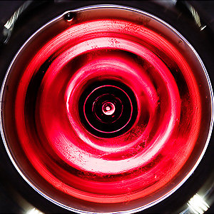
A debate that has lasted since they invented color film.
I don't think we can come to terms with it, it's a matter of taste and intent.
But it's inspiring
Hello. Un dibattito che dura da quando hanno inventato la pellicola a colori.
Non credo se ne possa venire a capo, è una questione di gusti e di intenti.
Però è stimolante
Ciao. |
|
|
sent on 19 Agosto 2022 (9:07) | This comment has been automatically translated (show/hide original)
Thank you Mario for your contribution. I started photographing in color in the 80s; For years, mistakenly, I always thought only "in color". Then, studying, deepening... In recent years, I have had a precise idea. I believe that for photography, digital or analog, color is very important, but only if it makes sense, otherwise it is disturbance or laziness. The photos are "seen" before taking them either in BN or in color. Then, as you say, for taste or inclination someone "sees" more color photos, others more in BN.
Great day! Grazie Mario per il tuo contributo. Io ho iniziato a fotografare a colori negli anni '80; Per anni, sbagliando, ho sempre pensato solo "a colori". Poi, studiando, approfondendo... Negli ultimi anni, mi sono fatto un'idea precisa. Credo che per la fotografia, digitale o analogica, il colore sia molto importante, ma solo se ha un senso, altrimenti è disturbo o pigrizia. Le foto "si vedono" prima di scattarle o in BN o a colori. Poi, come dici tu, per gusto o inclinazione qualcuno "vede" più foto a colori, altri più in BN.
Ottima giornata! |
|
|
sent on 19 Agosto 2022 (12:35) | This comment has been automatically translated (show/hide original)
The good Freeman has written excellent books, "Black and white photography",
"the timeless art of monochrome" is a sub-title that I really like is in my opinion one of his best, and I found it extremely formative.
But... but on thinking in b / w I still struggle now, that the photos are seen and must be seen before shooting there is no doubt, but I see them in color, certainly my brain desaturates, or rather tries 8-)
Then when I go to work on the PC photos that I thought in b / w often I do not find them, certainly for my way of composing (cleaning and few elements) the b / w helps but not always; then as Freeman says again and you see in your photo: "the color offers too much".
Anyway great debate ;-)
Il buon Freeman ha scritto ottimi libri, "Fotografia in bianco e nero",
"l'arte senza tempo della monocromia" è un sotto titolo che mi piace molto è a mio avviso uno dei suoi migliori, e l'ho trovato estremamente formativo.
Ma... ma sul pensare in b/n io ancora adesso faccio fatica, che le foto si vedono e si debbano vedere prima di scattare non c'è alcun dubbio, ma io le vedo a colori, certo il mio cervello le desatura, o meglio ci prova 
Poi quando vado a lavorare sul pc foto che ho pensato in b/n spesso non me le ritrovo, sicuramente per il mio modo di comporre (pulizia e pochi elementi) il b/n aiuta ma non sempre; poi come dice ancora Freeman e si vede nella tua foto: "il colore offre troppo".
Comunque gran bel dibattito 
|
|
|
sent on 19 Agosto 2022 (13:29) | This comment has been automatically translated (show/hide original)
Thank you for your generous attention and your valuable contribution. True what you say: you do not always find yourself on the monitor (or on the negative) the BN that you had "seen" in mind. It helps me a lot to shoot with BN film. When you have loaded it into the car, it clicks like a relay in the brain and everything becomes in BN, but there you have no choice, you are forced to think like this: lines, tones and matter. But the end result is another thing....
The same problem, however, also occurs with color, if not more. At least it applies to me...
:-D
Great day! Grazie Paki per la tua attenzione generosa e il tuo prezioso contributo. Vero quello che dici: non sempre ti ritrovi sul monitor (o sul negativo) il BN che avevi "visto" in mente. A me aiuta molto scattare con la pellicola BN. Quando l'hai caricata in macchina, scatta come un relè nel cervello e tutto diventa in BN, ma là non hai scelta, sei forzato a pensare così: linee, toni e materia. Ma il risultato finale è un'altra cosa....
Lo stesso problema però si ha anche col colore, se non di più. Almeno vale per me...

Ottima giornata! |
|
|
sent on 25 Agosto 2022 (12:00) | This comment has been automatically translated (show/hide original)
Difficult, yesterday as today (but even more today) to be able to translate into photos that w / b that you had in mind (but also that color) and more generally, the image as your mind had conceived it 8-) ... but we still strive to get closer to that idea ;-) Difficile, ieri come oggi (ma ancor più oggi) riuscire a tradurre in foto quel w/b che avevi in mente (ma anche quel colore) e più in generale, l'immagine come l'aveva concepita la tua mente ... ma ci sforziamo comunque di avvicinarci a quell'idea |
|
|
sent on 25 Agosto 2022 (12:31) | This comment has been automatically translated (show/hide original)
I believe that in some images the story in b / w is more incisive, sometimes the color distracts the thought you want to communicate.
Greetings
Vincenzo Credo che in alcune immagini il racconto in b/n sia più incisivo, a volte il colore distrae il pensiero che si desidera comunicare.
Un saluto
Vincenzo |
|
|
sent on 25 Agosto 2022 (17:08) | This comment has been automatically translated (show/hide original)
Thanks Carlo, we share the same difficulties and the same obstinacy in trying .... :-D
Thanks Vincenzo I fully share your thoughts. The NL also has by its nature the freedom of not being able / having to represent the reality that the photographer sees, unless he is colorblind. This gives more room for interpretation and therefore for the creativity of the photographer. That said, there are also images in which, by meaning and impact, color is extraordinarily more effective. Grazie Carlo, condividiamo le stesse difficoltà e la stessa ostinazione nel provarci....
Grazie Vincenzo condivido in pieno il tuo pensiero. Il BN poi ha anche per sua natura la libertà di non poter/dover rappresentare la realtà che vede il fotografo, a meno che questi non sia daltonico. Questo dà maggior margine all'interpretazione e quindi alla creatività del fotografo. Detto questo, ci sono poi immagini in cui, per significato e impatto, il colore è straordinariamente più efficace. |
|

Publish your advertisement on JuzaPhoto (info) |


 JuzaPhoto contains affiliate links from Amazon and Ebay and JuzaPhoto earn a commission in case of purchase through affiliate links.


 Resize to fit window
 4.0 MEGAPIXEL