What do you think about this photo?
Do you have questions or curiosities about this image? Do you want to ask something to the author, give him suggestions for improvement, or congratulate for a
photo that you really like?
You can do it by joining JuzaPhoto, it is easy and free!
There is more: by registering you can create your personal page, publish photos, receive comments and you can use all the features of JuzaPhoto.
With more than 260000members, there is space for everyone, from the beginner to the professional.
|
|
sent on 20 Luglio 2021 (17:31) | This comment has been translated
Beautiful, congratulations! |
|
|
sent on 27 Agosto 2021 (7:31) | This comment has been automatically translated (show/hide original)
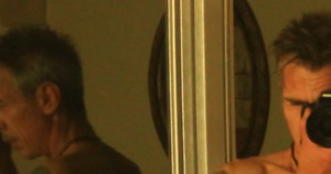
The framing is interesting, as well as the contrast between the green of the door and the white of the walls (effect a little diminished by being in the shade), very well the balance between high and low lights, but what, in my humble opinion, just does not go are the falling lines, the walls conspicuously inclined, effect easily eliminated in post.
Leonardo L'inquadratura è interessante , così come il contrasto tra il verde della porta e il bianco dei muri (effetto un po' sminuito dall'essere in ombra) , molto bene l'equilibrio tra alte e basse luci , quello però che , a mio modesto avviso , proprio non va sono le linee cadenti , i muri vistosamente inclinati, effetto facilmente eliminabile in post.
Leonardo |
|
|
sent on 27 Agosto 2021 (7:31) | This comment has been automatically translated (show/hide original)
The framing is interesting, as well as the contrast between the green of the door and the white of the walls (effect a little diminished by being in the shade), very well the balance between high and low lights, but what, in my humble opinion, just does not go are the falling lines, the walls conspicuously inclined, effect easily eliminated in post.
Leonardo L'inquadratura è interessante , così come il contrasto tra il verde della porta e il bianco dei muri (effetto un po' sminuito dall'essere in ombra) , molto bene l'equilibrio tra alte e basse luci , quello però che , a mio modesto avviso , proprio non va sono le linee cadenti , i muri vistosamente inclinati, effetto facilmente eliminabile in post.
Leonardo |
|
|
sent on 27 Agosto 2021 (7:44) | This comment has been automatically translated (show/hide original)
You are right, and thanks for writing some criticism, in fact I saw that they were crooked, but as I turned it twisted the other wall ! I tried to do a middle ground... :-D :-D thanks again Leo !! Hai ragione, e grazie per scrivere anche qualche critica, infatti vedevo che erano storti, ma come la giravo si stortava l'altro muro ! Ho cercato di fare una via di mezzo… grazie ancora Leo !! grazie ancora Leo !! |
|
|
sent on 27 Agosto 2021 (8:06) | This comment has been translated
  |
|

Publish your advertisement on JuzaPhoto (info) |


 JuzaPhoto contains affiliate links from Amazon and Ebay and JuzaPhoto earn a commission in case of purchase through affiliate links.


 Resize to fit window
 4.0 MEGAPIXEL