What do you think about this photo?
Do you have questions or curiosities about this image? Do you want to ask something to the author, give him suggestions for improvement, or congratulate for a
photo that you really like?
You can do it by joining JuzaPhoto, it is easy and free!
There is more: by registering you can create your personal page, publish photos, receive comments and you can use all the features of JuzaPhoto.
With more than 260000members, there is space for everyone, from the beginner to the professional.
|
|
sent on 21 Giugno 2020 (18:14) | This comment has been automatically translated (show/hide original)
FG
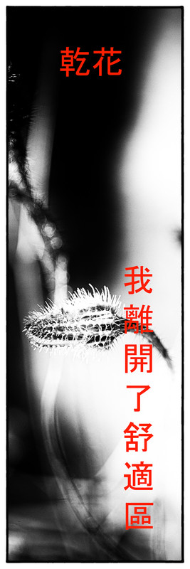
Nory the idea is that I recalled Japanese or Chinese prints and so I did it with a high contrast graphic style only b&n without half tones and with tampons in Chinese that say : dried flowers and in the FG I added as well : I came out of my comfort zone
FG
Dunque l'idea è che mi ricordava le stampe giapponesi o cinesi e dunque l'ho fatta con uno stile grafico ad alto contrasto solo b& n senza mezzi toni e con i tamponi in cinese che dicono : fiori secchi e nella FG ho aggiunto pure : sono uscito dalla mia zona di confort |
|
|
sent on 21 Giugno 2020 (19:40) | This comment has been automatically translated (show/hide original)
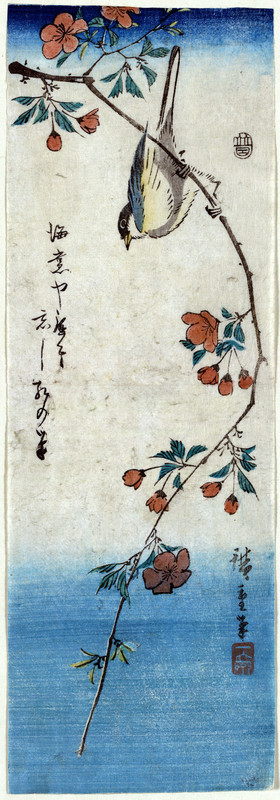
I love the Japponesi Hiroishige prints on everyone, and among the many I have one that remembers its own kind so I appreciate the gesture, much less the BN that just does not suit an oriental press, besides you also managed badly with all the whites burned amo le stampe japponesi Hiroishige su tutti, e tra le tante ne ho una che ricorda proprio genere quindi apprezzo il gesto, molto meno il BN che proprio non si addice ad una stampa orientale, oltretutto ti é riuscito anche male con tutti i bianchi bruciati |
|
|
sent on 21 Giugno 2020 (20:07) | This comment has been automatically translated (show/hide original)
At first glance, I liked it right away :-)
Forse, as Lomography says, I would have cured a little more the "whites", especially in the lower part of the flower, white on white, instead above it could stand, white on black.
How many likes ;-) A prima vista, mi è piaciuta subito 
Forse, come dice Lomography, avrei curato un po di più i "bianchi", soprattutto nella parte bassa del fiore, bianco su bianco, invece sopra ci poteva stare, bianco su nero.
Comunque mi piace  |
|
|
sent on 21 Giugno 2020 (20:13) | This comment has been automatically translated (show/hide original)
But what colors, the "real", the most "pure" and from which it is evident that I was inspired are what are like a kind of calligraphy made in bichrome only with black ink (sometimes brown) to the stroke with the brush and the writings are imprinted with wooden tampons ... The color is completely accessory in Japanese prints, lithographs and drawings everything is based on the design and variety of the brush stroke :-) Ma quali colori, le "vere", le piu "pure" e dalla quale è evidente che mi sono ispirato sono quelle che sono come una specie di calligrafia fatte in bicromia solo con l'inchiostro nero (a volte marrone) al tratto col pennello e le scritte sono impresse con tamponi di legno ...il colore è completamente accessorio nelle stampe, litografie e disegni giapponesi tutto è basato sul disegno e la varieta del tratto del pennello |
|
|
sent on 21 Giugno 2020 (21:56) | This comment has been automatically translated (show/hide original)
It has its charm I like. The red characters, however, are a bit ssonating, maybe I would have chosen white. Ha il suo fascino mi piace. I caratteri in rosso però stonano un po', forse avrei scelto il bianco. |
|
|
sent on 22 Giugno 2020 (13:08) | This comment has been automatically translated (show/hide original)
it's a beautiful idea, it also reminds me of the bookmarks that I love and that I often do with my photos!
this is a little different but congratulations on the idea! è un'idea bellissima, a me ricorda anche i segnalibri che adoro e che faccio spesso con le mie foto!
questo è un po diverso ma complimenti per l'idea! |
user92328
|
sent on 22 Giugno 2020 (14:42) | This comment has been automatically translated (show/hide original)
Beautiful Leo I really like, charming and original idea..... :-) ;-)
On the red font for the word "Japanese" who knows how it would look in another color....? although, contrasts, even chromatic, usually work, in fact red I really like in this case...
For the "white" discourse on the flower, yes, in fact, perhaps, an adjustment would help to make the dry flower stand out better... ;-) Bella Leo mi piace molto, idea affascinante ed originale.....
Sul carattere in rosso per la scritta "giapponese" chi sa come ci starebbe in altro colore....? anche se, i contrasti, anche cromatici, solitamente funzionano, infatti il rosso a me piace molto in questo caso...
Per il discorso dei "bianchi" sul fiore, si, in effetti , forse, un'aggiustatina gioverebbe a far risaltare meglio il fiore secco, oltretutto, a volte qualche imperfezione ci stanno più bene... |
|
|
sent on 22 Giugno 2020 (18:30) | This comment has been automatically translated (show/hide original)
“ But what colors, the "real", the most "pure" and from which it is evident that I was inspired are what are like a kind of calligraphy made in bichrome only with black ink (sometimes brown) to the stroke with the brush and the writings are imprinted with wooden tampons ... the color is completely accessory in Japanese prints, lithographs and drawings everything is based on the design and the variety of the brush stroke Smile „
ok I understand the genre, however, to say that the color is completely accessory in the prints affixed just NO I do not agree, I also refer to this genre, the original file and much larger and I printed it 70x25
“ Ma quali colori, le "vere", le piu "pure" e dalla quale è evidente che mi sono ispirato sono quelle che sono come una specie di calligrafia fatte in bicromia solo con l'inchiostro nero (a volte marrone) al tratto col pennello e le scritte sono impresse con tamponi di legno ...il colore è completamente accessorio nelle stampe, litografie e disegni giapponesi tutto è basato sul disegno e la varieta del tratto del pennello Sorriso „
ok ho capito a cosa ti riferisci, dire comunque che il colore é completamente accessorio nelle stampe apponessi proprio NO non mi trova d'accordo, io del resto mi riferivo a questo genere, il file originale e molto pi grande e me lo sono stampato 50x17
|
|
|
sent on 23 Giugno 2020 (23:29) | This comment has been automatically translated (show/hide original)
for me and a beautiful Leo frame, and and very pleasant as a whole. however for my taste I would have made the lower part of the branches darker/obvious
cosi I see the head of the plant coming out of nowhere :-) per me e una bella cornice Leo, ed e molto piacevole nel insieme . però per il mio gusto avrei fatto la parte bassa dei rami più scuro/evidente
cosi vedo la testa della pianta che viene fuori dal nulla |
|
|
sent on 24 Giugno 2020 (0:12) | This comment has been automatically translated (show/hide original)
That's a good idea. I too would have chosen a different color for ideograms. Ottima idea. Anch'io avrei scelto un colore diverso per gli ideogrammi. |
|
|
sent on 24 Giugno 2020 (16:58) | This comment has been automatically translated (show/hide original)
Original idea Leo, 100 points Idea originale Leo, 100 punti |
user171441
|
sent on 24 Giugno 2020 (21:19) | This comment has been automatically translated (show/hide original)
I like this black and white a lot, but in Japan I have never seen a print in BW indeed, iridescent colors to more I can not, sorry for me is ni :-" Questo bianco e nero mi piace molto, ma in Giappone non ho mai visto una stampa in BW anzi, colori cangianti a più non posso, mi dispiace per me è ni |
|
|
sent on 25 Giugno 2020 (12:04) | This comment has been automatically translated (show/hide original)
I prefer the one in the race Preferisco quella in gara |
user30556
|
sent on 27 Giugno 2020 (17:49) | This comment has been automatically translated (show/hide original)
Frankly, I don't care if it's more or less concretely referenced by some Japanese style.
The result is a post pleasing to the eye, original and furnishing. Some puzzled on the red inscription. Not so much for the color (although I would try with white), but for the contour that a little weighs down and steals too much attention Francamente non m'importa niente se si rifa' piu' o meno concretamente a qualche stile giapponese.
Il risultato e' una post gradevole alla vista, originale e d'arredamento. Qualche perplessita sulla scritta in rosso. Non tanto per il colore(anche se proverei col bianco), quanto per il contorno che un po' appesantisce e ruba troppa attenzione |
|

Publish your advertisement on JuzaPhoto (info) |


 JuzaPhoto contains affiliate links from Amazon and Ebay and JuzaPhoto earn a commission in case of purchase through affiliate links.


 Resize to fit window
 1.2 MEGAPIXEL