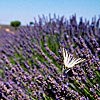
What do you think about this photo?
Do you have questions or curiosities about this image? Do you want to ask something to the author, give him suggestions for improvement, or congratulate for a
photo that you really like?
You can do it by joining JuzaPhoto, it is easy and free!
There is more: by registering you can create your personal page, publish photos, receive comments and you can use all the features of JuzaPhoto.
With more than 260000members, there is space for everyone, from the beginner to the professional.
|
|
sent on 24 Gennaio 2020 (9:23) | This comment has been automatically translated (show/hide original)
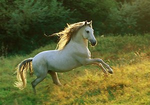
Beautiful composition, fantastic line game, all with blue dominant. That's really nice! Bellissima composizione, fantastico il gioco di linee, il tutto con dominante blu. Bella davvero! |
|
|
sent on 24 Gennaio 2020 (9:42) | This comment has been automatically translated (show/hide original)
This is amazing!
Congratulations! :-) Questa è strepitosa!
Complimenti! |
|
|
sent on 24 Gennaio 2020 (10:02) | This comment has been automatically translated (show/hide original)
Simple and complex at the same time, a great interpretation for me.
Congratulation Simone, the series has taken a new sprint!
Hello, David Semplice e complessa allo stesso tempo, una grande interpretazione per me.
Complimenti Simone, la serie ha preso un nuovo sprint!
Ciao, Davide |
|
|
sent on 24 Gennaio 2020 (10:58) | This comment has been automatically translated (show/hide original)
Congratulations Commissioner ;-) Complimenti Commissario  |
|
|
sent on 24 Gennaio 2020 (14:12) | This comment has been automatically translated (show/hide original)
Great job
I really like
Congratulations
Hello Ottimo lavoro
Mi piace molto
Complimenti
Ciao |
|
|
sent on 24 Gennaio 2020 (14:40) | This comment has been automatically translated (show/hide original)
Giammarco, Viola,David,Max,Alberto and Andrea thank you very much.
Alberto on the textures maybe it's just the undulations of the sand,in the foreground despite the blurring you can see better. maybe the detail extractor that has pulled out too many details ,I don't know but definitely not noise... Sharp, I think I didn't have a little in that area.
Hello
Simone Giammarco, Viola,Davide,Max,Alberto e Andrea grazie mille.
Alberto sulle texture forse sono proprio le ondulazioni della sabbia ,in primo piano nonostante lo sfocato si riescono a vedere meglio. forse il detail extractor che ha tirato fuori troppi dettagli ,non saprei ma sicuramente non è rumore...lo Sharp credo di averne applicato poco in quella zona.
Ciao
Simone |
|
|
sent on 24 Gennaio 2020 (14:47) | This comment has been automatically translated (show/hide original)
Beautiful, interesting, congratulations!
Joseph Bella, interessante, complimenti!
Giuseppe |
|
|
sent on 24 Gennaio 2020 (14:52) | This comment has been automatically translated (show/hide original)
“ I only know a strange texture in the middle of the image; it sounds like noise but maybe it's the effect of sharpening „ unfortunately the snow is cursed, if you work the fine details then you make these jokes.
Simone, are you sure you posted the correct photo in this gallery? The usual cu. you go to the heat and you find all white :-D :-D :-D :-D
“ Noto solo una strana texture nella parte centrale dell'immagine; sembra rumore ma forse è l'effetto dello sharpening „ purtroppo la neve è maledetta, se lavori i dettagli fini poi ti fa questi scherzi.
Simone, sei sicuro di aver postato la foto corretta in questa galleria? Il solito cu..lone, vai al caldo e trovi tutto bianco 
|
|
|
sent on 24 Gennaio 2020 (15:32) | This comment has been automatically translated (show/hide original)
Hello Simone, I am following with great interest this "series" on colors, I find the photos very successful but if I have to be completely honest this is the weakest.
Alberto, jokingly said it's too blue, well joking or not, I find that here the protagonist color is too intrusive while the texture weaker, always compared to how the rest of the series was treated.
They are small notes on a series that I find very beautiful, but honestly the fact that you are a good paseaggista is obvious so I "raised" the level of criticism/comment.
A greeting, George. Ciao Simone, sto seguendo con molto interesse questa "serie" sui colori, trovo le foto molto ben riuscite ma se devo essere del tutto sincero questa è la più debole.
Alberto, scherzando ha detto che è troppo blu, beh scherzando o no, trovo che qua il colore protagonista sia troppo invadente mentre la texture più debole, sempre rispetto a come è stata trattata il resto della serie.
Sono piccoli appunti su una serie che trovo molto bella, ma sinceramente il fatto che tu sia un bravo paseaggista è palese quindi ho "alzato" Il livello di critica/commento.
Un saluto, Giorgio. |
|
|
sent on 24 Gennaio 2020 (16:01)
Ciao Giorgio (finalmente conosco il tuo nome ) ti ringrazio tantissimo per aver espresso le tue più che legittime perplessità. Sono le stesse espresse da Alberto con cui mi confronto spesso in privato prima di pubblicare.
Lui mi ha chiesto al tempo...perché blu? Già perché? Perché l'originale era bianca a dx color crema al centro le montagne bluastre e il cielo lattiginoso tendente al blu.
Alla fine si veniva distratti dai colori e sfumature e ci si perdeva il gioco di forme e linee che, per quello che mi ero prefissato di ottenere, sarebbe il vero scopo di questa immagine.
Ho solo raffreddato il wb e corretto in alcune zone.
La dominante di colore non ha alcuna importanza in questa foto, ,ho scelto il blu perché più riposante per gli occhi e quindi meno distraente (distraente?  ) per la composizione. ) per la composizione.
Capisco benissimo che possa non piacere ci sta
Certo bisogna guardarla con occhi diversi dal paesaggista classico, perché col paesaggio naturale ha ben poco da spartire. Ciò non toglie che è un modo di rappresentare la natura che non mi dispiace per niente ,basta esserne consapevoli e non voler ottenere storpiatura o forzature della natura fini a se stesse.
Ti ringrazio per avermi dato l'opportunità di spiegare meglio i motivi delle mie scelte.
Un saluto
Simone Ciao Giorgio (finalmente conosco il tuo nome ) ti ringrazio tantissimo per aver espresso le tue più che legittime perplessità. Sono le stesse espresse da Alberto con cui mi confronto spesso in privato prima di pubblicare.
Lui mi ha chiesto al tempo...perché blu? Già perché? Perché l'originale era bianca a dx color crema al centro le montagne bluastre e il cielo lattiginoso tendente al blu.
Alla fine si veniva distratti dai colori e sfumature e ci si perdeva il gioco di forme e linee che, per quello che mi ero prefissato di ottenere, sarebbe il vero scopo di questa immagine.
Ho solo raffreddato il wb e corretto in alcune zone.
La dominante di colore non ha alcuna importanza in questa foto, ,ho scelto il blu perché più riposante per gli occhi e quindi meno distraente (distraente? ) per la composizione.
Capisco benissimo che possa non piacere ci sta
Certo bisogna guardarla con occhi diversi dal paesaggista classico, perché col paesaggio naturale ha ben poco da spartire. Ciò non toglie che è un modo di rappresentare la natura che non mi dispiace per niente ,basta esserne consapevoli e non voler ottenere storpiatura o forzature della natura fini a se stesse.
Ti ringrazio per avermi dato l'opportunità di spiegare meglio i motivi delle mie scelte.
Un saluto
Simone |
|
|
sent on 24 Gennaio 2020 (16:01) | This comment has been automatically translated (show/hide original)
The weakest? :-o
Giorgio, we have totally discordant opinions
I find this extremely clean, well thought out and realized in the composition, in the light, in the search for color that highlights the various shades of blue...
Also, from my point of view, it's more evocative than the previous ones.
La più debole?
Giorgio, abbiamo pareri totalmente discordanti
Io questa la trovo estremamente pulita, ben pensata e realizzata nella composizione, nella luce, nella ricerca del colore che mette in evidenza le varie tonalità di blu...
Inoltre, dal mio punto di vista, è più evocativa rispetto alle precedenti.
|
|
|
sent on 24 Gennaio 2020 (16:02) | This comment has been automatically translated (show/hide original)
Sorry, I wrote with Simone... Scusate, ho scritto insieme a Simone... |
|
|
sent on 24 Gennaio 2020 (16:17) | This comment has been automatically translated (show/hide original)
Simone meanwhile thanks for answering me and for revealing the backstory of the photo.
The fact that I had the same doubts as Alberto consoles me :-) .
I just wanted to point out that the photo in if I don't mind at all, individually I find it to be a great photo.
My "doubts" about this photo relate only when compared with the others in the series, in this sense I find it slightly distant from the others previously posted.
PS: in most of the comments I leave to the photos I sign, if i had not done it with you yet, I apologize :-
@Viola, as I wrote in these lines above, the photo in if I like and I agree with your description (clean, composed well etc).
On the talk of the series, I find it weaker but here probably comes out a personal taste definitely different from yours ;-)
. Simone intanto grazie per avermi risposto e per svelato il retroscena della foto.
Il fatto di aver avuto gli stessi dubbi di Alberto mi consola .
Volevo solo precisare che la foto in se non mi dispiace affatto, singolarmente trovo che sia un ottima foto.
I miei "dubbi" su questa foto riguardano solo se paragonata con le altre della serie, in questo senso la trovo leggermente distante rispetto alle altre precedentemente postate.
PS: nella maggior parte dei commenti che lascio alle foto mi firmo, se con te non l'avevo ancora fatto, mi scuso 
@Viola, come ho scritto in queste righe qua sopra, la foto in se mi piace e sono d'accordo con la tua descrizione (pulita, composta bene ecc).
Sul discorso della serie, io la trovo più debole ma qua probabilmente esce un gusto personale sicuramente diverso dal tuo
. |
|
|
sent on 24 Gennaio 2020 (16:48) | This comment has been automatically translated (show/hide original)
Of course I was joking, but you can't deny that it really looks like a snowy plain, at least at first glance.
Massimo I know you were joking is for what I missed. ;-)
You're right about the snow ;-) Ovviamente stavo scherzando, però non puoi negare che sembra veramente una piana innevata, almeno di primo acchito.
Massimo lo so che stavi scherzando è per quello che mi sei mancato.
Si hai ragione per la neve |
|
|
sent on 24 Gennaio 2020 (17:10) | This comment has been automatically translated (show/hide original)
Great composition, the cold tone as a single image is there, for the series you have to see how it really thought the overall work going beyond this gallery .
Congratulations, hello Ottima composizione, il tono freddo come singola immagine ci sta, per la serie bisogna vedere come è pensato davvero il lavoro complessivo andando oltre questa galleria .
Complimenti, ciao |
|
|
sent on 24 Gennaio 2020 (17:24) | This comment has been automatically translated (show/hide original)
Giorgio, I do not think it is personal tastes, but a different way of understanding photography: there are those who represent a landscape in an objective way, adhering to reality (because it is beautiful), and there are those who try to interpret it "transforming" it into a metaphor.
In this case you did not appreciate the cold tone, but it was functional to the result that you wanted to get to highlight just the composition, as Simone said.
Thank you for the comparison, it doesn't always happen!
Hello :-P
Giorgio, non credo si tratti di gusti personali, ma di un modo diverso d'intendere la fotografia: c'è chi rappresenta un paesaggio in modo oggettivo, aderente alla realtà (perché è bello), e c'è chi cerca di interpretarlo
Non c'è un giusto o sbagliato, basta saper discernere a seconda dei casi.
In questa foto non hai apprezzato il tono freddo, ma è stato funzionale al risultato che si voleva ottenere per metterne in evidenza proprio la composizione, come ha detto Simone.
Grazie per il confronto, non capita sempre!
Ciao
|
|

Publish your advertisement on JuzaPhoto (info) |


 JuzaPhoto contains affiliate links from Amazon and Ebay and JuzaPhoto earn a commission in case of purchase through affiliate links.


 Resize to fit window


![[en]](shared_files/layout/country_flags/flag_196.jpg)