What do you think about this photo?
Do you have questions or curiosities about this image? Do you want to ask something to the author, give him suggestions for improvement, or congratulate for a
photo that you really like?
You can do it by joining JuzaPhoto, it is easy and free!
There is more: by registering you can create your personal page, publish photos, receive comments and you can use all the features of JuzaPhoto.
With more than 259000members, there is space for everyone, from the beginner to the professional.
|
|
sent on 10 Settembre 2011 (19:55) | This comment has been automatically translated (show/hide original)
I can go or overplayed with the changes?? Puo andare o ho calcato troppo con le modifiche??? |
|
|
sent on 11 Settembre 2011 (18:58) | This comment has been automatically translated (show/hide original)
For me it can go, maybe we can play in a bit with the white to your taste. I hope I have understood right, or give me more clues about what to investigate :) Per me può andare, forse ci puoi giocare un pelino col bianco a tuo gusto. Spero di aver interpretato giusto, altrimenti dammi altri indizi su cosa indagare :) |
|
|
sent on 13 Settembre 2011 (15:12) | This comment has been automatically translated (show/hide original)
What you mean ... color .. exposure, etc. etc.
what do you mean by white? mean balance? perhaps too the wall tends to yellow is not it? Si quello intendevo... colore.. esposizione ecc ecc
tu cosa intendevi per il bianco?? intendi il bilanciamento?? forse il muro tende troppo al giallo vero?? |
|
|
sent on 13 Settembre 2011 (15:45) | This comment has been automatically translated (show/hide original)
I like shooting both colors for the subject and I must admit that the wall is slightly yellowed there, partly because the door frame and the frame of the window seem to me white, I infer that the yellowing is natural.
curiosity that purpose did you use? maybe my eyes deceive me, but I seem to see the pincushion a bit 'too pronounced. lo scatto mi piace sia per i colori che per il soggetto e devo ammettere che anche il muro leggermente ingiallito ci sta, anche perchè lo stipite della porta e la cornice della finestra mi sembrano bianchi, ne desumo che l'ingiallimento è naturale.
per curiosità che obiettivo hai usato? forse gli occhi mi ingannano ma mi sembra di vedere della distorsione a cuscino un po' troppo marcata. |
|
|
sent on 13 Settembre 2011 (15:47) | This comment has been automatically translated (show/hide original)
the image is very nice composition and colors. I'm not convinced that is the pincushion distortion. Very nice lighting. l'immagine è molto gradevole per composizione e colori. Quello che non mi convince è la distorsione a cuscinetto. Illuminazione molto bella. |
|
|
sent on 13 Settembre 2011 (15:58) | This comment has been automatically translated (show/hide original)
Pao because of what I said, "as you wish" because the photo is well balanced. I saved and checked. Says well Mago77. I saw, however, that you have room for interpretation by removing a dominant thread of blue. The yellow is not touched (it is certainly natural) and the picture becomes warmer (watch out for her pants though). Pao proprio per quello dicevo "a tuo gusto", perché la foto è ben bilanciata. L'ho salvata e ho controllato. Dice bene anche Mago77. Io ho visto però che hai margine d'interpretazione togliendo un filo di dominante azzurrina. Il giallo non viene toccato (è sicuramente naturale) e la foto diventa più calda (occhio ai pantaloni di lei però). |
|
|
sent on 13 Settembre 2011 (17:17) | This comment has been automatically translated (show/hide original)
Pao post is not 'excessive, but in my opinion' the click that and 'unbalanced, I go a bit' heavy sorry, but there are so many mistakes in a situation that you can 'give good results if you can play it.
The first aspect and 'point shot from that crushed the subject.
The second and 'too close to the background that has not allowed you to separate it from the wall, resulting in a flat photo.
The third is the crooked lines of the wall is the basic windows and doors.
I think you had two options
1) If you liked this angle of light on the model you'd have to put it next to the wall, and take the picture from there.
2) turn it towards you with the body ee advance at least 2 meters. You'd have to be in front of her.
In this way, the subject would have gained importance perspective than the walls and windows, the leaves of oleander would leave the composition in a natural way and the shadow would help give a sense of dimensionality 'the photo. <br />
Pao la post non e' eccessiva, ma secondo me e' lo scatto che e' sbilanciato, ci vado un po' pesante scusami, ma ci sono tanti errori in una situazione che ti puo' dare ottimi risultati se puoi riprodurla.
Il primo aspetto e' il punto di ripresa dall'alto che ha schiacciato il soggetto.
Il secondo e' la troppa vicinanza allo sfondo che non ti ha permesso di separarla dal muro con il risultato di una foto piatta.
Il terzo sono le linee storte sia del muro alla base che di porte e finestre.
A mio avviso avevi due opzioni
1) se ti piaceva questo angolo di luce sulla modella ti saresti dovuto mettere vicino al muro, e scattarla da li.
2) farla girare verso di te con il corpo e e avanzare almeno di 2 metri. Tu saresti dovuto essere di fronte a lei.
In questo modo il soggetto avrebbe guadagnato importanza prospettica rispetto al muro e alle finestre, le foglie di oleandro sarebbero uscite dalla composizione in modo naturale e l'ombra avrebbe contribuito a dare senso di tridimensionalita' alla foto.
|
|
|
sent on 14 Settembre 2011 (14:04) | This comment has been automatically translated (show/hide original)
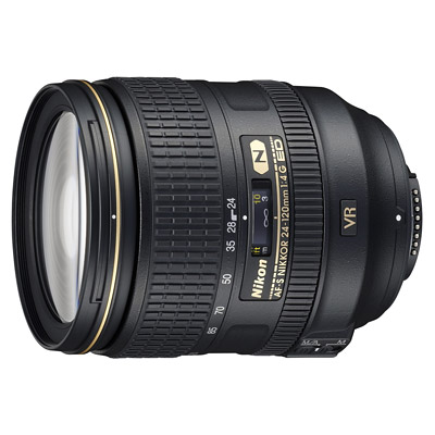
Then I made the photo with nikon 24-120 f4 ... and then in lightroom I applied the profile of the lens correction ... I explained where you see the distortion?
Sailor thanks for the advice .. actually removes the shadow of three-dimensional ...
the picture was taken @ 62mm ... you would have also changed focal length? Allora la foto l ho fatta con il 24-120 f4 nikon... e successivamente in lightroom ho applicato il suo profilo di correzione lente... mi spiegate dove vedete la distorsione??
Marinaio grazie per i consigli.. in effetti l ombra toglie di tridimensionalità...
la foto è stata fatta @62mm... tu avresti cambiato anche lunghezza focale?? |
|
|
sent on 14 Settembre 2011 (14:26) | This comment has been automatically translated (show/hide original)
Pao focal length I think is good, or would you also could have used a more 'long if I had space to get away, it depends on how close you are to her.
Try to imagine the model more 'detached from the wall, in the foreground, and the far wall. She would become more 'big, and would fill the frame maggiormante in height. Background if taken with a focal length more 'long would have different proportions of the blue and he framed even more' the protagonist, the resume point parallel to the ground would do the rest. I see so 'but there may be many other interpretations clearly. Pao la lunghezza focale secondo me va bene, o avresti potuto usarne anche una piu' lunga se avessi avuto spazio per allontanarti, dipende da quanto sei vicino a lei.
Prova a immaginare la modella piu' staccata dalla parete, in primo piano, e la parete lontana. Lei sarebbe diventata piu' grande, e avrebbe riempito maggiormante il fotogramma anche in altezza. Lo sfondo se scattato con una focale piu' lunga avrebbe avuto delle proporzioni diverse e il blu avrebbe incorniciato ancora di piu' la protagonista, il punto di ripresa parallelo al terreno avrebbe fatto il resto. Io la vedo cosi' ma ci possono essere molte altre interpretazioni chiaramente. |
|

Publish your advertisement on JuzaPhoto (info) |


 JuzaPhoto contains affiliate links from Amazon and Ebay and JuzaPhoto earn a commission in case of purchase through affiliate links.


 Resize to fit window