What do you think about this photo?
Do you have questions or curiosities about this image? Do you want to ask something to the author, give him suggestions for improvement, or congratulate for a
photo that you really like?
You can do it by joining JuzaPhoto, it is easy and free!
There is more: by registering you can create your personal page, publish photos, receive comments and you can use all the features of JuzaPhoto.
With more than 260000members, there is space for everyone, from the beginner to the professional.
|
|
sent on 16 Dicembre 2012 (13:49) | This comment has been automatically translated (show/hide original)
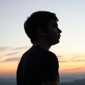
I like the composition, but I find the dominant blue a bit 'too much on, good light
Matthew mi piace la composizione,ma trovo la dominante azzurrina un po' troppo accesa,buona luce
Matteo |
|
|
sent on 17 Dicembre 2012 (19:16) | This comment has been automatically translated (show/hide original)
Hello M4tteo! Thank you so much for the comment because it makes me very happy ... for when it concerns the dominant I can tell you that it "sought" .. what I saw was this beautiful lake with very strong blue cast .. I increased the clarity to give a good visual impact and a nice contrast between the colors. I can tell you that I also lowered to about -15 luminance blue to bring out more of the sky ... if I go over to me lose a little 'of what it means to me shooting. I would be interested to know, however, if you find it so annoying.
Thank you! Ciao M4tteo!! Ti ringrazio tantissimo per il commento perchè mi fa molto piacere...per quando riguarda la dominante posso dirti che è "cercata"..quello che avevo visto era il lago con questa bella dominante blu molto accentuata..ho aumentato la chiarezza per dare un buon impatto visivo e un bel contrasto tra i colori. Posso dirti che ho anche abbassato a circa -15 la luminanza blu per far risaltare di più il cielo...se vado oltre secondo me perde un po' di quello che significa per me lo scatto. Mi interesserebbe sapere però se la trovi tanto fastidiosa.
Ti ringrazio!! |
|
|
sent on 17 Dicembre 2012 (23:52) | This comment has been automatically translated (show/hide original)
For my personal taste I can tell you that I love it because it is not natural in the sense that it is clear that was accentuated the blue tone and then it is clear that post was made, but of course is subjective as what, if your intent was precisely to stress and emphasize this aspect of the photo, so be it, the end for a photographer, a photo is just a means to communicate an emotion, or simply what you see behind a landscape.
good photos
Matthew Per i miei gusti personali posso dirti che non mi piace tantissimo perchè risulta poco naturale,nel senso che è evidente che è stata accentuata la tonalità azzurra e quindi è evidente che è stata post prodotta,però ovviamente è soggettiva come cosa,se il tuo intento era proprio quello di sottolineare ed enfatizzare questo aspetto della foto,ben venga,alla fine per un fotografo una foto è solo un mezzo per comunicare un emozione,o semplicemente quello che si vede dietro un paesaggio.
buone foto
Matteo |
|
|
sent on 18 Dicembre 2012 (19:51) | This comment has been automatically translated (show/hide original)
Yes, in fact it is extreme, but as you say everyone interprets the photograph subjectively, according to his taste ... there are those who interpret it scientifically, then the picture should reflect the reality, those who want to give it a touch of .. . call it "art" ... and then make it clear to the viewer what he felt when shooting ... I really like your words! thanks again the comparison and see you soon! Si, in effetti è estremizzata, ma come dici tu ognuno interpreta la fotografia soggettivamente, in base al suo gusto...c'è chi la interpreta scientificamente, quindi la foto deve rispecchiare la realtà, chi invece vuole dargli un tocco di...chiamiamola "arte"...e quindi far capire a chi la osserva cosa ha provato nel momento dello scatto...mi sono piaciute molto le tue parole!! grazie ancora del confronto e a presto!! |
|

Publish your advertisement on JuzaPhoto (info) |


 JuzaPhoto contains affiliate links from Amazon and Ebay and JuzaPhoto earn a commission in case of purchase through affiliate links.


 Resize to fit window