What do you think about this photo?
Do you have questions or curiosities about this image? Do you want to ask something to the author, give him suggestions for improvement, or congratulate for a
photo that you really like?
You can do it by joining JuzaPhoto, it is easy and free!
There is more: by registering you can create your personal page, publish photos, receive comments and you can use all the features of JuzaPhoto.
With more than 260000members, there is space for everyone, from the beginner to the professional.
|
|
sent on 05 Maggio 2018 (13:28) | This comment has been automatically translated (show/hide original)
Very interesting this interpretation. Well managed the blurry and excellent sharpness of the set. Personally I find excessive greyish background; I would have handled, with the first floor all the set to Ridimensinalrlo using an addition wire on the buds. Personal opinion..... very very personal very very personal! :-D Molto interessante questa interpretazione. Ben gestito lo sfocato e ottima nitidezza dell'insieme. Personalmente trovo eccessivo lo sfondo grigiastro; avrei gestito, con il primo piano tutto l'insieme per ridimensinalrlo utilizzando un filo in più sui germogli. Parere personale .....molto personale molto molto personale!  |
|
|
sent on 05 Maggio 2018 (13:57) | This comment has been automatically translated (show/hide original)
Hello Enrico, thank you for visiting and for having expressed your opinion "very very personal"! :-D
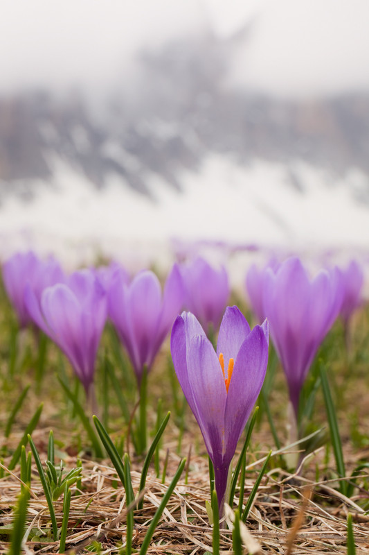
for me the "greyish background" is important and functional to the image: It is the Snowy mountain in the background, which represents the winter that recedes. I was undecided because I had more closed aperture shots where the mountain was better recognized, but in the end I opted for the one with a softer blur of the background.
Interesting though for me to understand whether the intent comes clear or not to the observer!
Hello, Alberto. Ciao Enrico, ti ringrazio per la visita e per aver espresso il tuo parere "molto molto personale"!
Per me lo "sfondo grigiastro" é importante e funzionale all'immagine: é la montagna innevata sullo sfondo, che rappresenta l'inverno che arretra. Ero indeciso perché avevo scatti con diaframma più chiuso in cui la montagna si riconosceva meglio, ma alla fine ho optato per quello con una sfocatura più morbida dello sfondo.
Interessante però per me capire se l'intento arriva chiaro oppure no all'osservatore!
Ciao, Alberto . |
|
|
sent on 05 Maggio 2018 (14:16) | This comment has been automatically translated (show/hide original)
I really like how to focus selectively, blurry and colors.
Excellent work
Compliments
Unfortunately, not knowing English, I do not understand your titles. It would not hurt if there was translation into Italian
Hello Mi piace molto come messa a fuoco selettiva, sfuocato e colori.
Ottimo lavoro
Complimenti
Purtroppo, non conoscendo l'inglese, non capisco i Tuoi titoli. Non sarebbe male se ci fosse la traduzione in italiano
Ciao |
|
|
sent on 05 Maggio 2018 (14:50) | This comment has been automatically translated (show/hide original)
Thanks Andrea! For translation now is not a big problem, thanks Google & Co. :-D
Anyway the photo is entitled: "Farewell of Winter"! ;-)
Hello, Alberto Grazie Andrea! Per la traduzione ormai non é un grosso problema, grazie Google & Co.
Comunque la foto si intitola: "Commiato dell'inverno"!
Ciao, Alberto |
|
|
sent on 05 Maggio 2018 (14:52) | This comment has been automatically translated (show/hide original)
Excellent Alberto Ottima Alberto |
|
|
sent on 05 Maggio 2018 (15:00) | This comment has been automatically translated (show/hide original)
Beautiful image! To my loss, I would have made it lightly + readable the background, but not too much to divert attention to the flowers! Anyway, Bravo! Hello Angel Immagine bellissima! A mio perdere, avrei reso leggermente + leggibile lo sfondo, ma non troppo da distogliere l' attenzione sui fiori! Comunque, bravo! Ciao Angelo |
|
|
sent on 05 Maggio 2018 (15:17) | This comment has been automatically translated (show/hide original)
So this would be the notorious fuzzy "creamy"?
Uhm I think the cream has melted. :-D
jokes aside Alberto for me here you have exaggerated by introducing a background area too wide and separate from the context.
I would have also made the background more readable a bit as I did with the flowered plant to be understood.
So honestly the message you wanted to give the winter that recedes just do not get me.
You said you have more with diaphragms more Chiusi...io I would try to take them into account.
This photo, is more a close-up to a crocus than a picture set. Beautiful the array of crocus blurred just behind, but, as presented I would stop them.
Hello Quindi questo sarebbe il famigerato sfocato "cremoso"?
Uhm mi sa che la crema ti si è sciolta tutta.
Scherzi a parte Alberto per me qui hai esagerato introducendo una zona di sfondo troppo ampia e separata dal contesto.
Avrei anch'io reso più leggibile lo sfondo un po' come ho fatto io con la pianta fiorita per intenderci.
Così onestamente il messaggio che hai voluto dare dell'inverno che arretra proprio non mi arriva.
Hai detto che ne hai altre con diaframmi più chiusi...io proverei a prenderli in considerazione.
Questa foto,è più un primo piano ad un crocus che una foto ambientata.bella la schiera di crocus sfocati appena dietro ,ma ,così come presentata mi fermerei li.
Ciao |
|
|
sent on 05 Maggio 2018 (16:03) | This comment has been automatically translated (show/hide original)
Thank you Luke, Angelo and Simone!
I know that you are right: I did not want to make a simple foreground to the crocus, but a photo set to communicate the transition between the two seasons... :-( I got caught up in the blurry, but this message is not clear!
Simone, yes, I had other shots with more apertures closed, but I did not want too much sharpness in the background: just an impression that it was readable... So I took into account the one with intermediate diaphragm and this is the result: what do you think?
Thanks for the important feedback,
Alberto.
[IMG]https://s14.postimg.cc/ca2b7dpo1/Winter_s_Farewell_2_2018.jpg [/IMG]
Grazie Luca, Angelo e Simone!
Mi sa che avete ragione: io non volevo fare un semplice primo piano ai crocus, ma una foto ambientata per comunicare la transizione tra le due stagioni... Mi sono fatto prendere dallo sfocato, ma così non risulta chiaro il messaggio! Mi sono fatto prendere dallo sfocato, ma così non risulta chiaro il messaggio!
Simone, si, avevo altri scatti con diaframmi più chiusi, ma non volevo troppa nitidezza sullo sfondo: solo un'impressione che fosse però leggibile... Ho preso dunque in considerazione quella con diaframma intermedio e questo è il risultato: cosa ne pensate?
Grazie per l'importante riscontro,
Alberto.
|
|
|
sent on 05 Maggio 2018 (17:02) | This comment has been automatically translated (show/hide original)
The photo hit me, but in fact I did not understand the background well then with your explanations went better, but if you can help my opinion with the latter that you put you interprets much better
Hello
Roberto La foto mi ha colpito, ma in effetti non comprendevo bene lo sfondo poi con le tue spiegazioni è andata meglio, ma se ti può essere d'aiuto il mio parere con quest'ultima che hai messo si interpreta decisamente meglio
ciao
Roberto |
|
|
sent on 05 Maggio 2018 (17:05) | This comment has been automatically translated (show/hide original)
Good shot, congratulations! Emanuele. Ottimo scatto, complimenti! Emanuele. |
|
|
sent on 05 Maggio 2018 (17:13) | This comment has been automatically translated (show/hide original)
You have it with a couple of more diaphragms. :-D
is definitely better. ;-) Ce l'hai con un paio di diaframmi in più.
Si è decisamente meglio . |
|
|
sent on 05 Maggio 2018 (17:21) | This comment has been automatically translated (show/hide original)
It was not easy to find this composition in the midst of millions of crocuses :-D which I find very beautiful.
never happened to see endless expanses of crochini as we saw them on these tours.
I prefer the second version, where it is more readable the background that helps to better understand the message you wanted to convey.
Compliments Alberto.
Hello
Fabrizio Non era facile trovare questa composizione in mezzo a milioni di crochi che trovo molto bella.
Non mi era mai capitato di vedere distese infinite di crochini come li abbiamo visti in queste escursioni.
Anch'io preferisco la seconda versione, dove è più leggibile lo sfondo che aiuta a comprendere meglio il messaggio che hai voluto trasmettere.
Complimenti Alberto.
Ciao
Fabrizio |
|
|
sent on 05 Maggio 2018 (19:28) | This comment has been automatically translated (show/hide original)
Thank you Marco, you're right! When we arrived on the first day there was still a lot of snow and a few flowers, but in the space of three days it exploded an incredible flowering! :-o Impossible not to trample on some!
Hello, Alberto Grazie Marco, hai ragione! Quando siamo arrivati il primo giorno c'era ancora tanta neve e pochi fiori, ma nel giro di tre giorni é esplosa una fioritura incredibile! Impossibile non calpestarne un po'! Impossibile non calpestarne un po'!
Ciao, Alberto |
|
|
sent on 05 Maggio 2018 (20:36) | This comment has been automatically translated (show/hide original)
Simo, for how many diaphragms he may have, will never be all in focus! MrGreenMrGreen
I do not want it all in focus, I would not like to neanche...ma still a little more readable yes. Simo, per quanti diaframmi possa avere, non sarà mai tutta a fuoco!MrGreenMrGreen
Non la voglio tutta a fuoco, non mi piacerebbe neanche...ma ancora un po' più leggibile si. |
|
|
sent on 05 Maggio 2018 (20:43) | This comment has been automatically translated (show/hide original)
You had to be very close, looking at the image I had thought of a longer focal length, for me good the first with square cut on the low
compliments, hello. Dovevi essere molto vicino, guardando l'immagine avevo pensato ad una focale più lunga, per me buona la prima con taglio quadrato sulla parte bassa
Complimenti, ciao. |
|
|
sent on 05 Maggio 2018 (20:53) | This comment has been automatically translated (show/hide original)
Simo, with more closed diaphragm becomes more readable the background but also the flowers become more clear, while the blur makes them more dreamlike... I think I'm stopping here! ;-)
Thanks Catherine: I agree with you on the square cut, perfect for the first image, even if it becomes a photo centered on the crocuses and less contextualized.
Good evening, Alberto.
Simo, con diaframma più chiuso diventa ulteriormente leggibile lo sfondo ma anche i fiori diventano più netti, mentre la sfocatura li rende più onirici... Penso di fermarmi qua!
Grazie Caterina: concordo con te sul taglio quadrato, perfetto per la prima immagine, anche se diventa una foto centrata sui crochi e meno contestualizzata.
Buona serata, Alberto.
|
|
|
sent on 05 Maggio 2018 (21:11) | This comment has been automatically translated (show/hide original)
Quotas] Simo, with more closed diaphragm becomes more readable the background but also the flowers become more clear, while the blur makes them more dreamlike... I think I'm stopping here! ;-)
„
Ah It's true I always forget that you are a purist :-D and a manual blur or a merger of two shots is asking too much. 8-)
well the second then.
Hello “ Simo, con diaframma più chiuso diventa ulteriormente leggibile lo sfondo ma anche i fiori diventano più netti, mentre la sfocatura li rende più onirici... Penso di fermarmi qua!;-)
„
ah è vero dimentico sempre che sei un purista e una sfocatura manuale o una fusione di due scatti è chiedere troppo.
bene la seconda allora.
ciao |
|

Publish your advertisement on JuzaPhoto (info) |


 JuzaPhoto contains affiliate links from Amazon and Ebay and JuzaPhoto earn a commission in case of purchase through affiliate links.


 Resize to fit window