What do you think about this photo?
Do you have questions or curiosities about this image? Do you want to ask something to the author, give him suggestions for improvement, or congratulate for a
photo that you really like?
You can do it by joining JuzaPhoto, it is easy and free!
There is more: by registering you can create your personal page, publish photos, receive comments and you can use all the features of JuzaPhoto.
With more than 260000members, there is space for everyone, from the beginner to the professional.
|
|
sent on 28 Marzo 2018 (18:50) | This comment has been automatically translated (show/hide original)
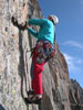
Beautiful Simone pattern .... beautiful b / w compliments as always
hi Luca Bellissimo pattern Simone....splendido b/n complimenti come sempre
Ciao Luca |
|
|
sent on 28 Marzo 2018 (19:05) | This comment has been automatically translated (show/hide original)
Unless you did not want to confuse it, then you did a great job !.
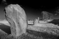
Not to make me say I did a great job, but that's exactly what I wanted. My first title was, the intruder, but ultimately he is the architect of that pattern for which he had every right to be in that vineyard. :-D
My aim is to strengthen the proportions between man and the vineyard. Even the high-toned color change is functional to me because it makes this comparison more essential. I have at least my intentions.
Thanks Luca and Daniele
A greeting
Simone A Meno che non volevi apposta confonderlo allora hai fatto un Gran lavoro!.
Non per farmi dire di aver fatto un gran lavoro, ma è proprio quello che volevo. Il mio primo titolo è stato, l'intruso, ma in definitiva è lui l'artefice di quel pattern per cui aveva tutto il diritto di starci in quella vigna.
Il mio scopo quello di rafforzare le proporzioni tra l'uomo e la vigna.anche il viraggio in chiave alta, per me è funzionale perché rende più essenziale tale confronto.queste almeno le mie intenzioni.
Grazie Luca e Daniele
Un saluto
Simone |
|
|
sent on 28 Marzo 2018 (20:27)
A little less harsh HIGH contrast would make the image easier to look at, but the graphic patterns work well in b&w. |
|
|
sent on 28 Marzo 2018 (20:33) | This comment has been automatically translated (show/hide original)
Beautiful Simone, congratulations. This picture in my opinion is poignant, gives me a great melancholy. That man is completely lost, lost in the world created by himself but from where he can not find the way to freedom. As I have interpreted it I would certainly have preferred to see it with much darker tones to accentuate its drama, but ... as you would say, they are completely personal opinions. Congratulations again Bellissima Simone , complimenti. Questa foto secondo me e' struggente , mi trasmette una grande malinconia. Quell'uomo è completamente perso , perso nel mondo creato da lui stesso ma da dove non riesce a trovare la via verso la libertà. Per come l'ho interpretata io avrei sicuramente preferito vederla con toni molto più scuri per accentuarne la drammaticità , ma...come diresti tu , sono pareri del tutto personali. Complimenti ancora |
|
|
sent on 28 Marzo 2018 (20:39) | This comment has been automatically translated (show/hide original)
Daniele (what kind of grudge are you kidding?) Timk and Franz, different interpretations and analyzes are welcome. For me it is a symptom that an image is alive and makes us think.
Then we would miss, nothing striking, but they are small personal satisfactions.
Thank you
Hello
Simone Daniele (ma quale rancore stai scherzando?) Timk e Franz, ben vengano diverse interpretazioni e analisi. Per me è sintomo che un'immagine è viva e fa pensare.
Poi ci mancherebbe, niente di eclatante, però sono piccole soddisfazioni personali.
Vi ringrazio
Ciao
Simone |
|
|
sent on 28 Marzo 2018 (20:43)
I totally respect your choices and know that you are experienced to enough to make those choices, as you so wish. I do not see your vision, just my brief interpretation. But I still Like, which is important! Respect to you. |
|
|
sent on 28 Marzo 2018 (20:59) | This comment has been automatically translated (show/hide original)
Timk because according to you
A less stiff HIGH contrast would make the image easier to look at
Are not enough the branches of the vineyard and a stylized man to understand what I wanted to represent?
Sorry if I did not write in English but I'm a bit rusty. Timk perché secondo te
Un contrasto HIGH meno rigido renderebbe l'immagine più semplice da guardare
Non ti bastano i tralci della vigna e un uomo stilizzato per capire quello che volevo rappresentare?
Scusa se non ho scritto in inglese ma sono un po' arrugginito. |
|
|
sent on 28 Marzo 2018 (21:48) | This comment has been automatically translated (show/hide original)
Dear Commissioner, you've hit the center once again!
GRAND BELLA ... I like a lot ...
I do not know what to say more, it's perfect for me. Caro Commissario hai fatto centro ancora una volta !
GRAN BELLA...mi piace un sacco...
Non so cosa dire di più, per me è perfetta. |
|
|
sent on 28 Marzo 2018 (22:43) | This comment has been automatically translated (show/hide original)
A fully convincing shot.
Hats off
Hello
Patrician
Uno scatto pienamente convincente.
Tanto di cappello
Ciao
Patrizio
|
|
|
sent on 28 Marzo 2018 (22:55)
Your English is fine, Commissioner. |
|
|
sent on 28 Marzo 2018 (23:32) | This comment has been automatically translated (show/hide original)
Yura, Patrick, thank you.
Timk ok, it does not matter
see you next time. ;-)
Simone Yura, Patrizio vi ringrazio.
Timk ok,non ha importanza
alla prossima.
Simone |
|
|
sent on 29 Marzo 2018 (10:50) | This comment has been automatically translated (show/hide original)
I understand the perplexities of those who preceded me, it seems very lost
Even without cutting anything the person would position it in the lower third, it would always remain isolated but the message would arrive more instantaneous
Claudio Capisco le perplessità di chi mi ha preceduto, mi sembra molto sperduto
Anche senza tagliare niente la persona la posizionerei nel terzo basso, resterebbe sempre isolato ma il messaggio arriverebbe più istantaneo
Claudio |
|
|
sent on 29 Marzo 2018 (12:07) | This comment has been automatically translated (show/hide original)
Hi Claudio, I used the quarter rule here. :-D
The subject for me remains the pattern of the vineyard, not the man for whom I believe that so defiled has its own because, even if I understand the perplexities that may arouse
Hello
Simone Ciao Claudio, qui ho usato la regola dei quarti.
Il soggetto per me rimane il pattern della vigna non l'uomo per cui credo che così defilato abbia il suo perché, anche se capisco le perplessità che possa suscitare
Ciao
Simone |
|
|
sent on 29 Marzo 2018 (15:29) | This comment has been automatically translated (show/hide original)
Good idea, the composition in my opinion is effective for the purpose, well also the conversion into a bn high-pitched graphic although maybe I would try to save more details, there are areas where the pattern of the vines in my opinion you lose a bit too much in white.
Congratulations, hello. Buona idea, la composizione secondo me è efficace allo scopo, bene anche la conversione in un bn grafico a tono alto anche se forse avrei provato a salvare quache dettaglio in più, ci sono zone in cui il pattern delle vigne a mio parere si perde un po' troppo nel bianco.
Complimenti, ciao. |
|
|
sent on 29 Marzo 2018 (18:48) | This comment has been automatically translated (show/hide original)
Hello Simo, finally I see it well from the PC ... I also like the idea behind this shot, as well as the choice of composition, with wider field ;-).
My perplexity is that expressed by Caterina and already by Tim: the b & n is a bit 'too "pushed" and the graphic effect is not readable in the same way in all areas ... Then you know that I love the "soft" treatments "in post, so this turns out to be" duretto "! :-D :-D :-D
Hi, Alberto.
PS: in the end you did it to try the "beast"! :-D How are you? ;-) Ciao Simo, finalmente la vedo bene dal PC... Anche a me piace l'idea dietro a questo scatto, così come la scelta della composizione, con campo più largo .
La mia perplessità è quella espressa da Caterina e già da Tim: il b&n è un po' troppo "spinto" e l'effetto grafico non è leggibile allo stesso modo in tutte le zone... Poi lo sai che amo i trattamenti "soft" in post, quindi questo mi risulta "duretto"!
Ciao, Alberto.
P.S.: alla fine ce l'hai fatta a provare la "bestia"! Come va? |
|
|
sent on 29 Marzo 2018 (20:00) | This comment has been automatically translated (show/hide original)
Caterina, Alberto is true, among other things, my first version was even more pushed because I had disappeared the concrete posts.I only left the branches but then I removed I backed down because it was really too exasperated.
I backed up to make the poles legible, in some areas I was left behind.
Then you know that I love the "soft" treatments in post, so this turns out to be "hard"
Because you are old Alberto, updated. :-D
The 80 400 is a great bell'ottica, I'm still trying, but it's a lot of fun.The quality is really remarkable, very clear.Averlo had in Africa .... Caterina,Alberto si è vero, tra l'altro la mia prima versione era addirittura ancora più spinta perché avevo fatto sparire i pali di cemento.rimanevano solo i tralci poi però ho tolto ho fatto marcia indietro perché era davvero troppo esasperata.
Ho indietreggiare fino a rendere leggibili anche i pali, in qualche zona sono rimasto indietro .
Poi lo sai che amo i trattamenti "soft" in post, quindi questo mi risulta "duretto
Perché sei vecchio Alberto , aggiornati.
L'80 400 è una gran bell'ottica, la sto ancora provando, ma è molto divertente.la qualità è davvero notevole,molto nitida.Averlo avuto in Africa.... |
|
|
sent on 30 Marzo 2018 (12:18) | This comment has been automatically translated (show/hide original)
I really like the idea and the result Simo! this reading in a high key, essential in graphism and full of content, an elusive story .. A me piace molto l'idea e il risultato Simo! questa lettura in chiave alta, essenziale nel grafismo e densa di contenuto, un racconto sfuggente.. |
user117231
|
sent on 02 Aprile 2018 (9:53) | This comment has been automatically translated (show/hide original)

I express my satisfaction with this splendid image with all the strength I have. ;-)
..
(ps But I would need you to explain it to me ...)
Esprimo il mio compiacimento per questa splendida immagine con tutta la forza che ho.
..
(p.s. Avrei però bisogno che me la spiegassi...) |
|

Publish your advertisement on JuzaPhoto (info) |


 JuzaPhoto contains affiliate links from Amazon and Ebay and JuzaPhoto earn a commission in case of purchase through affiliate links.


 Resize to fit window