What do you think about this photo?
Do you have questions or curiosities about this image? Do you want to ask something to the author, give him suggestions for improvement, or congratulate for a
photo that you really like?
You can do it by joining JuzaPhoto, it is easy and free!
There is more: by registering you can create your personal page, publish photos, receive comments and you can use all the features of JuzaPhoto.
With more than 260000members, there is space for everyone, from the beginner to the professional.
|
|
sent on 09 Ottobre 2017 (9:37) | This comment has been automatically translated (show/hide original)
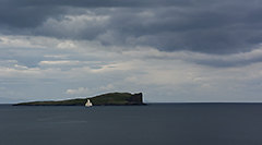
This bn exalts the shape of the stones, I like it very much! I like the sky less. I would have preferred a more rotated (or shifted) composition to the right with the tower approaching a wig to the left margin, always trying to give depth to the bigger branch but excluding the ones left to the left that disturb Questo bn esalta molto la forma dei sassi, mi piacciono moltissimo! Il cielo mi piace di meno. avrei preferito una composizione più ruotata (o spostata ) a destra con la torre che si avvicina un pelino di pù al margine sinistro, eercando sempre di dare profondità col ramo più grosso ma escludendo quelli piccoli a sinistra che disturbano |
|
|
sent on 09 Ottobre 2017 (9:43) | This comment has been automatically translated (show/hide original)
The inclusion of the foreground helps to give three-dimensionality to the photo, but I certainly would not include that pollen brought from the sea. I'm tired of commenting on the photo because it's well done, but I miss a subject or point of interest on which to focus. I would have dared a little more in the post, shading the blue and the aquamarine to have a nice dark sky that would have made it counterbalance the stones. L'inclusione del primo piano aiuta a dare tridimensionalità alla foto ma non avrei certo incluso quel legnetto portato dal mare. Fatico a commentare la foto perché a livello tecnico è ben eseguita, ma mi manca un soggetto o un punto di interesse sul quale focalizzarmi. Avrei osato un po' di più in post scurendo il blu e l'acquamarina per avere un bel cielo scuro che avrebbe fatto da contraltare ai sassi. |
user72446
|
sent on 09 Ottobre 2017 (9:52) | This comment has been automatically translated (show/hide original)
Very 'dynamic and three-dimensional' photos beautiful black and white, you've included several elements with the right proportions, a well-made picture !!!! Foto molto ''dinamica e tridimensionale'' bello il bianco e nero, hai incluso parecchi elementi con le giuste proporzioni, una foto ben fatta!!!! |
user90373
|
sent on 09 Ottobre 2017 (10:22) | This comment has been automatically translated (show/hide original)
Those of the F64 would certainly have focused on the foreground, and they were not mica-micio, bau-bau. ;-) Quelli dell"F64" avrebbero certamente messo a fuoco anche il primo piano e non eran mica micio-micio, bau-bau.  |
|
|
sent on 09 Ottobre 2017 (10:26) | This comment has been automatically translated (show/hide original)
beautiful Riccardo, lots of compliments, exceptional pdr and sharpness, great b / n, so many compliments bellissima Riccardo, tanti complimenti, eccezionale pdr e nitidezza, ottimo b/n, tanti tanti complimenti |
|
|
sent on 09 Ottobre 2017 (10:33) | This comment has been automatically translated (show/hide original)
Beautiful in everything from the bianconero to the composition, the only defect for me is the first floor not in focus, wanting to include I would have closed the diaphragm or I would have just moved away ;-) Bella in tutto dal bianconero alla composizione, l'unico difetto per me è il primo piano non a fuoco, volendolo includere avrei chiuso più il diaframma o mi sarei allontanato appena |
user81257
|
sent on 09 Ottobre 2017 (11:25) | This comment has been automatically translated (show/hide original)
You are trying to dial differently and okay, but try to be attentive to all the details.
In this photo a couple of things do not go: luminous stones that capture the scene (use a brightness mask) and extremely blurry. Stai cercando di comporre diversamente e va bene, ma cerca di essere attento a tutti i particolari.
In questa foto un paio di cose non vanno: sassi luminosi che catturano la scena (usa una maschera di luminosità) e primissimo piano sfocato. |
|
|
sent on 09 Ottobre 2017 (12:57) | This comment has been automatically translated (show/hide original)
It's a nice photo, but I would not have included it in the photo. E' una bella foto, ma il legnetto non l'avrei incluso nella foto. |
|
|
sent on 09 Ottobre 2017 (14:14) | This comment has been automatically translated (show/hide original)
Hi, the picture is beautiful, but it is not clear if the subject is the branch or turret, I would use some other element in the foreground to give three dimensionality, this in my mind takes too much attention, very beautiful also the sky. Ciao la foto è bella, però non è chiaro se il soggetto è il ramo o la torretta, avrei utilizzato qualche altro elemento in primo piano per dare tridimensionalità, questo secondo me prende troppa attenzione, molto bello anche il cielo. |
|
|
sent on 09 Ottobre 2017 (14:29) | This comment has been automatically translated (show/hide original)
I agree with Pippo, the photo itself is good at first sight, but having chosen a low pdr, the trunk makes you bother (usually we see it in such scenarios when placing the machine at half height-height 1.60). There is nothing to say about the development, maybe too much fired the stones, not bad but this time I would say it is redefined Concordo in toto con Pippo, la foto in se è buona a prima vista, ma avendo scelto tu un pdr basso, il tronco ti da fastidio (solitamente lo vediamo in scenari del genere quando si colloca la macchina a mezza altezza-altezza 1.60). Sullo sviluppo nulla da dire, forse troppo sparati i sassi, non male ma stavolta direi rivedibile |
|
|
sent on 09 Ottobre 2017 (15:18) | This comment has been automatically translated (show/hide original)
The branch in the foreground blurred me from a clutter of annoyance: P
and there is something in the frame that does not come back to me. Maybe the branch is too central, maybe moving it to dx?
The rest seems all right.
Il ramo in primo piano sfuocato mi da un pochetto fastidio :P
e c'è qualcosa nell'inquadratura che non mi torna. Forse il ramo è troppo centrale, magari spostandolo più a dx?
Il resto mi pare tutto ok.
|
|
|
sent on 09 Ottobre 2017 (17:49) | This comment has been automatically translated (show/hide original)
I would have slightly moved the trunk so that I would look back at the house in the background ;-)
If possible I would cut out a part of the sky.
David Avrei spostato lievemente il tronco, in maniera tale da guidare lo sguardo verso la casa sullo sfondo
Se possibile avrei ritagliato una parte del cielo.
Davide |
|
|
sent on 09 Ottobre 2017 (19:53) | This comment has been automatically translated (show/hide original)
Let's say the trunk in the direction of the turret would not have been bad, but also so I'm sorry, I also find here the gray bn Diciamo il tronco in direzione della torretta non sarebbe stato male,ma anche così non mi dispiace,trovo anche qui il bn grigio |
user96921
|
sent on 09 Ottobre 2017 (20:59) | This comment has been automatically translated (show/hide original)
As PP exercise in bw you chose a great shot as a grayscale. maybe the clouds too flat but subjective. The good shot though the horizon penalizes for the non-physiological lineage ... In the comfy but not exhilarating. ;-) come esercizio di PP in bw hai scelto uno scatto ottimo come scala dei grigi. forse le nuvole troppo piatte ma è soggettivo.L'inquadratura buona anche se l'orizzonte penalizza per la non linerità fisiologica...Nel comlesso valida ma non esaltante. |
|
|
sent on 09 Ottobre 2017 (23:41) | This comment has been automatically translated (show/hide original)
Thanks to everyone for the suggestions. Grazie a tutti per i suggerimenti. |
|
|
sent on 10 Ottobre 2017 (13:58) | This comment has been automatically translated (show/hide original)
I would have called it "the caiman". That's the effect that made me the piece of wood in the foreground. Which contributes a bit to vitalizing an image of its somewhat anonymous. L'avrei chiamato "il caimano". Quello è l'effetto che mi ha fatto il pezzo di legno in primo piano. Che contribuisce un po' a vitalizzare un 'immagine di suo un po' anonima. |
|
|
sent on 10 Ottobre 2017 (14:39) | This comment has been automatically translated (show/hide original)
Aesthetically I like it, converting to B / N is great in my opinion, as does the rendering of heaven. It disturbs me a bit the very blurry outline. The rest I like! Esteticamente mi piace molto, la conversione in B/N è ottima a mio avviso, come anche la resa del cielo. Mi disturba un poco il primissimo piano sfocato. Il resto mi piace! |
|
|
sent on 10 Ottobre 2017 (16:18) | This comment has been automatically translated (show/hide original)
I like the low shooting point, but maybe it's a bit too low: a slightly higher pdr would better look at the tower, so the branch gets a little too much attention. I think the wood should be in focus, I would reduce the brightness of the stones to the left and add a bit of contrast to the clouds. Have you tried a vertical cut? Mi piace il punto di ripresa basso, ma forse è un po' troppo basso: un pdr leggermente più alto avrebbe giudato meglio lo sguardo verso la torre, in questo modo il ramo si prende un po ' troppa attenzione. Credo che il legno dovesse essere a fuoco, ridurrei la luminosità delle pietre a sinistra ed aggiungerei un po' di contrasto alle nuvole. Hai provato un taglio verticale? |
|
|
sent on 10 Ottobre 2017 (18:26) | This comment has been automatically translated (show/hide original)
good, but it can also be improved
the diagonal trunk would help
and even less light on the stones, light too hard buona, ma migliorabile anche questa
il tronco in diagonale avrebbe aiutato
e anche meno luce sui sassi, luce troppo dura |
|
|
sent on 12 Ottobre 2017 (10:32) | This comment has been automatically translated (show/hide original)
Impressions, beautiful photos COmplimenti, bellissima foto |
|

Publish your advertisement on JuzaPhoto (info) |


 JuzaPhoto contains affiliate links from Amazon and Ebay and JuzaPhoto earn a commission in case of purchase through affiliate links.


 Resize to fit window
 16.2 MEGAPIXEL