What do you think about this photo?
Do you have questions or curiosities about this image? Do you want to ask something to the author, give him suggestions for improvement, or congratulate for a
photo that you really like?
You can do it by joining JuzaPhoto, it is easy and free!
There is more: by registering you can create your personal page, publish photos, receive comments and you can use all the features of JuzaPhoto.
With more than 260000members, there is space for everyone, from the beginner to the professional.
|
|
sent on 23 Gennaio 2017 (20:32) | This comment has been automatically translated (show/hide original)
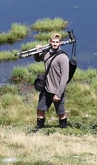
Composition and very beautiful atmosphere human presence enriches the shot I like very much but unfortunately the same can not be said of post production ..
Excessive sharpness opening shadows and saturation selective guess created heaven to stains or more stones are turned blue shame because the picture is very beautiful ... I believe that in this case a conversion to Juventus could solve all these ;-) problems Composizione ed atmosfera molto belli la presenza umana arricchisce lo scatto mi piace molto ma purtroppo lo stesso non si può dire della post produzione..
L'eccessiva nitidezza l'apertura ombre e la saturazione immagino selettiva ha creato il cielo a macchie ed in più le pietre sono diventate blu peccato perché la foto è molto bella...credo che in questo caso una conversione in bianconero potrebbe risolvere tutti questi problemi |
|
|
sent on 23 Gennaio 2017 (20:41) | This comment has been automatically translated (show/hide original)

I run both PP, and frankly I was in doubt until the last of which to load. I wanted to emphasize, however, the colors to give the idea of ??the season in which the photo was taken.
Ho eseguito entrambe le PP, e sinceramente sono stato in dubbio fino all'ultimo su quale caricare. Volevo comunque sottolineare i colori per dare l'idea della stagione in cui è stata scattata la foto. |
|
|
sent on 23 Gennaio 2017 (21:13) | This comment has been automatically translated (show/hide original)
The composizine is great, the landscape is as fvola and transmits a lot of peace. Shame about the poorly exposed stones that are blue. La composizine è ottima, il paesaggio è da fvola e trasmette molta quiete. Peccato per le pietre mal esposte che risultano blu. |
|
|
sent on 23 Gennaio 2017 (21:33) | This comment has been automatically translated (show/hide original)
Essential shooting and well composed with a well run against the sun. The human presence makes it more dynamic a scene otherwise a little 'anonymous. If I have to find fault it is known that an improved sharpness and not exciting colors. Maybe a b & w conversion could help a lot.
EDIT: I had the page open for a while 'and then I had not read the previous comments. I prefer sharply version b & n. Scatto essenziale e ben composto con un controsole ben gestito. La presenza umana rende più dinamica una scena altrimenti un po' anonima. Se devo trovare un difetto è che noto una nitidezza migliorabile e dei colori non esaltanti. Forse una conversione b&n potrebbe aiutare molto.
EDIT: avevo la pagina aperta da un po' e quindi non avevo letto i commenti precedenti. Preferisco nettamente la versione b&n. |
|
|
sent on 23 Gennaio 2017 (21:43) | This comment has been automatically translated (show/hide original)
really beautiful composition. Having also seen the version in black and white I must say that there is no history, won the second! The color version if, bra a bit 'too contrived. Anyway, congratulations! Composizione veramente bella. Dopo aver visto anche la versione in bianco e nero devo dire che non c'è storia, vince la seconda! La versione a colori se,bra un po' troppo artificiosa. Comunque complimenti! |
|
|
sent on 23 Gennaio 2017 (21:50) | This comment has been automatically translated (show/hide original)
Great photo. I have no complaints. I prefer the color version. Gran foto. Non ho nessuna critica. Preferisco la versione a colori. |
user39791
|
sent on 23 Gennaio 2017 (21:55) | This comment has been automatically translated (show/hide original)
Photos with great contrasts, where blacks and whites closed burned are inevitable in these situations I prefer the black and white and this case does not come out from this rule. However a beautiful photo. Foto con grandi contrasti dove neri chiusi e bianchi bruciati sono inevitabili, in queste situazioni preferisco il bianco e nero e questo caso non esce da questa regola. Ad ogni modo una bella foto. |
|
|
sent on 24 Gennaio 2017 (7:05) | This comment has been automatically translated (show/hide original)
What I'd give to me a walk in that place and the photo is successful precisely because infuses peace and tranquility. The color version has some inaccuracies but that can be corrected while the black and white for me is more aseptic. A greeting Cosa darei per farmi una passeggiata in quel luogo e la foto è riuscita proprio perché infonde pace e tranquillità. La versione a colori ha qualche imprecisione ma che può essere corretta mentre quella in bianco e nero per quanto mi riguarda è più asettica. Un saluto |
user81826
|
sent on 24 Gennaio 2017 (7:42) | This comment has been automatically translated (show/hide original)
You played a little 'too much with the luminance? Because the artifacts in the sky remind me of that.
To me the composition and the moment inspired also quite strong but the implementation goes totally against the idea of ??tranquility that it would transmit this evening scene. I would have suggested low contrast, pastel colors and fade into the horizon nell'arancione.
If you look at the picture the rocks appear bluish and even a little 'magenta and is a nice effect for me. Hai giocato un po' troppo con le luminanze? Perché gli artefatti nel cielo mi ricordano quello.
A me la composizione ed il momento ispirano anche abbastanza ma la realizzazione forte va totalmente contro l'idea di tranquillità che dovrebbe trasmettere questa scena serale. Ti avrei suggerito contrasti bassi, colori pastellati e che sfumano all'orizzonte nell'arancione.
Se guardi bene la foto le rocce appaiono bluastre ed anche un po' magenta e non è un bell'effetto per me. |
|
|
sent on 24 Gennaio 2017 (9:10) | This comment has been automatically translated (show/hide original)
the pictures and briefly caught are good, as I said rivedrei a little post production la foto e attimo colto sono buoni, come gia detto rivedrei un pochino la post produzione |
|
|
sent on 24 Gennaio 2017 (9:46) | This comment has been automatically translated (show/hide original)
Each picture has its own colors .. Needless to look for where the machine has not detected them ...
Personally I do not like so much the Bianconeri but when he does it take ..
This, personal opinion, is a Juventus ;-) Ogni foto ha i suoi colori.. Inutile cercarli dove la macchina non li ha rilevati...
Personalmente non mi piace tanto il bianconero ma quando ci va ci vuole..
Questa, parere personale, è da bianconero |
|
|
sent on 24 Gennaio 2017 (10:15) | This comment has been automatically translated (show/hide original)
This shot I really like; the composition seems to me made in a workmanlike manner. The human presence enriched further. I saw the version bn and I must say that I prefer. Questo scatto mi piace molto; la composizione mi sembra fatta a regola d'arte. La presenza umana arricchisce ulteriormente. Ho visto la versione in bn e debbo dire che la preferisco. |
|
|
sent on 25 Gennaio 2017 (9:26) | This comment has been automatically translated (show/hide original)
Hello. I prefer the long version in bn, in the other stands too predominance blue / purple cerulean and the burning bush in the sky; for the rest of the composition and clarity of the picture are very good, I like. Ciao. Preferisco di lunga la versione in bn, nell'altra spicca troppo la predominanza blu/viola ceruleo e la bruciatura a macchia nel cielo; per il resto composizione e leggibilità della foto vanno decisamente bene, mi piace. |
|
|
sent on 25 Gennaio 2017 (11:46) | This comment has been automatically translated (show/hide original)
The PDR is well educated, too bad for the PP and some too dark blacks, I still prefer the color photo that with its soft colors most excited about.
Hello Il PDR è ben colto, peccato per la PP e per alcuni neri troppo scuri, comunque preferisco la foto a colori che con i suoi colori tenui emoziona di più.
ciao |
user75655
|
sent on 25 Gennaio 2017 (16:33) | This comment has been automatically translated (show/hide original)
Excellent composition. Bravo, you're improving a lot. I do not repeat what others have already told you on the spot. In my opinion however, the version in black and white deserves better. Ottima la composizione. Bravo, stai migliorano molto. Non ti ripeto ciò che gli altri ti hanno già detto sulla posto. A mio avviso comunque la versione in bianco e nero merita di più. |
|
|
sent on 26 Gennaio 2017 (6:36) | This comment has been automatically translated (show/hide original)
I like the composition as well as the moment caught. The pp I'm not crazy, I already showed you in pvt what would be my idea :-) La composizione mi piace così come il momento colto. La pp non mi fa impazzire, ti ho già fatto vedere in pvt quale sarebbe la mia idea  |
user33434
|
sent on 26 Gennaio 2017 (13:16) | This comment has been automatically translated (show/hide original)
Hello Daniel, beautiful composition. In the color version the post production of the sky is not very balanced, however monochrome earns very becoming in my opinion one pleasing shot is the prospect that for the subjects. Greetings Ciao Daniele, bella composizione. Nella versione a colori la post produzione del cielo non è molto equilibrata però in bianco e nero guadagna molto diventando a mio avviso uno scatto gradevole sia per la prospettiva che per i soggetti ripresi. Saluti |
|
|
sent on 27 Gennaio 2017 (17:30) | This comment has been automatically translated (show/hide original)
Beautiful composition, even the posture of the human figure is correct. Maybe in version b / n it is unable to conceal the wider area burned in the sky.
But I must say that I miss the color sorry. Bella composizione, anche la postura della figura umana è corretta. Forse nelle versione b/n si riesce a dissimulare l'ampia zona bruciata nel cielo.
Ma devo dire che manco quella a colori mi dispiace. |
|
|
sent on 27 Gennaio 2017 (21:50) | This comment has been automatically translated (show/hide original)
lele this shot has potential, but the version you posted do not like.
I also agree with the suggestion to convert bn, but instead would try to figure out what's wrong with your color version.
in my opinion, once you've corrected the deep yellow horizon, blue and magenta that is on the rocks, and you've lightened the man, shooting could be even better. lele questo scatto ha del potenziale, ma la versione che hai postato non mi piace.
condivido anche io il suggerimento di convertirla in bn, ma al posto cercherei di capire cosa c'è che non va nella tua versione a colori.
secondo me , una volta che hai corretto il giallo intenso all'orizzonte, il blu e il magenta che c'è sulle pietre, e hai schiarito l'uomo, lo scatto potrebbe essere ancora migliore. |
|
|
sent on 31 Gennaio 2017 (22:35) | This comment has been automatically translated (show/hide original)
Is stain in the sky and just bad, much better version in black and white that the mask well, color saturation, and also 'excessive, the rocks are blue' to be reviewed .... definitely ... in black and white scurirei the sky a little too much at the limit ... Sta patacca nel cielo e proprio brutta, molto meglio la versione in bianco e nero che la maschera bene, a colori anche la saturazione e' eccessiva, gli scogli sono blu'....da rivedere decisamente...in bianco e nero scurirei un po il cielo troppo al limite... |
|

Publish your advertisement on JuzaPhoto (info) |


 JuzaPhoto contains affiliate links from Amazon and Ebay and JuzaPhoto earn a commission in case of purchase through affiliate links.


 Resize to fit window
 2.3 MEGAPIXEL