What do you think about this photo?
Do you have questions or curiosities about this image? Do you want to ask something to the author, give him suggestions for improvement, or congratulate for a
photo that you really like?
You can do it by joining JuzaPhoto, it is easy and free!
There is more: by registering you can create your personal page, publish photos, receive comments and you can use all the features of JuzaPhoto.
With more than 260000members, there is space for everyone, from the beginner to the professional.
|
|
sent on 12 Agosto 2012 (15:07) | This comment has been automatically translated (show/hide original)
Taking very interesting and enjoyable.
Good attention to detail, even the human elements are well positioned.
Compliments.
hello Scatto decisamente interessante e piacevolissimo.
Buona cura dei dettagli, anche gli elementi umani sono ben posizionati.
Complimenti.
ciao |
|
|
sent on 12 Agosto 2012 (15:25) | This comment has been automatically translated (show/hide original)
thank you
the important thing for me was to create a glazed effect hdr care .. without artifacts or visible signs .. a hdr one based on the perception of the human eye as dynamic range and contrast.
people .. certainly their presence (totally random I admit) make the architecture more livable. the end was around August 1 and there was little anyone .. in other photos I would have done without .. so much so that there are some ghosting (I kept them because I remember how the boards university of architecture with those semi-transparent)
sins ti ringrazio
l'importante per me era di creare un effetto patinato hdr curato.. senza artefatti o segni visibili.. un hdr che riprendesse la percezione dell'occhio umano come gamma dinamica e contrasto.
le persone.. sicuramente la loro presenza (del tutto casuale ammetto) rendono l'architettura piu vivibile. alla fine era l'1 agosto e in giro c'era poco nessuno.. in altre foto avrei fatto volentieri a meno.. tant'è che ci sono alcuni effetti fantasma (li ho tenuti perchè a mio modo ricordano le tavole universitarie di architettura con le persone semi-trasparenti)
sins |
|
|
sent on 12 Agosto 2012 (17:36) | This comment has been automatically translated (show/hide original)
And that is precisely the sense of HDR, I think.
A technique that allows us to approach a bit 'more dynamic range of the human eye to give us a more realistic scene.
It is often used to create special effects from the cartoon, sometimes gradevolissimi but more often than not.
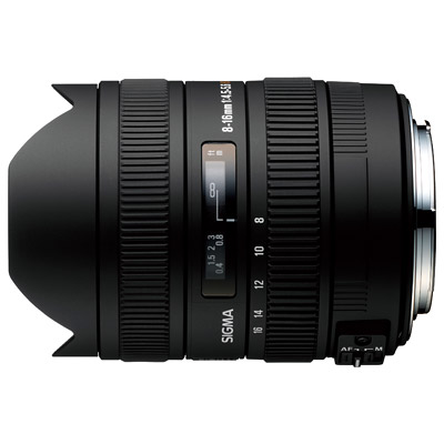
I also have the Sigma 8-16 and imagine the work that is behind this shot, although it is a good lens is not ideal for architecture.
This picture is, so far, the best photos of architecture that I have seen with that lens.
hello Ed è proprio quello il senso dell'HDR, secondo me.
Una tecnica che ci permette di avvicinarci un po' di più alla gamma dinamica dell'occhio umano per restituirci una scena più realistica.
Spesso è usata per creare effetti speciali da cartone animato, a volte gradevolissimi ma il più delle volte no.
Ho anch'io il Sigma 8-16 ed immagino il lavoro che ci sia dietro questo scatto, pur essendo una buona lente non è certo l'ideale per architettura.
Questa foto è, finora, la migliore foto di architettura che ho visto fare con quella lente.
ciao |
|
|
sent on 12 Agosto 2012 (17:44) | This comment has been automatically translated (show/hide original)
I was certainly benefit from having a paving interesting to keep the machine axis in
however, the 8-16 do not find it so impossible to use .. 8 there is certainly a considerable suction at the corners .. and as soon as you tilt the machine ... the vertical disappear in the sky:-D
I had a FF and 17ts .... ero sicuramente avvantaggiato dal fatto di avere una pavimentazione interessante per tenere la macchina in asse
comunque l'8-16 non lo trovo così impossibile da utilizzare.. certo a 8 c'è un risucchio agli angoli non indifferente.. e appena si inclina la macchina... le verticale spariscono in mezzo al cielo 
avessi una FF e il 17ts.... |
|
|
sent on 19 Agosto 2012 (3:25) | This comment has been automatically translated (show/hide original)
photo is about and it seems a bit 'too bright .. slightly because I like it but maybe it's too bright
read correction curves in the medium to medium dark
imageshack.us/photo/my-images/259/mart20copia.jpg/
I review whether the other if you can give me a hand
greetings
sins riguardo sta foto e mi sembra un po' troppo luminosa.. leggermente perchè a me luminosa piace ma forse è troppo
correzione leggere alle curve nei medio-medio scuri
imageshack.us/photo/my-images/259/mart20copia.jpg/
vedo se rivedere anche le altre se potete darmi una mano
saluti
sins |
user95
|
sent on 19 Agosto 2012 (9:10) | This comment has been automatically translated (show/hide original)
in my opinion
the second is much better, but it is the flavor of HDR, unwatchable in the first.
green shot in the fountain, and above all those letters that blend - made so "well exposed" with the architectural backdrop.
I am convinced that the original is better, given the good composition (and a double raw can be used to recover if anything that cloud) il mio parere:
la seconda va decisamente meglio, ma resta il sapore di HDR, inguardabile nella prima.
il verde sparato nella fontana, e sopratutto quelle lettere che si confondono - rese così "ben esposte" con l'architettura di sfondo.
sono convinto che l'originale sia meglio, vista la buona composizione (e che un doppio raw possa servire a recuperare semmai quella nuvola) |
|
|
sent on 19 Agosto 2012 (10:05) | This comment has been automatically translated (show/hide original)
Even unwatchable! I do not think so badly treated and afalsata
Image a bit saturated c is full forum
Probably the first one Po smortina
Will post the original but due to the poor light of noon doubt can improve Addirittura inguardabile?! Non mi sembra così mal curata e afalsata
Di immagini un po sature c è pieno il forum
Probabilmente la prima un Po smortina
Posterò l originale ma vista la cattiva luce di mezzogiorno dubito possa migliorare |
user95
|
sent on 19 Agosto 2012 (11:06) | This comment has been automatically translated (show/hide original)
Ale be patient if I was trenchant, to other my views on the hdr is unknown.
I repeat, I really like the composition and do not know the original but I think with this subject a "hardness graphics" can not be bad ;-)
“ The pictures a little saturated c is full forum „
well, the color alone does not ... "A little 'saturated" stands for "unwatchable"?
:-D Ale abbi pazienza se sono stato tranchant, ad altri il mio punto di vista sugli hdr è noto.
ripeto, mi piace molto la composizione e non conosco l'originale ma penso che con questo soggetto una "durezza grafica" possa non essere male 
“ Di immagini un po sature c è pieno il forum „
mah, il colore da solo non c'entra... "un po' sature" sta per "inguardabili"?
|
|
|
sent on 19 Agosto 2012 (12:54) | This comment has been automatically translated (show/hide original)
Also I am not fond of HDR pushed, with halos fabulous and natural colors. In my case, I see it very natural and useful to remove the hardness of light and recover a bit of range.
Anyway I was just weird judgment unwatchable
But that still more opinions I get the better Anche io non sono amante degli HDR spinti, con aloni fiabeschi e colori naturali. Nel mio caso lo vedo molto naturale ed utile per togliere la durezza della luce e recuperare un pizzico di gamma.
Cmq mi faceva solo strano il giudizio inguardabile
Ma tranquillo che più opinioni ricevo meglio è |
|
|
sent on 19 Agosto 2012 (14:07) | This comment has been automatically translated (show/hide original)
I like the three-dimensional sense, the presence of human figures, sharpness, composition and point of recovery.
To improve:
Cromie-saturation and background (mountains and the blue sky below the bridge connecting the two structures)
-Obvious differences in tone between the two skies
-Readability walls to the right
He feels the lack of a polarizing filter
(IMHO)
Hello and good light, laurel Mi piacciono il senso tridimensionale, la presenza delle figure umane, la nitidezza, la composizione e il punto di ripresa.
Da migliorare :
-Cromie e saturazione sfondo (montagna e l'azzurro del cielo inferiore al ponte di collegamento delle 2 strutture)
-Evidenti differenze di toni tra i 2 cieli
-leggibilità pareti a destra
Si sente la mancanza di un filtro polarizzatore
(IMHO)
Ciao e buona luce, lauro |
|
|
sent on 19 Agosto 2012 (15:25) | This comment has been automatically translated (show/hide original)
Thank you for criticism and appreciation. The right wall is recoverable but perhaps removes dynamic
For the colors what do you recommend? The difference between the two heavens is evident from the glass that darkens and breaks. But I did not work in the different areas
C is some dominant? In part I think the mountains
Thank you if you can bring out the best from questimmagine
Sina Ti ringrazio per critiche ed apprezzamenti. La parete di destra è recuperabile ma forse toglie dinamica
Per le cromie cosa mi consigli? La differenza tra i due cieli è resa evidente dalla vetrata che scurisce e spezza. Ma non ho fatto interventi differenti nelle zone
C è qualche dominante? A parte credo le montagne
Vi ringrazio se riuscite a tirare fuori il meglio da questimmagine
Sina |
|
|
sent on 19 Agosto 2012 (15:43) | This comment has been automatically translated (show/hide original)
To me, it's all about an item not used in this recovery which is the polarizing filter.
If you look at even the white cloud above the air corridor is flat.
The filter knob would improve the three-dimensionality of the sky, increased sharpness, saturation and contrast.
The mountains, rather than with dominant are overexposed ... certainly far from what your eyes were recorded.
Pp you still have room to make the homogenous two portions of the sky and play with the lights / shadows, making the shadows less readable and thus increasing the readability in a bit on the pale walls.
If this kind of images you are always the most important currency in the future to revolutionize your outfit and go on acting like the 5D mark II + the classic canon 17-400mm ... l 'HDR will be even more soft ;-)
(IMHO)
hello, laurel Secondo me, tutto ruota su un elemento non utilizzato in questa ripresa che è il filtro polarizzatore.
Se osservi bene anche la nuvola bianca sopra il corridoio aereo è piatta.
Il filtro pola avrebbe migliorato la tridimensionalità del cielo, aumentato la nitidezza, la saturazione e il contrasto .
Le montagne , più che con dominanti, sono sovraesposte ... lontane certamente da ciò che i tuoi occhi avevano registrato.
In p.p. hai ancora margine per rendere omogene le 2 porzioni di cielo e giocare con il comando luci/ombre rendendo le ombre meno leggibili e aumentando di conseguenza un pelino la leggibilità sulle pareti chiare.
Se questo genere di immagini sono per te sempre più importanti valuta in futuro di rivoluzionare il tuo corredo e passare su una f.f. tipo la 5d mark II + il classico canon 17-400mm ... l'HDR sarà ancora più soft
(IMHO)
ciao, lauro |
|
|
sent on 19 Agosto 2012 (16:03) | This comment has been automatically translated (show/hide original)
I meditate meditate. Your advice does not make a turn.
FF for now it remains a dream but it is definitely my point of arrival. The 17 40 gives me doubts about the distortion and brightness and edges. Peró say it is a natural polarizer. I valutavo the tokina 16 28. Boh
Maybe in conjunction with an very bright for 28 nights indoors.
We will see
Sins Medito medito. I tuoi consigli non fanno una piega.
FF per ora rimane un sogno ma è sicuramente il mio punto di arrivo. Il 17 40 mi fa venire dei dubbi per la distorsione e la luminosità e i bordi. Peró dicono che è un polarizzatore naturale. Io valutavo il tokina 16 28. Boh
Magari ad affiancargli un 28 molto luminoso per serate in interni.
Vedremo
Sins |
|
|
sent on 19 Agosto 2012 (20:34) | This comment has been automatically translated (show/hide original)
listening to the advice of LM
has been lost a little 'grain on the rock but I placed the sky and gained a little bit on the light
in more I darkened the letters to counter the ambient
let's see how you:-D seems

ascoltando i consigli di LM
si è persa un po' di grana sulla roccia ma ho sistemato il cielo e guadagnato qualcosina sulle luci
in piu ho scurito le lettere per contrastarle con l'ambient
vediamo come vi sembra
|
|
|
sent on 19 Agosto 2012 (20:46) | This comment has been automatically translated (show/hide original)
Yes you Can! :-)
Good work!
hello and good light, laurel Yes you Can !! 
Ottimo lavoro !
ciao e buona luce, lauro |
|
|
sent on 19 Agosto 2012 (20:51) | This comment has been automatically translated (show/hide original)
the sky and the letters! How did I not accorgemene first:-D
recovery in the clouds could be more strong .. on the wall is fine ..
I just felt like I would have done these changes in a selective way .. thus leaving intact the brightness and saturation of the walls in the shade in the "square" of the mart il cielo e le lettere?! come ho fatto a non accorgemene prima
il recupero sulle nuvole poteva essere piu strong.. sulla parete va bene..
avessi proprio avuto voglia avrei fatto queste modifiche in modo selettivo.. quindi lasciando intatta la luminosità e saturazione dei muri in ombra nella "piazzetta" del mart |
|
|
sent on 19 Agosto 2012 (22:38) | This comment has been automatically translated (show/hide original)
I think last attempt combining the best of the first and second version (mask very fast)
in particular the first version I kept the walls of mert and other buildings in the shade and the water of the fountain, so as to reduce the contrast of shadows-lights .. into the sky, flooring and darker than the letters.
let's see how
greetings
sins credo ultimo tentativo unendo il meglio della prima e della seconda versione (maschera molto veloce)

in particolare della prima versione mi sono tenuto i muri del mert e degli altri edifici in ombra e l'acqua della fontana, così da ridurre il contrasto ombre-luci.. tenendo il cielo, la pavimentazione e le lettere piu scure.
vediamo com'è
saluti
sins |
|
|
sent on 20 Agosto 2012 (2:41) | This comment has been automatically translated (show/hide original)
place for those who care the picture starting with the exhibition "correct" and tricky:-D with a minimum of post to prepare together with other HDR (Recuero sharp contrast)
posto per chi può interessare la foto di partenza con l'esposizione "corretta" e ostica con un minimo di post per prepararle insieme alle altre all'hdr (recuero nitidezza contrasto)

|
user95
|
sent on 20 Agosto 2012 (8:23) | This comment has been automatically translated (show/hide original)
no, I'm not jealous of Lauro but that of the letters you see I had made it:-D
more seriously, what I think - to my taste and opinion - seeing the triptych:
- The first "cover" was and remains a still image of a scene from Arena Quake or Doom ... maybe a little 'light but as a game or cardboard is fine. Here you will see a lot of landscapes from the planet Mars passed off fotonaturalismo landscape ...
- The second, as I imagined, with those letters and those shadows credible, it is very good for me
- The third again has a taste artificial
As the photography (the real one): in fact, the sky would be to recover a bit ', but the light is, it's tough, and slipped deviate from this isare soon in the comic.
it must be said that the initial plan overlaps, confusing, sometimes style of architecture in the background. the "M" on the way out of the mountains, especially.
hello no, non sono geloso di Lauro ma quella delle lettere te l'avevo fatta notare io
più seriamente, quello che penso - a mio gusto e parere - vedendo il trittico:
- la prima "in copertina" era e rimane il fermo immagine di una scena di Quake Arena o di Doom... forse un po' chiara ma come game o cartone va bene. qui se ne vedono tanti, di paesaggi dal pianeta Marte spacciati per fotonaturalismo paesaggistico...
- la seconda, come immaginavo, con quelle lettere e quelle ombre credibili, è per me molto buona
- la terza torna ad avere un gusto artificiale
quanto alla fotografia (quella vera): in effetti il cielo sarebbe da recuperare un po', ma la luce è quella, è dura, e scostarsi da questo fa scivolare presto nel fumetto.
c'è da dire però che il primo piano si sovrappone, confondendo, a tratti stilistici dell'architettura in secondo piano. la "M" sulla via di fuga sui monti, sopratutto.
ciao |
|
|
sent on 20 Agosto 2012 (10:56) | This comment has been automatically translated (show/hide original)
In my there are no monsters in quake :-)
Anyway we finally understood. For the rest I taste
Have a nice day Nella mia non ci sono i mostri di quake :-)
Cmq alla fine ci siamo capiti. Per il resto so gusti
Buona giornata |
|

Publish your advertisement on JuzaPhoto (info) |

 MART - Rovereto
 JuzaPhoto contains affiliate links from Amazon and Ebay and JuzaPhoto earn a commission in case of purchase through affiliate links.


 Resize to fit window
 1.5 MEGAPIXEL