What do you think about this photo?
Do you have questions or curiosities about this image? Do you want to ask something to the author, give him suggestions for improvement, or congratulate for a
photo that you really like?
You can do it by joining JuzaPhoto, it is easy and free!
There is more: by registering you can create your personal page, publish photos, receive comments and you can use all the features of JuzaPhoto.
With more than 260000members, there is space for everyone, from the beginner to the professional.
|
|
sent on 17 Agosto 2012 (14:36) | This comment has been automatically translated (show/hide original)
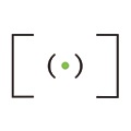
I like very much, especially the relationship between the background is the subject, which comes out very well despite being small compared to the background. there is something sticking out from the bottom, the clonerei. Unfortunately however the site I do not like, contrasts with this clean and minimal, resulting in chaotic and not very functional (IMHO of course) mi piace molto,sopratutto il rapporto tra sfondo è soggetto, che viene fuori molto bene pur essendo piccolo rispetto allo sfondo. c'è qualcosa che spunta dalla parte bassa, lo clonerei. purtroppo invece il sito non mi piace, contrasta con questa immagine pulita e minimal, risultando caotico e non troppo funzionale (IMHO naturalmente) |
|
|
sent on 17 Agosto 2012 (14:44) | This comment has been automatically translated (show/hide original)
thanks .. the relationship was important so I'm glad I did not messed
what comes out at the bottom is my horse .. I do not know if you clone or pull on
for the site understand that the ratio ultra wild display, which among other changes from browser to monitor, often forced to have some close up uncalculated
I'm at the point I invite you to also look at my site www.desins.it .. probably closest to the standard photo
hello and thank you for visiting grazie.. il rapporto era importante quindi sono contento di non aver toppato
quel che sbuca in basso è il mio cavallo.. non so se clonarlo o tirarlo su
per il sito capisco che il rapporto ultra wild di visualizzazione, che tra l'altra cambia da browser a monitor, costringe spesso ad avere dei close up non calcolati
a sto punto ti invito a guardare anche il mio sito www.desins.it.. probabilmente piu vicino allo standard della foto
ciao e grazie per la visita |
|
|
sent on 17 Agosto 2012 (21:04) | This comment has been automatically translated (show/hide original)
is not the relationship ultrawild, it is precisely the chaotic be .. cmq repeat personal considerations of one's personal environment but cmq remain. your site, sorry, still quite bad. I assure you that in 2012 what makes a good web site is the speed, cleanliness, navigability. your site is too slow to load. loaded all the thumbnails, and because they appear it takes a lot for my taste. not absolutely critical content, but the container, which graphically nemmen is not bad, but it is slow. I make these criticisms in a constructive way is clear, there are thousands of sites worse than yours, mine is just a suggestion. I presume you are an architect, I'm an architect too, then hear an advice as an equal. while the first site, as well as slow, not very navigable.
<br/> For the horse, I would say yes, or pull it up or delete it .. non è il rapporto ultrawild, è proprio l'essere caotico.. cmq ripeto considerazioni personali di uno che sta nell'ambiente ma cmq personali rimangono. il tuo sito, scusa, rimane abbastanza pessimo. ti assicuro che nel 2012 quel che fa di un sito un buon sito è la velocità, la pulizia, la navigabilità. il tuo sito è troppo lento nel caricarsi. ha caricato tutte le thumbnail, e perchè appaiono ci vuole un sacco per i miei gusti. non critico assolutamente il contenuto, ma il contenitore, che graficamente non è nemmen male, ma è lento. ti faccio queste critiche in modo costruttivo sia chiaro, ci son migliaia di siti peggiori del tuo, il mio è solo un consiglio. presumo tu sia un architetto, sono un architetto anche io, quindi un consigli oda pari a pari. mentre il primo sito, oltre che lento, non è ben navigabile.
per quanto riguarda il cavallo, direi proprio di si, o lo tiri su o lo cancelli.. |
|
|
sent on 18 Agosto 2012 (2:01) | This comment has been automatically translated (show/hide original)
wrong :-)
designer .. specialized over time in 3D graphics .. to make the designer real little stuff
I see the battle with the architectural and industrial photography now .. see
for the site (not mine) I would have said anything but chaotic .. I would cut all the images differently emphasizing the close up (studio type section (edited by me))
for my site only regret that it is all in flash .. no future, but quickly transportable html5 .. (Not by me because I'm a goat)
velocizzabile compressing better images .. in addition to being many are 1500x1000 .. not a little
navigability as we have opposite opinions .. the first is quite classic with the horizontal bar just .. in my opinion a configuration perfettin for studies of interior .. graphically similar to big large studies that inspired us .. while mine has a home from which all further connections between sections .. very basic .. also because it comes as a portfolio online .. I am a "newbie"
I never offend .. eventually need to take everything with pliers .. and any criticism is just a way to self-questioning .. then confirm .. faster the better .. minimal modern graphics (I like the blank) .. I have also received very positive opinions from web designers and programmers so cheers relativity
I thank you for your interest in seeing both sites and write your opinion (not everyone does)
good job
sins sbagliato :-)
designer.. specializzato col tempo in grafica 3d.. di fare il progettista vero e proprio poca roba
vedo di giocarmela con la fotografia industriale e architettonica ora.. vediamo
per il sito (non mio) avrei detto tutto ma non caotico.. io avrei tagliato tutte le immagini in modo diverso accentuando il carattere close up (tipo sezione studio (curata da me))
per il mio sito rimpiango solo che è tutto in flash.. senza futuro, ma velocemente trasportabile in html5.. (non da me perchè sono una capra)
velocizzabile comprimendo meglio le immagini.. che oltre ad essere tante sono 1500x1000.. non poco
come navigabilità abbiamo pareri opposti.. il primo è abbastanza classico con le bar orizzontali e basta.. a mio parere una configurazione perfetta per studi di interior.. graficamente simili a grossi grossi studi da cui ci siamo ispirati.. mentre il mio ha una home da cui parte tutto senza ulteriori collegamenti tra le sezioni.. molto basico.. anche perchè nasce come portfolio on-line.. sono un "novellino"
offendermi io mai.. alla fine occorre prendere tutto con le pinze.. e ogni critica è solo un modo per auto-interrogarsi.. quindi confermo.. più veloce è meglio è.. grafica moderna minimal (a me piace il vuoto).. ho ricevuto anche pareri più che positivi da grafici web e programmatori quindi evviva la relatività
ti ringrazio per l'interesse nel vedere entrambi i siti e scrivere la tua opinione (non lo fanno tutti)
buon lavoro
sins |
|
|
sent on 18 Agosto 2012 (7:47) | This comment has been automatically translated (show/hide original)
What do you mean "my horse"? You are standing on the back? wow! In che senso "il mio cavallo"? Sei in piedi in groppa?  |
|
|
sent on 18 Agosto 2012 (14:18) | This comment has been automatically translated (show/hide original)
mmm .. I do not know if it is a dialect word ..
however, is where does the pants between her legs .. no sexual reference:-D mmm.. non so se è un termine dialettale..
comunque è dove finiscono i pantaloni tra le gambe.. nessun riferimento sessuale  |
|
|
sent on 18 Agosto 2012 (14:22) | This comment has been automatically translated (show/hide original)
ah no, then you got it wrong: D left of yourself, looking at the picture, there's a tip, do not know what is. I thought you meant one of those horses that are used by children, with the broom handle, and it was his ear: D ah no allora hai capito male :D a sx di te stesso, guardando la foto, c'è una punta, non so cosa sia. io pensavo che intendevi uno di quei cavalli che si usano da bambini, col manico di scopa, e quello fosse il suo orecchio :D |
|
|
sent on 18 Agosto 2012 (14:35) | This comment has been automatically translated (show/hide original)
oh my god:-D
I had not noticed .. if camouflaged with cloth monitor o mio dio
non ci avevo fatto caso.. se mimetizzava coi pelucchi del monitor |
|
|
sent on 18 Agosto 2012 (14:37) | This comment has been automatically translated (show/hide original)
hahaha: D I could actually find it strange too the horse, but you know, the Faculty of Architecture teaches you not to be surprised by anything: D ahahah :D effettivamente lo potevo trovare strano anche io il cavallo, però lo sai, la facoltà di architettura t'insegna a non stupirti di nulla :D |
|
|
sent on 18 Agosto 2012 (15:36) | This comment has been automatically translated (show/hide original)
milan design has the power to split years ago calling for independence:-D a milano la facoltà di design si è scissa anni addietro invocando la propria indipendenza |
|
|
sent on 18 Agosto 2012 (15:44) | This comment has been automatically translated (show/hide original)
even here in Florence, and good Italians who we are, having well in mind that the only good thing that we had was the public school and public health, for fear that people are accustomed too well, those design put you in old warehouse that once served as a warehouse I think the Expert. I had the girl there was always a feeling that climate always fresh and well-tempered, hot in summer and cold in the winter, the thermal shock ever:-D anche qua a firenze, e da buoni italiani quale siamo, avendo ben a mente che l'unica cosa buona che avevamo era la scuola pubblica e la sanità pubblica, per paura che la gente si abituasse troppo bene, quelli di design li hanno messi nel vecchio capannone che una volta serviva credo all'expert come magazzino. io avevo la ragazza lì,era sempre un emozione quel clima fresco e sempre ben temperato, caldo d'estate e freddo d'inverno, un sia mai lo sbalzo termico |
|
|
sent on 18 Agosto 2012 (15:55) | This comment has been automatically translated (show/hide original)
ah .. we have the opposite .. new building .. new plants .. new stations .. new laboratories ah.. da noi il contrario.. edificio nuovo.. impianti nuovi.. postazioni nuove.. laboratori nuovi |
|

Publish your advertisement on JuzaPhoto (info) |


 JuzaPhoto contains affiliate links from Amazon and Ebay and JuzaPhoto earn a commission in case of purchase through affiliate links.


 Resize to fit window
 1.5 MEGAPIXEL