What do you think about this photo?
Do you have questions or curiosities about this image? Do you want to ask something to the author, give him suggestions for improvement, or congratulate for a
photo that you really like?
You can do it by joining JuzaPhoto, it is easy and free!
There is more: by registering you can create your personal page, publish photos, receive comments and you can use all the features of JuzaPhoto.
With more than 260000members, there is space for everyone, from the beginner to the professional.
|
|
sent on 11 Settembre 2016 (8:48) | This comment has been automatically translated (show/hide original)
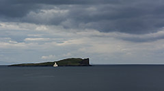
It's a nice photomerge (facilitated :-D) with great compo and good for ... but the shades are quite spente..io I dared a b / n È un bel photomerge (facilitato ) con un'ottima compo ed un buon per...ma le tonalità sono abbastanza spente..io avrei osato un b/n ) con un'ottima compo ed un buon per...ma le tonalità sono abbastanza spente..io avrei osato un b/n |
|
|
sent on 11 Settembre 2016 (9:29) | This comment has been automatically translated (show/hide original)
He not for a light batter of jpeg shadows closed left and all those tourists to the castle for me would be a beautiful color for the image and composition ... ;-)
congratulations to you and to the galaxy. non fosse per un leggero impasto del jpeg le ombre chiuse a sinistra e tutti quei turisti al castello per me sarebbe una bellissima immagine per colori e composizione ... ...
complimenti a te e al galaxy. |
|
|
sent on 11 Settembre 2016 (10:08) | This comment has been automatically translated (show/hide original)
Many colored dots on the bridge in a medieval atmosphere a little jar us a little but that's okay ....
But since you're so good with cloning (left nothing not known) why not remove those ;-)? at least those yellow and red ... Tanti puntini colorati sul ponte in una atmosfera un pò medioevale ci stonano un pò ma va bene....
Ma visto che sei così bravo con la clonazione (a sinistra non si nota nulla) perché non togliere anche quelli? almeno quelli gialli e rossi... |
|
|
sent on 11 Settembre 2016 (10:26) | This comment has been automatically translated (show/hide original)
You're right. I'll try. Hai ragione. Ci proverò. |
user81257
|
sent on 11 Settembre 2016 (10:33) | This comment has been automatically translated (show/hide original)
The views thus not driven me crazy for the simple fact that you can enjoy just printed (on practically you see a thin strip monitor).
But this is done very well, the colors are good, although the composition is there.
Entitled Castle, but the castle is bound in a small photo porzioncina, is not enhanced in any way, it does not dominate. The scenery is beautiful, the left is slightly darker.
Marco. I panorami così spinti non mi fanno impazzire per il semplice fatto che si riescono a godere solo stampati (su monitor praticamente si vede una striscia sottile).
Però questo è realizzato molto bene, i colori sono buoni, anche la composizione ci sta.
Intitolata Castle, ma il castello è rilegato in una piccola porzioncina di foto, non è esaltato in alcun modo, non domina. Il panorama è bello, a sinistra è leggermente scura.
Marco. |
|
|
sent on 11 Settembre 2016 (10:41) | This comment has been automatically translated (show/hide original)
Um true ... I should call it "Loneliness ... (are relegated here in the corner for 500 years, and all this water is making me grow moss on the tiles.)" :-D
It does not seem dark to the left. There the sky was closed, where protrudes the sun is necessarily brighter.
Lighten at that point, meant to overexpose the rest. Uhm vero...Avrei dovuto intitolarlo "Solitudine...(sono relegato qui in un angolo da 500 anni e tutta questa acqua mi sta facendo crescere il muschio sulle tegole.)"
Non mi sembra scura a sinistra. Lì il cielo era chiuso, dove sporge il sole é necessariamente più luminoso.
Schiarire in quel punto, significava sovraesporre il resto. |
|
|
sent on 11 Settembre 2016 (11:08) | This comment has been automatically translated (show/hide original)
I really like but I agree with Philip, I find it a little off. I have no suggestions, this light would be an issue to be placed in post on a jpg of the phone, at least for me. Personally I would try the b / n. Mi piace molto ma concordo con Filippo, la trovo un pò spenta. Non ho suggerimenti, questa luce sarebbe un problema da sistemare in post su un jpg del telefono, almeno per me. Personalmente proverei il b/n. |
|
|
sent on 11 Settembre 2016 (12:24) | This comment has been automatically translated (show/hide original)
I do not mind, of course the colors are a bit 'too dark and dull but generally has excellent composition and the view came good without artifice. To come back with the camera :-D Non mi dispiace, certo i colori sono un po' troppo cupi e spenti ma in generale ha un'ottima composizione e il panorama è venuto bene senza artifizi. Da ritornarci con la reflex |
|
|
sent on 11 Settembre 2016 (14:05) | This comment has been automatically translated (show/hide original)
@ Pier88
To come back with Foveon ... 8-) @Pier88
Da ritornarci col Foveon... |
|
|
sent on 11 Settembre 2016 (23:27) | This comment has been automatically translated (show/hide original)
I like this shot for me one of your best, to appreciate it should be printed and hung, sin which is done with the phone, to post something like this of something else .... just clonerei the grass at bottom left. Mi piace questo scatto per me uno dei tuoi migliori, per apprezzarlo andrebbe stampato e appeso, peccato che è fatto col telefono, per la post qualcosa mi piace di questa qualcosa dell altra....clonerei solo l erba in basso a sx. |
|
|
sent on 12 Settembre 2016 (7:38) | This comment has been automatically translated (show/hide original)
Maybe I cut off the picture on the left, and I left a little 'more than the castle bridge space, for the rest I can only compliment you for the beautiful photos.
David Forse taglierei la foto a sx e avrei lasciato un po' più di spazio al ponte del castello, per il resto non posso che farti i complimenti per la bella foto.
Davide |
|
|
sent on 12 Settembre 2016 (10:34) | This comment has been automatically translated (show/hide original)
Usually I do not like the panoramic picture because we often get carried away and simply there is "too much." This however I like, has a good composition and I find unnecessary items so for me it is a successful shot. We appreciated the fact that it was done with a simple phone. Di solito non amo le foto panoramiche perché spesso ci si fa prendere la mano e semplicemente c'è "troppo". Questo invece mi piace, ha una buona composizione e non trovo elementi inutili quindi per me è uno scatto riuscito. Apprezzabile il fatto che sia stato fatto con un semplice cellulare. |
|
|
sent on 12 Settembre 2016 (14:04) | This comment has been automatically translated (show/hide original)
David
there where he unplugged the image to the right, beginning a modern building with the ticket.
Andrew
To me that tuft of grass that grows on the left is' sympathy, and also helps to give depth to the picture.
thanks to Razor1979.
Davide
lì dove ho staccato l'immagine a destra, cominciava una costruzione moderna con la biglietteria.
Andrea
A me quel ciuffetto di erba che spunta a sinistra fa' simpatia, ed inoltre contribuisce a dare profondità alla foto.
grazie anche a Razor1979.
|
|

Publish your advertisement on JuzaPhoto (info) |


 JuzaPhoto contains affiliate links from Amazon and Ebay and JuzaPhoto earn a commission in case of purchase through affiliate links.


 Resize to fit window
 3.5 MEGAPIXEL