What do you think about this photo?
Do you have questions or curiosities about this image? Do you want to ask something to the author, give him suggestions for improvement, or congratulate for a
photo that you really like?
You can do it by joining JuzaPhoto, it is easy and free!
There is more: by registering you can create your personal page, publish photos, receive comments and you can use all the features of JuzaPhoto.
With more than 260000members, there is space for everyone, from the beginner to the professional.
|
|
sent on 09 Agosto 2016 (8:15) | This comment has been automatically translated (show/hide original)
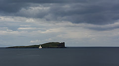
Hi Nicola. From my point of view the photo is technically perfect and it is interesting occasionally see a sunset without the sun at the center of the picture :-)
The problem is that now the issue is so inflated that it is really hard to impress with the sunsets. Even here on Juza he is full of sunsets in all the sauces. So often just read "sunset" on the title and you go over ... at least to me it happens. :-D
That said, I repeat that the photo is very well done from the technical point of view / composition and the PP was excellent retaining a very pleasing appearance and "realistic" of the sky. Compliments! Ciao Nicola. Dal mio punto di vista la foto tecnicamente è perfetta ed è interessante ogni tanto vedere un tramonto senza il sole al centro dell'immagine 
Il problema è che oramai il tema è talmente inflazionato che è veramente difficile stupire con i tramonti. Anche qui su juza ne è pieno di tramonti in tutti le salse. Quindi spesso basta leggere "tramonto" sul titolo e si passa oltre... almeno a me capita. 
Detto ciò, ripeto che la foto è fatta benissimo dal punto di vista tecnico/compositivo e la pp è stata ottima conservando un aspetto molto gradevole e "realistico" del cielo. Complimenti! |
|
|
sent on 09 Agosto 2016 (8:25) | This comment has been automatically translated (show/hide original)
I really like this photo I find very pleasant tree silhouette ... In terms of composition I find it perfect as always in all your photos, only notice maybe in a bit too much saturated blue in vivid contrast to the clouds.
Hello Ale. Mi piace molto questa foto trovo molto gradevole la silhouette dell'albero... A livello compositivo la trovo perfetta come sempre in tutte le tue foto, unico appunto forse un pelino troppo saturato il blu in acceso contrasto con le nuvole.
Ciao Ale. |
|
|
sent on 09 Agosto 2016 (9:28) | This comment has been automatically translated (show/hide original)
A classic and beautiful sunset ... I appreciate the fact that you have only kept the silhouette of the country. The tree from an element that breaks and originality ... vice versa would only be a beautiful sky. well done technically.
Obviously it's not easy being one of the most abused subjects in photography :) Un classico e bellissimo tramonto...apprezzo il fatto che tu abbia mantenuto esclusivamente la silhouette del paese. L'albero da un elemento che spezza e da originalità...viceversa sarebbe stato solo un bel cielo. Tecnicamente ben eseguita.
Ovviamente non è facile essendo uno dei soggetti più abusati in fotografia :) |
|
|
sent on 09 Agosto 2016 (12:16) | This comment has been automatically translated (show/hide original)
The sunset can return wonderful warm colors as in this case. Snap great thanks to the clouds designs and excellent tree silhouette. Il tramonto può restituire colori caldi bellissimi come in questo caso. Scatto ottimo anche grazie ai disegni delle nuvole e all'ottima silhouette dell'albero. |
|
|
sent on 09 Agosto 2016 (12:26) | This comment has been automatically translated (show/hide original)
Perhaps the tree silhouette contrasts excessively with respect to the color palette of the sunset.
Taken one by one, I do not see anything wrong. But put together do not form a harmonious combination.
Probably if the tree he had some visible details, you would better integrated whole.
I repeat image technically correct, but not convincing. Forse la silhouette dell'albero contrasta in maniera eccessiva rispetto alla palette dei colori del tramonto.
Presi ad uno ad uno, non ci vedo niente di scorretto. Ma messi insieme non formano un accostamento armonico.
Probabilmente se l'albero avesse avuto dei dettagli visibili, si sarebbe integrato meglio nell'insieme.
Ripeto immagine tecnicamente corretta, ma non convincente. |
user33434
|
sent on 09 Agosto 2016 (12:33) | This comment has been automatically translated (show/hide original)
fantastic colors and beautiful silhouette. Nothing to complain. Bravo Colori fantastici e bella silhouette. Nulla da eccepire. Bravo |
|
|
sent on 09 Agosto 2016 (17:27) | This comment has been automatically translated (show/hide original)
Difficult to make a suggestion, the composition is balanced and the colors of the sky very nice.
There is no body, a light, a shadow, something that detach, and bring out.
The jot them: if the intent was to highlight the colors of the sky, why not look in the clouds in the sky a texture or an abstract design which connect the image, providing two different levels of reading? Difficile dare un suggerimento, la composizione è equilibrata ed i colori del cielo molto gradevoli.
Manca un soggetto, una luce, un'ombra, qualcosa che la stacchi e la faccia emergere.
La butto li: se l'intento era quello di evidenziare i colori del cielo, perchè non cercare tra le nuvole in cielo una texture od un disegno astratto al quale collegare l'immagine, fornendo due livelli diversi di lettura? |
user81826
|
sent on 10 Agosto 2016 (11:49) | This comment has been automatically translated (show/hide original)
When you want to make a silhouette is important for me to have any well-defined edges and in this case the lower part is not them at all and this is, again in my opinion, the main problem of the picture. At the same time the main shaft silhouette is pleasant.
[URL =] www.juzaphoto.com/galleria.php?l=it&t=103858
This is for example to me a much more successful your silhouette. Quando si vuole fare una silhouette è importante secondo me avere tutti i contorni ben definiti ed in questo caso la parte bassa non li ha affatto ed è questo, sempre a parere mio, il problema principale della foto. Al contempo la silhouette dell'albero principale risulta piacevole.
www.juzaphoto.com/galleria.php?l=it&t=103858
Questa è per esempio per me una tua Silhouette molto più riuscita. |
|
|
sent on 10 Agosto 2016 (12:11) | This comment has been automatically translated (show/hide original)
Simple and beautiful Semplice e bella |
|
|
sent on 10 Agosto 2016 (16:07) | This comment has been translated
Beautiful, congratulations! |
|
|
sent on 10 Agosto 2016 (16:27) | This comment has been automatically translated (show/hide original)
quoto sonmian.
the picture is monotonous, already seen, unoriginal.
The silhouette is a bit 'pushy and a little' 'complicated' quoto sonmian.
l'immagine risulta monotona, già vista, poco originale.
la silouette è un po' invadente e un po' "complicata" |
user14286
|
sent on 10 Agosto 2016 (16:49) | This comment has been automatically translated (show/hide original)
I agree. condivido. |
|
|
sent on 11 Agosto 2016 (0:30) | This comment has been automatically translated (show/hide original)
The problem as mentioned by others is that the theme is inflated. The tree then a great mass of fine details but not a form on which the eye can linger (to say, it was a bare winter tree without making a miracle would have had a completely different impact). excellent colors anyway. Il problema come detto da altri è che il tema è inflazionato. L'albero poi ha una gran massa di dettagli fini ma non una forma su cui l'occhio possa soffermarsi (per dire, fosse stato un albero spoglio d'inverno pur senza far gridare al miracolo avrebbe avuto tutto un altro impatto). Colori ottimi comunque. |
|
|
sent on 11 Agosto 2016 (13:12) | This comment has been automatically translated (show/hide original)
I agree with everything you said ManInTheMaze. Condivido tutto ciò che ha detto ManInTheMaze. |
|
|
sent on 18 Agosto 2016 (7:03) | This comment has been automatically translated (show/hide original)
A successful minimal, then the window of the house .... Una minimal ben riuscita, poi dalla finestra di casa.... |
|
|
sent on 18 Agosto 2016 (8:57) | This comment has been automatically translated (show/hide original)
Thank you all for your constructive comments. Grazie a tutti per i commenti costruttivi. |
|
|
sent on 23 Agosto 2016 (11:14) | This comment has been automatically translated (show/hide original)
Hi Nicola :-)
I agree with what was said by PaoloPgC: silhouette too difficult to read, it lacks the apparently lower shaft which merges with the background and the result is a very readable image (but with a beautiful sky, that yes ;-)).
A greeting,
Lorenzo Ciao Nicola
Concordo con quanto detto da PaoloPgC: silhouette troppo poco leggibile, manca la pare inferiore dell'albero che si confonde con lo sfondo e ne esce un immagine poco leggibile (ma con un cielo bellissimo, quello sì  ). ).
Un saluto,
lorenzo |
|
|
sent on 05 Settembre 2016 (21:40) | This comment has been automatically translated (show/hide original)
Thanks Lorenzo Grazie Lorenzo |
|

Publish your advertisement on JuzaPhoto (info) |


 JuzaPhoto contains affiliate links from Amazon and Ebay and JuzaPhoto earn a commission in case of purchase through affiliate links.


 Resize to fit window
 3.8 MEGAPIXEL