What do you think about this photo?
Do you have questions or curiosities about this image? Do you want to ask something to the author, give him suggestions for improvement, or congratulate for a
photo that you really like?
You can do it by joining JuzaPhoto, it is easy and free!
There is more: by registering you can create your personal page, publish photos, receive comments and you can use all the features of JuzaPhoto.
With more than 260000members, there is space for everyone, from the beginner to the professional.
|
|
sent on 05 Agosto 2016 (11:00) | This comment has been automatically translated (show/hide original)
Great picture!
Gionskj Eccezionale ritratto!
Gionskj |
|
|
sent on 05 Agosto 2016 (11:37) | This comment has been automatically translated (show/hide original)
Thank you so much Gionskj!
All the best, Richard Grazie mille Gionskj!
Un saluto, Riccardo |
|
|
sent on 05 Agosto 2016 (11:52) | This comment has been automatically translated (show/hide original)
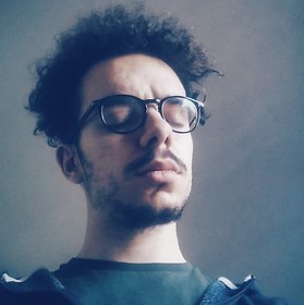
Very nice, I would have been just a hair wider to take more hat and fingertips. I really like the post as in all your photos.
I think I've already said it uses very well your "minimal" outfit, with all due respect to many ... :-D Molto bella, sarei stato solo un pelo più largo per prendere più cappello e la punta delle dita. Mi piace molto la post come in tutte le tue foto.
Credo di avertelo già detto ma usi molto bene la tua attrezzatura "minimal", con buona pace di tanti...  |
|
|
sent on 05 Agosto 2016 (12:12) | This comment has been automatically translated (show/hide original)
Thank you very much Riccardo, too kind! :-)
One of the fingers and the hat is really a great pity, unfortunately I found out when it was too late .. Grazie mille Riccardo, troppo gentile! 
Quello delle dita e del cappello è veramente un gran peccato, sfortunatamente me ne sono accorto quando ormai era troppo tardi.. |
user81826
|
sent on 05 Agosto 2016 (13:34) | This comment has been automatically translated (show/hide original)
Beautiful, it seems that I had started off well with photography.
It gives me a little 'annoyance left arm too present in the frame, thus cut off to the right and add a bit' of space left if possible reporting to the current format.
In addition to this decrease the contrast and saturation of a coat to give a little 'over the battered effect seen the colors that I find a bit' too dominant.
Focus and blurry spot on and I really like the hat and cuts to the fingers just below the ring. Compliments
Paul Bella, pare che avessi cominciato subito bene con la fotografia.
Mi dà un po' fastidio il braccio sinistro troppo presente nel fotogramma, taglierei dunque a destra ed aggiungerei un po' di spazio a sinistra se possibile riportando al formato attuale.
Oltre a questo diminuire il contrasto e la saturazione di un pelo per dare un po' più l'effetto pastellato visto che trovo i colori un po' troppo preponderanti.
Fuoco e sfuocato azzeccati e mi piacciono molto i tagli al cappello e alle dita proprio sotto l'anello. Complimenti
Paolo |
|
|
sent on 05 Agosto 2016 (14:53) | This comment has been automatically translated (show/hide original)
Since the hat is now cut I would bet on a format quadrato..per the good rest !! Visto che il cappello è ormai tagliato io avrei puntato su un formato quadrato..per il resto ottimo!! |
|
|
sent on 05 Agosto 2016 (15:07) | This comment has been automatically translated (show/hide original)
Thank you so much Paul and Ales5a78! :-)
"It gives me a little 'annoyance left arm too present in the frame, thus cut off to the right and add a bit' of space left if possible reporting to the current format."
I was not so convinced of the left, but the arm, not being very experienced in PP not be able to create more space on the left ... It could be a just solution to the square propostio Ales5a78 ;-)
"In addition to this decrease the contrast and saturation of a coat to give a little 'over the battered effect seen the colors that I find a bit' too dominant."
Thank you so much, I exaggerate too much with the saturation and contrast, I hope that with your advice somessa improve :-D Grazie mille Paolo e Ales5a78!
"Mi dà un po' fastidio il braccio sinistro troppo presente nel fotogramma, taglierei dunque a destra ed aggiungerei un po' di spazio a sinistra se possibile riportando al formato attuale."
Anch'io non ero molto convinto del braccio sx, ma, non essendo molto esperto di pp non riuscirei a creare altro spazio a sx... Potrebbe essere una giusta soluzione il formato quadrato propostio da Ales5a78 
"Oltre a questo diminuire il contrasto e la saturazione di un pelo per dare un po' più l'effetto pastellato visto che trovo i colori un po' troppo preponderanti. "
Grazie mille, esagero troppo con la saturazione e il contrasto, spero che con i vostri consigli possa migliorare |
|
|
sent on 05 Agosto 2016 (16:06) | This comment has been automatically translated (show/hide original)
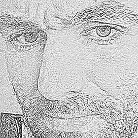
I would cut up to half the face
so it would be highlighted more the face, in my opinion.
however beautiful portrait io avrei tagliato fino a metà fronte
cosi si sarebbe messo in evidenza di piu il viso,secondo me.
comunque bel ritratto |
|
|
sent on 05 Agosto 2016 (17:44) | This comment has been automatically translated (show/hide original)
Beautiful portrait. They seem a bit 'fired whites of arm and back ... Bel ritratto. Mi sembrano un po' sparati i bianchi su braccio e schiena... |
|
|
sent on 05 Agosto 2016 (20:25) | This comment has been automatically translated (show/hide original)
Beautiful portrait, it seems to me that you have exploited well the color of the lips and eyes. Perhaps a less narrow cutout would have been slightly better in my opinion. Bel ritratto, mi sembra che hai valorizzato bene il colore delle labbra e degli occhi. Forse un ritaglio meno stretto sarebbe stato leggermente meglio a mio avviso. |
|
|
sent on 05 Agosto 2016 (20:40) | This comment has been automatically translated (show/hide original)
Beautiful portrait ... very blurry and beautiful pose (too bad for that hand cut ... it took was a Passetto back) ... shame about the eye Right slightly closed. beautiful girl valued by you ... and think that there are those who shoot at 10000 Euros in hand and does not know how to do justice to the subject ..... Bellissimo il ritratto... ottimo sfocato e bella la posa (peccato per quella mano tagliata... bastava un Passetto indietro)... peccato per l'occhio Destro leggermente più chiuso. Ragazza bellissima valorizzata da te... e pensa che c'è chi scatta con 10000 euro in mano e non sa come rendere giustizia al soggetto..... |
|
|
sent on 05 Agosto 2016 (22:38) | This comment has been automatically translated (show/hide original)
Nice shot, it bothers me a little 'arm that takes too much shooting, he saw the beautiful pastel shade shooting seems a bit' light and sharpness in his eyes too strong, hello Andrea. Bello scatto, mi infastidisce un po' il braccio che prende troppo scatto, visto la bella tinta pastello dello scatto mi sembra un po' troppo forte la luce e nitidezza negli occhi, ciao Andrea. |
|
|
sent on 06 Agosto 2016 (10:21) | This comment has been automatically translated (show/hide original)
Thank you all, really too kind! :-)
I will take note of all your great advice ;-)
"(too bad for that hand cut ... it took was a Passetto back) ... shame about the eye Right slightly closed"
By the hand, as I said earlier, I realized when it was too late, do not know how nervous :-D
For the right eye I'm sorry but it's done well, it has the much closed right eye left Grazie mille a tutti, veramente troppo gentili!
Terrò conto di tutti i vostri ottimi consigli
" (peccato per quella mano tagliata... bastava un Passetto indietro)... peccato per l'occhio Destro leggermente più chiuso"
Per la mano, come ho detto in precedenza, me ne sono accorto quando ormai era troppo tardi, non sai quanto nervoso
Per l'occhio destro mi dispiace ma è fatta così, ha l'occhio dx molto più chiuso del sx |
|
|
sent on 06 Agosto 2016 (10:53) | This comment has been automatically translated (show/hide original)
hello Riccardo
to me the picture like it, it's nice to represent PHYSIOLOGICAL (because all we have is pure human anatomy) asymmetries of our body. I'll tell you that the hand cut does not bother me at all, the look is kidnapped by the color of the subject's eyes. Excellent management of light (for my skills in the field really great job)
The only thing for me are the oversaturated colors, but maybe it is desired.
A greeting! Ciao Riccardo
a me la foto piace così, è bello rappresentare le FISIOLOGICHE (perchè tutti le abbiamo, è pura anatomia umana) asimmetrie del nostro corpo. Ti dirò che la mano tagliata non mi disturba per nulla, lo sguardo viene rapito dal colore degli occhi del soggetto. Ottima gestione della luce (per le mie competenze in materia davvero ottimo lavoro)
L'unica cosa per me sono i colori troppo saturi, ma magari la cosa è voluta.
Un saluto! |
|
|
sent on 06 Agosto 2016 (11:26) | This comment has been automatically translated (show/hide original)
Thank you so much hook, I am very happy that you enjoyed! :-)
For the colors you're right, too saturated for my photo, I'm trying to improve ;-)
A greeting Grazie mille Gancio, sono molto felice che ti sia piaciuta!
Per i colori hai ragione, saturo troppo le mie foto, sto cercando di migliorare
Un saluto |
|
|
sent on 07 Agosto 2016 (16:48) | This comment has been automatically translated (show/hide original)
very nice ... even I like it. I do not know if it was accidental or deliberate, but I find it very appropriate also the choice of clothes and the hat that still emphasize more eyes. I would leave thus the PP so that I think helps retain the viewer's gaze to the eyes and mouth level!
compliments! molto bella... anche a me piace così. non so se è stata casuale o voluta ma trovo molto azzeccata anche la scelta dei vestiti e del cappello che enfatizzano ancora di più gli occhi. lascerei quindi anche la pp così che a mio avviso aiuta a trattenere lo sguardo dell'osservatore a livello occhi e bocca!
complimenti! |
user33434
|
sent on 07 Agosto 2016 (17:55) | This comment has been automatically translated (show/hide original)
Riccardo beautiful, so much for the pose that you have chosen for color management. the light is well exploited also. I do not find negative elements. Greetings Bella Riccardo, tanto per la posa che hai scelto che per la gestione del colore. Anche la luce è ben sfruttata. Non trovo elementi negativi. Saluti |
|
|
sent on 08 Agosto 2016 (8:16) | This comment has been automatically translated (show/hide original)
A picture certainly succeeded with good management of light that enhances the eyes of the model. It 'a shame to have cut the fingers of the hand ...
Un ritratto sicuramente riuscito con una buona gestione della luce che valorizza gli occhi della modella. E' un peccato aver tagliato del dita della mano...
|
|
|
sent on 08 Agosto 2016 (12:23) | This comment has been translated
Thanks a lot to everyone! |
|
|
sent on 10 Agosto 2016 (10:40)
Ciao Riccardo. mi piace lo sviluppo, hai fatto un ottimo lavoro, mi piace il color grading sulle ombre.
la composizione non è molto pulita, in particolare stonano la mano tagliata, il gomito a filo bordo ed il braccio mozzato all'angolo della foto. dovremmo aprire un thread sulle linee compositive dei nostri scatti a mostrare cosa intendo per chiarezza di composizione e geometrie.
per quanto riguarda il controluce, direi che potevi anche evitarlo, avendo messo un cappello non fa risaltare i capelli, al contrario brucia in modo fastidioso il braccio ed il vestito sulla schiena.
il pannello riflettente dorato mi piace, ma visto l'orario la luce non era così calda, con il pannello bianco l'effetto veniva più naturale secondo me. inoltre lo hai messo un po' troppo in basso e troppo diretto creando delle fastidiose ombre sul collo e sul viso, come sul naso. hai costretto la modella a socchiudere gli occhi per l'abbagliamento. Ciao Riccardo. mi piace lo sviluppo, hai fatto un ottimo lavoro, mi piace il color grading sulle ombre.
la composizione non è molto pulita, in particolare stonano la mano tagliata, il gomito a filo bordo ed il braccio mozzato all'angolo della foto. dovremmo aprire un thread sulle linee compositive dei nostri scatti a mostrare cosa intendo per chiarezza di composizione e geometrie.
per quanto riguarda il controluce, direi che potevi anche evitarlo, avendo messo un cappello non fa risaltare i capelli, al contrario brucia in modo fastidioso il braccio ed il vestito sulla schiena.
il pannello riflettente dorato mi piace, ma visto l'orario la luce non era così calda, con il pannello bianco l'effetto veniva più naturale secondo me. inoltre lo hai messo un po' troppo in basso e troppo diretto creando delle fastidiose ombre sul collo e sul viso, come sul naso. hai costretto la modella a socchiudere gli occhi per l'abbagliamento. |
|

Publish your advertisement on JuzaPhoto (info) |


 JuzaPhoto contains affiliate links from Amazon and Ebay and JuzaPhoto earn a commission in case of purchase through affiliate links.


 Resize to fit window
 11.0 MEGAPIXEL


![[en]](shared_files/layout/country_flags/flag_196.jpg)