What do you think about this photo?
Do you have questions or curiosities about this image? Do you want to ask something to the author, give him suggestions for improvement, or congratulate for a
photo that you really like?
You can do it by joining JuzaPhoto, it is easy and free!
There is more: by registering you can create your personal page, publish photos, receive comments and you can use all the features of JuzaPhoto.
With more than 260000members, there is space for everyone, from the beginner to the professional.
|
|
sent on 23 Luglio 2016 (0:20) | This comment has been automatically translated (show/hide original)
Not bad your version but I prefer my :-D Non male anche la tua versione ma preferisco la mia  |
|
|
sent on 23 Luglio 2016 (9:50) | This comment has been automatically translated (show/hide original)
I thought I'd work on green and yellow to bring out the man who is very small .... but already better than the first versione..miglioro a bit 'at a time :) Io ho pensato di lavorare su verdi e gialli per far risaltare l'uomo che è molto piccolo.... però già meglio della prima versione..miglioro un po' alla volta :) |
|
|
sent on 08 Settembre 2016 (9:48) | This comment has been automatically translated (show/hide original)
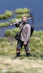
I like it. The sky is very beautiful and very majestic landscape, made even better by the human presence that gives the idea of ??the proportions very well.
a hair more room to the right and up, to place the human figure into the top and bottom third of the right I might have moved.
There is a bit of sharpening. Mi piace. Il cielo è molto bello e il panorama decisamente maestoso, reso ancora meglio dalla presenza umana che fornisce molto bene l'idea delle proporzioni.
Avrei forse spostato un pelo la camera più a destra e in alto, per posizionare la figura umana all'incrocio dei terzi di destra e inferiore.
Un pizzico di sharpening ci sta. |
|
|
sent on 08 Settembre 2016 (10:02) | This comment has been automatically translated (show/hide original)
This to me is very nice considering the vertical cut and zoom would have been in a bit more largo..la human figure is a bit too decentralized ...
Excellent development a little less contrasty, more natural than your usual!
Compliments. Questa per me è molto bella considerando il taglio verticale e lo zoom sarei stato un pelino più largo..la figura umana è un po troppo decentrata...
Ottimo sviluppo un pò meno contrastata e più naturale rispetto al tuo solito!
Complimenti. |
|
|
sent on 08 Settembre 2016 (11:20) | This comment has been automatically translated (show/hide original)
I like the conversion to B / W and also the photo. Maybe I saw the title I would cut the frame under the guy, so you relegate the bottom right and not at the center, but only to make it smaller.
Hello Mi piace la conversione in B/N e anche la foto. Magari visto il titolo avrei tagliato l'inquadratura sotto il ragazzo, in modo da relegarlo in basso a destra e non al centro, ma solo per renderlo più piccolo.
ciao |
|
|
sent on 08 Settembre 2016 (11:26) | This comment has been automatically translated (show/hide original)
The picture is good. The progression of a little 'less floors.
It is used to place the highest point on the bottom.
Here the highest point coincides with the center.
Or the hill, which assumes a "force" within the image top to the mountains on the bottom.
Not that it is wrong in absolute terms but at least in my opinion, it tends to create a sense of artificial, a kind of prospective block.
I also have the impression that the photo hangs slightly to the left, giving the mountains a slope to front.
Also I feel a sense of overflow. I do not know what I mean.
The black and white development looks good. La foto é buona. La progressione dei piani un po' meno.
Si é abituati a collocare il punto più alto sul fondo.
Qui il punto più alto coincide col centro.
Ovvero la collinetta, che assume una "forza" all'interno dell'immagine superiore alle montagne sul fondo.
Non che la cosa sia sbagliata in assoluto, ma almeno in me, tende a creare un senso di artificioso, una sorta di blocco prospettico.
Ho anche l'impressione che la foto penda leggermente a sinistra, dando ai monti una pendenza in avanti.
Inoltre avverto un senso di troppo pieno. Non so se mi spiego. La collina che é la meno interessante graficamente prende più della metà del fotogramma.
Monti e nuvole, decisamente più decorativi, sono un po' relegati a fare da comparsa.
Lo sviluppo del bianco e nero sembra buono. |
|
|
sent on 08 Settembre 2016 (12:38) | This comment has been automatically translated (show/hide original)
Thank you all for the appreciation and for the advice.
In fact I agree with many comments, I decided to use this cut to give an idea of ??the path already traveled laboriously (see his head bowed boy) and at the same time suggesting the curve that pointed at the intersection of the lines of the hills where he rise the peaks Grazie a tutti per gli apprezzamenti e per i consigli.
In effetti concordo con molte osservazioni, ho deciso di usare questo taglio per dare l'idea del sentiero già percorso faticosamente (vedi la testa chinata del ragazzo) e che allo stesso tempo suggerisse la curva che puntava all'incrocio delle linee delle collinette dove poi si ergono le cime |
|
|
sent on 08 Settembre 2016 (15:35) | This comment has been automatically translated (show/hide original)
Comment because I promised myself to comment on everything, even how to workout the eye.
Honestly to me, that I understand nothing of processing and little about photography, this photo seems castrated: blue skies, white clouds, majestic gray and ocher mountains, deep yellow and green of the meadows and in the midst of all this a little man in a dark suit and with his head in search of himself ... and so black in the middle of gray ...
It 's very beautiful, well composed and well managed in the light and PP, the boy is in the right place "in the middle of the journey of his life."
It 's definitely a great job, but my eye is not able to appreciate it ...: - | Commento perché mi sono ripromesso di commentare tutto, anche come allenamento all'occhio.
Sinceramente a me, che ne capisco nulla di elaborazione e poco di fotografia, questa foto sembra castrata: cieli blu, nuvole bianche, maestosi grigi e ocra delle montagne, gialli e verdi profondi dei prati e in mezzo a tutto questo un omino di scuro vestito e con la testa china in cerca di se stesso... così e nero in mezzo al grigio...
E' molto bella, è ben composta e ben gestita nella luce e nella pp, il ragazzo è nel punto giusto "nel mezzo del cammin di sua vita".
E' sicuramente un gran bel lavoro, ma il mio occhio non riesce ad apprezzarlo...  |
|
|
sent on 08 Settembre 2016 (16:08) | This comment has been automatically translated (show/hide original)
I thank you for your reading ... Kun no doubt understand. I wanted to give strength to the concept is in my black and white took less distraction.
But it's my vision :) I understand your
Ti ringrazio Kun per la tua lettura...senza dubbio comprendo. Volevo dare forza al concetto è secondo me il bianco e nero portava meno distrazione.
Ma è la mia visione :) comprendo la tua
|
|
|
sent on 08 Settembre 2016 (16:38) | This comment has been automatically translated (show/hide original)
A nice picture, I like the scenery and the BW. Personally I would have given more space to the cloudy sky ;-)
Hi Davide Una bella foto, mi piace il paesaggio e il BW. Personalmente avrei dato più spazio al cielo nuvoloso 
Ciao Davide |
|
|
sent on 08 Settembre 2016 (20:54) | This comment has been translated
Thanks Davide :) |
|
|
sent on 08 Settembre 2016 (22:00) | This comment has been automatically translated (show/hide original)
Hello Philip, shooting technically successful. I appreciate the conversion of soft bn, with many gray and then the sky with those clouds that off very well. Even compositional I like, but not 100%, I do not know, something is missing to make me dwell and say "what a beautiful picture!". Such categories have given much importance and I share this choice, but ... you might see better! I do not know, a green filter to lighten the vegetation and put in prominence, or vice versa, and then I might have ventured a resume point slightly lower, which would give more sense of ascent and effort. Ciao Filippo, scatto tecnicamente ben riuscito. Apprezzo la conversione in bn morbida, con tanti grigi e poi i cielo con quei nuvoloni che staccano benissimo. Anche a livello compositivo mi piace, ma non al 100%, non so, manca qualcosa per farmi soffermare e dire "che bella foto!". Ad esempio al sentiero hai dato molta importanza e condivido questa scelta, pero... si potrebbe vedere meglio! Non so, un filtro verde per schiarire la vegetazione e metterlo in risalto, o viceversa, e poi avrei forse azzardato un punto di ripresa leggermente più in basso, che desse maggiormente il senso di salita e fatica. |
user96921
|
sent on 09 Settembre 2016 (7:35) | This comment has been automatically translated (show/hide original)
not bad but too grigetta all, I would try other PP
Hello
rob non male ma troppo tutta grigetta, proverei altre PP
Ciao
rob |
|
|
sent on 09 Settembre 2016 (19:39) | This comment has been automatically translated (show/hide original)
Thanks Razor and robbot for the passage ...
interesting reflection on the PDR ... the moment I never thought ... Grazie Razor e RobBot per il passaggio...
interessante la riflessione sul PDR...sul momento non ci avevo pensato... |
|

Publish your advertisement on JuzaPhoto (info) |


 JuzaPhoto contains affiliate links from Amazon and Ebay and JuzaPhoto earn a commission in case of purchase through affiliate links.


 Resize to fit window
 2.4 MEGAPIXEL