What do you think about this photo?
Do you have questions or curiosities about this image? Do you want to ask something to the author, give him suggestions for improvement, or congratulate for a
photo that you really like?
You can do it by joining JuzaPhoto, it is easy and free!
There is more: by registering you can create your personal page, publish photos, receive comments and you can use all the features of JuzaPhoto.
With more than 260000members, there is space for everyone, from the beginner to the professional.
|
|
sent on 27 Settembre 2016 (15:25) | This comment has been automatically translated (show/hide original)
Only two things I would have changed, I do not speak of defects but of personal taste.
I turned up the shot for not having the bottom bushes and I would try to give a little 'contrast to the sky: on the right is very nice, but it flattens out a bit' to the left.
Beautiful shot: you made good on green grass even if maybe you could fill in a bit more
Compliments. Solo due cose avrei modificato, non parlo di difetti ma di gusto personale.
Avrei alzato l'inquadratura per non avere i cespugli in basso e avrei provato a dare un po' di contrasto al cielo: sulla destra è molto bello, ma si appiattisce un po' a sinistra.
Bello scatto: hai reso bene il verde dell'erba anche se forse potevi saturare un pelino di più
Complimenti. |
|
|
sent on 27 Settembre 2016 (15:53) | This comment has been automatically translated (show/hide original)
Bella..chissà with dp3 ....
I do not dislike the bushes indeed fill an area "dead" of photos that otherwise no one would look ... The colors are a fair compromise considering the place, while the stakes in a place so natural bother me ...
Still beautiful! Bella..chissà con la dp3....
A me i cespugli non dispiacciono anzi riempiono una zona "morta" della foto che altrimenti nessuno guarderebbe... I colori sono un giusto compromesso considerando il luogo, mentre i paletti in un luogo così naturale mi danno fastidio...
Comunque bella! |
|
|
sent on 27 Settembre 2016 (16:12) | This comment has been automatically translated (show/hide original)
Now I have also taken the DP1M, but I think the best is to do the stitching with dp3m.
Thank you both for the visit. Adesso ho preso anche la dp1m, però secondo me il massimo è fare lo stitching con la dp3m.
Grazie ad entrambi per la visita. |
|
|
sent on 27 Settembre 2016 (16:50) | This comment has been automatically translated (show/hide original)
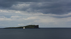
The Isle of Skye is extremely charming and fascinating, and the picture you have chosen is well balanced.
The light and the clouds have helped you make it even more interesting shot. I like the photo, but just to make the nuisance it seems that something is missing ... it seems a bit 'flat and I feel the absence of some kind of mystical atmosphere that I would expect to see. Perhaps as you have suggested is the fault of the slightly saturated colors, or a hint of contrast more. Nothing you can not add in PP. L'isola di Skye è estremamente suggestiva ed affascinante e l'inquadratura che hai scelto è ben bilanciata.
La luce e quelle nuvole ti hanno aiutato a rendere lo scatto ancora più interessante. La foto mi piace, ma tanto per fare il rompiscatole mi sembra che manchi qualcosa... mi sembra un po' piatta e avverto l'assenza di una sorta di atmosfera mistica che mi aspetterei di vedere. Forse come ti hanno suggerito è colpa dei colori poco saturi, o un pizzico di contrasto in più. Nulla che tu non possa aggiungere in pp. |
|
|
sent on 27 Settembre 2016 (16:59) | This comment has been automatically translated (show/hide original)
Very beautiful. It's funny but it's exactly as I would have expected the views posted by Marco Coscarella some time ago, in the color version. I like, I have no particular criticisms or advice to give. Molto bella. È buffo ma è esattamente come mi sarei aspettato il panorama postato da Marco Coscarella qualche tempo fa, nella versione a colori. Mi piace, non ho critiche né consigli particolari da dare. |
|
|
sent on 27 Settembre 2016 (20:16) | This comment has been automatically translated (show/hide original)
Mystical atmosphere? Razor Ah, but you've smoked? :-D
Is saturated, no saturated. It seems to me already beautiful artificial. Scotland I remember I it's softer than so.
But probably my visual memory begins to falter ... ;-)
Thanks also to Richard. Atmosfera mistica? Ah Razor, ma che te sei fumato?
Saturo si, saturo no. A me sembra già bello artificioso. La Scozia che mi ricordo io è più moscia di cosí.
Ma probabilmente la mia memoria visiva comincia a perdere colpi...
Grazie anche a Riccardo. |
|
|
sent on 27 Settembre 2016 (20:57) | This comment has been automatically translated (show/hide original)
The only thing that does not convince me 100% is the lighting, if possible I would have expected a softer light and less "aggressive" ;-)
Anyway congratulations for the beautiful picture, I'm curious to see pictures with DP1M 8-) L'unica cosa che non mi convince al 100% è l'illuminazione, se possibile avrei atteso una luce più tenue e meno "aggressiva"
Comunque complimenti per la bella foto, sono curioso di vedere le foto con la dp1m |
|
|
sent on 27 Settembre 2016 (21:33) | This comment has been automatically translated (show/hide original)
smoked anything .... but drank liters of Talisker is, and when I see the island I was thirsty ... :-D fumato niente.... ma bevuto litri di Talisker si, e quando vedo l'isola mi viene sete... |
|
|
sent on 27 Settembre 2016 (22:04) | This comment has been automatically translated (show/hide original)
of great potential shooting, quoto kun! Scatto di grande potenzialità, quoto kun! |
|
|
sent on 27 Settembre 2016 (23:30) | This comment has been automatically translated (show/hide original)
Very well composed, the PP a little 'flat sincerely then if grigiona memories there can be, true that Skye can make it much more effective colors if you are lucky to be there at the right time with the right conditions. Molto ben composta, la pp un po' piatta sinceramente poi se la ricordi grigiona ci può stare, pur vero che Skye può rendere cromie ben più efficaci se si è più fortunati ad essere lì al momento giusto con le condizioni giuste. |
|
|
sent on 28 Settembre 2016 (14:02) | This comment has been automatically translated (show/hide original)
I agree with what was said
pdr good, but colors unsatisfactory,
turn down the lights a hair perhaps it would be sufficient to saturate the colors
But the shot seems to me you've already seen: - / concordo con quanto già detto
ottimo pdr, ma cromie non soddisfacenti,
abbassare un pelo le luci forse sarebbe sufficiente a saturare i colori
Ma lo scatto mi pare di averlo già visto  |
|
|
sent on 28 Settembre 2016 (15:07) | This comment has been automatically translated (show/hide original)
The composition I like it too, and the shot is not bad.
Too bad light.
A bit ' "strange" in HD. And 'noise or a bit' too much sharpening? La composizione piace anche a me, e lo scatto non è male.
Peccato la luce.
Un po' "strana" in HD. E' rumore o un po' troppo sharpening? |
|
|
sent on 28 Settembre 2016 (15:19) | This comment has been automatically translated (show/hide original)
thank you guys.
Sharpening. :-D One of my first post, made a bit 'of thumb ... grazie ragazzi.
Sharpening. Una delle mie prime post, fatta un po' a spanne... |
user81826
|
sent on 28 Settembre 2016 (15:39) | This comment has been automatically translated (show/hide original)
Well, the composition is all there and you see that you are improving but I still find the faults (then certainly can not teach me), in the interpretation of post production. I would not push you to omologarti the typical postcard and indeed we see that you are discovering your own style, however, make it more interesting this is. Bè, la composizione ci sta tutta e si vede che stai migliorando però trovo ancora delle mancanze (poi sicuro non posso insegnarti io), nell'interpretazione della post produzione. Non vorrei spingerti ad omologarti alla cartolina tipica ed anzi si vede che stai scoprendo un tuo stile, però renderlo più interessante questo si. |
|
|
sent on 28 Settembre 2016 (15:44) | This comment has been automatically translated (show/hide original)
Thanks Paul. See above. Grazie Paolo. Vedi sopra. |
|
|
sent on 28 Settembre 2016 (22:10) | This comment has been automatically translated (show/hide original)
Very nice, maybe a little saturated color hair and overall contrast a bit 'weak, especially in the left side of the clouds. Molto bella, forse colori un pelo poco saturi e contrasto generale un po' debole, specialmente nella parte sinistra delle nuvole. |
|
|
sent on 02 Ottobre 2016 (0:36) | This comment has been automatically translated (show/hide original)
to me like the colors, the contrast as well.
finally a white balance as it should be (at least on my monitor I see it correctly!) a me i colori piacciono, il contrasto pure.
finalmente un bilanciamento del bianco come si deve (almeno sul mio monitor la vedo corretta ! ) |
|
|
sent on 02 Ottobre 2016 (21:17) | This comment has been automatically translated (show/hide original)
As always, the world is beautiful because various.
Thank you guys. Come sempre, il mondo è bello perché vario.
Grazie ragazzi. |
|

Publish your advertisement on JuzaPhoto (info) |


 JuzaPhoto contains affiliate links from Amazon and Ebay and JuzaPhoto earn a commission in case of purchase through affiliate links.


 Resize to fit window
 22.7 MEGAPIXEL