What do you think about this photo?
Do you have questions or curiosities about this image? Do you want to ask something to the author, give him suggestions for improvement, or congratulate for a
photo that you really like?
You can do it by joining JuzaPhoto, it is easy and free!
There is more: by registering you can create your personal page, publish photos, receive comments and you can use all the features of JuzaPhoto.
With more than 260000members, there is space for everyone, from the beginner to the professional.
|
|
sent on 08 Giugno 2016 (13:29) | This comment has been automatically translated (show/hide original)
Without words.
Greetings and congratulations wings Senza parole.
Saluti e complimenti ale |
|
|
sent on 08 Giugno 2016 (14:18)
Great shot; kinda different to see the ice in orange! |
|
|
sent on 08 Giugno 2016 (14:25) | This comment has been translated
Very nice! cheers |
|
|
sent on 08 Giugno 2016 (14:44) | This comment has been automatically translated (show/hide original)
Really egregious compliments
A greeting
Enrico Davvero egregia complimenti
Un saluto
Enrico |
|
|
sent on 08 Giugno 2016 (15:37) | This comment has been automatically translated (show/hide original)
Thank you so much Fulvio, Alexander, Sergio and Henry! Thanks a lot Momentum60! :-)
Greetings, Leonardo
Grazie mille Fulvio, Alessandro, Sergio ed Enrico! Thanks a lot Momentum60!
Un saluto, Leonardo
|
|
|
sent on 08 Giugno 2016 (18:12) | This comment has been translated
Spectacular |
|
|
sent on 08 Giugno 2016 (18:25) | This comment has been automatically translated (show/hide original)
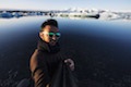
persolamente the result not like crabs ..
I find it really great composition, beautiful lines in the ice, a balanced and pleasant viewing.
Now, I do not know how it was the raw, but I see there an orange spread on any image, it may be natural, I find it really unrealistic and I can not make me .. I do not take pleasure with duty purist ( also because they are not for nothing, and you know :-D) but I'd rather see a differentiation of tones between light and shadow, and a saturation drop is on the mountain and on the clouds in the upper right.
Hello ;-) persolamente il risultato non mi piace granchè..
trovo la composizione davvero ottima, belle le linee nel ghiaccio, una visione bilanciata e piacevole.
ora, non so come fosse il raw, ma io ci vedo una spalmata arancione su tutta l'immagine che, per quanto possa essere naturale, la trovo veramente poco realistica e non riesco a farmela piacere.. non prendermi per il purista di turno (anche perche non lo sono per niente, e lo sai  ) ma preferirei vedere una differenziazione dei toni tra luci ed ombre, ed un calo di saturazione sia sulla montagna che sulla nuvole in alto a destra. ) ma preferirei vedere una differenziazione dei toni tra luci ed ombre, ed un calo di saturazione sia sulla montagna che sulla nuvole in alto a destra.
ciao  |
|
|
sent on 08 Giugno 2016 (18:58) | This comment has been automatically translated (show/hide original)
Leonardo sorry, but for the vote breakdown 10 because it tastes great, but the post do not like it.
without dwelling quoto entire comment Bruno..anche commas and parentheses. ;-)
Hello
Simone Mi spiace Leonardo,ma per la composizione voto 10 perchè è davvero ottima,ma la post non mi piace proprio.
senza dilungarmi quoto tutto il commento di Bruno..anche le virgole e le parentesi.
ciao
Simone |
|
|
sent on 08 Giugno 2016 (19:10)
Allora.. Innanzitutto grazie a tutti dei commenti e delle critiche, sapete che apprezzo moltissimo!
Bruno/Alessandro/Simone: hai ragione per quanto riguarda l'arancione presente in tutta la foto, sinceramente non è che mi faccia impazzire nemmeno a me; questo è forse uno degli scatti in cui più ho "osato" nei colori di tutto l'ultimo viaggio ed ero consapevole che a tanti non sarebbero andati giù Ho provato a rivederla già tre volte, tutte e tre le volte calando sia i contrasti che la saturazione (puoi immaginarti com'era la prima!!) e il risultato ancora non mi appaga affatto, per questo l'ho pubblicata sperando di ricevere qualche consiglio!
Il punto è: la dominante arancione in tutto il frame era già presente nel raw (ovviamente in maniera minore) e a me non dispiace; puntualmente però appena lavoro un minimo su curve/contrasti il colore mi esplode e non riesco a controllarlo  Riproverò un'altra volta, cercando di virare un pochino verso un'interpretazione più neutra! Riproverò un'altra volta, cercando di virare un pochino verso un'interpretazione più neutra!
Grazie ancora a tutti dei commenti, davvero gentilissimi!!
Un saluto, Leonardo Allora.. Innanzitutto grazie a tutti dei commenti e delle critiche, sapete che apprezzo moltissimo!
Bruno/Alessandro/Simone: hai ragione per quanto riguarda l'arancione presente in tutta la foto, sinceramente non è che mi faccia impazzire nemmeno a me; questo è forse uno degli scatti in cui più ho "osato" nei colori di tutto l'ultimo viaggio ed ero consapevole che a tanti non sarebbero andati giù Ho provato a rivederla già tre volte, tutte e tre le volte calando sia i contrasti che la saturazione (puoi immaginarti com'era la prima!!) e il risultato ancora non mi appaga affatto, per questo l'ho pubblicata sperando di ricevere qualche consiglio!
Il punto è: la dominante arancione in tutto il frame era già presente nel raw (ovviamente in maniera minore) e a me non dispiace; puntualmente però appena lavoro un minimo su curve/contrasti il colore mi esplode e non riesco a controllarlo Riproverò un'altra volta, cercando di virare un pochino verso un'interpretazione più neutra!
Grazie ancora a tutti dei commenti, davvero gentilissimi!!
Un saluto, Leonardo |
|
|
sent on 08 Giugno 2016 (19:21) | This comment has been automatically translated (show/hide original)
“ the dominant orange around the frame was already present in the raw (obviously to a lesser extent) „
maybe Leo the wb your reflex time did cilecca.prova also to vary the first to throw the tonal values.
or working at contrario.regola the lights and contrasts etc. and then gradually bring the wb towards sx maybe you can find the giusta.sono adjustment only ideas.
Hello “ la dominante arancione in tutto il frame era già presente nel raw (ovviamente in maniera minore) „
magari Leo il wb della tua reflex stavolta ha fatto cilecca.prova anche a variare quello prima di buttarti sui valori tonali.
oppure lavora al contrario.regola le luci e i contrasti ecc e poi porti gradualmente il wb verso sx magari trovi la regolazione giusta.sono solo idee.
ciao |
|
|
sent on 08 Giugno 2016 (23:32) | This comment has been automatically translated (show/hide original)
I would try to decrease the temperature a bit ... but it 's also so beautiful' and perhaps in reality 'the light was really so' hot, 'cause change? ....
Hello Ale :-) Proverei a diminuire un po la temperatura ... ma e' bella anche cosi' e forse nella realta' la luce era davvero cosi' calda, perche' cambiare?....
Ciao Ale |
|
|
sent on 08 Giugno 2016 (23:42) | This comment has been automatically translated (show/hide original)
Beautiful image, beautiful hot atmosphere. Pdr and composition at the top. Compliments!
Andrew Splendida immagine, bellissima l'atmosfera calda. Pdr e composizione al top. Complimenti!
Andrea |
|
|
sent on 09 Giugno 2016 (6:20)
Very nice low and wide angle, suiting the foreground and composition. |
|
|
sent on 09 Giugno 2016 (6:44) | This comment has been automatically translated (show/hide original)
Excellent pdr, the PP to review, look another version, deserves kudos 8-)
Claudio c Ottimo il pdr ,la pp da rivedere ,aspetto un'altra versione ,merita complimenti 
Claudio c |
|
|
sent on 09 Giugno 2016 (10:14) | This comment has been automatically translated (show/hide original)
So .. What to say thanks again to all! Really very, very kind to have spent time and words to help me! I tried to follow the advice a bit 'of all, and I focused on how to mitigate the orange right from the start, and with several strong turns toward the blue / cyan I found a much more neutral and clean vision! Saw you wanted to stay up to date, good morning to the time I went back there with all the calm of the world and here's the result! I honestly still feel that we lack a touch more, do not know what, but this already satisfies me a lot more than what I posted yesterday! If you have other tips to add to this here, they are welcome!
[IMG]http://postimg.org/image/toj6ijykr/[/IMG] Allora.. Che dire, grazie di nuovo a tutti! Davvero molto, molto gentili ad aver speso tempo e parole per aiutarmi! Ho provato a seguire i consigli un po' di tutti e mi sono concentrato su come attenuare l'arancione sin dall'inizio, e con diverse forti virate verso il blu/ciano ho trovato una visione molto più neutra e pulita! Visto che volevate rimanere aggiornati, stamani alla buon ora mi ci sono rimesso con tutta la calma del mondo ed ecco il risultato! Sinceramente sento ancora che ci manca un tocco un più, non so cosa, ma questa mi soddisfa già molto di più rispetto a quella che ho postato ieri! Se avete altri consigli da aggiungere a questa qui, ben vengano!

upload
PS: perdonate il casino con tutti questi url, non sono mai stato un genio a caricare le foto nei commenti
Un saluto, Leonardo |
|
|
sent on 09 Giugno 2016 (17:02) | This comment has been automatically translated (show/hide original)
Very beautiful, the other also as colors.
Place and stuffs to the Top!
Bravo
Paul Molto bella, la seconda anche come colori.
Posto e compo al Top!
Bravo
Paolo |
|

Publish your advertisement on JuzaPhoto (info) |


 JuzaPhoto contains affiliate links from Amazon and Ebay and JuzaPhoto earn a commission in case of purchase through affiliate links.


 Resize to fit window
 2.7 MEGAPIXEL


![[en]](shared_files/layout/country_flags/flag_196.jpg)