What do you think about this photo?
Do you have questions or curiosities about this image? Do you want to ask something to the author, give him suggestions for improvement, or congratulate for a
photo that you really like?
You can do it by joining JuzaPhoto, it is easy and free!
There is more: by registering you can create your personal page, publish photos, receive comments and you can use all the features of JuzaPhoto.
With more than 260000members, there is space for everyone, from the beginner to the professional.
user33434
|
sent on 10 Agosto 2016 (17:07) | This comment has been automatically translated (show/hide original)
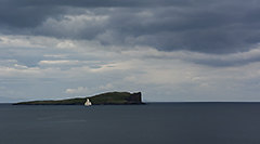
I find it really beautiful. I like the white of the sky, the black of the beach and the union between the two that is on the bottom right. The whole is very harmonious and management of the entire dynamic range is perfect. A filter might have helped to get more detail from the clouds. A greeting La trovo veramente molto bella. Mi piace il bianco del cielo, il nero della spiaggia e l'unione tra i due che risulta sulla parte in basso a destra. Il tutto è molto armonico e la gestione dell'intera gamma dinamica è perfetta. Un filtro avrebbe forse aiutato a ricavare maggior dettaglio dalle nuvole. Un saluto |
|
|
sent on 10 Agosto 2016 (18:31) | This comment has been automatically translated (show/hide original)
It really like, gives me the feeling of emptiness, loneliness. I poace nolto development at Juventus and composition with a frame that balances well the various plans and elements of the scene.
I have no criticism to advance, maybe pull out a slight majority opposed by the tones of the sky Mi piace molto, mi trasmette la sensazione di vuoto, di solitudine. Mi poace nolto lo sviluppo in bianconero e la composizione con un inquadratura che bilancia bene i vari piani ed elementi della scena.
Non ho critiche da avanzare, forse tirar fuori un lieve maggior contrasto dai toni del cielo |
|
|
sent on 10 Agosto 2016 (22:14)
Sulla questione del cielo non saprei. Forse avrebbe reso troppo ricco di dettagli il tutto ed un po' confusionario. In questa maniera lo sguardo si concentra di più sui dettagli della spiaggia.
Mi piace come le linee diagonali tendano a chiudersi sul terzo dell'immagine.
Se dovessi proprio trovarci qualcosa, forse l'eccessivo contrasto va a scapito della ricchezza tonale.
Questo per quanto riguarda l'aspetto tecnico. Dal punto di vista compositivo, l'immagine non mi colpisce particolarmente. Manca di pathos. La parte difficile è spiegare perché.
Probabilmente dipende dal fatto che lo sguardo converge verso la costa, che non è particolarmente attraente.
Nel b/n la forma, privata del colore, in qualche modo deve colpire. E qui non succede.
Forse potresti provare a dargli una intonazione tonale che vira verso il plumbeo, leggermente violaceo. Livido insomma. Un po' come una copertina Ecm. Sulla questione del cielo non saprei. Forse avrebbe reso troppo ricco di dettagli il tutto ed un po' confusionario. In questa maniera lo sguardo si concentra di più sui dettagli della spiaggia.
Mi piace come le linee diagonali tendano a chiudersi sul terzo dell'immagine.
Se dovessi proprio trovarci qualcosa, forse l'eccessivo contrasto va a scapito della ricchezza tonale.
Questo per quanto riguarda l'aspetto tecnico. Dal punto di vista compositivo, l'immagine non mi colpisce particolarmente. Manca di pathos. La parte difficile è spiegare perché.
Probabilmente dipende dal fatto che lo sguardo converge verso la costa, che non è particolarmente attraente.
Nel b/n la forma, privata del colore, in qualche modo deve colpire. E qui non succede.
Forse potresti provare a dargli una intonazione tonale che vira verso il plumbeo, leggermente violaceo. Livido insomma. Un po' come una copertina Ecm. |
|
|
sent on 11 Agosto 2016 (2:44) | This comment has been automatically translated (show/hide original)
The first impression I got was of excessive sharpness which makes it tiring for the eyes - usually problem with the sharpening of Juza, since opening the high-resolution image that is not noticed.
Conversion and composition excellent, really conveys a sense of loneliness and suspended atmosphere. La prima impressione che ho avuto è stata di una nitidezza eccessiva che rende il tutto faticoso per gli occhi - solito problema con lo sharpening di juza, dato che aprendo l'immagine ad alta risoluzione questo non si nota.
Conversione e composizione ottime, davvero trasmette un senso di solitudine e atmosfera sospesa. |
|
|
sent on 11 Agosto 2016 (13:28) | This comment has been automatically translated (show/hide original)
unique atmosphere!
Composition and conversion in b / n sublime.
Compliments! ;-) Atmosfera unica!
Composizione e conversione in b/n sublimi.
Complimenti! |
|
|
sent on 11 Agosto 2016 (15:55) | This comment has been automatically translated (show/hide original)
I really like this picture ... I do not find human elements that sometimes disturbs me a lot in photos like these! I would say beautiful in its simplicity! Only note the perspective ... not that it is your fault, but the appearance is that the photo hangs to right.
Hello Ale! mi piace molto questa foto...non trovo elementi umani che a volte mi disturbano parecchio in foto come queste! direi nella sua semplicita stupenda! Unico appunto la prospettiva...non che sia colpa tua ma l'apparenza è che la foto penda verso dx.
Ciao Ale! |
|
|
sent on 11 Agosto 2016 (19:32) | This comment has been automatically translated (show/hide original)
Have already spent three or four times by this shooting but I can not frame it, there sparrow 'yet ... from my pc I see too much sharpness / contrast, for the composition to see again' again, I see that it has less of the other comments we see that others have the same problem my 8-) Sono gia passato tre o quattro volte da questo scatto ma non riesco a inquadrarlo, ci passero' ancora...dal mio pc vedo troppa nitidezza/contrasto, per la composizione la rivedro' ancora, vedo che ha meno commenti delle altre si vede che anche altri hanno lo stesso mio problema  |
|
|
sent on 11 Agosto 2016 (20:22)
Ringrazio tutti quelli che hanno commentato finora. Un paio di risposte
“ dal mio pc vedo troppa nitidezza „
Come scriveva un altro utente l'effetto migliora abbastanza vedendo la versione a piena risoluzione.
“ Dal punto di vista compositivo, l'immagine non mi colpisce particolarmente. Manca di pathos. La parte difficile è spiegare perché.
Probabilmente dipende dal fatto che lo sguardo converge verso la costa, che non è particolarmente attraente.
Nel b/n la forma, privata del colore, in qualche modo deve colpire. E qui non succede „
Legittimo e giusto quello che dici. La foto voleva giocare con la convergenza delle linee, che a mio parere non tendono alla scogliera (che in qualche modo rappresenta una linea stessa) bensi' a quel riquadro di vuoto.

Tale composizione non ti trasmette phatos, e magari hai ragione. Probabilmente la foto rimane zoppa per la mancanza di un elemento compositivo "forte" laddove converge lo sguardo.
Volendo fare l'avvocato del diavolo si potrebbe pero' dire che anche "l'assenza" e' un elemento compositivo 
Ringrazio tutti quelli che hanno commentato finora. Un paio di risposte
“ dal mio pc vedo troppa nitidezza „
Come scriveva un altro utente l'effetto migliora abbastanza vedendo la versione a piena risoluzione.
“ Dal punto di vista compositivo, l'immagine non mi colpisce particolarmente. Manca di pathos. La parte difficile è spiegare perché.
Probabilmente dipende dal fatto che lo sguardo converge verso la costa, che non è particolarmente attraente.
Nel b/n la forma, privata del colore, in qualche modo deve colpire. E qui non succede „
Legittimo e giusto quello che dici. La foto voleva giocare con la convergenza delle linee, che a mio parere non tendono alla scogliera (che in qualche modo rappresenta una linea stessa) bensi' a quel riquadro di vuoto.
Tale composizione non ti trasmette phatos, e magari hai ragione. Probabilmente la foto rimane zoppa per la mancanza di un elemento compositivo "forte" laddove converge lo sguardo.
Volendo fare l'avvocato del diavolo si potrebbe pero' dire che anche "l'assenza" e' un elemento compositivo
|
|
|
sent on 13 Agosto 2016 (8:33) | This comment has been automatically translated (show/hide original)
Click that sends loneliness and a sense of emptiness. Maybe a little 'too microcontrast but who is there in converting B & N. Scatto che trasmette solitudine e un senso di vuoto. Forse un po' troppo microcontrasto ma che comunque ci sta nella conversione B&N. |
|
|
sent on 14 Agosto 2016 (21:58) | This comment has been automatically translated (show/hide original)
In the photo Overall I like and I find it technically correct. In fact, contrary to what many have said ... I would have added no details to heaven, that's okay. I like this clear separation between the elements of earth and air transport.
The only note? The composition.
Maybe I made up differently. Says @Maserc, I feel that particularly affects. To be honest I find it a bit 'disturbing the presence of stones in the foreground that too steal the mountain scene.
If I were you I would only compound with three elements: sky, mountains and sand; without adding the stones. Doing so would have produced something along the lines of Ansel Adams and (maybe) you would not wrong :). Nel complesso la foto mi piace e la trovo tecnicamente corretta. Infatti, contrariamente a quanto hanno detto molti... non avrei aggiunto dettagli al cielo, va bene così. Mi piace questa netta separazione tra gli elementi di terra e quelli aerei.
L'unico appunto? La composizione.
Forse avrei composto diversamente. Come dice @Maserc, sento che non colpisce particolarmente. Ad onor del vero trovo un po' disturbante la presenza dei sassi in primo piano che rubano troppo la scena alla montagna.
Fossi in te avrei composto solo con tre elementi: cielo, montagna e sabbia; senza aggiungere i sassi. Così facendo avresti prodotto qualcosa sulla falsariga di Ansel Adams e (forse) non avresti sbagliato :). |
|
|
sent on 23 Agosto 2016 (11:33) | This comment has been automatically translated (show/hide original)
Then the sharpening is too strong for me .. But then opening in high resolution the problem vanishes. beautiful the idea of ??a black stripe between two white, but as previously mentioned missing the subject at the point where the gaze converges .. absence for me in this case is not a compositional element :-)
by heaven I agree with those who say that this is one of those cases where a little 'flat sky for once does not hurt, I find corrretto so :)
Lorenzo Allora lo sharpening è troppo forte secondo me.. però poi aprendo in alta risoluzione il problema svanisce. bella l'idea di una striscia nera in mezzo a due bianche, ma come già stato detto manca il soggetto nel punto in cui lo sguardo converge.. l'assenza per me in questo caso non è un elemento compositivo 
per il cielo sono d'accordo con chi dice che questo è uno di quei casi in cui un po' di cielo piatto per una volta non guasta, lo trovo corrretto così :)
lorenzo |
|
|
sent on 23 Agosto 2016 (13:28) | This comment has been automatically translated (show/hide original)
I do not see major flaws, probably detected by others (I also saw that someone posted a thumbnail with big red arrows ... :-D). Sorry but comment without reading the others, I have to catch the holiday.
It seems to me a beautiful black and white, but frankly it's not my thing, do not tell me much, perhaps because I am the Algarve where the cliffs so there's a fed. "I like it" on trust! Non vedo grossi difetti, probabilmente rilevati da altri (ho visto anche che qualcuno ha postato una miniatura con grosse frecce rosse... ). Scusate ma commento senza leggere gli altri, devo recuperare la vacanza.
Mi sembra un bel bianco e nero ma francamente non è il mio genere, non mi dice granché, forse perché vengo dall'Algarve dove di scogliere così ce n'è a stufo. "Mi piace" sulla fiducia! |
|

Publish your advertisement on JuzaPhoto (info) |


 JuzaPhoto contains affiliate links from Amazon and Ebay and JuzaPhoto earn a commission in case of purchase through affiliate links.


 Resize to fit window
 1.5 MEGAPIXEL


![[en]](shared_files/layout/country_flags/flag_196.jpg)