What do you think about this photo?
Do you have questions or curiosities about this image? Do you want to ask something to the author, give him suggestions for improvement, or congratulate for a
photo that you really like?
You can do it by joining JuzaPhoto, it is easy and free!
There is more: by registering you can create your personal page, publish photos, receive comments and you can use all the features of JuzaPhoto.
With more than 260000members, there is space for everyone, from the beginner to the professional.
|
|
sent on 09 Settembre 2012 (3:01)
well composed and a great concept.. reminds me of crucification ... |
|
|
sent on 10 Settembre 2012 (9:36) | This comment has been automatically translated (show/hide original)
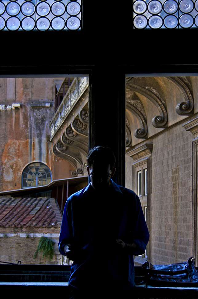
Thanks Mcliu, I took the picture to the Uffizi Gallery in Florence, and the symbolism of the cross just hit me, I liked the light, and I took, I'm glad you liked it, thanks for your visit and positive comment. ;-) ;-) Thanks Mcliu, I took the picture to the Uffizi Gallery in Florence, and the symbolism of the cross just hit me, I liked the light, and I took, I'm glad you liked it, thanks for your visit and positive comment. |
|
|
sent on 14 Ottobre 2012 (14:05) | This comment has been automatically translated (show/hide original)
In my view, went decently cropped ... is crooked and decentralized ... The signature is too invasive, completely distracts from the atmosphere "mystique" that you wanted to convey ... My Opinion, and Light :) A mio avviso andava croppata decentemente...è storta e decentrata...La firma è troppo invasiva,distoglie completamente dall'atmosfera "mistica" che volevi trasmettere... Mia Opinione, sia Chiaro :) |
|
|
sent on 14 Ottobre 2012 (16:59) | This comment has been automatically translated (show/hide original)
Holy scoop that judgment "drastic" dear Alessandro perhaps before "expose" your judgment so drastic, in fact, you should better look, where crooked?? High up in the "cross" but his retort you can not addrizzare, so many that the central pole is straight, and how would you "cropparla" (which both you and I would urge others to use in moderation because sintassicamente not a reproach but because acoustically is bad), if you look you realize that "croppando" as you say taglieresti out or the top part of the window, thus removing any remembrance of the cross or the lower part of the subject that is relevant to instead "put "the same environment, cut to the right or left clasp too the two branches of that" cross "the distance that has the subject from the branching of thewindow binds very possibility of any crop without reducing the insiema to something very significant, perhaps the only thing on which I agree is the signature, I "ran" a little too big, but you know sometimes you're wrong. :-D:-D Porca paletta che giudizio "drastico" caro Alessandro forse prima di "esporre" un tuo giudizio così drastico, appunto, dovresti osservare meglio, storta dove??? Nell'alto della "croce" ma è storta di suo non si può addrizzare, tantè che il palo centrale è dritto, e come vorresti "cropparla" (termine che sia te che altri inviterei ad usare con moderazione non perchè sintassicamente un obbrobrio ma perchè anche acusticamente è brutto), se dai un'occhiata ti rendi conto che "croppando" come dici tu taglieresti fuori o la parte in alto della finestra, togliendo così ogni rimembranza di croce o la parte bassa del soggetto che invece è importate per "collocare" lo stesso nell'ambiente, tagliare a destra o a sinistra stringerebbe troppo i due rami della suddetta "croce" la distanza che ha il soggetto dalla ramificazione della finestra lega molto ogni possibilità di crop senza ridurre l'insiema a qualcosa di poco significativo, forse l'unica cosa su cui concordo è la firma, mi è "scappata" un pò troppo grossa, ma sai a volte si sbaglia. |
user17043
|
sent on 14 Ottobre 2012 (18:14) | This comment has been automatically translated (show/hide original)
I'm just an expert but from what I see I like the character and 'surrounded by a light
clear that surrounds and embraces everything in fact almost divine and the silhouette in profile at the bottom left is 'know it's not' only to find our light so you can illuminate the dark places of the world. A photo poetic and beautiful that makes sense. Congratulations! :-) Sono poco esperta ma da quello che vedo mi piace il personaggio che e' avvolto da una luce
chiara che avvolge e abbraccia ogni cosa appunto quasi divina e la silhouette di profilo in basso a sinistra fa' sapere che non e' solo, per ritrovare la nostra luminosità in modo da poter illuminare i posti bui del mondo. Una foto poetica e bella ricca di significato. Complimenti !  |
|
|
sent on 14 Ottobre 2012 (18:17) | This comment has been automatically translated (show/hide original)
hello marco
to the horizon then have it with you? :-D
regardless of the cross, which seems indeed retort his many 'the pillar behind the person and' straight,
the photo should be assessed for what it transmits or can 'broadcast.
here the view goes to the person who reads, perhaps something "higher."
not ruffianarmi but the technique sometimes " must " overshadowing (chiaramemte my personal opinion).
good photos
free ciao marco
per l'orizzonte allora ce l'hanno con te?
a prescindere dalla croce che sembra in effetti storta di suo tante' che il montante dietro la persona e' dritto,
la foto va valutata per quello che trasmette o puo' trasmettere.
qui lo sguardo va alla persona che legge, forse qualcosa di "alto".
non per ruffianarmi ma la tecnica a volte " deve " passare in secondo piano(chiaramemte mia personalissima opinione).
buone foto
franco |
|
|
sent on 14 Ottobre 2012 (18:23) | This comment has been automatically translated (show/hide original)
as a whole does not convince me for these reasons:
Cyan-dominant silhouette on
-Distracting noise on the left-
I kept the composition, but I tried to illuminate the book and the boy's face through systems of fortune as a table lamp or torch phone. Alternatively I would have to in a bit overexposed.
hello and good light, laurel nel complesso non mi convince per questi motivi:
-dominanti ciano sulla silhouette
-elemento di distrazione-disturbo sulla sinistra
Avrei mantenuto la composizione ma avrei cercato di illuminare il libro e il viso del ragazzo tramite sistemi di fortuna come lampada da tavolo o torcia del cellulare . In alternativa avrei sovraesposto di un pelino.
ciao e buona luce, lauro |
|
|
sent on 14 Ottobre 2012 (18:56) | This comment has been automatically translated (show/hide original)
still expect marco
por mi
b & w ;-) aspettiamo comunque marco
por mi
b & w |
user5266
|
sent on 14 Ottobre 2012 (19:55) | This comment has been automatically translated (show/hide original)
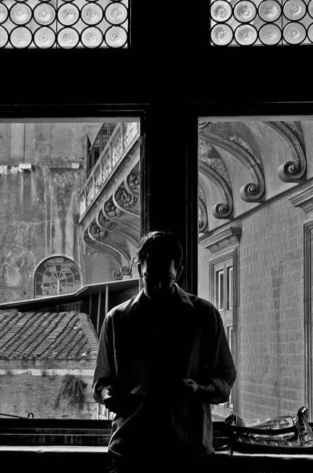
Personally, I have no doubt that in BN I like much, much more.
Alessandro Personalmente non ho dubbi,quella in BN mi piace molto ma molto di più.
Alessandro |
|
|
sent on 14 Ottobre 2012 (19:59)
Ragazzi qui si sta sfiorando qualche sorta di paradosso, premetto che le foto di elle non le vedo perche' sono collegato con smart phone e non le visualizza ma sento davvero cose forti premetto che non disdegno affatto la pp ma dipende, a me piace molto cogliere l'attimo, molto piu' delle foto posate o di un "set" per quanto ben costruito. Mi guardo intorno e cerco di "vedere" cose che gli altri non vedono e scatto, spesso, come in questo caso, non ho il tempo per un altro scatto, nello specifico ero agli uffizi a Firenze con tantissima gente che andava e veniva, il ragazzo si e' appoggiato un attimo e io passavo di lì, ho visto la scena,lui a capo chino e la croce sopra, ci ho visto qualcosa e quel qualcosa mi e' piaciuto le condizioni di luce erano difficili, fuori tanta luce e dentro scuro in due secondi ho scattato facendo del mio meglio. Poi non ho voluto intervenire perche' non ritenevo che il volto o il libro fossero impotanti, anzi, per me era l' insieme della foto la siluette che si creava che dava la sensazione di una sorta di "pentimento" sotto un'apparenza simbolica fortissima, speravo che trasmettesse la stessa sensazione ma forse mi sbagliavo. |
|
|
sent on 14 Ottobre 2012 (20:00) | This comment has been automatically translated (show/hide original)
I prefer the BN ElleEmme, even the good color version, but the lighting cold bothers me, perhaps because indoor lighting is normally hot.
Valentino Preferisco il BN di Elleemme, buona anche la versione colore, ma l'illuminazione fredda mi da fastidio; forse perchè in interno l'illuminazione è normalmente calda.
Valentino |
|
|
sent on 14 Ottobre 2012 (20:10) | This comment has been automatically translated (show/hide original)
Now I could see the picture, it will be that I've seen so many times in its original version, the BN is that I do not have a great feeling but I like much more the color version, but de gustibus .... .... Ora sono riuscito a veder la foto, sarà che l'ho vista tante volte nella sua versione originale, sarà che io con il B-N non ho un gran feeling ma a me piace decisamente più la versione a colori, ma de gustibus........ |
|
|
sent on 14 Ottobre 2012 (20:11) | This comment has been automatically translated (show/hide original)
Marf, the feeling that you've caught, I caught it too, then, in my opinion, you are able to pass through your shot. ElleEmme has refined the picture improving it, but the content is everything.
Valentino Marf, la sensazione che hai colto tu l'ho colta anche io, quindi, a mio avviso, sei riuscito a trasmetterla attraverso il tuo scatto. Elleemme ha raffinato la foto migliorandola, ma il contenuto rimane tutto.
Valentino |
|
|
sent on 14 Ottobre 2012 (20:42) | This comment has been automatically translated (show/hide original)
Marf259 say that you caught the fleeting moment but beyond the feeling that you felt the skin remain dominant, what was holding up the main subject remains hidden, the intrusiveness of the picture on the left that acts as a pivot and the lack of three-dimensionality of the window as well. As you may have seen a version in B & W (maybe performed better than mine) I find it personally more "functional" because it does not stand out and emphasizes the dominant reading of some details. Since you were backlit and certainly could not use the flash for obvious reasons, why did not you save the details in a bit overexposed in the background and allowing a better reading of the silhouette? The subject was static ;-).
Before I forget, you could always report the shooting data?
hello and good light, laurel Diciamo Marf259 che hai colto l'attimo fuggente ma al di là della sensazione che sentivi di pelle le dominanti restano, ciò che teneva in mano il soggetto principale rimane nascosto, l'invadenza della figura a sinistra che non fa da perno e la mancanza di tridimensionalità della finestra pure. Come avrai percepito, una versione in B&N (magari eseguita meglio della mia) la trovo personalmente più "funzionale" perchè non fa risaltare le dominanti ed enfatizza la lettura di alcuni particolari . Visto che eri in controluce e non potevi certamente usare il flash per ovvi motivi, perchè non hai sovraesposto un pelino salvando il dettaglio sullo sfondo e permettendo una miglior lettura della silhouette ? Il soggetto era statico .
Prima che mi dimentichi, potresti riportare sempre i dati di scatto?
ciao e buona luce, lauro |
|
|
sent on 14 Ottobre 2012 (22:42) | This comment has been automatically translated (show/hide original)
Rispondendoti Marf I must be in agreement with ElleEmme ... The subject intruder left was definitely excluded ... because you wanted to transmit mysticism Likewise the cross was all right in the center, as if to symbolize a kind of ascension ... instead the predominance of "empty" to the right of the cross diverts attention ... As regards the signature seen that the background is black enough to make it less "dense" would be seen in any case :-) Rispondendoti Marf devo trovarmi in accordo con Elleemme... Il soggetto intruso a sinistra andava sicuramente escluso...Altresì visto che volevi trasmettere misticismo la croce andava benissimo in posizione centrale,come a voler simboleggiare una sorta di ascensione... invece la netta predominanza di "vuoto" alla destra della croce distoglie l'attenzione ... Per quanto riguarda la firma visto che lo sfondo è nero bastava renderla meno "densa" si sarebbe vista comunque |
|
|
sent on 15 Ottobre 2012 (21:51) | This comment has been automatically translated (show/hide original)
If you allow me, I have the honor to disagree for a couple of reasons, first I do not see the whole picture, all this trouble in the dominant lamented by elle it I never even had big "bumps" for all that space to right of the cross, and the intruder, as you can see from other comments, someone addiruttura like, how do you see the photos are very subjective and can not be reduced to a kind of mathematical perfection, otherwise we have a little formula (- dominated + light + rule of thirds picture perfect =) we would have a mess of perfect photos that say nothing, the criticism I like and accept them always happy, but I also like a minimum of "contradictory" and I do not like to reduce the images to a kind of plan that must be must be "perfect" photo is not as is your interpretation of reality is not the absolute reality, I sawa lot of technically perfect photos that say nothing, for example, that would benefit the whole picture if you had read the title of the publication that the man is reading? This constant search for technical perfection at all costs, I think that will take us all in the wrong direction, it is an opinion, nothing more clear but has the same right to cittadinaza than others, but I'm thinking if I made 2012 years ago, the original subject you would have bothered dominate? The crooked position of the legs or the legionnaire at the bottom right that looked?? Mah! Se mi permette, mi pregio di non essere d'accordo per un paio di motivi, in primo non vedo nell'insieme della foto, tutto questo fastidio nella dominante lamentata da elle ne tantomeno ho mai avuto grossi "sobbalzi" per tutto quello spazio a destra della croce, e l'intruso, come puoi notare anche da altri commenti, a qualcuno addiruttura piace, come vedi le foto sono molto soggettive e non si riducono a una sorta di perfezione matematica, altrimenti facciamo una formuletta (- dominati + luce + regola dei terzi = foto perfetta) avremmo un casino di foto perfette che non dicono nulla, le critiche mi piacciono e le accetto sempre volentieri, ma mi piace pure un minimo di "contraddittorio" e non mi piace ridurre sempre le immagini in una specie di planimetria che giocoforza deve essere "perfetta" la foto non è così è una tua interpretazione della realtà non la realtà assoluta, ho visto un sacco di foto tecnicamente perfette che non dicono nulla, ad esempio che vantaggio avrebbe avuto nel suo insieme la foto se si fosse letto il titolo della pubblicazione che l'uomo sta leggendo?? Questa continua ricerca della perfezione tecnica a tutti i costi mi pare che ci porti tutti nella direzione sbagliata, è un'opinione, chiaro nulla più ma che ha lo stesso diritto di cittadinaza di altre, mi viene da pensare ma se l'avessi fatta 2012 anni fà, al soggetto originale vi avrebbe infastidito la dominate? La posizione storta delle gambe o il legionario in basso a destra che guardava?? Mah!!! |
|
|
sent on 15 Ottobre 2012 (22:09) | This comment has been automatically translated (show/hide original)
By the way, the casino had not greeted friends, I apologize :-) :-) Caio Fracno, I always saw something wrong, 8-) ;-) Hello Ale, you know I do not always like the bn, even here are against, what can you do?? Thanks for the ride, as usual welcome, indeed expected, as of course are welcome steps of all, discussions or not. Thanks also to Fabiana, and Valentino, it was a pleasure "find" I hope to see you again.
Fabiana to be inexperienced I like your shots have a way of "seeing" that I really like. See you soon. A proposito, nel casino non avevo salutato degli amici, chiedo venia Caio Fracno, ha visto ho sempre qualcosa di storto,  Ciao Ale, lo sai che il b-n non sempre mi piace, anche qui sono controcorrente, che ci vuoi fare??? Grazie del passaggio, come al solito gradito, anzi, atteso, come naturalmente sono graditi i passaggi di tutti, discussioni o meno. Grazie anche a Fabiana, e Valentino, è stato un piacere "trovarvi" spero di rivedervi ancora. Ciao Ale, lo sai che il b-n non sempre mi piace, anche qui sono controcorrente, che ci vuoi fare??? Grazie del passaggio, come al solito gradito, anzi, atteso, come naturalmente sono graditi i passaggi di tutti, discussioni o meno. Grazie anche a Fabiana, e Valentino, è stato un piacere "trovarvi" spero di rivedervi ancora.
Fabiana per essere poco esperta mi piacciono i tuoi scatti hai un modo di "vedere" che mi piace molto. A presto. |
|
|
sent on 15 Ottobre 2012 (22:17) | This comment has been automatically translated (show/hide original)
Marf ... the photo should please you and should excite you ... no rain here but, in my opinion, you should always keep in mind that an image (like it or not) is actually a mix of technical and emotional side ... rates are variable but I think the concept of mix remains objective. The constructive comments are at your disposal is for you to sift, to consider or ignore them.
In my opinion:
-L'intruso is a key element of reinforcement nor why not look at the backlit subject.
-The dominant is this, if you is inoperative is your right (God forbid ;-)) but you can not pass it as a soft presence.
-The backlit subject, imagine that it is reading a book, but could also hold a rope given that blacks are so closed that you do not recognicone forms of what is holding ... a hint could be there.
I found an interesting topic and the number of construction operations is confirmed, it is up to you to draw positive conclusions.
hello, good light and the next ;-), laurel
Marf ... la foto deve piacere a te e deve emozionare te ... qui non ci piove ma, a mio avviso, bisogna sempre tener presente che un'immagine (volenti o nolenti) è in realtà un mix tra lato emotivo e tecnico ... le percentuali sono variabili ma il concetto di mix penso che rimanga oggettivo. I commenti costruttivi sono a tua disposizione sta a te vagliarli, considerarli o ignorarli .
Secondo me:
-L'intruso non è un elemento chiave nè rafforzativo perchè non guarda il soggetto in controluce.
-La dominante è molto presente, se per te è inifluente è un tuo diritto (ci mancherebbe) ma non puoi farla passare come una presenza soft.
-Il soggetto in controluce, immaginiamo che stia leggendo un libro ma, potrebbe anche reggere una corda dato che i neri sono talmente chiusi che non si riconoscono le forme di ciò che tiene in mano ... un accenno poteva starci.
Io ho trovato un topic interessante e il numero degli interventi costruttivi lo conferma , ora sta a te trarne delle conclusioni positive.
ciao, buona luce e alla prossima , lauro
|
|
|
sent on 16 Ottobre 2012 (8:51) | This comment has been automatically translated (show/hide original)
Clear Elle, the positive or negative comments that are part of the game, the only thing that does not seem correct in many comments I've seen, and I do not mean this but in general it's a kind of dictates, is that they are this tone "to be the best photo must be so etc.etc. etc." as if there was some sort of "contract" the perfect shot, this bothers me a bit, I am of the opinion that the "certainties" are a little (maybe hand me the word exasperated) "violent" as dogmas, the question is more democratic, being quoted as "I think the photo could be improved if I had done this this and this" do not you think a better approach?? Sometimes in life form is substance. That's it, then the advice is up to each individual to treasure it or not, is his sensitivity and intelligence we sometimesreally like a photo and others is not only a great, perhaps, why us and only us remember a time, a place, a person, is also in the sensitivity of those comments to understand certain things, it's a nice forum and I always found people very friendly and correct, but if there is better is always better, is not it? Good light to you and the next. Chiaro Elle, i commenti positivi o negativi che siano fanno parte del gioco, l'unica cosa che non mi sembra corretto in tanti commenti che ho visto, e non mi riferisco a questi ma in generale è una sorta di dictat, è che sono di questo tono "per essere migliore la foto deve essere così etc.etc. etc." come se ci fosse una sorta di "capitolato" della foto perfetta, questo mi disturba un pò, io sono del parere che le "certezze" siano un pò (passami il termine forse esasperato) "violente" come i dogmi, il dubbio è più democratico,se fosse espressa così "secondo me la foto potrebbe migliorare se avessi fatto questo questo e questo" non ti sembra un approccio migliore??? A volte nella vita la forma è sostanza. Tutto qui, poi dei consigli spetta ad ogni singolo farne tesoro o meno, sta alla sua sensibilità ed intelligenza a volte ci piace tantissimo una foto che per altri non è un gran che solo, magari, perchè a noi e solo a noi ricorda un momento, un posto, una persona, sta anche nella sensibilità di chi commenta capire certe cose, è un bel forum e ho trovato sempre persone molto gentili e corrette, ma se ci si migliora è sempre meglio, non trovi?? Buona luce a te e alla prossima. |
|

Publish your advertisement on JuzaPhoto (info) |

 Guardando in giro
 JuzaPhoto contains affiliate links from Amazon and Ebay and JuzaPhoto earn a commission in case of purchase through affiliate links.


 Resize to fit window