What do you think about this photo?
Do you have questions or curiosities about this image? Do you want to ask something to the author, give him suggestions for improvement, or congratulate for a
photo that you really like?
You can do it by joining JuzaPhoto, it is easy and free!
There is more: by registering you can create your personal page, publish photos, receive comments and you can use all the features of JuzaPhoto.
With more than 260000members, there is space for everyone, from the beginner to the professional.
|
|
sent on 27 Aprile 2012 (14:32) | This comment has been automatically translated (show/hide original)
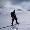
THE IDEA IS NOT 'BAD BUT HAS THE CREATION OF HOLES .... THE FUND IS NOT 'A LITTLE FIRE AND DETAILED THAN THE FIRST FLOOR, YOU CAN SEE THE JOINING OF TWO ROWS BETWEEN THEM THAT DO NOT HAVE MUCH TO DO AS LIGHTS, THE FUND IS TOO DARK AND FIRST FLOOR TOO LIGHT. MAYBE I SHOULD BE SHOT FOR ME LIFTED WITH A LITTLE PERSPECTIVE THAT WAS MORE 'SUGGEST .... MY PERSONAL OPPINIONI! L'IDEA NON E' MALE MA LA REALIZZAZIONE HA DEI BUCHI.... IL FONDO NON E' A FUOCO E POCO DETTAGLIATO RISPETTO AL PRIMO PIANO, SI VEDE LA GIUNTURA DI DUE FILE CHE TRA LORO NON HANNO MOLTO A CHE FARE COME LUCI, IL FONDO TROPPO SCURO E IL PRIMO PIANO TROPPO CHIARO. PER L'INQUADRATURA FORSE MI SAREI ALZATO UN POCO CON LA PROSPETTIVA CHE SAREBBE STATA PIU' SUGGESTIVA.... MIE OPPINIONI PERSONALI!! |
|
|
sent on 27 Aprile 2012 (19:02) | This comment has been automatically translated (show/hide original)
I like the composition and the colors also, perhaps, agree with Pierniteo still a bit 'more breath on the Left corner of the roof was right.
For what concerns the fusion are noticed in moons joints, in particular:
- The sky line hill to right of the sun appears a bit 'too dark and detached from the rest of the hills.
- The line between the rock wall and illuminated the valley has some areas that are too dark wall.
- Around the parapet zones are uncertain, or a little 'light streaks in the sky and a little' dark fence.
The more you work, however, is post production and then recovered with a more patient in the transition zones.
Fixed that you just have a nice picture ;-) La composizione mi piace e anche le cromie, forse, concordo comunque con Pierniteo un po' di più respiro sopra l'angolo Sx del tetto ci stava bene.
Per quel che riguarda la fusione si notano a lune giunture, in particolare:
- la linea collina cielo a Dx del sole appare un po' troppo scuro e stacca dal resto delle colline.
- la linea tra parete rocciosa illuminata e fondovalle presenta alcune aree di parete troppo scure.
- attorno al parapetto ci sono zone incerte, ovvero un po' di aloni chiari nel cielo e un po' di staccionata scura.
Il più comunque è lavoro si post produzione e quindi recuperabile con un lavoro più paziente nelle zone di transizione.
Sistemato quello ti resta una bella foto  |
|
|
sent on 27 Aprile 2012 (21:42) | This comment has been automatically translated (show/hide original)
I find it very beautiful and charming, I really like the camera angle. However, I agree with Pierniteo, too detachment of brightness between the two files.
Regards,
Fabry. Io la trovo molto bella e suggestiva, mi piace molto l'angolo di ripresa. Concordo però con Pierniteo, troppo stacco di luminosità tra i due file.
Saluti,
Fabry. |
|

Publish your advertisement on JuzaPhoto (info) |


 JuzaPhoto contains affiliate links from Amazon and Ebay and JuzaPhoto earn a commission in case of purchase through affiliate links.


 Resize to fit window