What do you think about this photo?
Do you have questions or curiosities about this image? Do you want to ask something to the author, give him suggestions for improvement, or congratulate for a
photo that you really like?
You can do it by joining JuzaPhoto, it is easy and free!
There is more: by registering you can create your personal page, publish photos, receive comments and you can use all the features of JuzaPhoto.
With more than 260000members, there is space for everyone, from the beginner to the professional.
|
|
sent on 18 Maggio 2015 (21:01) | This comment has been automatically translated (show/hide original)
Great shot, congratulations! Ottimo scatto, complimenti! |
|
|
sent on 18 Maggio 2015 (21:54) | This comment has been automatically translated (show/hide original)
Superb !! :-) Stupenda!! |
|
|
sent on 18 Maggio 2015 (22:03) | This comment has been automatically translated (show/hide original)
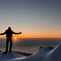
Wow ... Simone !! This is a show, the post I really like, really gentle transition between areas of light and shadow ;-)
Corrected have kept very low to the horizon, the sky snuff space 8-)
I always like the BN more .. for example I really like the style of this artist:
[URL =] www.colethompsonphotography.com/FavoritesImages.htm#Tongariki6
and 'very graphic and uses a lot of clouds, but his shots seem suspended in tempowow!
Hello,
Giuseppe Wow... Simone!! Questa è uno spettacolo, la post mi piace parecchio, davvero delicata la transizione tra le zone di luce e ombra 
Corretto aver tenuto molto basso l'orizzonte, quel cielo meritava molto spazio
A me il BN piace sempre di più.. ad esempio mi piace molto lo stile di questo artista:
www.colethompsonphotography.com/FavoritesImages.htm#Tongariki6
e' molto grafico e sfrutta parecchio le nuvole, ma i suoi scatti sembrano sospesi nel tempo
Ciao,
Giuseppe |
|
|
sent on 18 Maggio 2015 (22:36) | This comment has been automatically translated (show/hide original)
thanks to Diamond, Arvina and Giuseppe for comments (quesi there hoping more: -D)
giuse
I saw the link, apart from photos Easter Island: -D I identified the shots really remarkable.
I believe that the BN in the landscape is the most difficult of all.
it is easy to fall into banality as this is basically my image, where my version BN did not want to add anything to the already extraordinary scene ripresa.perchè overturn a wonder like this? Who am I to allow me to believe that this rovinarla.non image lends itself to interpretations bold or graphic as already highlighted in tua.Anche the author that I've linked as you can see is dedicated to graphical representations and essential only on subjects thatare well suited to these choices (desert dunes, beaches, rocks, slopes, etc.) where the forms are basic and well defined at source.
this is just my humble opinion, probably dictated by my undeniable inexperience in this kind of shots.
hello and thanks for the chat
Simone
grazie a Diamante,Arvina e Giuseppe per i commenti (quesi non ci speravo più ) )
giuse
ho visto il link,a parte le foto all'isola di Pasqua ho individuato degli scatti davvero notevoli.
credo che il BN in paesaggio sia il più difficile in assoluto.
è facile cadere nel banale come fondamentalmente è questa mia immagine,dove la mia versione in BN non ha voluto aggiungere nulla alla già straordinarietà della scena ripresa.perchè stravolgere una meraviglia del genere?,chi sono io per permettermi di rovinarla.non credo che questa immagine si presti ad interpretazioni audaci o grafiche come si è già evidenziato nella tua.Anche l'autore che mi hai linkato come puoi ben vedere si dedica a rappresentazioni grafiche ed essenziali solo su soggetti che ben si prestano a tali scelte (dune del deserto,spiagge,scogli,pendii ecc) dove le forme sono essenziali e ben delineate già all'origine.
questo è solo il mio modesto parere,probabilmente anche dettato dalla mia innegabile inesperienza in questo genere di scatti.
ciao e grazie per la chiacchierata
Simone
|
|
|
sent on 18 Maggio 2015 (22:55) | This comment has been automatically translated (show/hide original)
And 'true Simone, unless you thought right estremizzarla that's okay, because this is your vision .. the important thing is always to experiment and try new things, just so we grow (and is not only for photography) ;-)
Hello,
Giuseppe E' vero Simone, se non ritenevi giusto estremizzarla va bene così, perché questa è la tua visione .. l'importante è sperimentare sempre e cercare cose nuove, solo così si cresce ( e vale non solo per la fotografia)
Ciao,
Giuseppe |
|
|
sent on 19 Maggio 2015 (0:19) | This comment has been automatically translated (show/hide original)
The composition reveals the majestic beauty of the place, but it certainly strikes me especially the vast sky and the management of the backlight with its shadows opened and contrast deliberately attenuated.
A beautiful and original work.
Hello, Patrick
La composizione rivela la maestosa bellezza del luogo, ma certo mi colpisce in modo particolare il vasto cielo e la gestione del controluce con le sue ombre aperte e il contrasto volutamente attenuato.
Un lavoro bello e originale.
Ciao, Patrizio
|
|
|
sent on 19 Maggio 2015 (8:47) | This comment has been automatically translated (show/hide original)
Hello Simone, with these black and white we are rolling back to a time when these were the colors of the picture and the skill of the photographer was to capture the nuances and make them stand out with the play of light rather than the colors. Nowadays, where color gives you an immediate answer both visually both emotionally, I think it becomes more difficult to appreciate a landscape photograph thus realized. The reading becomes more difficult and the nuances are not always so obvious. This your photo, unlike the color, I do not see the howling Gusela claiming his rule. The mountain has turned into a puzzled face, almost critical, addressed precisely to those who observe the picture as to wonder if the reader the scene able to perceive the magnitude of that place, if the right is dominated by Mount, onlla left gives way to the explosion of the sun with its rays goes to caress the snowy areas remained in shadow. Even the sky, in his clouds, shows a face hesitant, thinking about how they can enjoy shooting. But to quote the words of the great Dante "we not speak of them, but look and go". In support of this should be enough to embrace the sky, the space between the clouds, is about to do to Gusela and to whom it has proposed in this version.
Have a good day
Riccardo Ciao Simone, con questi bianco e nero ci stai riportando indietro nel tempo, quando questi erano i colori della fotografia e l'abilità del fotografo era quella di cogliere le sfumature e farle risaltare con i giochi di luce anziché coi colori. Al giorno d'oggi, dove il colore ti dà subito una risposta sia sul piano visivo sia sul piano emotivo, penso diventi più difficile apprezzare una foto di paesaggio così realizzata. La lettura diventa più difficile e le sfumature non sempre così evidenti. In questa tua foto, a differenza di quella a colori, non vedo più l'ululante Gusela che reclama il suo dominio. La montagna si è tramutata in un volto perplesso, quasi critico, rivolto proprio a chi osserva la foto come a chiedersi se chi legge la scena riesca a percepire la grandezza del luogo che, se sulla destra è dominata dal monte, sulla sinistra lascia spazio all'esplosione del sole che con i suoi raggi va ad accarezzare le zone innevate rimaste in ombra. Anche il cielo, fra le sue nuvole, mostra un volto titubante, pensando a quanti possano apprezzare lo scatto. Ma per dirla con parole del sommo Dante "non ragioniam di loro, ma guarda e passa". A conforto di ciò dovrebbe bastarti l'abbraccio che il cielo, nello spazio fra le nubi, è in procinto di fare al Gusela e a chi lo ha proposto in questa versione.
Buona giornata
Riccardo |
|
|
sent on 19 Maggio 2015 (10:28) | This comment has been automatically translated (show/hide original)
for me it is really very nice, a remarkable work on the part of the sky right, backlight did really well in a situation that I find particularly difficult for glazing thin.
I have no idea who potressi improve the first floor of the snow and make it more uniform, I find it too light in the center left from the last third of the right. but in the end no one I look at them as the show as you say it is the other way
hello per me è davvero molto bella, un lavoro notevole sulla parte del cielo di destra, controluce fatto davvero bene in una situazione che ritengo particolarmente difficile per la velatura sottile.
ho idea che potressi migliorare il primo piano della neve e renderlo più uniforme, lo trovo troppo chiaro al centro sx rispetto all'ultimo terzo di dx. ma poi alla fine nessuno credo guardi li dato che lo spettacolo come dici tu è da un'altra parte
ciao |
|
|
sent on 19 Maggio 2015 (12:35) | This comment has been automatically translated (show/hide original)
“ the contrast deliberately attenuated. „
Patrick, you've got it right, though not the kind most hype understand landscape photography, it is my prerogative to give more attention to the nuances while maintaining color and light never too decisi.questa prerogative is also transmitted to the black and white where the color turns into contrast.
thanks for the appreciation
Riccardo and Gianmarco
blending and making the area of ??the dazzling sun (Gian here because in the end I chose the clearer) I have tried to remove the role of actor to Gusela, I believe also with you succeeded.
for Gianmarco
I did not understand what you mean if the stripe in the foreground or in the background in shadowunder the step.
in the end I kept the light version for Gusela, the sky and the light in the foreground, while I held the dark version for all shaded part under the Giau, this in order to create better detachment of floors (first floor light, second floor and dark background still unclear) all not for mere technicality or some kind of rules of composition, but just because I liked the most and seemed more balanced and complete.
thanks for visits
A greeting
Simone “ il contrasto volutamente attenuato. „
Patrizio,hai colto nel segno,anche se non è il genere più gettonato di intendere la fotografia di paesaggio,è una mia prerogativa dare maggior attenzione alle sfumature mantenendo luci e colori mai troppo decisi.questa prerogativa si trasmette anche al bianco e nero dove il colore si trasforma in contrasto.
grazie per l'apprezzamento
Riccardo e Gianmarco
sfumando e rendendo abbagliante la zona del sole (ecco Gian perchè alla fine ho scelto quella più chiara) ho cercato di togliere il ruolo di attore protagonista alla Gusela,credo anche con voi di esserci riuscito.
per Gianmarco
non ho capito a cosa ti riferisci se alla striscia in primissimo piano o quella in secondo piano in ombra sotto al passo.
alla fine ho tenuto la versione chiara per la Gusela,il cielo e il primissimo piano in luce,mentre ho tenuto la versione scura per tutta la parte in ombra sotto il giau,questo per poter creare meglio lo stacco dei piani (primo piano chiaro,secondo piano scuro e sfondo ancora chiaro) il tutto non per mero tecnicismo o per chissà quali regole compositive,ma solo perchè mi piaceva di più e mi sembrava più equilibrata e completa.
grazie per le visite
un saluto
Simone |
|
|
sent on 19 Maggio 2015 (12:44) | This comment has been automatically translated (show/hide original)
I mean the language of snow in the foreground to the center left that it seems clearer that right with a rather sharp transition at the penultimate hairpin
hello mi riferisco alla lingua di neve in primissimo piano che a centro sx mi sembra più chiara che a dx con un passaggio piuttosto netto all'altezza del penultimo tornante
ciao |
|
|
sent on 19 Maggio 2015 (12:52) | This comment has been automatically translated (show/hide original)
ah maybe I get it now, you see a fairly sharp line, an area almost rectangular center fotogramma.sinceramente I do not see big differences in brightness, that line you see I tell you what ... is a cloned hurt of that lump of earth that came out of snow (you can view the entire release that I sent you) .you have reason could be there more careful :-(
hello ah forse ho capito adesso,si vede una riga abbastanza netta, una zona quasi rettangolare a centro fotogramma.sinceramente non vedo grosse differenze di luminosità,quella riga che si vede te lo dico io che cos'è...è una clonata fatta male di quella zolla di terra che usciva dalla neve (lo puoi vedere sulla versione intera che ti avevo inviato).si hai ragione potevo starci più attento
ciao |
|
|
sent on 19 Maggio 2015 (15:25) | This comment has been automatically translated (show/hide original)
beautiful composition, I like the breadth skyward. I find it a little grigiotta conversion in white, I find them a little too close. ;-)
Hello Simone! ;-) bella composizione, mi piace l'ampio respiro verso il cielo. Trovo un pò grigiotta la conversione nei bianchi, li trovo un pò troppo chiusi.
Ciao Simone! |
|
|
sent on 19 Maggio 2015 (16:23) | This comment has been automatically translated (show/hide original)
Remarkable!
Clara Notevole!
Clara |
|
|
sent on 19 Maggio 2015 (16:32) | This comment has been automatically translated (show/hide original)
nice idea, beautiful composition I really like how the light. I do not like the effect orton overlooking a little 'around the frame.
a greeting :) bella l'idea, bella la composizione mi piace parecchio come controluce. non mi piace l'effetto orton che domina un po' tutto il fotogramma.
un saluto :) |
|
|
sent on 19 Maggio 2015 (21:51) | This comment has been automatically translated (show/hide original)
26ugrave; real „
I really find it hard to give Claudio ragione..cavolo around the sun is impossible that there is the same light that board fotogramma.il black sky is only the effect of the red filter blue, classical interpretation of analog memoria.sono convinced the absolute consistency of brightness on the whole frame, sorry that is not the same for you.
Pampaar
I can not deny your taste photo, I went to see your photographs and I realize that we have two hands decidedly different in terms of contrasti.l'effetto glow you mention I only applied on the sky and really minimally Gusela on, to make the tonal passages between shadow and light the softer possible.And my prerogative is the color photos ofthose in BN, is now part of my act fotografia.prendo still your opinion and thank you so much for having expressed. :-P
hello to everyone
Simone Grazie Clara per il comemnto positivo.
adesso però devo difendermi dagli attacchi di max,claudio e Pampaar
scherzo ovviamente
sono stracontento che abbiate dedicato un pò di tempo a questo scatto.
devo essere sincero però
anche con tutta la mia buona volontà stavolta faccio fatica a venirvi incontro
Max ,ok ma i bianchi delle nuvole più bianchi di così li vado a bruciare e onestamente faccio fatica ad immaginare la neve in ombra diversa dal grigio
Claudio
“ avrei visto meglio una luminosità più simile nella parte sinistra o viceversa a seconda del tuo gusto ;-)
Questo per avere una visione più reale, „
faccio davvero molta fatica a darti ragione..cavolo Claudio attorno al sole è impossibile che ci sia la stessa luminosità che a bordo fotogramma.il nero del cielo è solo l'effetto del filtro rosso sul blu,classica interpretazione di analogica memoria.sono convinto della assoluta coerenza di luminosità sull'intero fotogramma,mi spiace che non sia lo stesso per te.
Pampaar
non posso certo contestare il tuo gusto fotografico,sono andato a vedere le tue foto e mi rendo conto che abbiamo due mani decisamente differenti in fatto di contrasti.l'effetto glow di cui parli l'ho applicato solo sul cielo e davvero in minima parte sulla Gusela ,per rendere i passaggi tonali tra ombre e luci il più morbido possibile.è una mia prerogativa sia sulle foto a colori che su quelle in BN,ormai fa parte della mia fotografia.prendo atto comunque del tuo parere e ti ringrazio davvero per averlo espresso.
un saluto a tutti
Simone |
user33394
|
sent on 20 Maggio 2015 (23:24) | This comment has been automatically translated (show/hide original)
Dear Simone .... where do I start? :-P
I waited to review this because I wanted to see your picture on a PC screen after reading the previous comments on his cell phone.
Beautiful composition, but this is quite obvious with your shots!
They immediately affect the plans of sharpness that you gave it clicks. The Gusela stands throughout the frame and draws attention to me in a crazy way, the road below with the play of curves seems to invite you to go behind the mountains under the sun, that the latter goes with rays to illuminate the snow first floor and small ridges. (Then one day you will explain how you can make the beams so!) In short, a masterpiece !!
The sky I think you've made it very well contrastedright and where there is the most soft glow as the sun .... but it seems normal to be so !! wow! no? ;-)
In the background I can see many levels of mountains increasingly blurred but just readable and looking you just want to lose you to the infinite.
The realization in B / N by a value added to your creativity!
Bravissimo!
Best wishes
Luigi Caro Simone.... da dove inizio?
Ho aspettato a commentare questa tua foto perché volevo vederla sullo schermo del PC dopo aver letto i commenti precedenti al cellulare.
Composizione bellissima, ma questo è abbastanza scontato con i tuoi scatti!
Subito mi colpiscono i piani di nitidezza che hai dato allo scatto. La Gusela spicca su tutto il fotogramma e mi attira l'attenzione in un modo pazzesco, la strada sotto con quel gioco di curve sembra invitarti ad andare dietro le montagne sotto al sole, quest'ultimo che con i raggi va ad illuminare la neve in primo piano e sui piccoli crinali. (Poi un giorno mi spiegherai come fai a fare i raggi così!) Insomma un piccolo capolavoro!!
Il cielo secondo me l'hai reso molto bene contrastato a dx e più morbido dove c'è il bagliore dato dal sole....ma mi sembra normale che sia così!! no?
Nello sfondo riesco a vedere tantissimi livelli di montagne sempre più sfumate ma altrettanto leggibili e con lo sguardo ti viene voglia di perderti verso nell'infinito.
La realizzazione in B/N da un valore aggiunto alla tua creatività!
Bravissimo!
Un caro saluto
Luigi |
|
|
sent on 21 Maggio 2015 (2:35) | This comment has been automatically translated (show/hide original)
most of the pictures I have on this forum are nocturnal, so it is not that much doily with a landscape in bn. However curiosity that made you think of this photo? :) Just to see.
However if you want softer tonal passages simply reduce the local contrast is not it? however, the effect is there, but only on the areas detailed in my opinion. I do not like the flat areas such as sky and snow .. my taste anyway. was only a precisely because so many of your photographs not the saw, or at least not as strong.
A greeting la maggior parte delle foto che ho su questo forum sono notturni, per cui si non è che centrino molto con un paesaggio in bn. comunque per curiosità che foto ti ha fatto pensare questo? :) giusto per capire.
comunque se vuoi passaggi tonali più morbidi semplicemente riduci il contrasto locale no? comunque l'effetto ci sta, ma solo sulle zone dettagliate secondo me. non mi piace sulle zone piatte come cielo e neve.. gusto mio comunque. era solo un appunto perchè su tante tue foto non l ho visto, o almeno non così forte.
un saluto |
|
|
sent on 21 Maggio 2015 (13:11) | This comment has been automatically translated (show/hide original)
“ was only a precisely because so many of your photographs not the saw, or at least not as strong. „
and God forbid that I should not let me out, we are in photography forums, or at least I still want to believe ;-)
the glow as I said I only applied on the sky (I can guarantee that I removed the snow from the level of at least 3.2 but from memory honestly), but only in this case because usually like you say the sky just do not apply because from a file already low in contrast (clarity of acr) do not need it. I think the fact that the sun is behind the fog and dazzles think has amplified the effect.
the clouds, even at the edges (because the glow acts primarily on those) I like così just why they are clouds.
I can not stand those photos where you can see the contours of the clouds net and sharp, and the forum you see them, you want to contrasts exasperated want for unsharp masks too heavy.
“ if you want softer tonal passages simply reduce the local contrast is not it? „
I do not think it has the same effect, the glow does not diminish the contrast, but the mixes do not know how to explain, it gives me a different feeling, I have to pull away a bit of sharpness sharp edges and details should not flatten the photo. I am not a technician, but I'm going to feel a lot and end result, however, I saw that I apply it on almost all my photos and almost always with the same values ??of% will most probably, again in the NL it was accentuated.
try totake a look at this my color and please tell me if you think there is too much glow, because the situation was the same but it was backlit. www.juzaphoto.com/galleria.php?t=1329854&l=it
regarding your photographs, it was enough to look at the first page, excluding of course the night, even if I find it too even those opposed to my gusti.Io I refer to the photos that appear in order of popularity, something that I do not understand the utility, I would rather see them in time to appreciate the progress that one makes during his "life" camera, but I am not the owner of the site so I adapt to what I have to disposizione.anche I compared two years ago now, I changed my way of post production I think it's obvious.
give you an example, but you do not need a lotI am that you asked me I'll link those, where I noticed these differences in style in post production.
www.juzaphoto.com/galleria.php?l=it&t=561331 the edges of the rock too obvious and too dark without detail
www.juzaphoto.com/galleria.php?l=it&t=447829 is all too contrasty
www.juzaphoto.com/galleria.php?t=1339213&l=it contrast on Gusela for me is excessive
This image instead where I find myself very
www.juzaphoto.com/galleria.php?t=1204392&l=it
hello and I hope that our good chat can be helpful if the players concerned for obvious positions on their styles, at least for someone who unfortunately he came across this discussion.
thank you for your concern I enjoyed :-P
hello
Simone
“ era solo un appunto perchè su tante tue foto non l ho visto, o almeno non così forte. „
e ci mancherebbe altro che non dovessi farmelo notare,siamo in forum di fotografia o almeno voglio ancora crederlo
il glow come ho già detto l'ho applicato solo sul cielo (ti posso garantire che sulla neve l'ho tolto dal livello almeno dei 2/3 ma vado a memoria onestamente),ma solo in questo caso perchè di solito come dici tu sul cielo proprio non lo applico perchè partendo da un file già poco contrastato (chiarezza di acr) non ne ho bisogno. secondo me il fatto che il sole sia dietro a quella velatura e abbaglia credo abbia amplificato l'effetto.
sulle nuvole ,anzi sui bordi (perchè il glow agisce principalmente su quelli) mi piacciono così proprio perchè sono nuvole.
non sopporto quelle foto dove si vedono i contorni delle nuvole netti e taglienti,e sul forum se ne vedono,vuoi per i contrasti esasperati,vuoi per maschere di contrasto troppo pesanti.
“ se vuoi passaggi tonali più morbidi semplicemente riduci il contrasto locale no? „
secondo me non ha lo stesso effetto ,il glow non diminuisce il contrasto,ma lo impasta non so come spiegarmi,mi dà un'altra sensazione,mi deve tirare via un pò di nitidezza tagliente sui bordi e sui dettagli non deve appiattirmi la foto.io non sono un tecnico,ma vado molto a sensazione e a risultato finale,ho visto comunque che lo applico su quasi tutte le mie foto e sempre con quasi gli stessi valori di % .probabilmente ,ripeto in BN la cosa si è accentuata.
prova a dare un'occhiata a questa mia a colori per favore e dimmi se secondo te c'è troppo glow,perchè la situazione era la stessa ma non era in controluce. www.juzaphoto.com/galleria.php?t=1329854&l=it
per quanto riguarda le tue foto,mi è bastato guardare la prima pagina,escludendo ovviamente i notturni,anche se trovo troppo contrastati anche quelli per i miei gusti.Io mi riferisco alle foto che compaiono in ordine di popolarità,cosa di cui non ne capisco l'utilità,avrei preferito vederle in ordine di tempo per apprezzare il progresso che uno fa durante la sua "vita" fotografica,ma non sono io il titolare del sito per cui mi adeguo a quello che ho a disposizione.anche io rispetto a due anni fa ormai,ho cambiato modo di post produrre credo sia evidente.
farti un esempio non serve molto ma visto che me lo hai chiesto ti linko quelle , dove noto queste differenze di stile in post produzione.
www.juzaphoto.com/galleria.php?l=it&t=561331 i bordi dello scoglio troppo evidenti e troppo scuro senza dettaglio
www.juzaphoto.com/galleria.php?l=it&t=447829 è tutta troppo contrastata
www.juzaphoto.com/galleria.php?t=1339213&l=it il contrasto sulla Gusela per me è eccessivo
questa invece un'immagine in cui mi ritrovo molto
www.juzaphoto.com/galleria.php?t=1204392&l=it
ciao e spero che questa nostra bella chiacchierata possa essere stata utile se non ai diretti interessati per ovvie prese di posizione sui propri stili,almeno per qualcuno che disgraziatamente si sia imbattuto in questa discussione.
grazie a te per l'interessamento ho apprezzato molto
ciao
Simone
|
|
|
sent on 21 Maggio 2015 (13:14) | This comment has been automatically translated (show/hide original)
Thanks Luigi
I almost forgot to thank you, but we've got to sentrci the cell so I just greetings.
if you want those rays I told you more than once what to do! -D
hello Grazie Luigi
mi stavo dimenticando di ringraziarti,ma abbiamo già avuto modo di sentrci al cell per cui mi limito ai saluti.
se vuoi quei raggi ti ho già detto più di una volta cosa devi fare!
ciao |
|

Publish your advertisement on JuzaPhoto (info) |

 Paesaggi 1
 JuzaPhoto contains affiliate links from Amazon and Ebay and JuzaPhoto earn a commission in case of purchase through affiliate links.


 Resize to fit window