What do you think about this photo?
Do you have questions or curiosities about this image? Do you want to ask something to the author, give him suggestions for improvement, or congratulate for a
photo that you really like?
You can do it by joining JuzaPhoto, it is easy and free!
There is more: by registering you can create your personal page, publish photos, receive comments and you can use all the features of JuzaPhoto.
With more than 260000members, there is space for everyone, from the beginner to the professional.
user24883
|
sent on 24 Marzo 2015 (13:13) | This comment has been automatically translated (show/hide original)
a beautiful idea, soft tissue, such as the feminine curves, very natural, like the setting that you gave. this my humble thought before this shooting beautiful, dreamy. hello Patrizia una bellissima idea, morbido il tessuto, come le curve femminili, molto naturale, come l'ambientazione che hai dato. questo il mio modesto pensiero davanti a questo scatto bello, sognante. ciao Patrizia |
|
|
sent on 24 Marzo 2015 (15:47) | This comment has been automatically translated (show/hide original)
Thank You!
I chose the picture of landscape in bn will post that soon, you'll see that you can do! one of a fence I've already inserted! sappimi say. ;-) Grazie!
Ho scelto delle foto di paesaggio in bn che presto posterò, vedrai che si può fare! una di una staccionata l'ho già inserita! sappimi dire. |
|
|
sent on 25 Marzo 2015 (8:08) | This comment has been automatically translated (show/hide original)
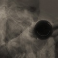
Hello Carlo..questo not snap you da'merito .., there are obvious errori..e you can not deny them of vederli..Dal model's face burned by the sun, the colors of the background plates, hand cut right .., I stop qui..Spero not you take it .. maybe it was better a B / N..e give piu'contrasto to lenzuolo.Che below was naked I believe was the main thought of the viewer, which focuses immediately look on that sheet arguing with the sun ... .., and that in the backlight highlights the physicality Model stessa.Idea not easy realizzazione..un greeting ivan Ciao Carlo..questo scatto non ti da'merito..,ci sono evidenti errori..e non puoi negarli di vederli..Dal viso della modella bruciata dal sole,dai colori piatti dello sfondo,la mano tagliata a dx..,mi fermo qui..Spero non te la prenda..,forse era meglio un B/N..e dare piu'contrasto al lenzuolo.Che sotto fosse nuda non credo sia stato il pensiero principale dello spettatore ,che focalizza da subito lo sguardo su quel lenzuolo che litiga ...col sole..,e che nel controluce evidenzia la fisicita della modella stessa.Idea di non facile realizzazione..un saluto ivan |
|
|
sent on 25 Marzo 2015 (10:36) | This comment has been automatically translated (show/hide original)
Thanks Ievenska, not that I do not take! ... 4,6,8 eyes are better than two!
In fact of the many flaws that I had taken into account, the hand I was trivially escaped!
One of the photos that I think deserves to theme (I think it is high impact), but that in the canons of photography no! ... I would say amateurish!
Color but do not agree, I see it in color, but well done with care and with an 'other equipment!
PS: nice your new avatar!
Grazie Ievenska, no che non me la prendo!...4,6,8 occhi vedono meglio di due!
In effetti dei tanti difetti che avevo preso in considerazione, la mano mi era banalmente sfuggita!
Una delle foto che secondo me merita per tema (credo sia di grande impatto), ma che nei canoni della fotografia no!...direi dilettantesca!
Sul colore però non sono d'accordo, la vedo a colori, ma ben fatta con cura e con un' altra attrezzatura!
PS: bello il tuo nuovo avatar!
|
|
|
sent on 25 Marzo 2015 (10:49) | This comment has been automatically translated (show/hide original)
Avatar draws chose not to caso..La Fallaci great good or evil saying things as they were, getting many nemici..poi adesso..dopo know some of his libri..chi was right. L'avatar e'stato scelto non a caso..La grande Fallaci nel bene o nel male diceva le cose come stavano,procurandosi tanti nemici..poi sappiamo adesso..dopo certi suoi libri..chi aveva ragione. |
|
|
sent on 14 Febbraio 2016 (20:37) | This comment has been automatically translated (show/hide original)
Perhaps lacking a bit of contrast is a b & w would have been better, but it's not as bad hello Patrick Forse manca un po di contrasto è un b&w sarebbe stato migliore, ma non è così male ciao Patrizio |
|

Publish your advertisement on JuzaPhoto (info) |


 JuzaPhoto contains affiliate links from Amazon and Ebay and JuzaPhoto earn a commission in case of purchase through affiliate links.