What do you think about this photo?
Do you have questions or curiosities about this image? Do you want to ask something to the author, give him suggestions for improvement, or congratulate for a
photo that you really like?
You can do it by joining JuzaPhoto, it is easy and free!
There is more: by registering you can create your personal page, publish photos, receive comments and you can use all the features of JuzaPhoto.
With more than 260000members, there is space for everyone, from the beginner to the professional.
|
|
sent on 18 Dicembre 2014 (18:40) | This comment has been automatically translated (show/hide original)
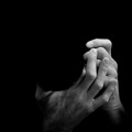
soft tones, details well separated, a beautiful image. I'm not crazy for borders and for titling down when loaded into a site. Vittorio toni morbidi, dettagli ben separati, una bella immagine. Non vado pazzo per i bordi e per la titolatura in basso quando caricati in un sito. Vittorio |
|
|
sent on 19 Dicembre 2014 (14:24) | This comment has been automatically translated (show/hide original)
Thanks Victor. As for the rest, it's a personal choice. Personally I find instead that the presentation of a work is key to enhancing the work itself and the dedication of those who created it. Although it is an image loaded on a site. The presentation also becomes a kind of "trademark", and recognizable identity. Behind my photographs there is love, research, technique, emotion, care and commitment: these are the values ??that I would like to convey.
Hello,
Alberto. Grazie Vittorio. Riguardo al resto, è una scelta personale. Personalmente trovo invece che la presentazione di un'opera sia fondamentale per valorizzare l'opera stessa e la dedizione di chi l'ha creata. Anche se si tratta di un'immagine caricata su un sito. La presentazione diventa anche una sorta di "marchio di fabbrica", riconoscibile ed identificativo. Dietro le mie fotografie c'è amore, ricerca, tecnica, emozione, cura e dedizione: questi sono i valori che vorrei trasmettere.
Ciao,
Alberto. |
|
|
sent on 19 Dicembre 2014 (17:15) | This comment has been automatically translated (show/hide original)
I appreciate your work and confirm that the notice the care, passion and dedication.
But here it is not about graphics.
In your page in Juzaphoto.com who oversaw the layout has entered a position, which appears just above the blue buttons, which you can place title, equipment and settings, and then in a abundant space for notes, the description of the situation you've photographed etc. The black background is in itself an element that frames and the 'watermark' containing the elements of copyright should be included in the picture to reduce the risk of unauthorized use.
The white border, the title shown below the photos and the copyright notice are part of a tradition linked to exposure of prints that only in the case of a show can have a plate containing dates, notes andcc. but which are essential otherwise.
Clarified these elements 'bon ton' graphic then you better do as you like, however, conscious that with what you call 'trademark' risks to create a little positive sense of 'alert' in the observer accustomed otherwise.
A spirit of cooperation, a Wave, Vittorio apprezzo e confermo che dal tuo lavoro si nota la cura, la passione e la dedizione.
Ma qui si tratta di grafica non di merito.
Nella tua pagina in Juzaphoto.com chi ne ha curato il layout ha inserito una posizione, che compare appena sopra ai pulsanti blu, nella quale puoi mettere titolo, equipment e settaggi, e poi in uno spazio abbondante per le note, la descrizione della situazione che hai fotografato ecc. Lo sfondo nero rappresenta di per sè un elemento che incornicia e il 'watermark' contenente gli elementi di copyright andrebbe inserito nella foto per ridurre il rischio di utilizzo non autorizzato.
Il bordo bianco, il titolo riportato sotto alla foto e l'indicazione di copyright fanno parte di una consuetudine collegata alla esposizione di stampe che solo nel caso di una mostra possono avere una targhetta contenente date, annotazioni ecc. ma che sono indispensabili altrimenti.
Chiariti questi elementi di 'bon ton' grafico poi tu fai come meglio ti aggrada, conscio però che con quello che tu chiami 'marchio di fabbrica' rischi di creare un poco positivo senso di 'allerta' nell'osservatore abituato diversamente.
Con spirito di collaborazione, un Saluto, Vittorio |
|
|
sent on 19 Dicembre 2014 (18:58) | This comment has been automatically translated (show/hide original)
Thanks Victor, stand by my idea, but I appreciate your intervention distinct and constructive.
Hello, Alberto. Grazie Vittorio, rimango della mia idea, ma apprezzo molto il tuo intervento distinto e costruttivo.
Ciao, Alberto. |
|
|
sent on 19 Dicembre 2014 (19:08) | This comment has been automatically translated (show/hide original)
Beautiful scene, good composition and delicate colors, congratulations!
Hello. Bella scena, buona composizione e delicate cromie, complimenti!
Ciao. |
|
|
sent on 20 Dicembre 2014 (11:19) | This comment has been automatically translated (show/hide original)
Hello Catherine, thanks for your visit!
Alberto Ciao Caterina, grazie della visita!
Alberto |
|

Publish your advertisement on JuzaPhoto (info) |


 JuzaPhoto contains affiliate links from Amazon and Ebay and JuzaPhoto earn a commission in case of purchase through affiliate links.


 Resize to fit window
 1.2 MEGAPIXEL