What do you think about this photo?
Do you have questions or curiosities about this image? Do you want to ask something to the author, give him suggestions for improvement, or congratulate for a
photo that you really like?
You can do it by joining JuzaPhoto, it is easy and free!
There is more: by registering you can create your personal page, publish photos, receive comments and you can use all the features of JuzaPhoto.
With more than 260000members, there is space for everyone, from the beginner to the professional.
|
|
sent on 28 Novembre 2014 (20:25) | This comment has been automatically translated (show/hide original)
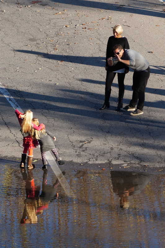
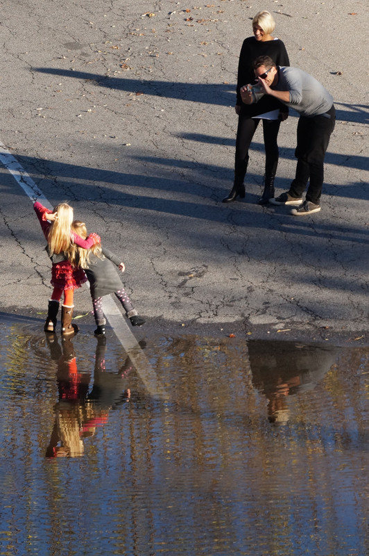
Very nice, I really enjoy the moment and caught the reflection, I would have cut in a bit at the top to remove
the triangle and focus more on the subject.
Congratulations.
Hello Claudio. Molto bella, mi piace molto il momento colto ed il riflesso, avrei tagliato un pelino in alto per togliere
il triangolo e focalizzare maggiormente sui soggetti.
Complimenti.
Ciao Claudio. |
|
|
sent on 29 Novembre 2014 (5:06) | This comment has been automatically translated (show/hide original)
Hello Ras
Since the image obtained from a crop, I have a good margin for ravanare with the shot that I had previously laid out a bit 'in a hurry, without thinking about it.
Here I kept the same distance between the head of the mother and the top edge and between the reflected and the bottom edge of the child:

The composition is more balanced but always remains, even if reduced, the triangle formed by the shadow at the top.
Here I moved all the way up, giving more space to the water, and conceivably could also be there as the theme of the gallery is the flooding:

<br/>
In the end I paged the picture in 4: 3 (typically prefer formats "classic" 3: 2 and 4: 3) and, while I was there, I gave a small rectified:

Good earthen latter, since so the subjects are best focused. Eventually, after trying several alternatives, I have come to your own conclusion.
In the gallery, however, leave the one that already exists, because the replacement would also deleted comments.
Hello and thanks for the "feedback".
Roberto Ciao Ras
Essendo l'immagine ricavata da un crop, ho un buon margine per ravanare con l'inquadratura che precedentemente avevo impaginato un po' di fretta, senza rifletterci su.
Qui ho tenuto la stessa distanza tra la testa della madre e il bordo superiore e tra quella riflessa della bambina e il bordo inferiore:
La composizione è più equilibrata ma resta sempre, anche se ridotto, il triangolo formato dall'ombra in alto.
Qui ho spostato il tutto verso l'alto, dando più spazio all'acqua, e concettualmente potrebbe anche starci dal momento che il tema della galleria è l'esondazione:
Alla fine ho impaginato la foto in 4:3 (in genere prediligo i formati "classici" 3:2 e 4:3) e, già che c'ero, le ho dato una piccola raddrizzata:

Terrei buona quest'ultima, dal momento che così i soggetti sono meglio focalizzati. Alla fine, dopo aver provato diverse alternative, sono giunto alla tua stessa conclusione.
Nella galleria però lascio quella che già c'è, perché con la sostituzione verrebbero cancellati anche i commenti.
Ciao e grazie per il "feedback".
Roberto |
|
|
sent on 29 Novembre 2014 (13:35) | This comment has been automatically translated (show/hide original)
I fully agree the last is certainly the most balanced.
Hello Claudio. Sono pienamente d'accordo l'ultima è sicuramente la più bilanciata.
Ciao Claudio. |
|

Publish your advertisement on JuzaPhoto (info) |


 JuzaPhoto contains affiliate links from Amazon and Ebay and JuzaPhoto earn a commission in case of purchase through affiliate links.


 Resize to fit window
 16.0 MEGAPIXEL