The contrast: levels, curves and other tools
- More
» - Articles
» The contrast: levels, curves and other tools
The contrast: levels, curves and other tools, text and photos by
Juza. Published on 27 Ottobre 2014; 2 replies, 10798 views.
The contrast is one of the first things that I adjust during post-processing: it is one of the essential elements of every image. If the photo is too contrasted it looks "harsh"; on the other hand, if it has not enough contrast it has a flat, "muddy" look. Mastering the techniques to enhance the contrast, both in the entire image and selectively, if the fist step to improve your photos.
The levels
The most important tool to enhance the contrast and the brightness of every photo are the levels. In the past I used the Levels tool (
Image>Adjustments>Levels), but currently I adjust them through the Curves tool (
Image>Adjustments>Curves), that allows to fine tune both curves and levels. This window shows an histogram of the photo, two sliders (the black and the white triangles under the graph) and a diagonal line that you can adjust to create a curve of contrast; first, we will analyze the levels, that is the part composed by the histogram and the two sliders. The histogram is shown on a 0-255 scale, even though if you are working on a 16 bit photo you actually have 4096 values of brightness instead of 255.
Moving the sliders, you change both the contrast and the brightness of the photo. The two sliders corresponds to black (0) and highlights (255). If you move the black point to the right by, say, 30 levels of brightness, all the data between 0 and 30 will be clipped, and the level 30 becomes the new black point (the pixels that had a brightness of 30 are darkened to 0): the photo becomes more contrasted and darker. If, instead, you move the white slider towards the left, the photo becomes more contrasted and brighter.
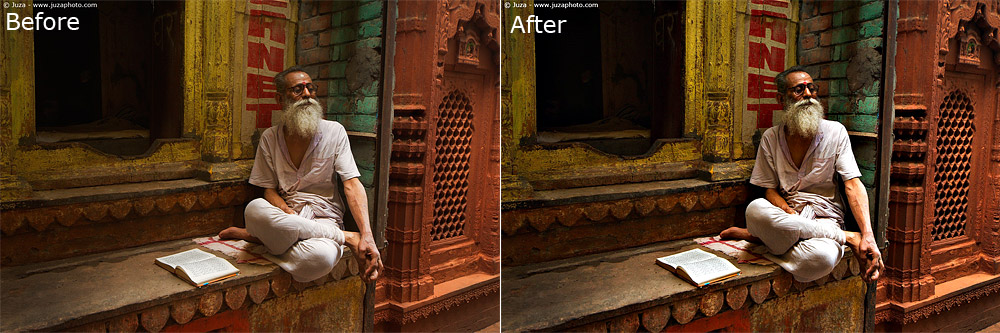
The Levels are very useful when you have an histogram that does not touch the edges (when there is an empty area between the edge of the graph and the side of the histogram window). In these situations, the photo lacks of contrast and it looks flat, "muddy". Moving the black and the white sliders towards the edges of the graph, you can clip the empty areas, improving the contrast of the image. If you compare the histogram of the photo before and after the levels adjustment, you clearly see that in the previous photo the data was "compressed" in the midtones area, and there were wide empty areas between the edges of the graph and the sides of the window. In the second image, instead, the edges of the histogram comes closer the sides, and the graph is more evenly distributed throughout the entire range of brightness, from black to white.
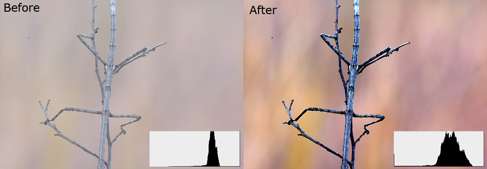
On the left: the image and its histogram before the adjustment. On the right: the image and its histogram after the adjustment.
You don't have to move always the white and black sliders exactly in correspondence with the edges of the histogram - depending by the photo and by your personal tastes, you may leave a little of empty room between the sliders and the graph, to maintain a slightly soft, low-contrast look; otherwise, you can even clip a little of the histogram, to create a very strong "Velvia-like" contrast.
Sometimes, it is not possible to get an optimal contrast without clipping some data. An example are subject that have some white areas: if you move the sliders close to the edges of the histogram the contrast is improved, but the photo still needs "something more", and if you move the sliders until the entire photo had good contrast, the white areas become pure white, without detail (because you have clipped some date from the histogram).
The solution is to use the layer mask to avoid applying the contrast enhancement on the brightest areas: make a copy of the photo on a second layer, that you can rename as "whites copy", then hide the layer (click on the layer visibility icon) and come back to the background layer. Enhance the contrast until the entire photo looks pleasing - don't worry if the bright areas become pure white. When you are satisfied by the results, make visible and select the "whites copy" layer and apply the Layer Mask "Hide All". Select a brush that has approximately the same size of the white areas, and set the hardness on 0%. Now, you just have to paint on the white areas to recover the detail from the "whites copy" layer. You can do the same things into shadows, if they have become too dark. Pay much attention to the edges: you have to create a gradual transition between areas of different brightness, and you must avoid artifacts, as bright or dark halos.
The curves
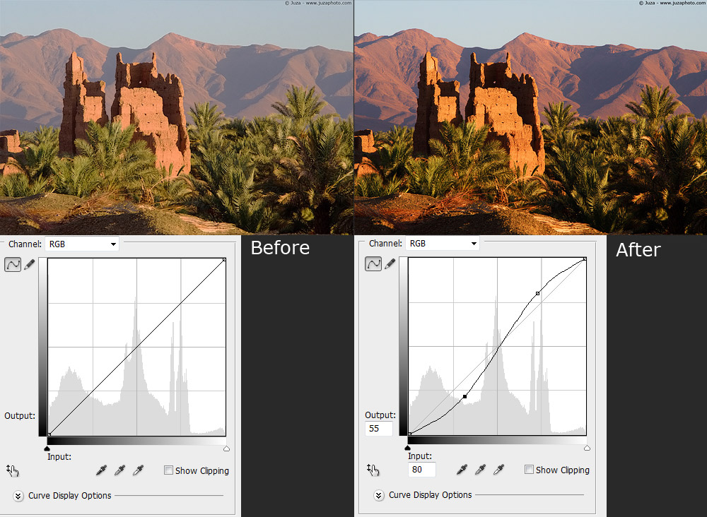
Right: the photo before the curves adjustment; the contrast is not perfect yet. Left: the photo after the curves adjustment.
Even tough levels adjustments greatly improve the photo, often they are not enough and you also need come curves adjustment. You can to that with the Curves tool that you have already opened to adjust the levels. The diagonal line in the curves windows represents the brightness; on the left lower corner there is pure back, in the center there are the midtones and in the upper right corner there are the highlights. I often use the so-called "S curve": to improve the contrast, click on the lower half of the line and drag it a little lower, then click on the upper half of the line and drag it a little higher.
The curves are a versatile tool than can be used in various ways for different results, but I use them only for adjustments of contrast. In other words, with the Curves windows first I do the main contrast adjustments by editing the 'levels' (clipping the empty edges of the graph), the I do the small contrast adjustment by editing the curve (applying the S curve to the diagonal line). I never use the curves to brighten up the shadows (with the reverse S curve), because the resulting image looks quite "muddy": there are better ways to extract detail from shadows and highlights, as the "Shadow/Highlights" tool or selective adjustments with layers and layer mask.
The Shadow/Highlight tool
The S/H tool is a powerful tool that allows to extract a lot of detail from the shadows and the highlights. Click on Image>Adjustment>Shadow/Highlight to open the window and select "Show More Options". There are many controls, but the ones that I use are only two: Amount and Tonal Width.
In the Shadows table, the Tonal Width defines the range of brightness that is considered "shadow", and the Amount determines how much you brighten up the shadow. The default values (50% for both the controls) are way too high: if you use these values, the shadows becomes very bright and detailed, but the photo lose contrast and the colors becomes awful. When I use the S/H tool, usually I set the Amount on 5-10%, and the Tonal Width on a value between 10 and 30%: the exact values depends by the image.
The Highlight table works in a similar way: Tonal Width defines the range of brightness that is considered "highlight", and the Amount determines how much you darken the highlights. Usually, I set the Tonal Width on 10-30%, and amount on 10-50%, depending by the photo. Again, you have to pay attention to don't exaggerate the effect, otherwise you get artifacts and bad colors. Sometimes, I use the Highlight tools with different values (Tonal Width on 70-90%, and amount on 1-5%): these settings darkens a little the photo and sometimes they improve color and contrast.
The S/H tools is quite effective, but it tends to create halos: pay much attention to the edges, in particular if there are large uniform areas. If you notice an halo, you can either reduce the Amount and Tonal Width, or you can use the Layer Mask to avoid applying the S/H correction on the borders of the subject. Other than that, remember than brightening the image increases the noise: if the photo is taken at high ISO, usually the amount of S/H enhancement that you can use is limited by noise.
Local contrast enhancements with the Unsharp Mask
Usually, the Unsharp Mask (Filter>Sharpen>Unsharp Mask) is used to improve the sharpness of the photo. Nevertheless, it is possible to use this tool to improve the contrast of the photo. It is not an alternative to Levels or Curves and I don't use it often, but sometimes it helps to enhance the image after the main contrast adjustments.
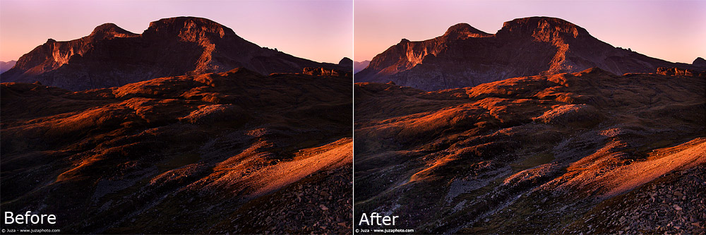
To use the Unsharp Mask for contrast enhancement, set Threshold on 0, Radius on 20-40 pixels and Amount on a value between 15% and 30%. With these values, the Unsharp Mask enhances the local contrast instead of the sharpness; a nice side effect is that even the colors becomes a bit more "punchy". While usually there is not a night/day difference between the photo before and after the enhancement, it helps to improve the image; in the example above you can clearly see that the midtones are more contrasted, the colors are more intense and the details look sharper.
This technique works quite well when the image has not bright highlights or dark shadows; photos that have mainly midtones can benefit from local contrast enhancement. The main cons of the local contrast enhancement are the halos - if there are clear edges and uniform areas (as a blue sky), this technique may create some halos. To avoid these artifacts, when it is necessary I apply the local contrast with the Layer Mask, avoiding the edges.
Improving the contrast/brightness in the eye and catchlight
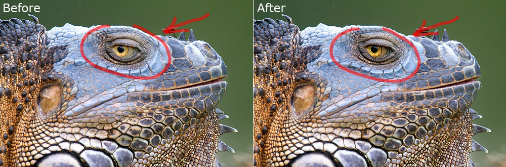
The eye of the subject is one of the key elements of the photo but sometimes the eye is not as apparent as it could be. This is often the case in photos taken in backlight, but even photos taken in frontal light sometimes can benefit from some enhancement of the eye. Usually, this enhancement is an increase of contrast and brightness applied selectively with the Layer Mask.
To enhance the eye, I make a copy of the image on a second layer, that I rename as "eye enhancement", and I increase the contrast with Curves, bringing the black point towards the right and the white point towards the left, until the eye is clearly brighter and it has a more intense color. Don't worry about the highlights on the subject - apply the correction while looking only at the eye. When you have enhanced the eye, apply the layer mask Hide All and select a small brush (the diameter of the brush should be nearly half the diameter of the eye), with hardness around 60-70%. Paint carefully on the eye, paying much attention to the edges: it is easy to create artifact if you are not careful with the mask, even though you can correct the errors inverting the brush color from white to black, and painting again on the artifacts.
The last step is checking the result. Select and deselect the layer visibility icon near the "eye enhancement" layer, to compare before and after. After the enhancement, the eye should be brighten and more saturate, but it should not look unnatural, even at 100% magnification. If you realize that you have exaggerated the enhancement, reduce the Opacity of the "eye enhancement" layer until the image looks improved, but natural. Merge the layers to conclude the processing.
Other times, the entire eye does not need improvement, but you can enhance the catchlight. As you may already know, the catchlight is a small reflection that appears in the eyes of your subject - usually, it is the reflection of the Sun, but you can create it even in shade or cloudy days with a little of fill flash. Even though the catchlight is just a detail, that usually is few pixel wide, it is quite important, since it gives more life to the subject.
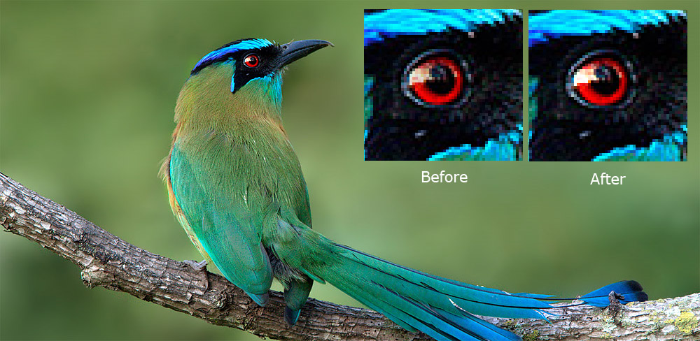
It is rare to photograph an animal without even a tiny catchlight in the eye, but sometimes the catchlight is too small or too dim, and you can improve it to give more "pop" to the photo. My technique is pretty easy: I select the Dodge Tool with a brush slightly larger than the catchlight and hardness 70-80%, I set the Range on "highlights" and exposure 50%.
To brighten up and enlarging the catchlight, I click many times on the white spot, until I am satisfied by the results. Remember that in nature the catchlight is never perfectly round as the brush of the Dodge Tool - to maintain a natural look, you have to change the position of the brush by few pixel between one click and another, to maintain the slightly uneven shape of the catchlight. Other than that, remember than after the enhancement it should be a little bigger, not a lot bigger, otherwise it looks clearly artificial. If the eye does not show any catchlight at all (as in some back lightened photos), I do not suggest to clone in a catchlight from another photo or to create a catchlight with Photoshop, the result looks to artificial.
Replies and comments
What do you think about this article?
Do you want to tell your opinion, ask questions to the author, or simply congratulate on a particularly interesting article?
You can join the discussion by joining JuzaPhoto, it is easy and free!
There is more: by registering you can create your personal page, publish photos, receive comments, join discussions and you can use all the features of JuzaPhoto.
With more than 259000 members, there is space for everyone, from the beginner to the professional.
|
|
sent on 08 Settembre 2017 (18:41)
Thanks for this info. It's very useful. |
|
|
sent on 14 Dicembre 2017 (18:27)
Great article on curve & level adjusting contrast.
in first part of your article for 8 bit we have 0 to 256 and 0 to 4096 is for 12 not the 16 bit. for 16 bit it will be
0 to 65,536
best regards,
Allen |

 JuzaPhoto contains affiliate links from Amazon and Ebay and JuzaPhoto earn a commission in case of purchase through affiliate links.

