RCE Foto

(i) On JuzaPhoto, please disable adblockers (let's see why!)


Login LogoutJoin JuzaPhoto!
JuzaPhoto uses technical cookies and third-part cookies to provide the service and to make possible login, choice of background color and other settings (click here for more info).

By continuing to browse the site you confirm that you have read your options regarding cookies and that you have read and accepted the Terms of service and Privacy.


OK, I confirm


You can change in every moment your cookies preferences from the page Cookie Preferences, that can be reached from every page of the website with the link that you find at the bottom of the page; you can also set your preferences directly here

Accept CookiesCustomizeRefuse Cookies


  1. Galleries
  2. »
  3. Landscape (wilderness)
  4. » Last autumn colors

 
Last autumn colors...

Parco Naz. Gran Sasso - Monti del

View gallery (32 photos)


What do you think about this photo?


Do you have questions or curiosities about this image? Do you want to ask something to the author, give him suggestions for improvement, or congratulate for a photo that you really like?


You can do it by joining JuzaPhoto, it is easy and free!

There is more: by registering you can create your personal page, publish photos, receive comments and you can use all the features of JuzaPhoto. With more than 241000 members, there is space for everyone, from the beginner to the professional.


avatarjunior
sent on November 15, 2021 (15:36) | This comment has been automatically translated (show/hide original)

I really like the photo, both the management of the lights on the now bare and brown trees, and the hilly green area. in fact at the bottom the trees look three-dimensional. If I can afford it, however, the yellow of the protagonist trees seems to me a little too saturated and almost tending to green at the top. They look like mimosa trees. In my opinion, turning off that yellow a little would improve the yield.
Samply personal opinion.

avatarjunior
sent on November 15, 2021 (15:56) | This comment has been automatically translated (show/hide original)

Thank you Ambro for the passage and appreciation... unfortunately it is not always very easy to manage the colors on the monitor, I viewed the file on two different screens and in one it appeared slightly more saturated in the other less.
M.

avatarsupporter
sent on November 16, 2021 (13:54) | This comment has been translated

Beautiful!

avatarjunior
sent on November 16, 2021 (18:33) | This comment has been automatically translated (show/hide original)

Thanks also to you Bo...
M.

avatarsenior
sent on November 17, 2021 (9:07) | This comment has been automatically translated (show/hide original)

I also think like Ambro94, on my monitor the yellows are too bright and greenish. Too bad because the shot is beautiful but that color is out of tune enough


RCE Foto

Publish your advertisement on JuzaPhoto (info)

Some comments may have been automatically translated with Microsoft Translator.  Microsoft Translator


 ^

JuzaPhoto contains affiliate links from Amazon and Ebay and JuzaPhoto earn a commission in case of purchase through affiliate links.

Mobile Version - juza.ea@gmail.com - Terms of use and Privacy - Cookie Preferences - P. IVA 01501900334 - REA 167997- PEC juzaphoto@pec.it

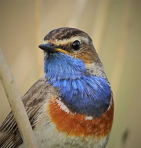
May Beauty Be Everywhere Around Me