What do you think about this photo?Do you have questions or curiosities about this image? Do you want to ask something to the author, give him suggestions for improvement, or congratulate for a photo that you really like?
You can do it by joining JuzaPhoto, it is easy and free!
There is more: by registering you can create your personal page, publish photos, receive comments and you can use all the features of JuzaPhoto. With more than 241000 members, there is space for everyone, from the beginner to the professional.
| sent on February 25, 2017 (22:33) | This comment has been automatically translated (show/hide original)
Bravo!
The description helps the reading of the image; so it is almost like being there.
Bravo. Bravo!
La descrizione aiuta la lettura dell'immagine; così sembra quasi di esserci.
Bravo. |
| sent on February 28, 2017 (20:16) | This comment has been translated
Thank you! |
| sent on March 15, 2017 (21:43) | This comment has been automatically translated (show/hide original)
This picture I find it a level of composition I find it most effective to show the plot of this huge expanse of salt 8-) but I prefer the colors of the 'last photo gallery
Questa foto la trovo infatti a livello compositivo la trovo più efficace per mostrare la trama di questa enorme distesa di sale però preferisco i colori dell' ultima foto della galleria però preferisco i colori dell' ultima foto della galleria
|
| sent on March 15, 2017 (21:56) | This comment has been automatically translated (show/hide original)
Yes, I am aware of and I did the PP several times in different ways. In the end I decided not to bet at all on the most "comforting" the other warm colors because I did miss the essence of this fire amalgamating the entire frame, as is the case in the other. Certainly it is less attractive visually, but here the choice was entirely different from by simply click the fact I used a pdc minimal relevance to remove the view. For me this is the best and is the only one that I printed, but should not be looked at only from the point of view of simple photo panoramic explanatory. Then of course they are always tastes and subjective perceptions. I thank the passage.
A greeting. Si, ne sono consapevole ed ho fatto la pp più volte in vario modo. Alla fine ho preferito non puntare per nulla sui caldi colori più "confortanti" dell'altra perchè mi facevano perdere l'essenza di questo incendio amalgamandolo a tutto il fotogramma, come invece succede nell'altra. Certamente è meno allettante visivamente, ma qui la scelta era completamente diversa fin dallo scatto infatti ho usato una pdc minima per togliere rilevanza al panorama. Per me questa resta la migliore ed è l'unica che ho stampato, ma non va guardata solo dal punto di vista della semplice foto panoramica esplicativa. Poi chiaramente sono sempre gusti e percezioni soggettive. Ti ringrazio del passaggio.
Un saluto. |
| sent on March 16, 2017 (10:20) | This comment has been automatically translated (show/hide original)
the fire boundaries that surround the Salt puzzles are in my opinion the most valued in the other shooting. Hence the fuzzy line on the horizon is annoying i confini di fuoco che delimitano il puzzle di sale sono secondo me maggiormente valorizzati nell'altro scatto. qui la linea sfocata all'orizzonte disturba un pò |
| sent on March 16, 2017 (11:05) | This comment has been automatically translated (show/hide original)
Gorgeous!
I immersed myself in that place thanks to the caption.
Congratulations indeed to realize. Bellissima!
Mi sono immerso in quel posto grazie alla didascalia.
Complimenti davvero per la realizzazione. |
| sent on March 16, 2017 (20:26) | This comment has been automatically translated (show/hide original)
Thanks for the ride at all.
@ 7h3 L4W I totally agree. As I said this is not explanatory of the place in my intentions. The intent is more artistic, as a visual impact for texture and color contrast. I realize, however, that perhaps does not take and is not read as I would like. With printing hail size reaches more. Perhaps I should reduce to almost nothing the sky to lose even more context to the viewer. I have to see. Anyway, thank you, the feelings of those who see the pictures for the first time as a spectator are always useful.
Gianluca. Grazie per il passaggio a tutti.
@7h3 L4w Sono assolutamente d'accordo. Come dicevo questa non è esplicativa del luogo nelle mie intenzioni. L'intento è più artistico, come impatto visivo per la texture ed il contrasto dei colori. Mi rendo conto però che forse non prende e non viene letta come vorrei. Con la stampa in formato grandino arriva di più. Forse dovrei ridurre quasi a nulla il cielo per far perdere ancora di più il contesto a chi la guarda. Devo vedere. Comunque grazie, le sensazioni di chi guarda le foto per la prima volta da spettatore sono sempre utilissime.
Gianluca. |
| sent on October 10, 2020 (11:07) | This comment has been automatically translated (show/hide original)
Beautiful scenery, congratulations! Splendido scenario, complimenti! |
| sent on October 10, 2020 (14:25) | This comment has been automatically translated (show/hide original)
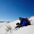
Then I tell you something
Yil your toil and the cold endured... have been repaid by this wonderful image you gave us
Compliments
Hello
Stefano Allora ti dico una cosa
Tutta la tua fatica e il freddo sopportato...sono stati ripagati da questa immagine stupenda che ci hai regalato
Complimenti
Ciao
Stefano |
|

Publish your advertisement on JuzaPhoto (info) |


 JuzaPhoto contains affiliate links from Amazon and Ebay and JuzaPhoto earn a commission in case of purchase through affiliate links.


 2.5 MEGAPIXEL
 Resize to fit window