What do you think about this photo?Do you have questions or curiosities about this image? Do you want to ask something to the author, give him suggestions for improvement, or congratulate for a photo that you really like?
You can do it by joining JuzaPhoto, it is easy and free!
There is more: by registering you can create your personal page, publish photos, receive comments and you can use all the features of JuzaPhoto. With more than 241000 members, there is space for everyone, from the beginner to the professional.
user67391 | sent on June 06, 2016 (14:33) | This comment has been automatically translated (show/hide original)
Here, I would have been cut to the left because the gaze of the subject, among other things, it is addressed. My taste of course. Qui io avrei tagliato a sinistra perché lo sguardo del soggetto, tra l'altro, li è indirizzato. Gusto mio naturalmente. |
| sent on June 06, 2016 (17:04) | This comment has been automatically translated (show/hide original)
In hindsight I too :-D
In street unfortunately we can not always predict the situation, a moment before is talking to one right after the second call to the left :-D Col senno di poi anche io 
In street purtroppo non si puo prevedere sempre la situazione, un momento prima sta parlando con uno a destra, il secondo dopo lo chiamano a sinistra |
| sent on October 03, 2016 (18:52) | This comment has been automatically translated (show/hide original)
The pictures in general I like.
I would correct only the pictures cut, cut I do not like that sign.
Bravo La foto in generale mi piace.
Avrei corretto solo il taglio della foto, quel cartello tagliato non mi piace.
bravo |
| sent on October 03, 2016 (22:13) | This comment has been automatically translated (show/hide original)
They gave good advice on the right size and have a more functional composition.
A good street.
Perhaps a more contrast and less hair shot white T-shirt, for what I see ...... then bn It is very personal. Ti hanno dato un buon consiglio taglia a dx ed hai una composizione più funzionale.
Una buona street.
Forse un pelo più di contrasto e meno sparato il bianco della maglietta, per quello che vedo io ......poi il bn e'molto personale. |
| sent on October 03, 2016 (23:33) | This comment has been automatically translated (show/hide original)
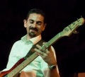
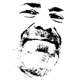
Hello Lenza. Sorry if I'm honest, but it is not your best photos ...
His face and the dog are very "Bologna walkers", but there is too much mess, in my opinion.
The sign you can cut without problems, but scooters are ...
I do not know, maybe strigendola much you can neutralize a bit ', but so disturbing.
I close with compliments for the gallery.
Ciao Lenza. Scusa se sono onesto, ma non è la tua foto migliore...
La sua faccia e il cane sono molto "Bologna walkers", ma c'è troppo casino, secondo me.
Il cartello lo puoi tagliare senza problemi, ma i motorini restano...
Non so, forse strigendola molto puoi neutralizzarli un po', ma così disturbano.
Chiudo con i complimenti per la galleria.
|
| sent on October 03, 2016 (23:51) | This comment has been automatically translated (show/hide original)
considering the other photos in your gallery this is not very good ...
As said by stain their scooters behind the "type" spoil a bit the nice atmosphere created ...
Tried a vertical cropping and is much better but it becomes a portrait and you lose the urban setting, perhaps expected during shooting who knows ...
considerando le altre foto della tua galleria questa non è un granché...
Come detto da macchia i motorini proprio dietro il "tipo" rovinano un po l'atmosfera carina creatasi...
Provato un ritaglio verticale e viene decisamente meglio ma diventa un ritratto e perdi l'ambientazione urbana, magari previsto in fase di scatto chissà...
|
| sent on October 04, 2016 (0:16) | This comment has been automatically translated (show/hide original)
The gallery I like, I do not think one of the best shots, disturb the scooters on fire and cut sign, odd that af 2.2 is all so 'little focus behind: -o, by chance is a crop? La galleria mi piace, questo non lo ritengo uno degli scatti migliori, disturbano i motorini a fuoco e il cartello tagliato, strano che a f 2,2 sia tutto cosi' poco sfuocato dietro  , per caso è un crop ? , per caso è un crop ? |
| sent on October 04, 2016 (0:41) | This comment has been automatically translated (show/hide original)
To me the picture does not say much, I do not find the person suitable for the region, as if posing.
I agree on the white a little 'to the limit.
From what I've seen of the gallery I think there's great material. Anche a me la foto non dice molto, non trovo il soggetto adatto al contesto, quasi fosse in posa.
Sono d'accordo sui bianchi un po' al limite.
Da quello che ho visto della galleria penso che ci sia ottimo materiale. |
user81826 | sent on October 04, 2016 (8:45) | This comment has been automatically translated (show/hide original)
For me you did a good job in making it interesting shot with b / n although whites are fired shoes / mesh etc. They are annoying and I also seem burned on the laces, hair etc.
The subject is special and you have caught a beautiful smile; unfortunately it remains too detached from the environment where it is and it does not seem, to me at least, perform a particular function, and if we took the subject with pasting dog on a green lawn for a walk, little would change anything. Per me hai fatto un buon lavoro nel rendere lo scatto interessante col b/n anche se i bianchi sparati su scarpe/maglia ecc. sono fastidiosi e a me sembrano anche bruciati sui lacci, i capelli ecc.
Il soggetto è particolare e ne hai colto un bel sorriso; purtroppo rimane troppo distaccato dall'ambiente in cui si trova e che non sembra, almeno a me, espletare una funzione particolare e se prendessimo il soggetto col cane incollandoli su un prato verde a fare una passeggiata, cambierebbe poco nulla. |
| sent on October 04, 2016 (9:10) | This comment has been automatically translated (show/hide original)
But you have recovered much? Even looking at the picture in HD, it seems battered.
Compositionally speaking, it seems to me a posing needless so successful. The one-armed street sign not like.
The falling lines left equals and scooters on the bottom get confused. Ma hai recuperato tanto? Anche guardando la foto in hd, mi sembra malconcia.
Compositivamente parlando, mi sembra una messa in posa manco tanto riuscita. Il cartello stradale monco non mi piace.
Le linee cadenti a sinistra uguale e gli scooter sul fondo fanno confusione. |
| sent on October 04, 2016 (9:36) | This comment has been automatically translated (show/hide original)
Urca I try to reply to all, this specimen represents the category "Fighetti of Bolo-well."
The pose that seems forced I took it on purpose to show how they want to show themselves to the world, more precise, smiling with the dog breed etc ...
The crop is just to straighten lines drooping in the corners.
I agree on the sign, better remove it.
On scooters, to tell the truth I barely noticed them, but if I will bother us more attention.
For the PP discourse, there are no heavy recoveries and whites are not burned (at least in the photo offline silverefex tells me that they are 9 to 10 and then the details are there in theory) maybe it's a problem when exporting or similar!
Thank you all for the comments, because this photoI really like but I know that I am not able to convey the message! Urca provo a rispondere a tutti, questo esemplare rappresenta la categoria dei "Fighetti della Bolo-bene".
La posa che sembra forzata l'ho colta appositamente per far vedere come vogliono mostrarsi al mondo, sempre precisi, sorridenti, con il cane di razza ecc...
Il crop è giusto per raddrizzare le linee cadenti negli angoli.
Concordo sul cartello, meglio rimuoverlo.
Sui motorini, a dire il vero a malapena li avevo notati, ma se disturbano ci farò più attenzione.
Per il discorso PP, non ci sono pesanti recuperi e i bianchi non sono bruciati (almeno nella foto offline silverefex mi dice che sono dei 9 su 10 quindi le info ci sono in teoria) forse è un problema di esportazione o simili!
Grazie a tutti per i commenti, perché questa foto mi piace molto ma mi sa che non son riuscito a veicolare il messaggio! |
| sent on October 04, 2016 (10:36) | This comment has been automatically translated (show/hide original)
As suggested earlier by the other I eliminated a minimum the right area making the subject less central, more would have eliminated the sign at pp.
Your explanation has improved by far the understanding and the beauty of the image ;-)
Ps Excellent gallery :-) Come consigliato in precedenza dagli altri avrei eliminato un minimo la zona di dx rendendo il soggetto meno centrale, in più avrei eliminato il cartello in pp.
La tua spiegazione ha migliorato di gran lunga la comprensione e la bellezza dell'immagine 
P.s. Ottima galleria  |
user81257 | sent on October 04, 2016 (11:32) | This comment has been automatically translated (show/hide original)
Although whites are not burned, but they are very very pushy and reportedly wearing them to the main subject, give enough discomfort (in my opinion).
The scooter also disturb me, just because they are in the main scene.
One of the tips that I often read carefully the background in photography is exactly what the main subject.
Overall the picture is not too bad, but it is not the maximum.
For the message, unfortunately I think is restricted to residents of Bologna, such as I who are in Rome this thing I did not know.
A good exercise, but for now only that ;-)
Marco. Anche se i bianchi non sono bruciati, però sono molto molto invadenti e, stando li addosso al soggetto principale, danno abbastanza fastidio (a mio parere).
I motorino disturbano anche me, proprio perché sono nella scena principale.
Uno dei consigli che leggo spesso in fotografia è cura lo sfondo esattamente quanto il soggetto principale.
Nel complesso la foto non è malaccio, ma non è neanche il massimo.
Per il messaggio, purtroppo penso sia limitato agli abitanti di Bologna, ad esempio io che sono di Roma questa cosa non la sapevo.
Un buon esercizio, ma per ora solo quello
Marco. |
| sent on October 04, 2016 (17:51) | This comment has been automatically translated (show/hide original)
“ this specimen represents the category "Fighetti of Bolo-well."
The pose that seems forced I took it on purpose to show how they want to show themselves to the world, more precise, smiling with the dog breed etc ... „
Here is the importance of the group! I learned from Mark the importance of correctly (in theory): two lines like this below the photo instead invitation to comment to the gallery nail the subject in its context! One that has nothing to do with Bologna alleys and scooters students. One that should stay somewhere else and this is isolated and apparently out of context. " questo esemplare rappresenta la categoria dei "Fighetti della Bolo-bene".
La posa che sembra forzata l'ho colta appositamente per far vedere come vogliono mostrarsi al mondo, sempre precisi, sorridenti, con il cane di razza ecc... "
Ecco l'importanza del gruppo! Ho appreso da Marco l'importanza del giusto titolo (in teoria): due righe come questa sotto la foto invece dell'invito al commento alla galleria inchiodano il soggetto nel suo contesto! Uno che non c'entra nulla con la Bologna dei vicoli e dei motorini degli studenti. Uno che dovrebbe stare da un'altra parte e per questo è isolato ed evidentemente fuori contesto.
Tecnicamente il "bruciato" resta stonato, ma ha un senso per il messaggio che volevi mandare, come se volessi esagerare il suo essere fuori luogo. |
| sent on October 04, 2016 (18:35) | This comment has been automatically translated (show/hide original)
Look at the message there 'arrives, just look superficially and arrives.
Scooters keep them It is a photo of street not made in the studio, I told you to cut more than another sign to place the subject in a manner ideal for the composition. The photo and 'good, not look at the likes those count relatively.
Still I do not understand comments like "nice good pictures" and then not cé 'the like. ???
It's fine for the purpose are the comments, but 'if you like let's put them. :-D
Happened to me ... never mind ... then I remembered, I e'presi by the comment and then .... :-D Guarda il messaggio c'e' arriva, basta guardare non superficialmente e arriva.
I motorini tienili e'una foto street non fatta in studio, ti dicevo di tagliare il cartello più che altro per posizionare il soggetto in maniera ideale per la composizione. La foto e' buona, non guardare i likes quelli contano relativamente.
Comunque non capisco commenti tipo "foto bella bravo"e poi non cé' il like. ???
Va bene che lo scopo sono i commenti, pero' se piace mettiamoli.
Capitato anche a me...figuriamoci...poi mi sono ricordato, si e'presi dal commento e poi.... |
| sent on October 04, 2016 (20:08) | This comment has been automatically translated (show/hide original)
It is a good Street, sympathetic character with a beautiful expression .... but it does not strike me as the other tunnel. Maybe because I see little isolated the subject, there is a little 'behind the casino.
Too fired white :-) È una buona Street, personaggio simpatico con una bella espressione.... ma non mi colpisce come le altre della galleria. Forse perché vedo poco isolato il soggetto, c'è un po' di casino dietro.
Troppo sparati i bianchi |
| sent on October 04, 2016 (22:01) | This comment has been automatically translated (show/hide original)
The cartel cut is unfortunate because inevitably the eye, after a quick glance to the main subject, ends up falling right there! For the rest is a snap alone does not shine particularly but, placed in the context of the gallery, makes sense. Technically conversion bn do not mind: the high lights burned, mainly on the subject, on the one hand disturb a bit '(not too much) on the other literally detached from the context, and I think it was this your intention. Il cartello tagliato è un peccato perché inevitabilmente l'occhio, dopo una rapida occhiata al soggetto principale, finisce per cadere proprio lì! Per il resto è uno scatto che da solo non brilla particolarmente ma, inserito nel contesto della galleria, acquista un senso. Tecnicamente la conversione in bn non mi dispiace: le alte luci bruciate, principalmente sul soggetto, se da una parte disturbano un po' (neanche troppo) dall'altra letteralmente lo staccano dal contesto e credo fosse questo il tuo intento. |
| sent on October 04, 2016 (22:21) | This comment has been automatically translated (show/hide original)
The message goes to 100% ... I have in mind the kind of character that you wanted to represent, and photos, from this point of view (which is the most important) works.
My were only notes concerning the aesthetics, which is largely subjective. Il messaggio passa al 100%... Ho ben presente il tipo di personaggio che hai voluto rappresentare, e la foto, da questo punto di vista (che è sicuramente il più importante) funziona.
I miei erano solo appunti riguardanti l'estetica, che è in gran parte soggettiva. |
| sent on October 04, 2016 (22:27) | This comment has been automatically translated (show/hide original)
Personally I find the scooters in this shot a very impactful nuisance. Even just choosing a pdr far right would be enough to not have them behind the subject. Personalmente in questo scatto trovo gli scooter un elemento di disturbo molto impattante. Anche solo scegliendo un pdr più a destra sarebbe stato sufficiente per non averli dietro al soggetto. |
| sent on October 06, 2016 (21:33) | This comment has been automatically translated (show/hide original)
After your explanation the message has arrived and I upped the shooting. I find it interesting, although I would see better with a vertical cut. Hello Dopo la tua spiegazione il messaggio è arrivato e ho rivalutato la scatto. La trovo interessante, anche se l'avrei vista meglio con un taglio verticale. Ciao |
|

Publish your advertisement on JuzaPhoto (info) |

 Bologna Walkers

 JuzaPhoto contains affiliate links from Amazon and Ebay and JuzaPhoto earn a commission in case of purchase through affiliate links.


 2.0 MEGAPIXEL
 Resize to fit window