What do you think about this photo?Do you have questions or curiosities about this image? Do you want to ask something to the author, give him suggestions for improvement, or congratulate for a photo that you really like?
You can do it by joining JuzaPhoto, it is easy and free!
There is more: by registering you can create your personal page, publish photos, receive comments and you can use all the features of JuzaPhoto. With more than 242000 members, there is space for everyone, from the beginner to the professional.
| sent on February 12, 2016 (21:27) | This comment has been automatically translated (show/hide original)
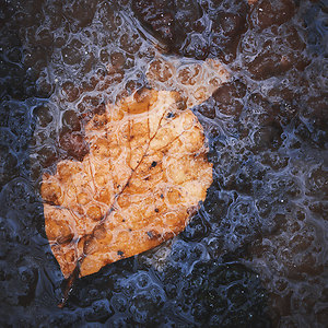
Actually can remember Monet; beautiful, congratulations.
Mauro Effettivamente può ricordare Monet; bella, complimenti.
Mauro |
| sent on February 12, 2016 (22:19) | This comment has been automatically translated (show/hide original)
It is always a pleasure to watch different images of a place so much photographed. beautiful image È sempre un piacere guardare immagini diverse di un luogo così tanto fotografato. Immagine stupenda |
| sent on February 13, 2016 (9:20) | This comment has been automatically translated (show/hide original)
Very nice moved to recall the style of the Impressionists, also excellent composition, if I can ... I think even monet would be offended if the caricavi a bit 'more to color level ;-)
Hello
Claudio Molto bello il mosso a richiamare lo stile degli impressionisti, ottima anche la composizione, se posso... penso che neanche monet si sarebbe offeso se la caricavi un po' di più a livello cromatico 
Ciao
Claudio |
| sent on February 13, 2016 (12:42) | This comment has been automatically translated (show/hide original)
Thanks for the comments!
Anthony: Thank you very much, I'm glad that the photo you like! Iceland is now almost always see images from the same places also because, in my opinion, there is this strange mechanism by which people only appreciate that type of picture. A nice photo of Vestrahorn, for example, is always "well received" on the Internet, different things are frequently not considered. From my point of view is the exact opposite: as much as I can appreciate (and also do) photographs in the most popular places these images are now truly "superfluous" and are not of particular interest. Then, looking at the commercial aspect, the "usual" images seems to be the only ones to ensure great returns.
Turibol: thank you so much of your feedback. From my point of view aumenterei not in any way, the saturation of this image! :) It wants to be a "story" of a part of Icelandic nature, a bit ethereal and dream a little.
The colors of the tundra and birch trees, in fact, are also varied but not overly saturated. Thanks again and greetings! Grazie mille per i commenti!
Antonio: grazie mille, sono contento che la foto ti piaccia! Dell'Islanda si vedono ormai quasi sempre immagini dagli stessi luoghi anche perchè, secondo me, c'è questo strano meccanismo per il quale le persone apprezzano solo quel tipo di foto. Una bella foto dei Vestrahorn, ad esempio, viene sempre "ben accolta" su internet, cose diverse vengono invece spesso non considerate. Dal mio punto di vista è l'esatto contrario: per quanto io possa apprezzare (e fare anche) fotografie nei luoghi più noti queste immagini risultano ormai veramente "superflue" e prive di particolare interesse. Poi, osservando l'aspetto commerciale, le "solite" immagini sembra siano le uniche a garantire grandi ritorni.
Turibol: grazie mille del tuo feedback. Dal mio punto di vista non aumenterei nel modo più assoluto la saturazione di questa immagine! :) Essa vuole essere un "racconto" di una parte della natura islandese, un pò eterea ed un pò onirica.
I colori della tundra e delle betulle, nella realtà, sono poi variegati ma non particolarmente saturi. Grazie ancora ed un saluto! |
| sent on February 13, 2016 (13:53) | This comment has been automatically translated (show/hide original)
Vincenzo quoto every word;) Vincenzo quoto ogni singola parola ;) |
| sent on February 13, 2016 (14:08) | This comment has been automatically translated (show/hide original)
Knowing I was certain that your choice was not dictated by the case ;-)
Maybe the title at this point is not entirely apt :-) Conoscendoti ero certo che era una tua scelta non dettata dal caso
Magari il titolo a questo punto non è del tutto azzeccato  |
| sent on February 13, 2016 (14:39) | This comment has been automatically translated (show/hide original)
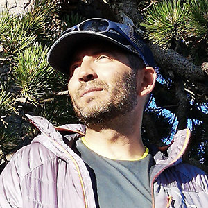
I agree with your thinking Vincenzo on "shots / subjects" inflated .. in my opinion, I find much more interesting than a photograph like this than the usual location, even if well-executed .. here it perceives the interpersonal work, intimate, artistic photographer, added value in the international scene. Shooting unequivocally represents the moment caught, thanks to the dynamism of opposition / immobility that you have been able to well represent. Concordo con il tuo pensiero Vincenzo sul tema "inquadrature/soggetti" inflazionati.. a mio modo di vedere, trovo molto più interessante una fotografia come questa rispetto alla solite location, se pur ben eseguite.. qui si percepisce il lavoro interpersonale, intimo e artistico del fotografo, valore aggiunto nel panorama internazionale. Lo scatto rappresenta in modo inequivocabile il momento colto, grazie alla contrapposizione dinamismo/staticità che hai saputo ben rappresentare. |
| sent on February 14, 2016 (10:33) | This comment has been automatically translated (show/hide original)
Thank you so much Gabriele for appreciation and comment! :)
Grazie mille Gabriele per l'apprezzamento ed il commento! :)
|
user81257 | sent on February 23, 2016 (11:20) | This comment has been automatically translated (show/hide original)
wow!
I do not believe that that effect of "brush" you've got only with the rough, tell me that's not true: -D
I agree with the colors slightly more saturated, especially given the season you went to take pictures, but it is a slight detail.
For the rest, excellent picture, really.
----------
MC
[URL =] www.facebook.com/FotografiePerBeneficenza 
Non ci credo che quell'effetto di "spennellate" lo hai ottenuto solo con il mosso, dimmi che non è vero 
Concordo con i colori leggermente più saturi, soprattutto vista la stagione che sei andato a fotografare, ma è un leggero dettaglio.
Per il resto, ottima foto, veramente.
----------
MC
www.facebook.com/FotografiePerBeneficenza |
| sent on February 29, 2016 (0:10) | This comment has been automatically translated (show/hide original)
And 'A PHOTO BEAUTIFUL AS THE REST OF YOUR GALLERIES
COMPLIMENTS
A GREETING E' UNA FOTO BELLISSIMA COME DEL RESTO LE TUE GALLERIE
COMPLIMENTI
UN SALUTO |
| sent on January 27, 2017 (1:28) | This comment has been automatically translated (show/hide original)
Usually I look at the images of the landscape, here on Juza, to learn the technique .. The landscape is not "my" photography, though (really I have not found it yet)
This caught me.
I love it so ... I do not see more saturated ... the blur you would see more and lose its effect ... painting.
Are some of the inflation immagini..io agreement I add that there is also inflation "vision."
What sense does it make good postcards not the 'I never understood ... But interpretare..aggiungere an item ... or, as in this case, through the colors to even imagine the wind, I find that makes the wonderful image. ..and that helps the viewer ... to "be there." Thank you. Solitamente osservo le immagini dei paesaggisti, qui su Juza, per imparare la tecnica.. Il paesaggio non è "la mia" fotografia, però (veramente non l'ho ancora trovata )
Questa mi ha catturato.
Mi piace così...non la vedo più satura...il mosso si vedrebbe di più e perderebbe il suo effetto... dipinto.
Sono d'accordo sull'inflazione di alcune immagini..io ci aggiungo che vi è anche inflazione di "visione".
Che senso ha produrre delle belle cartoline non l' ho mai capito... Ma interpretare..aggiungere un elemento...o, come in questo caso, attraverso i colori far immaginare anche il vento, trovo che renda l'immagine meravigliosa...e che aiuti chi la osserva...ad "esserci". Grazie. |
| sent on August 13, 2017 (19:53) | This comment has been automatically translated (show/hide original)
Thank you very much for the comments Marco, Mauri and Ros1
Marco: I confirm that the brush strokes are the effect of the wind movement (obviously sought)
Grazie mille per i commenti Marco, Mauri e Ros1
Marco: ti confermo che le spennellate sono effetto del mosso del vento (cercato ovviamente)
|
|
Publish your advertisement on JuzaPhoto (info) |


 JuzaPhoto contains affiliate links from Amazon and Ebay and JuzaPhoto earn a commission in case of purchase through affiliate links.


 Resize to fit window