What do you think about this photo?Do you have questions or curiosities about this image? Do you want to ask something to the author, give him suggestions for improvement, or congratulate for a photo that you really like?
You can do it by joining JuzaPhoto, it is easy and free!
There is more: by registering you can create your personal page, publish photos, receive comments and you can use all the features of JuzaPhoto. With more than 243000 members, there is space for everyone, from the beginner to the professional.
| sent on January 24, 2014 (21:54) | This comment has been automatically translated (show/hide original)
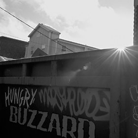
beautiful light and intense scene. has quite a story.
compliments
bella la luce e intensa la scena. ha un bel racconto.
complimenti
|
| sent on January 24, 2014 (22:35) | This comment has been automatically translated (show/hide original)
thank you very much ;-)
perhaps I left too much air at the top, the next time a similar situation I happen even try some shots horizontally. grazie mille 
forse ho lasciato troppa aria in alto, la prossima volta che mi ricapita una situazione simile provo anche qualche scatto in orizzontale. |
| sent on January 24, 2014 (22:51) | This comment has been automatically translated (show/hide original)
This size is in proportion to 30x45. very often in fine art prints, exhibitions, is cut in proportion 30x40 format which is a very interesting, always rectangular, but a little 'less. is a format that is used a lot in this proportion and it shows the card in b / w that is produced in various formats, but not always in proportion 30x40 and 30x45 (apart from the small sizes such as 10x15 and 12x18 that are filled), this serves also to eliminate vignetting various angles and very often the format is more pleasant to the eyes. clear that we should cut 2.5 cm from side to side. it happens that sometimes you're forced to cut everything on one side and this decompensates the brightness in the press because as you know the goals are brighter in the center and gradually darken towards the corners. therefore it is easy to imagine that if cuts from one part, that part rimane clearer of the other, including vignetting that is only from one side. then this is corrected in post production by lowering the brightness and / or creating vignetting and / or lightening the uncut side (lots of options at your choice).
you can try to remove these 5 cm above the head of the subjects. then controls the brightness, it is not always said you have to intervene, but if your eye sees something you have to work on that side. questo formato è in proporzione 30x45. molto spesso nelle stampe fine art, nelle mostre, viene tagliato in proporzione 30x40 che è un formato molto interessante, sempre rettangolare ma un po' meno. è un formato che si usa molto in questa proporzione e lo dimostra la carta in b/n che viene prodotta nei vari formati ma sempre in proporzione 30x40 e non 30x45 ( a parte i formati piccoli come il 10x15 e 12x18 che sono pieni ) questo serve anche ad eliminare vignettature varie agli angoli e molto spesso il formato risulta più piacevole agli occhi. chiaro che bisognerebbe tagliare 2,5 cm da un lato e dall'altro. succede che a volte sei costretto a tagliare tutto da una parte e questo scompensa la luminosità sulla stampa perchè come sai gli obiettivi al centro sono più luminosi e pian piano scuriscono verso gli angoli. quindi è facile immaginare che se tagli da una parte, quella parte rimane più chiara dell'altra, compreso vignettatura che risulta solo da un lato. questo poi viene corretto in post produzione abbassando la luminosità e/o creando vignettatura e/o schiarendo il lato non tagliato ( un sacco di opzioni a tua scelta ).
puoi provare a togliere questi 5 cm sopra la testa dei soggetti. poi controlli la luminosità, non è sempre detto che devi intervenire ma se il tuo occhio nota qualcosa devi lavorare su quel lato. |
| sent on January 24, 2014 (22:55) | This comment has been automatically translated (show/hide original)
I would really recommend a very useful thank you. ;-) un consiglio davvero utilissimo ti ringrazio. |
|

Publish your advertisement on JuzaPhoto (info) |


 JuzaPhoto contains affiliate links from Amazon and Ebay and JuzaPhoto earn a commission in case of purchase through affiliate links.


 Resize to fit window