JuzaPhoto uses technical cookies and third-part cookies to provide the service and to make possible login, choice of background color and other settings (click here for more info).
By continuing to browse the site you confirm that you have read your options regarding cookies and that you have read and accepted the Terms of service and Privacy.
You can change in every moment your cookies preferences from the page Cookie Preferences, that can be reached from every page of the website with the link that you find at the bottom of the page; you can also set your preferences directly here
Do you have questions or curiosities about this image? Do you want to ask something to the author, give him suggestions for improvement, or congratulate for a photo that you really like?
There is more: by registering you can create your personal page, publish photos, receive comments and you can use all the features of JuzaPhoto. With more than 243000 members, there is space for everyone, from the beginner to the professional.
sent on August 27, 2013 (11:48) | This comment has been automatically translated (show/hide original)
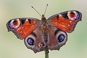
Very beautiful! Perfect clarity, however, I would have increased by more than the overall contrast to improve even more this shot. In addition to this I would have cloned the background points blacks most likely due to the sensor dirty. Molto bella! Nitidezza perfetta però io avrei aumentato di più il contrasto generale per migliorare ancora di più questo scatto. Oltre che a questo avrei clonato sullo sfondo i punti neri dovuti molto probabilmente al sensore sporco.
sent on August 27, 2013 (15:44) | This comment has been automatically translated (show/hide original)
What is missing to the subject is a bit 'of liveliness to the color, I think with curves Could you make it more alive. Quello che manca al soggetto è un po' di vivacità al colore, penso che con curve riusciresti a renderlo più vivo.
sent on August 27, 2013 (17:02) | This comment has been automatically translated (show/hide original)
Analysis careful you have already received. It is a good photo easily improved (excellent base ;-)), a classic well done! compliments, Roberto. Analisi tecniche attente ne hai già ricevute. Si tratta di una buona foto facilmente migliorabile (ottima la base! ), un classico ben fatto! complimenti, Roberto.
Ciao ragazzi e grazie del passaggio. Inanzitutto per lo sporco del sensore posso dire ci provo a togliere tutti i puntini neri, ma per quanto possa essere attento qualcosa ti sfugge sempre e puntualmente quando stampi salta fuori sempre qualcosa di strano. Dovrei decidermi a farlo pulire. Veniamo al discorso di contrasto e colore. Io sinceramente le guardo su un bel monitor (non facciamo nomi) calibrato e non sento tutta questa necessità di modificare troppe cose rispetto a quello che esce dalla macchina. Nel senso della fedeltà dei colori. D'altra parte se la vedete smorta o poco viva un motivo, giusto o sbagliato che sia, ci sarà
Vi andrebbe di perdere un po di tempo e farmi avere un'elaborazione che a vostro giudizio ha colori vivi il giusto e contrasto totale giusto? Mi sarebbe utile il confronto su ciò che propongo e ciò che viene visto dall'altra parte basandomi sul mio monitor. Non so come si possa fare ma potrei farvi avere anche il raw se interessa a tal fine. Ciao e grazie
sent on August 28, 2013 (11:58) | This comment has been automatically translated (show/hide original)
Sorry if I'm allowed to edit the photo in my opinion this is less dull than yours, try to see on your monitor as you can see!
Practically or set the tonal values ??and curves increased slightly the vividness and sharpness. Let me know how it is coming :-) Scusa se mi sono permesso di modificare la foto questa secondo me è meno smorta della tua, prova a vedere sul tuo monitor come si vede!
Praticamente o sistemato i valori tonali le curve e aumentato un po la vividezza e la nitidezza. Fammi sapere com'è venuta
Ciao enrico. Inanzitutto grazie per avermi tolto quella dominante arancio-rossa e grazie per avermi permesso il confronto sul mio monitor. Mi chiedi cosa ne penso? E' una bella versione. Il problema è che una melitaea non ha colori così saturi e neri così neri Ciao e non scusarti


 JuzaPhoto contains affiliate links from Amazon and Ebay and JuzaPhoto earn a commission in case of purchase through affiliate links.


 8.4 MEGAPIXEL
 Resize to fit window