What do you think about this photo?Do you have questions or curiosities about this image? Do you want to ask something to the author, give him suggestions for improvement, or congratulate for a photo that you really like?
You can do it by joining JuzaPhoto, it is easy and free!
There is more: by registering you can create your personal page, publish photos, receive comments and you can use all the features of JuzaPhoto. With more than 243000 members, there is space for everyone, from the beginner to the professional.
| sent on February 21, 2022 (17:01) | This comment has been automatically translated (show/hide original)
Good
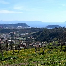
PPMio personal taste I would have given a little more contrast (selective).
The cut, I think it can be improved by going down the horizon and intercepting the diagonal in the corner to DX Buona PP
Mio gusto personale avrei dato un pò di contrasto (selettivo) in piu .
Il taglio, credo che sia migliorabile scendendo l orizzonte e intercettando la diagonale nell angolo a DX |
| sent on February 22, 2022 (9:53) | This comment has been automatically translated (show/hide original)
I don't know. The cut does not convince me, also because the eye is attracted a lot by the houses on the right. I see it a bit too homogeneous as colors. Of course they are always very subjective opinions, so you did very well to do so. Non so. Il taglio non mi convince, anche perché l'occhio viene attirato molto dalle case sulla destra. La vedo un po' troppo omogenea come colori. Naturalmente sono sempre pareri molto soggettivi, quindi hai fatto benissimo a farla così. |
| sent on February 22, 2022 (21:22) | This comment has been automatically translated (show/hide original)
but because what should be attracted to the eye in the original photo, there is nothing ma perche da cosa dovrebbe essere attratto l'occhio nella foto originale, non c'é niente |
| sent on February 22, 2022 (22:18) | This comment has been automatically translated (show/hide original)
The subject to me seems the sheets and their appearance a bit 'iridescent, but' as I said every interpretation is fine.
Il soggetto a me sembrano i teli e il loro aspetto un po' cangiante, pero' come ho detto ogni interpretazione va bene.
|
| sent on February 23, 2022 (17:18) | This comment has been automatically translated (show/hide original)
Little contrast Poca contrastata |
| sent on February 23, 2022 (21:19) | This comment has been automatically translated (show/hide original)
Completely changes the center of interest (or visual fulcrum, as you want) and perspective, putting a little aside the canvas sea and getting closer to the buildings on the side of the frame; to me the result from the compositional point of view does not convince completely, but they are tastes.
A thread flat tones and the general contrast, even if the image thus obtained is still quite balanced. Cambia completamente il centro d'interesse (o fulcro visivo, come volete voi)e prospettiva ,mettendo un pò in disparte il mare telato ed avvicinandosi maggiormente ai caseggiati al lato del frame; a me il risultato dal punto di vista compositivo non convince del tutto, ma sono gusti.
Un filo piatti i toni ed il contrasto generale,anche se l'immagine così ottenuta risulta comunque abbastanza equilibrata. |
| sent on February 26, 2022 (11:31) | This comment has been automatically translated (show/hide original)
The cut does not convince me, and I find it a bit 'little contrasted Il taglio non mi convince, e la trovo un po' poco contrastata |
|

Publish your advertisement on JuzaPhoto (info) |


 JuzaPhoto contains affiliate links from Amazon and Ebay and JuzaPhoto earn a commission in case of purchase through affiliate links.


 2.2 MEGAPIXEL
 Resize to fit window