What do you think about this photo?Do you have questions or curiosities about this image? Do you want to ask something to the author, give him suggestions for improvement, or congratulate for a photo that you really like?
You can do it by joining JuzaPhoto, it is easy and free!
There is more: by registering you can create your personal page, publish photos, receive comments and you can use all the features of JuzaPhoto. With more than 243000 members, there is space for everyone, from the beginner to the professional.
| sent on March 12, 2017 (22:25) | This comment has been automatically translated (show/hide original)
Great insight and really well done shooting Grande intuizione e scatto veramente ben realizzato |
| sent on March 12, 2017 (22:52) | This comment has been automatically translated (show/hide original)
very beautiful and richard stark message arrives immediately. It works quietly without caption, perhaps by inserting the post in the title or in the photo data.
compliments. molto bella riccardo e messaggio crudo, arriva subito. funzionerebbe tranquillamente anche senza didascalia, magari inserendo il posto nel titolo o nei dati della foto.
complimenti. |
user72446 | sent on April 10, 2017 (10:51) | This comment has been automatically translated (show/hide original)
consumerism breaks down every ideology ............ ITA! il consumismo abbatte ogni ideologia............Bellissimo scatto! |
user90373 | sent on April 10, 2017 (11:50) | This comment has been automatically translated (show/hide original)
If it were not for the caption we could be the Unity party Roncobilaccio and would thus lose some of syncretism. :-) Se non fosse per la didascalia potremmo essere alla festa dell'Unità di Roncobilaccio e si andrebbe così a perdere un pò del sincretismo.  |
| sent on April 10, 2017 (12:07) | This comment has been automatically translated (show/hide original)
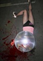
Message well represented. Beautiful diagonal cut of the picture, gives dynamism.
The only flaw, which, however, does not affect the shooting intentions, the flare is given from the center of the photo lamppost.
Since the name of the fast food is already cut, I would have tried to tighten the face of the girl sitting behind the railing, perhaps looking for a PDR that would allow me to have the framed face. Messaggio ben rappresentato. Bello il taglio diagonale della foto, dona dinamicità.
Unica pecca, che però non incide sulle intenzioni dello scatto, è il flare dato dal lampione a centro foto.
Visto che il nome del fast food è già tagliato, avrei cercato di stringere sul volto della ragazza seduta dietro la ringhiera, magari cercando un pdr che mi permettesse di avere il viso incorniciato. |
| sent on April 10, 2017 (12:14) | This comment has been automatically translated (show/hide original)
@Emiliano
@Ettore
@Kun
thanks for the ride and assessments.
Hector has done the most interesting observation, that I had not the least considered: the context is totally lacking in the absence of an adequate presentation could be anywhere.
Oh God, no ... certainly not just anywhere in the United States. :-D
@Emiliano
@Ettore
@Kun
grazie per il passaggio e le valutazioni.
Ettore ha fatto l'osservazione più interessante, evidenziando un aspetto che io non avevo minimamente considerato: il contesto manca totalmente, in mancanza di una presentazione adeguata potremmo essere ovunque.
Oddìo, proprio ovunque no... certamente non negli Stati Uniti. 
Comunque si tratta di un errore grave per un'immagine che si propone come "di reportage".
Meno grave forse se inserita in una serie, come l'avevo pensata in origine, ma non è questo il caso: io l'ho proposta come immagine unica e come tale va valutata.
Temo che gli altri commenti rimarcheranno più o meno tutti -giustamente, sottolineo- questo aspetto.
Trovo comunque che l'idea di fondo, e cioé il contrasto tra i due simboli forse più lontani tra loro nel mondo così come lo conosciamo, arrivi lo stesso anche se con forza attenuata dalla mancata contestualizzazione. |
| sent on April 10, 2017 (13:48) | This comment has been automatically translated (show/hide original)
Beautiful mixed message between capitalism and communism, and if the message is strong do not need comments on technique .... Bellissimo il messaggio contrastante tra capitalismo e comunismo, e se il messaggio è forte non servono commenti sulla tecnica.... |
| sent on April 10, 2017 (14:48) | This comment has been automatically translated (show/hide original)
Bel contrast between capitalism and communism, but as already mentioned by other lacks the contextualization: as realized the image, the place could be any, wasting much of the same image contrast between political statements and facts.
I wish you would cut the railing not seen the top of the woman. Bel contrasto tra capitalismo e comunismo, ma come già detto da altri manca la contestualizzazione: così com'è realizzata l'immagine, il posto potrebbe essere qualunque, facendo perdere all'immagine stessa molto del contrasto tra proclami politici e realtà dei fatti.
Avrei preferito che la ringhiera non tagliasse il visto della donna in alto. |
| sent on April 10, 2017 (15:18) | This comment has been automatically translated (show/hide original)
I think the picture is very good, and the context is not necessary just the explanation, indeed enlarge image would lose strength all'accoppiata flags teaches
I would like to take a trivial example, I saw a messenger job as reportage where you could see different desert landscapes, then I asked why we talk about reportage, then I read the description and I understand the strength of the work, all the images are done in Packistan and show boundaries between mined areas and those cleaned ... only that the boundaries are often unseen, the report says these boundaries and looking at the pictures you will immediately understand the severity of the problem.
All this rigmarole I wrote it because a job often need a caption to be understood, and I see no error in the image Secondo me la foto è ottima e contesto non è necessario basta la spiegazione, anzi allargare immagine avrebbe fatto perdere forza all'accoppiata bandiere insegna
Vorrei fare un esempio banale, ho visto un lavoro messo come reportage dove si vedevano diversi paesaggi desertici, allora mi sono chiesto perchè si parla di reportage, poi ho letto la descrizione e ho capito la forza del lavoro, tutte le foto sono fatte in Packistan e mostrano confini tra zone minate e quelle ripulite...solo che i confini spesso sono invisibili, quel reportage racconta questi confini e guardando le foto si capisce subito la gravità del problema.
Tutta questa tiritera l'ho scritta perchè un lavoro spesso necessità di una didascalia per essere compreso e non vedo nessun errore nell'immagine
Ovvio che il contesto puo anche essere espresso con altre foto, un reportage non è mai una singola foto, ma una serie, un racconto coeso e coerente |
user117231 | sent on April 10, 2017 (18:42) | This comment has been automatically translated (show/hide original)
Full of meaning and also of forms ... so something for everyone. 8-) Densa di significati e anche di forme...quindi per tutti i gusti.  |
| sent on April 10, 2017 (21:11) | This comment has been automatically translated (show/hide original)
The message is more direct than ever. Here comes all right. You have approached very well the devil to holy water. In fact contextualization as proposed by Ettore would be so good and right. The writing of the McDonald would have preferred to see it whole, but cmq get the same message. Very conceptual, I would try to prefer a different PDR, not taken at random .. Il messaggio è piu che mai diretto. Arriva eccome. Hai accostato molto bene il diavolo all acqua santa. In effetti una contestualizzazione come proposto da Ettore sarebbe cos buona e giusta. La scritta del mc donald avrei preferito vederla intera, ma cmq arriva lo stesso il messaggio. Molto concettuale, avrei provato a prediligere un pdr diverso, meno scattata a caso.. |
| sent on April 10, 2017 (21:33) | This comment has been automatically translated (show/hide original)
Excellent, I do not add more: cool:
Congratulations Richard! Ottima, non aggiungo altro:cool:
Complimenti Riccardo! |
| sent on April 10, 2017 (22:11) | This comment has been automatically translated (show/hide original)
effectively cut it further reinforces the message ... congratulations Taglio efficace che rende ancora più forte il messaggio...complimenti |
user81826 | sent on April 11, 2017 (12:36) | This comment has been automatically translated (show/hide original)
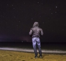
The subject is very interesting, very, however, lacks all the care I expect from a shot of the author. There is no color management, there is no light management, the composition may work but it does not satisfy me.
I do not see references to Vietnam if not 0iccola star and I would like to see, perhaps due to a person in the foreground. Il soggetto è molto interessante, davvero molto, però manca tutta la cura che mi aspetto da uno scatto d'autore. Non c'è gestione del colore, non c'è gestione della luce, la composizione può funzionare ma non mi soddisfa.
Non vedo richiami al Vietnam se non la 0iccola stellina e mi sarebbe piaciuto vederne, magari grazie ad una persona in primo piano. |
| sent on April 11, 2017 (13:59) | This comment has been automatically translated (show/hide original)
As always excellent photos. It looks like a still image from the film (strictly 4k). The contrast between the toni rossi, blue tones and in the minority yellow exalt the shooting lines. Beautiful realization. Come sempre un'ottima foto. Sembra quasi un fermo immagine da film (rigorosamente 4k). Il contrasto tra i toni rossi, i toni blu ed in minoranza i gialli esaltano le linee dello scatto. Bellissima realizzazione. |
| sent on April 11, 2017 (17:55) | This comment has been automatically translated (show/hide original)
Beauteous eyes ... but now we've used ... I think it is right that labirint Hector. A middle ground could be put it in a gallery dedicated to Vietnam ;-). For the rest nothing that can be of help :-P Bell'occhio...ma ormai ci hai abituato...secondo me ha ragione sia labirint che Ettore. Una via di mezzo potrebbe essere inserirla in una galleria dedicata al Vietnam . Per il resto nulla che possa esserti di aiuto . Per il resto nulla che possa esserti di aiuto |
| sent on April 11, 2017 (18:09) | This comment has been automatically translated (show/hide original)
@ Riccardo.asselta
@Alexmi
@Labirint
@Io Ro
@Nico Angels
@Baribal
@ Bambi's Revenge
@PaoloPgC
@Ronkybuz
@ Ales5a78
Thanks to all for the passage and the feedback.
Special thanks to Labirint, whose opinion is very close to the way I saw this when I took it: the photo was all there, in the proximity of the opposite poles. Besides, I did not worry much, and certainly this is not very "photographic" but at least I am certain that the shot say what I wanted him to say, the rest would be an embellishment, improvement definitely but I think not essential. @Riccardo.asselta
@Alexmi
@Labirint
@Io Ro
@Nico Angeli
@Baribal
@Bambi's Revenge
@PaoloPgC
@Ronkybuz
@Ales5a78
grazie a tutti per il passaggio e le valutazioni.
Un ringraziamento particolare a Labirint, il cui parere si avvicina molto al modo in cui ho visto questa immagine quando l'ho scattata: la foto stava tutta lì, nella vicinanza tra gli opposti poli. Del resto non mi sono preoccupato molto e certamente questo non è molto "fotografico" ma almeno ho la certezza che lo scatto dica quello che volevo che dicesse, il resto sarebbe stato un abbellimento, migliorativo senz'altro ma io credo non essenziale. |
| sent on April 12, 2017 (11:04) | This comment has been automatically translated (show/hide original)
I have to tell you the truth, I looked at the picture without reading the caption, and the contrast between the political symbol and the commercial I noticed it right away.
So from the point of view of content, the picture is formally correct.
E 'from the perspective of the composition (which is the one that is closest to my heart), that leaves me a bit' puzzled.
There are too many irons in the fire. The tip eye directly on the lamppost, and then turns around looking for items.
And the elements are the weakest element of the image. Twice the brand is cut in half. It 'true that with Coke is probably the most recognizable brand on the planet, but also the eye wants its part.
In conclusion, for me, a shot managed to half.
Devo dirti la verità, mi sono guardato la foto senza leggere la didascalia, ed il contrasto tra il simbolo politico e quello commerciale l'ho notato subito.
Quindi dal punto di vista dei contenuti, la foto è formalmente corretta.
E' dal punto di vista della composizione (che è quella che mi sta più a cuore), che mi lascia un po' perplesso.
C'è troppa carne al fuoco. L'occhio punta direttamente sul lampione, e poi gira intorno alla ricerca di elementi.
E sono gli elementi il punto debole dell'immagine. Due volte il brand è tagliato a metà. E' vero che insieme a coca cola è probabilmente la marca più riconoscibile del pianeta, ma anche l'occhio vuole la sua parte.
Buona la scelta del taglio diagonale, che aggiunge dinamismo al tutto.
In conclusione per me, uno scatto riuscito a metà.
|
| sent on April 12, 2017 (15:51) | This comment has been automatically translated (show/hide original)
Thanks Maserc. The cutting of the written I tried, instinctively I decided that it was better to avoid readability. Futile, no doubt. In the first instance I tried a vertical that included the only two graphic logos by cutting entirely written, but the excessive brightness of the store and the illustrations inside me disturbed; in hindsight he might have made it better, although it would not add much in terms of information, they are identical places around the world. Grazie Maserc. Il taglio della scritta l'ho cercato, istintivamente ho valutato che fosse meglio evitarne la leggibilità. Futile, senza dubbio. In prima battuta avevo tentato una verticale che includesse i soli due loghi grafici tagliando del tutto le scritte, ma l'eccessiva luminosità del negozio e le figure all'interno mi disturbavano; col senno di poi forse avrebbe reso meglio, anche se non avrebbe aggiunto granché in termini di informazione, sono luoghi identici in tutto il mondo. |
| sent on April 16, 2017 (10:52) | This comment has been automatically translated (show/hide original)
The vertical cut is perfect ... the composition and opposed communism capitalism is beautiful. Obviously with tripod iso LOWEST etc ... was even better .... but I would not say it was a free hand Il taglio verticale è perfetto... la composizione e la contrapposizione comunismo capitalismo é bellissima. Ovvio che con treppiede iso piu bassi etc... era ancora meglio....ma non avrei detto che era a mano libera |
|

Publish your advertisement on JuzaPhoto (info) |


 JuzaPhoto contains affiliate links from Amazon and Ebay and JuzaPhoto earn a commission in case of purchase through affiliate links.


 1.9 MEGAPIXEL
 Resize to fit window