What do you think about this photo?Do you have questions or curiosities about this image? Do you want to ask something to the author, give him suggestions for improvement, or congratulate for a photo that you really like?
You can do it by joining JuzaPhoto, it is easy and free!
There is more: by registering you can create your personal page, publish photos, receive comments and you can use all the features of JuzaPhoto. With more than 242000 members, there is space for everyone, from the beginner to the professional.
| sent on October 25, 2016 (20:46) | This comment has been automatically translated (show/hide original)
Beautiful!
Greetings, Christiano. Bella!
Un saluto, Christiano. |
| sent on October 25, 2016 (20:46) | This comment has been translated
Thanks Christiano!! |
user28347 | sent on October 25, 2016 (21:08) | This comment has been automatically translated (show/hide original)
cool the flesh color as the mountains, and girl ;-) figo il color carne come i monti,e ragazza |
| sent on October 25, 2016 (21:48) | This comment has been automatically translated (show/hide original)
Thank you, it was just what I was looking for, I'm glad you've noticed !! Grazie, era proprio quello che ricercavo, sono contento che tu lo abbia notato!! |
| sent on October 26, 2016 (12:12) | This comment has been automatically translated (show/hide original)
Cinematic taste.
Very nice also for the color combination and the light captured.
Compliments,
Vincenzo Di gusto cinematografico.
Molto bella anche per l'accostamento cromatico e la luce catturata.
Complimenti,
Vincenzo |
| sent on October 26, 2016 (12:23) | This comment has been automatically translated (show/hide original)
Thank you for your compliments!! Grazie per i complimenti!! |
| sent on November 02, 2016 (7:53) | This comment has been automatically translated (show/hide original)
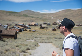
The colors are beautiful and I think they are the strong point of the picture. In my opinion there is a bit 'too much space behind the girl in light of the title. I think it might have been better to look for the shadow user to include in the shot all the long shadow of the model. I colori sono molto belli e credo siano il punto forte della foto. A mio avviso c'è un po' troppo spazio alle spalle della ragazza anche alla luce del titolo. Secondo me si sarebbe potuto ricercare meglio l'uso dell'ombra per includere nello scatto tutta l'ombra lunga della modella. |
| sent on November 02, 2016 (8:39) | This comment has been automatically translated (show/hide original)
The photo is technically successful, beautiful the blurred and she placed third on the right.
But I am not convinced: the rocks too present in the background does not make shooting a landscape and the girl too limited in the frame does not make a portrait. Another detail (but it's a detail) I find no correspondence between the title and the picture: her gaze turned to the nearby rocks, there is a horizon toward which to aim.
I really like the management of lights and colors. La foto è tecnicamente riuscita, bello lo sfuocato e la ragazza posizionata sul terzo di destra.
Però non mi convince: le rocce troppo presenti sullo sfondo non rendono lo scatto un paesaggio e la ragazza troppo limitata nel frame non lo rende un ritratto. Un altro dettaglio (ma è un dettaglio) non trovo corrispondenza tra titolo e foto: lo sguardo della ragazza è rivolto a rocce vicine, non c'è un orizzonte verso cui puntare.
Mi piace molto la gestione delle luci e delle cromie. |
| sent on November 02, 2016 (11:00) | This comment has been automatically translated (show/hide original)
I really like the choice of colors. For the composition I'd taken a bit 'more to the left by moving your subject even further to the right.
The background is a little 'too present, was blurred a bit' more, I see that you were already at full aperture, however. Mi piace molto la scelta dei colori. Per la composizione avrei anch'io ripreso un po' più a sinistra spostando il soggetto ancora di più sulla destra.
Lo sfondo è un po' troppo presente, andava sfocato un po' di più, vedo che eri già a tutta apertura però. |
| sent on November 02, 2016 (11:17) | This comment has been automatically translated (show/hide original)
The photos I like, of course color management is what makes it interesting! I agree with the choice of leaving the background slightly out of focus while the composition I find improvable. I moved toward the left pdr bringing the girl closest to the right edge of the frame and including a larger portion left. La foto mi piace, ovviamente la gestione del colore è ciò che la rende interessante! Condivido la scelta di lasciare lo sfondo leggermente fuori fuoco mentre la composizione la trovo migliorabile. Avrei spostato il pdr verso sx portando la ragazza più vicino al bordo dx del frame ed includendo una porzione maggiore a sx. |
| sent on November 02, 2016 (17:38) | This comment has been automatically translated (show/hide original)
I do not know how to explain .... the picture is very beautiful but the color bell'accostamento there and the beautiful composition I find it a bit closed in the sense that the model being of shoulders I imagine watching a scene while here I only see rocks! In a nutshell I missing a bit of the sky to give greater depth: - | Non so come spiegarmi....la foto è molto bella ma al di là del bell'accostamento di colori e della bella composizione la trovo un po chiusa, nel senso che la modella essendo di spalle mi immagino guardi un panorama mentre qui vedo solo rocce! In poche parole credo che manchi un po di cielo per dare maggior profondità  |
| sent on November 02, 2016 (19:26) | This comment has been automatically translated (show/hide original)
Meanwhile thank you all for the comments, now I try to answer, when it relates to the cut right in fact you're right, there's a little bit too much room on the right side !!
For the opening, of course it would be better a well larger aperture, however, I had assembled the 24-120 f4 and then more than I could not get down !!
While when it relates to the view, it really rocks were immense, real mountains, talking about hundreds of meters and as far as I was them the view !!
Instead, for the title "looking forward" which more or less means "waiting", I chose it because she was still watching them, landscape, as if waiting for something !! Intanto grazie a tutti per i commenti, ora cerco di rispondere, per quando riguarda il taglio a destra in effetti avete ragione, c'è un pochino troppo margine sul lato destro!!
Per l'apertura, ovviamente sarebbe stato meglio un diaframma ben più aperto, però avevo montato il 24-120 e quindi più di f4 non potevo scendere!!
Mentre per quando riguarda il panorama, in realtà le rocce erano immense, vere e proprie montagne, si parla di centinaia di metri e per quanto mi riguarda erano proprio loro il panorama!!
Invece per il titolo "looking forward" che più o meno sta per "in attesa", l'ho scelto perché lei stava li immobile a guardare il panorama, come se aspettasse qualcosa!! |
| sent on November 02, 2016 (23:00) | This comment has been automatically translated (show/hide original)
Just to understand ... what makes you prefer a wide aperture in these shots?
Frankly I would have closed and showed a little 'well-defined mountain.
I want to understand why so many are looking blurred at all costs, or as in this case ... I would see all the functional 'image. Giusto per capire...cosa vi fa preferire un diaframma aperto in questi scatti?
Francamente io avrei chiuso e fatto vedere anche un po' di montagna ben definita.
Voglio capire perché in tanti cerchiate lo sfocato a tutti i costi,o come in questo caso...io non lo vedrei funzionale all' immagine. |
| sent on November 02, 2016 (23:15) | This comment has been automatically translated (show/hide original)
With more closed diaphragm the girl would merge with :-D rocks goodbye tridimensionality
.I already see it closed this way: -o
But interesting .. Con diaframma piu chiuso la ragazza si sarebbe fusa con le rocce  addio tridimensionalità addio tridimensionalità
.io già la vedo chiusa cosi
Però interessante.. |
| sent on November 03, 2016 (23:38) | This comment has been automatically translated (show/hide original)
I really like the management of light, I would just put more 'conflict, and I would have left just more' down and not eliminating the right corner at the top I do not like. The colors are very beautiful but the sky would have selected him trying to make it more 'natural. Mi piace molto la gestione della luce, avrei messo appena piu' contrasto, e avrei lasciato appena di piu' in basso e di meno a destra eliminando l angolino in alto che non mi piace. I colori sono molto belli ma il cielo lo avrei selezionato cercando di renderlo piu' naturale. |
| sent on November 04, 2016 (9:37) | This comment has been automatically translated (show/hide original)
Beautiful art gallery. Congratulation!! Splendida galleria. Molti complimenti!! |
| sent on November 04, 2016 (9:43) | This comment has been automatically translated (show/hide original)
I fully agree with Ale, if I had closed there would no longer be three-dimensional !!
I also thank Andrea and Stefano !! Concordo pienamente con Ale, se avessi chiuso non ci sarebbe più stata tridimensionalità!!
Ringrazio anche Andrea e Stefano!! |
| sent on November 04, 2016 (9:49) | This comment has been automatically translated (show/hide original)
I'm not convinced, cmq is irrelevant ;-) Non ne sono convinto,cmq é ininfluente |
user81257 | sent on November 07, 2016 (10:25) | This comment has been automatically translated (show/hide original)
I like your style, you're different from the others and this is a point in your favor, you are not a stereotype.
Did you have a good eye to develop the photos with these warm tones and low contrast, make it sweet and very delicate.
But I do not convince some choices, the first one to include a little interesting background.
You tell me that you are the Grand Canyon and I believe the word, but it could have been taken anywhere, I find no references, I see only stones.
Another thing that does not convince me is little contrast between the subject and the background, for detachment mean color. The body is pretty much the same color of the stones, it's good that it is the only subject, but does not stand out at all.
in short, a few tips, but the idea is beautiful, I love it.
Tues.co. Mi piace il tuo stile, sei diverso dagli altri e questo è un punto a tuo favore, non sei uno stereotipo.
Hai avuto un buon occhio per sviluppare la foto con questi toni caldi e poco contrastati, la rendono dolce e molto delicata.
Però non mi convincono alcune scelte, la prima quella di includere uno sfondo poco interessante.
Tu mi dici che sei al Gran Canyon e ci credo sulla parola, ma potrebbe essere stata scattata ovunque, non trovo riferimenti, vedo solo pietre.
Altra cosa che non mi convince è il poco stacco tra il soggetto e lo sfondo, per stacco intendo cromatico. Il corpo è praticamente dello stesso colore delle pietre, va bene che è l'unico soggetto, ma non risalta per niente.
Qualche piccolo accorgimento insomma, ma l'idea è bella, mi piace.
Marco. |
| sent on November 08, 2016 (11:23) | This comment has been automatically translated (show/hide original)
I thought about it a moment before commenting on this photo.
The reason is that though there was nothing wrong, at the same time he could not convince me.
Probably thinking about it, they are two things that do not go. The first is the percentage of the entire image blurred. Let me explain, the picture is totally blurred, the eye has a point on which to focus until after a thorough scan of the image. And this causes me some effort.
Second point color. Everything has a dominant cream, the brain struggles to connect with the long shadows of the image. Eg once I was expecting a more charged tones, due precisely to a sun so low. Also I expect the sunlight illuminates the rocks that make up the landscape and instead &serious; sbiadirle. It gives me the impression of color that takes the light during an eclipse. Ci ho pensato un attimo prima di commentare questa foto.
Il motivo è che benchè non ci fosse nulla che non andava, allo stesso tempo non riusciva a convincermi.
Probabilmente, pensandoci su, sono due le cose che non vanno. La prima è la percentuale di sfocato dell'intera immagine. Mi spiego meglio, il quadro è totalmente sfocato, l'occhio non ha un punto su cui focalizzarsi se non dopo un'attenta scansione dell'immagine. E questo mi provoca una certa fatica.
Secondo punto il colore. Tutto ha una dominante crema, che il cervello fatica a collegare alle ombre lunghe dell'immagine. Pe una volta mi aspettavo una tonalità più carica, riconducibile per l'appunto ad un sole così basso. Inoltre mi aspetto che la luce del sole accenda le rocce che costituiscono il paesaggio anzichè sbiadirle. Mi dà l'impressione del colore che prende la luce durante un'eclissi. |
|

Publish your advertisement on JuzaPhoto (info) |


 JuzaPhoto contains affiliate links from Amazon and Ebay and JuzaPhoto earn a commission in case of purchase through affiliate links.


 17.9 MEGAPIXEL
 Resize to fit window