What do you think about this photo?Do you have questions or curiosities about this image? Do you want to ask something to the author, give him suggestions for improvement, or congratulate for a photo that you really like?
You can do it by joining JuzaPhoto, it is easy and free!
There is more: by registering you can create your personal page, publish photos, receive comments and you can use all the features of JuzaPhoto. With more than 242000 members, there is space for everyone, from the beginner to the professional.
user75895 | sent on May 03, 2016 (14:34) | This comment has been automatically translated (show/hide original)
dago nice shooting hello ;-) bello scatto ciao dago |
| sent on May 03, 2016 (14:57) | This comment has been automatically translated (show/hide original)
ITA Enrico, beautiful dedication of the caption, a greeting :-P Bellissimo scatto Enrico, bella la dedica della didascalia, un saluto |
| sent on May 03, 2016 (17:10) | This comment has been automatically translated (show/hide original)
Hello Henry, nice shooting and good caption.
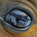
If I have a note I think there is a bit 'too sharp, on the water, at least with my monitor I think so.
However well handled light and color, not too exaggerated.
A greeting
Federico
Ciao Enrico, bello lo scatto e bella la didascalia.
Se devo muovere un appunto mi sembra ci sia un po' troppo sharp, sull'acqua, almeno col mio monitor mi sembra così.
Ben gestita invece la luce ed i colori, non troppo esasperati.
Un saluto
Federico
|
| sent on May 04, 2016 (8:18) | This comment has been translated
Nice! |
| sent on May 04, 2016 (8:21) | This comment has been automatically translated (show/hide original)
Spectacular photos for me compliments
Greetings, Henry Foto spettacolare per quanto mi riguarda complimenti
Un saluto, Enrico |
| sent on May 04, 2016 (8:37) | This comment has been automatically translated (show/hide original)
Nice atmosphere! Congratulations Henry!
Hello! Sergio ;-) :-P Bella atmosfera! Complimenti Enrico!
Ciao! Sergio |
| sent on May 04, 2016 (8:51) | This comment has been automatically translated (show/hide original)
Meritati complimenti a questa affascinante immagine e alla tua grande determinazione di migliorare la tua personale post produzione... e devo ammettere con grande felicità che ci stai riuscendo benissimo!
Cromie e fascino a grandi livelli! composizione stupenda e attimo colto semplicemente pazzesco!
Due cosine! lo sharp che ti hanno già menzionato e avrei dato un poco più luce al paese... personalmente non lavoro più sullo sharp se non in qualche occasione dove una maggior nitidezza in punti selezionati rende meglio l'idea del micro particolare... ma di solito lascio la nitidezza all'obiettivo... alcuni filtri di PS tendono già di suo ad introdurre contrasti e nitidezze, come il controllo tonale delle luci e ombre. Invece preferisco applicare in maniera adeguata e controllata filtri che tolgono l'effetto metallico della foto digitale, magari anche a discapito della super nitidezza, ma a favore di una più "poetica" visione dell'immagine... chiaramente gusti personali.... in questa tua comunque il risultato ottenuto è davvero notevole! Mi congratulo ancora! Un caro saluto! |
| sent on May 04, 2016 (9:58)
Beautiful Picture! compliments! |
| sent on May 04, 2016 (10:18) | This comment has been automatically translated (show/hide original)
Hello Henry, in this composition and atmosphere we are very good
I think the brightness a bit 'low, due to the excessive contrast, when you lose the blue tones of the sky in my humble opinion it means that it is a bit' walked the hand ;-)
For the unsharp mask in the reflection the sign that you should be suspicious and when the piping become bright white, in architecture we can rest while on reflexes and in heaven is far better to maintain the natural detail, even for the signal that you wanted to give more on dreaming that the hard-drama
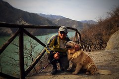
However the memories of the days with his father remain indelible .....
A greeting
Claudio Ciao Enrico, in questa la composizione e l'atmosfera sono molto valide
Secondo me la luminosità un po' bassa e dovuta all'eccessivo contrasto, quando si perdono le tonalità azzurre del cielo secondo il mio modesto parere vuol dire che si è un po' calcato la mano
Per la maschera di contrasto nel riflesso il segno che ti deve insospettire e quando i bordini diventano bianco luminosi, in architettura ci possono stare, mentre sui riflessi e nei cieli è molto meglio mantenere il dettaglio naturale, anche per il segnale che volevi dare più sul sognante che sul duro-drammatico
Comunque i ricordi delle giornate col proprio padre restano indelebili.....
Un saluto
Claudio |
| sent on May 04, 2016 (11:36) | This comment has been automatically translated (show/hide original)
Now I come to you !!! :-D
Federico :-P thanks for your visit to the "bit 'too sharp" you're right but with the new PP and I still have to adjust a few things, the view, as you discussed in the tread on the topic of some time ago does not help me.
I'm still happy that you enjoyed shooting
enry Ora vengo a voi !!! 
Federico grazie della visita per lo " po' troppo sharp" hai ragione ma con la nuova PP devo ancora tarare alcune cosette e, la vista, come hai discusso nel tread sull argomento di qualche tempo addietro non mi aiuta.
Sono comunque felice che lo scatto ti sia piaciuto
Enry |
| sent on May 04, 2016 (11:48) | This comment has been automatically translated (show/hide original)
Fulvio :-P
“ do not personally work on more sharp if not a few occasions where a greater sharpness in selected points makes a better idea of ??the particular micro. „ Applying the perceptive sharpness , recently put technical in practice, it notices that in PS and in the photo display on the PC it's all right; when the place Juza here ... things change. I have to work with less intensity because the site sets it to her; so I understand. Then as I repeated my view "the batista ago" and has said everything. :-P :-D Other things I do and Nik Plugin do not use them, I'm just going to Camera Raw and PS.
Thank you
enry Fulvio
" personalmente non lavoro più sullo sharp se non in qualche occasione dove una maggior nitidezza in punti selezionati rende meglio l'idea del micro particolare." Applicando la nitidezza percettiva , tecnica da poco messa in pratica, noto che in PS ed in visualizzazione della foto sul PC è tutto a posto; quando la posto in Juza ecco ...le cose cambiano. Devo lavorare con meno intensità perché il sito la imposta di suo; così mi pare di capire. Poi come ho già ripetuto la mia vista " la fà batista" ed è detto tutto. Altre cose non faccio e le Plugin di Nik non le uso, vado solo di Camera Raw e PS.
Grazie
Enry |
| sent on May 04, 2016 (11:59) | This comment has been automatically translated (show/hide original)
Veniamo a Claudio.
" Ciao Enrico, in questa la composizione e l'atmosfera sono molto valide " è un complimento che mi fa moolto piacere perchè vuol dire che qualche cosa ho migliorato e, detto da te, mi rende ancorpiù contento.
" Secondo me la luminosità un po' bassa e dovuta all'eccessivo contrasto, quando si perdono le tonalità azzurre del cielo secondo il mio modesto parere vuol dire che si è un po' calcato la mano" Discorso della nitidezza percettiva che devo migliorare; ci lavorerò su. Faccio solo presente che la foto è scattata alle 20,30 di sera; forse sullo scatto dell'abitato dovevo abbassare di due stop il tempo di esposizione e non avrfei avuto problemi. IMHO
" Per la maschera di contrasto nel riflesso il segno che ti deve insospettire e quando i bordini diventano bianco luminosi" grazie per la dritta.
Ancora grazie per l'intervento e un caro saluto.
Enry
|
| sent on May 04, 2016 (13:20) | This comment has been automatically translated (show/hide original)
Grazie per il nuovo intervento Fulvio. Come ho detto visualizzando la foto da postare in JPG con il visualizzatore del PC mi sembra meno contrastata e con una nitidezza adeguata. Postata salta fuori questo problema. Per le impostazioni di PS conosco il procedimento che ho mantenuto identico a prima. Devo capire come il nuovo flusso di lavoro avendo inserito la "nitidezza percettiva e la maschera accentua passaggio" influiscano sul risultato finale.
" Per la maschera di contrasto nel riflesso il segno che ti deve insospettire e quando i bordini diventano bianco luminosi ... verissimo... d'altronde la nitidezza non sono altro che dei pixel bianchi intorno a ciò che vogliamo evidenziare... più la parte bianca aumenta e più lo sharp si evidenzia...Cool" Questa è un'ottima indicazione di cui farò tesoro
Ancora un sentito grazie per l'intervento
Un caro saluto
Enry
|
| sent on May 04, 2016 (16:55) | This comment has been automatically translated (show/hide original)
Beautiful Enry, for sharp, long ago I read on the blog that the processing carried out by the website increases a little Codest,
so you have to evaluate this as well, you could also see it well on your monitor, but when the loads on the forum undergoes a sharp increase of that fails to make, 8-) 8-)
A greeting
Vittorio 8-) ;-) Bella Enry, per lo sharp, tempo fa sul blog lessi che l'elaborazione effettuata dal sito aumenta un pochino codesto,
quindi c'è da valutare anche questo, tu potresti anche vederla bene sul tuo monitor, ma quando poi la carichi sul forum subisce un incremento dello sharp che non si quantifica, 
Un saluto
Vittorio |
| sent on May 04, 2016 (18:20) | This comment has been automatically translated (show/hide original)
The sharpness should be given in the magnification to 100% ;-)
La nitidezza va data in ingrandimento al 100%
|
| sent on May 04, 2016 (19:19) | This comment has been automatically translated (show/hide original)
Thanks Vittorio visit and for indication on the site Sharp; I remembered having read anything but I was not sure. However solved the mystery. I blew it I: - | : - | a value in a mask and patatracchete ...... !!!!
Also follows signs for Claudio
Hello Grazie della visita Vittorio e per l'indicazione sullo Sharp del sito; ricordavo di aver letto qualche cosa ma non ne ero certo. Comunque risolto l'arcano. Ho cannato io  un valore in una maschera e ......patatracchete!!!! un valore in una maschera e ......patatracchete!!!!
Segue anche indicazione per Claudio
Ciao |
| sent on May 04, 2016 (19:29) | This comment has been automatically translated (show/hide original)
“ The sharpness should be given in the magnification to 100%; -) „
Last night I started a new photography course organized by my camera club and today, after your / your instructions as a good pain in the ass I broke the Maronites. I hope that next time do I get :-D
For Sharp I explained the crap I going to review the steps in PSD and the next I hope there are no problems.
The sharpness asking the speakers (Lorenzo di Nozzi - Cesare Re) unanimously they gave me a different answer you around.
"The clarity should be given on the basis of the printed picture size". I did not want to stress them than wasting precious time; next week, if I can, I see to clarify the discussion.
enry " La nitidezza va data in ingrandimento al 100% ;-)"
Ieri sera ho cominciato un nuovo corso di fotografia organizzato dal mio fotoclub e oggi, dopo le tue/vostre indicazioni da buon rompiballe ho rotto i maroni. Spero che la prossima volta mi facciano entrare
Per lo Sharp ho spiegato la mi cagata andando a rivedere i passaggi in PSD e per la prossima spero non vi siano problemi.
Sulla nitidezza interpellando i relatori ( Lorenzo di Nozzi - Cesare Re e Matteo vecchi ) concor× mi hanno dato una risposta diversa che ti giro.
" la nitidezza va data in base alla dimensione di stampa della foto". Non ho voluto stressarli oltre facendo perdere tempo prezioso; la settimana prossima, se riesco, vedo di chiarire meglio il discorso.
Enry |
|

Publish your advertisement on JuzaPhoto (info) |


 JuzaPhoto contains affiliate links from Amazon and Ebay and JuzaPhoto earn a commission in case of purchase through affiliate links.


 2.5 MEGAPIXEL
 Resize to fit window