What do you think about this photo?Do you have questions or curiosities about this image? Do you want to ask something to the author, give him suggestions for improvement, or congratulate for a photo that you really like?
You can do it by joining JuzaPhoto, it is easy and free!
There is more: by registering you can create your personal page, publish photos, receive comments and you can use all the features of JuzaPhoto. With more than 243000 members, there is space for everyone, from the beginner to the professional.
user31676 | sent on June 30, 2016 (0:25) | This comment has been automatically translated (show/hide original)
Bel B & W, very beautiful detail and the composition of your shot. Bel B&W, molto belli i dettagli e la composizione dello scatto. |
| sent on June 30, 2016 (7:44) | This comment has been translated
Thanks Mcolloca.  |
user81257 | sent on July 08, 2016 (9:19) | This comment has been automatically translated (show/hide original)
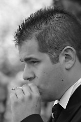
I like the sharpness of the picture, even the BN seems well managed, bright as it should be a shot like that.
But I see the falling lines to be placed and it seems to me is overly tight composition.
Marco. Mi piace la nitidezza della fotografia, anche il BN mi sembra gestito bene, luminoso come dovrebbe uno scatto del genere.
Vedo però le linee cadenti da sistemare e mi sembra abbia una composizione troppo stretta.
Marco. |
| sent on July 08, 2016 (9:32) | This comment has been automatically translated (show/hide original)
In a fit like that I really appreciate the clarity and management of b / n; Also I like the compo, although close as rightly pointed out by Marco I think it was necessary in order not to "lose" the subject in the background that appears to be too sharp.
Overall I really like even if the background is a little confusing but it certainly does not depend from you :) In uno scatto del genere apprezzo molto la nitidezza e la gestione del b/n; anche la compo mi piace, sebbene stretta come giustamente segnalato da Marco credo fosse necessaria per non far "perdere" il soggetto sullo sfondo che risulta essere anch'esso nitido.
Nel complesso mi piace molto anche se lo sfondo é un po confusionario ma non dipende certo da te :) |
| sent on July 08, 2016 (9:45) | This comment has been automatically translated (show/hide original)
The composition is also close to a matter of space, if I had taken a step back I would have found myself in front of at least two groups. :-D La composizione è stretta anche per una questione di spazi, se avessi fatto un passo indietro mi sarei ritrovato davanti almeno un paio di comitive.  |
| sent on July 08, 2016 (9:49) | This comment has been automatically translated (show/hide original)
Beautiful B & N, have managed very well the material aspect of the work. Personally I would have opened the diaphragm to pull a little 'plans because I find that the second floor, while interesting, distract a bit' from the main subject (but that is of course a subjective choice).
The narrow cut instead I like, although I would have extended a right to not cut the hair at the bottom lion. Bello il B&N, hai gestito molto bene l'aspetto materico dell'opera. Personalmente avrei aperto il diaframma per staccare un po' i piani in quanto trovo che il secondo piano, pur interessante, distolga un po' dal soggetto principale (ma quella è ovviamente una scelta soggettiva).
Il taglio stretto invece mi piace, anche se avrei allargato un pelo a destra per non tagliare il leone in basso. |
| sent on July 08, 2016 (10:03) | This comment has been automatically translated (show/hide original)
Well done, nice detail and b / w fair in my opinion.
For me perhaps the composition a bit 'wider, but if you could not okay ;-) Ben eseguita, bel dettaglio e b/n giusto secondo me.
Anche per me forse composizione un po' più larga, ma se non potevi va bene così |
| sent on July 08, 2016 (10:35) | This comment has been automatically translated (show/hide original)
The black and white is very successful, although I would have preferred a more mixed hair (more highlights).
I also opened a little more to further blur the backwaters architectures, just enough not to be confused with the subject in the foreground.
Finally I do not have minded a shot slightly wider, that would include for example the top of the structure with the top visible arc. Il bianco e nero è molto riuscito, anche se l'avrei preferito un pelo più contrastato (più alte luci).
Avrei anche aperto un pò di più per sfocare maggiormente le architetture retrostanti, quel tanto che bastava per non confonderle con il soggetto in primo piano.
Infine non mi sarebbe dispiaciuta un'inquadratura leggermente più ampia, che comprendesse ad esempio la sommità della struttura con l'arco visibile in alto. |
| sent on July 08, 2016 (10:55) | This comment has been automatically translated (show/hide original)
Beautiful black and white.
There is something that does not convince me on the composition ...
The central theme I think is the person, but my eye looks still something in the upper right, where is the Palm ...
Here I branch or I would have put all or I would not have to put anything. Bello il bianco e nero.
C'è qualcosa che non mi convince sulla composizione...
Il tema centrale credo sia la persona, ma il mio occhio cerca comunque qualcosa nella parte alta a destra, dove sta la palma...
Ecco io la palma o l'avrei messa tutta o non l'avrei messa per niente. |
| sent on July 08, 2016 (11:59) | This comment has been automatically translated (show/hide original)
Hello Marco.
I remember when this photo postasti in the discussion of HDR vs. exposure right.
I like it because there is uniformity of color between foreground and background, probably due to B / W, but at the same time there is a slight blur that separates the background keeping still recognizable.
I covered the picture many times to find a criticism: the bell cut but it is not the main subject, the upper part of the fountain with the writing but also outside the framework would be lost statue ... no I can not find something that It has no meaning. Ciao Ruben.
Ricordo questa foto quando la postasti nella discussione su hdr vs. esposizione a destra.
Mi piace perché c'è uniformità di colore tra primo piano e sfondo, probabilmente grazie al b/n, ma allo stesso tempo c'è un lieve sfocato che stacca lo sfondo mantenendolo comunque riconoscibile.
Ho riguardato più volte la foto per trovare una critica: il campanile tagliato ma non è il soggetto principale, la parte alta della fontana con la scritta anch'essa fuori quadro ma si sarebbe persa la statua... no non riesco a trovare qualcosa che non abbia un senso. |
user81826 | sent on July 08, 2016 (12:06) | This comment has been automatically translated (show/hide original)
This is a shot of special and I have 0 experience with it.
First the good choice of black and white that I find almost obligatory in a shot as well.
The advice I can give you is that I would not cut the palm tree on the right or if I can not choose a more clean cut and not at the end of the leaves.
Also evaluated was a more abrupt cut it clicks, taking up only the subject of the fountain and removing all disturbing elements. It will set a cut that made by you but is certainly setting difficult and a bit 'confusing. However, I would not have done it better. Compliments.
Questo è uno scatto di particolare ed io ho 0 esperienza al riguardo.
Innanzitutto buona la scelta del bianco e nero che trovo quasi obbligata in uno scatto così.
Il consiglio che posso darti è che non avrei tagliato la palma sulla destra o qualora non possibile avrei scelto un taglio più netto e non in corrispondenza della fine delle foglie.
Inoltre era valutabile un taglio più brusco allo scatto, riprendendo solamente il soggetto della fontana e togliendo tutti gli elementi di disturbo. È si un taglio ambientato quello fatto da te ma indubbiamente è un'ambientazione difficile ed un po' confusionaria. Io comunque non avrei saputo fare di meglio. Complimenti.
|
| sent on July 08, 2016 (12:09) | This comment has been automatically translated (show/hide original)
“ Hello Mark. „
??? I???
“ I covered the picture many times to find a criticism ... no ... I can not find something that makes no sense. „
Thank you. ;-)
Thanks also to others for criticism. ;-) " Ciao Marco."
??? Io???
" Ho riguardato più volte la foto per trovare una critica... ... no non riesco a trovare qualcosa che non abbia un senso."
Grazie.
Grazie anche agli altri per le critiche. |
user33434 | sent on July 08, 2016 (13:03) | This comment has been automatically translated (show/hide original)
The merger work you've done is great in my opinion, is a picture full of color and full of interesting details, however, I believe that visually creates a bit 'of disorder is the facade of St. Agnes piece that appears to me shortly blurry too forcefully entering in the composition. Il lavoro di fusione che hai fatto è ottimo a mio avviso, è una foto ricca di tonalità e piena di dettagli interessanti però a mio avviso quello che crea visivamente un po' di disordine è il pezzo di facciata di Sant'Agnese che mi appare poco sfocato entrando troppo prepotentemente nella composizione. |
| sent on July 08, 2016 (13:32) | This comment has been automatically translated (show/hide original)
The conversion to b / n is successful, the sharpness is excellent.
I share that opinion of Stec2vtr, palm on the top right disturbs a lot, I would have narrowed even further the framing (I know to go against other opinions, but the world is beautiful because it is different: -D) La conversione in b/n è ben riuscita, la nitidezza è ottima.
Sono dello stesso parere di Stec2vtr, la palma in alto a dx disturba molto, avrei ristretto ancora di più l'inquadratura (so di andare controcorrente rispetto agli altri pareri, ma il mondo è bello perché è vario ) |
| sent on July 08, 2016 (14:25) | This comment has been automatically translated (show/hide original)
Excellent b & w very incisive, also excellent sharpness. The palm tree cut out of place a little ', perhaps with a less narrow cut would be even better. Ottimo b&w molto incisivo, ottima anche la nitidezza. La palma tagliata stona un po', forse con un taglio meno stretto sarebbe stato ancora meglio. |
| sent on July 08, 2016 (14:39) | This comment has been automatically translated (show/hide original)
A great black and white, I would have decentralized some the statue to the left and open the aperture to blur the background more. Un ottimo bianco e nero,avrei decentrato un pò la statua verso sinistra ed aperto i diaframmi in modo da sfocare maggiormente lo sfondo. |
| sent on July 08, 2016 (16:57) | This comment has been automatically translated (show/hide original)
I'm going against the tide, I do not like at all.
I find quite messy composition with many areas cut up (written) and right (lion) and little room between subject and edges.
the light is flat and does not value the subject, indeed smears it on the building basically taking away his normal three-dimensionality that is expected.
the iris closed too far to detach the subject from the building back and giving the composition a bit 'more clean and clear;
what could recall playing with light under development it has been blighted by a post that is marked zonal contrasts, but also made the image so marked as to make it even more difficult to read.
Finally I find the cut and just reasoned shooting settings and very little guessed development.
vado contro corrente, non mi piace affatto.
trovo la composizione abbastanza disordinata con tante zone tagliate in alto (scritte) e a destra (leone) e pochi margini tra soggetto e bordi.
la luce è piatta e non valorizza il soggetto, anzi lo spalma sul palazzo in fondo togliendogli la normale tridimensionalità che ci si aspetta.
il diaframma troppo chiuso per staccare il soggetto dal palazzo dietro e rendere la composizione un po' più pulita e chiara;
quel che si poteva recuperare giocando con la luce in fase di sviluppo è stato rovinato da una postproduzione che ha si accentuato i contrasti zonali, ma anche reso l'immagine così marcata da renderne ancor più difficile la lettura.
trovo infine il taglio e le impostazioni di scatto poco ragionate e lo sviluppo davvero poco azzeccato.
|
| sent on July 08, 2016 (17:07) | This comment has been automatically translated (show/hide original)
" vado contro corrente, non mi piace affatto."
Così vi voglio!!!
Senza volermi giustificare spiego il "come" sia avvenuto questo scatto.
Passeggiata verso l'ora di pranzo (luce pessima), calca, normale per Roma, tentativi vari intorno alla fontana (mi è sempre piaciuta) con poco spazio di lavoro.
PP a colori era pessima, ho provato a salvarmi con il b/n pur non comprendendolo a pieno, lo sfondo è stato in parte ammorbidito in post (in effetti ho chiuso troppo il diaframma, ma cercavo di allungare i tempi).
Riguardandola a distanza di mesi con le vostre osservazioni condivido che il taglio della parte destra meritava una cura maggiore, le scritte sull'obelisco invece le trovo poco utili visto che il soggetto è "l'uomo" rappresentante il fiume Gange.
Sulla PP sicuramente si poteva fare di meglio.
Grazie a tutti! |
| sent on July 08, 2016 (17:16) | This comment has been automatically translated (show/hide original)
Um ... Ruben ... oops ... wrong. : - | Ehm... Ruben... ops... corretto. |
| sent on July 08, 2016 (17:52) | This comment has been automatically translated (show/hide original)
I expanded on the right to let in palm and lion, surely would be more detached from the church (this was the idea, right?) Opening of the aperture, as regards the PP I do not mind this effect almost scratched pencil on paper and I increased a bit 'the contrast. Avrei allargato sulla destra per lasciar dentro palma e leone, sicuramente sarebbe risultata più staccata dalla chiesa (era questa l'idea, no?) aprendo il diaframma, per ciò che riguarda la pp a me non dispiace quest'effetto quasi graffiato da matita sulla carta ed avrei aumentato un po' il contrasto. |
|

Publish your advertisement on JuzaPhoto (info) |


 JuzaPhoto contains affiliate links from Amazon and Ebay and JuzaPhoto earn a commission in case of purchase through affiliate links.


 Resize to fit window