What do you think about this photo?Do you have questions or curiosities about this image? Do you want to ask something to the author, give him suggestions for improvement, or congratulate for a photo that you really like?
You can do it by joining JuzaPhoto, it is easy and free!
There is more: by registering you can create your personal page, publish photos, receive comments and you can use all the features of JuzaPhoto. With more than 242000 members, there is space for everyone, from the beginner to the professional.
| sent on June 12, 2012 (9:25) | This comment has been automatically translated (show/hide original)
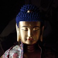
For me I think you did a great job. Apart from the beauty of the shot itself is remarkable that the B & W is well run with the presence of a point of white and deep black. Beautiful pictures in key low key ;-) Per quanto mi riguarda credo che tu abbia fatto un ottimo lavoro. A parte la bellezza dello scatto in se che è notevole il B&W è ben gestito con presenza di un punto di bianco e il nero profondo. Bella foto in chiave low key  |
| sent on June 12, 2012 (9:53) | This comment has been automatically translated (show/hide original)
Hello Mario, even I do not have much experience in b / w. It seems to me that the conversion is good. Shooting color I really like and I prefer it. The shades of red, the background visible and more details in shadows fill more of the image, make it more harmonious and, on the whole, emphasize the serenity of Monaco. The conversion to b / w, with a black background and less tonal transitions, wants to be more dramatic, but less suited to the expression of the subject. However, it seems to me that the choice between the two is only a matter of personal taste and feelings. Ciao Mario, non ho molta esperienza nemmeno io nel b/n. Mi sembra che la conversione sia buona. Lo scatto a colori mi piace molto e lo preferisco. Le tonalità di rosso, lo sfondo visibile ed i maggiori dettagli nelle zone d'ombra riempiono di più l'immagine, la rendono più armoniosa e, nel complesso, sottolineano la serenità del monaco. La conversione in b/n, con lo sfondo nero e meno transizioni tonali, vuole essere più drammatica ma si adatta meno all'espressione del soggetto. Comunque mi sembra che la scelta tra le due sia solo una questione di gusti personali e sensazioni. |
| sent on June 12, 2012 (11:42) | This comment has been automatically translated (show/hide original)
The shot struck me immediately, the B / N is, in my personal opinion (de gustibus ...), very nice because very deep and with great clarity. I did not see the shot in color and after to see him not to remain affected, I like that very much. Congratulations! Lo scatto mi ha colpito immediatamente, il B/N è, a mio parere personale (de gustibus...), molto bello proprio perché molto profondo e con grande nitidezza. Non ho visto lo scatto a colori e lo vedrò dopo per non rimanerne influenzato, questo mi piace moltissimo. Complimenti! |
| sent on June 12, 2012 (11:44) | This comment has been automatically translated (show/hide original)
I saw the other pictures. It 's true that everyone has their own tastes ... I'll tell you that I feel more intense portrait b / w ... :-)
Salutoni and great photos!
Mark Ho visto l'altra foto. E' proprio vero che ognuno ha i suoi gusti... ti dirò che mi sembra più intenso il ritratto b/n... 
Salutoni e ottime foto!
Marco |
| sent on June 12, 2012 (11:49) | This comment has been automatically translated (show/hide original)
Very very beautiful and expressive Molto molto bella ed espressiva |
| sent on June 12, 2012 (11:52) | This comment has been automatically translated (show/hide original)
a really nice picture! I really like the use of black and white that stands out the expression of the subject!
Great achievement!
Congratulations and good photos! davvero una bella foto!!! Mi piace molto l'uso del bianco e nero che risalta l'espressione del soggetto !!!
Ottima realizzazione !!
Complimenti e buone foto!!! |
| sent on June 12, 2012 (11:59) | This comment has been automatically translated (show/hide original)
very good conversion even though I do not think is very suitable to the subject .... I lowered some highlights on her face!
Hello Mario, Andrea! molto buona la conversione anche se secondo me non si adatta molto al soggetto....avrei abbassato un pò le alte luci sul viso!
ciao Mario,Andrea! |
| sent on June 12, 2012 (12:08) | This comment has been automatically translated (show/hide original)
For me, much more 'beautiful than to colori.Ciao Mario. ;-) Per me,molto piu' bella quella a colori.Ciao Mario. |
| sent on June 12, 2012 (14:53) | This comment has been automatically translated (show/hide original)
well I prefer this to the "red" ;) although I'm not crazy of "color" ... pure io preferisco questa alla "rossa" ;) anche se non mi fa impazzire la "tinta"... |
| sent on June 12, 2012 (15:04) | This comment has been automatically translated (show/hide original)
Fantastic image! Immagine fantastica! |
| sent on June 12, 2012 (20:12) | This comment has been automatically translated (show/hide original)
I had lost the color and I went to see her.
Well ... this is nice, but the other is much better!
Hello,
Simone Mi ero persa quella a colori e sono andato a vederla.
Beh...questa è bella ma l'altra è molto meglio!
Ciao,
Simone |
| sent on June 12, 2012 (21:36) | This comment has been automatically translated (show/hide original)
Thank you all for visiting
As far as I'm concerned I have no preference between the two because I think that each has its own "atmosphere"
I have not posted "the red" to make a comparison but to understand if you convince the conversion or maybe "I would have done that ..."
Accept advice
Hello
Mario Grazie a tutti per la visita
Per quello che mi riguarda non ho preferenze tra le due perchè penso che ognuna ha la sua "atmosfera"
Non ho postato "la rossa" per fare un confronto ma per capire se vi convince la conversione o magari un "io avrei fatto così..."
Accetto consigli
Ciao
Mario |
| sent on June 13, 2012 (10:53) | This comment has been automatically translated (show/hide original)
Very nice .. I would say both tie ;) Good though this bn, not too contrasty and with a cold tone that fits the image of serenity that transmits Monaco. Congratulations again! Molto belle entrambe..direi parimerito ;) Ottimo comunque questo bn, non troppo contrastato e con un tono freddo che si adatta bene all'immagine di serenità che il monaco trasmette. Ancora complimenti!! |
| sent on June 13, 2012 (11:55) | This comment has been automatically translated (show/hide original)
Thanks Viaggiatorenotturno Grazie Viaggiatorenotturno |
| sent on September 12, 2014 (21:47) | This comment has been automatically translated (show/hide original)
Lights and shadows emphasize expressiveness already very intense man.
Superb portrait. Luci ed ombre sottolineano un'espressività già molto intensa di quest'uomo.
Stupendo ritratto. |
| sent on December 04, 2014 (13:04) | This comment has been automatically translated (show/hide original)
Great compliments beautiful light, lighting is 50% of the photo. Bravo:-) Gran bella luce complimenti, l'illuminazione è il 50% della foto. Bravo |
| sent on February 22, 2015 (15:05) | This comment has been automatically translated (show/hide original)
that spell! che incanto! |
| sent on February 22, 2015 (15:58) | This comment has been automatically translated (show/hide original)
ultimately I think this version is even better than the color! in definitiva credo che questa versione sia anche meglio di quella a colori! |
| sent on February 22, 2015 (15:59) | This comment has been automatically translated (show/hide original)
Undoubtedly more intense the BN. Nice work Indubbiamente piú intenso il BN. Bel lavoro |
|

Publish your advertisement on JuzaPhoto (info) |


 JuzaPhoto contains affiliate links from Amazon and Ebay and JuzaPhoto earn a commission in case of purchase through affiliate links.


 Resize to fit window