JuzaPhoto uses technical cookies and third-part cookies to provide the service and to make possible login, choice of background color and other settings (click here for more info).
By continuing to browse the site you confirm that you have read your options regarding cookies and that you have read and accepted the Terms of service and Privacy.
You can change in every moment your cookies preferences from the page Cookie Preferences, that can be reached from every page of the website with the link that you find at the bottom of the page; you can also set your preferences directly here
Do you have questions or curiosities about this image? Do you want to ask something to the author, give him suggestions for improvement, or congratulate for a photo that you really like?
There is more: by registering you can create your personal page, publish photos, receive comments and you can use all the features of JuzaPhoto. With more than 243000 members, there is space for everyone, from the beginner to the professional.
sent on May 21, 2012 (16:13) | This comment has been automatically translated (show/hide original)
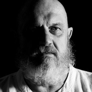
The scene seems interesting but I'm not convinced the pp; personally do not like the selective desaturation and also I do not like a little 'flat gray of the veil that right. Understanding that everyone is right to follow their own tastes and go on his way .... La scena mi sembra interessante ma non mi convince la pp; personalmente non amo le desaturazioni selettive ed inoltre non mi piace nemmeno un po' quel grigio piatto del velo a destra. Fermo restando che ognuno è giusto che segua i propri gusti e vada avanti per la sua strada....
sent on May 21, 2012 (17:19) | This comment has been automatically translated (show/hide original)
Memy Hello, thank you for your opinion. I wanted to do it this way because, having taken with a compact antiquated, the colors had seemed to me real soon. Shortly, however, the versone not desaturated soon as possible in order to have a comparison! What else do you convince the pp? Ciao Memy, grazie del tuo parere. Ho voluto farla così perchè, avendola scattata con una compatta vetusta, i colori mi erano sembrati poco reali. Caricherò comunque la versone non desaturata appena possibile in modo da avere un confronto! Cos'altro non ti convince della pp?
user612
sent on May 25, 2012 (20:31) | This comment has been automatically translated (show/hide original)
I like it, maybe because more drammacità the scene. The only discordant note is actually the color of the veil. Giorgio A me piace, forse perche da più drammacità alla scena. L'unica nota stonata in effetti è il colore del velo. Giorgio
sent on August 16, 2013 (11:32) | This comment has been automatically translated (show/hide original)
I also like for the composition. Too bad the face is not very readable. Anche a me piace anche per la composizione. Peccato che il viso non sia molto leggibile.


 JuzaPhoto contains affiliate links from Amazon and Ebay and JuzaPhoto earn a commission in case of purchase through affiliate links.


 Resize to fit window