What do you think about this photo?Do you have questions or curiosities about this image? Do you want to ask something to the author, give him suggestions for improvement, or congratulate for a photo that you really like?
You can do it by joining JuzaPhoto, it is easy and free!
There is more: by registering you can create your personal page, publish photos, receive comments and you can use all the features of JuzaPhoto. With more than 243000 members, there is space for everyone, from the beginner to the professional.
| sent on October 11, 2015 (0:47)
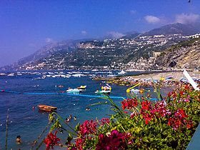
Similar to before when you've posted something a little more experimental, was awaiting other comments but none seem to be forthcoming. I like the tall format and the top part of that, which is very nice but the plain white featureless foreground just confuses and is just too white!! (It is difficult to look at) Had there been a wave or two, or just something there to break it up, then perhaps. And cropping it into a square at the top wouldn't be the same as the tall format empahsises the height of the masts. Yes, the same visual rules that apply in dressing people applies to photos too! |
| sent on October 11, 2015 (1:14)
Thanks very much for your comment, Tim. I knew this wouldn't appeal to everyone - I think it's a love it or hate it kind of thing. I tried different crops but found the large expanse of white appealing to my eye - other versions lost the minimalist impact. |
| sent on October 11, 2015 (1:25)
As I said, this wan't about the cropping, it was about lack of content over that large area. Others might disagree but they have been silent, so far! |
| sent on October 11, 2015 (1:30)
Less silent on Blip :))
Although I have to admit that the reception there has been mixed, as I would have expected..... |
| sent on December 30, 2016 (19:05)
I think it is a good bit of work. I disagree about the large expanse of white foreground, the composition draws my eyes to the middle ground and the hazy horizon. Had the immediate foreground had content then the image would not have had the same impact, in fact your eyes would be drawn to the foreground and reduce the image impact.
With regard to Tim's statement ---visual rules that apply in dressing people applies to photos too!
Rules are meant to be bent and in some cases broken, only then do we get something out of the ordinary, something that stays in your memory.
Happy New Year Ann. |
| sent on December 30, 2016 (19:51)
Thanks very much, Frank! I'm so pleased you see it in a similar way to the way I do! I probably don't know all the rules, so I can happily be creative and break them without even knowing it! And I'm confident enough to still go with what I like, even if I do know that I am breaking rules :)
Did you notice that I did eventually post an image from my trip to Corfe Castle? I think I told you I wasn't happy with any of them...... With a little editing, I found one I liked!
A very Happy New Year to you, too, Frank!
Ann :)) |
|

Publish your advertisement on JuzaPhoto (info) |


 JuzaPhoto contains affiliate links from Amazon and Ebay and JuzaPhoto earn a commission in case of purchase through affiliate links.


 24.5 MEGAPIXEL
 Resize to fit window