What do you think about this photo?Do you have questions or curiosities about this image? Do you want to ask something to the author, give him suggestions for improvement, or congratulate for a photo that you really like?
You can do it by joining JuzaPhoto, it is easy and free!
There is more: by registering you can create your personal page, publish photos, receive comments and you can use all the features of JuzaPhoto. With more than 243000 members, there is space for everyone, from the beginner to the professional.
| sent on January 31, 2015 (8:22) | This comment has been automatically translated (show/hide original)
Excellent for me..davvero congratulations! Ottima per me..davvero complimenti! |
| sent on January 31, 2015 (8:42) | This comment has been automatically translated (show/hide original)
Excellent image, perfect reading Franco and for me also excellent advice of Raffaele, if you use lr or Acr probably just pick up a little of the cursor white with a light hand and being careful not to cause burns, in Ps with curves can act even better but is more difficult to explain away post;-)
Congratulations, hello. Ottima immagine, perfetta la lettura di Franco e per me ottimo anche il consiglio di Raffaele, se usi lr o Acr probabilmente basta alzare un poco il cursore dei bianchi con mano leggera e stando attento a non provocare bruciature, in Ps con le curve puoi agire ancora meglio ma è più difficile da spiegare via post
Complimenti, ciao. |
| sent on January 31, 2015 (9:07) | This comment has been automatically translated (show/hide original)
:-D:-)   |
| sent on January 31, 2015 (10:23) | This comment has been automatically translated (show/hide original)
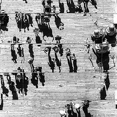
Sweet - salty classic Mediterranean diet:-D
Beautiful scene of daily life "not comfortable" .....
Greetings
hello
luca Dolce - salato dieta mediterranea classica
Bella scena di vita quotidiana "non comoda" .....
Un caro saluto
ciao
luca |
| sent on January 31, 2015 (15:46) | This comment has been automatically translated (show/hide original)
Really good, so soft and well composed. A moment of daily life beautifully taken. Excellent cleaning due to the lack of customers, the lights of the kiosk seem to create a scene isolated from the surrounding environment.
Excellent.
Congratulations,
Walter Davvero buona, così soft e ben composta. Un momento di vita quotidiana splendidamente ripreso. Ottima la pulizia dovuta all'assenza di clienti, le luci del chiosco sembrano creare una scena isolata dall'ambiente circostante.
Ottima.
Complimenti,
Walter |
| sent on January 31, 2015 (18:26) | This comment has been automatically translated (show/hide original)
Beautiful composition, congratulations. Bella composizione, complimenti. |
| sent on January 31, 2015 (23:19) | This comment has been automatically translated (show/hide original)
Read the previous comments, particularly those of Raphael and Catherine, I go back willingly on this because it gives me the opportunity for a modest reflection that I hope will be helpful to the author and to those who will pay attention.
The reading "technique" of Raffaele and Catherine is impeccable. Indeed grays are prevalent and whites a bit 'off. The image is undoubtedly lackluster. It is a defect to be corrected? Catherine, in particular, offers a careful intervention and light and, as always in his speeches, is a hint of common sense. Even in my opinion, probably the best.
However, in these cases, the response is often more complex.
A reading of "expressive" image proposes a number of variables closely related to the intentions and the pensiero, more or less aware, the author. This is not a photograph "WOW!" an imposing colors and refined aesthetics. Condensation but a story that the author has chosen to express according to its sensitivity. The emotion that drove him to shoot and to opt for a realization "lackluster" prevailed on options more technically correct. This, to some extent, of course, for me it is a value. I can think of two examples absolutely out of proportion, but may serve to clarify my thinking: a famous photo of HCB made at a beach with the horizon pendant and some amazing photographs of Giacomelli that, when printed, applied (he, darkroom) of masking obvious and technically within reach of the worst beginners.
In those cases, the expressive power has, however, made consistent, given a valESiamo, in fact, so confident that HCB would have to straighten the horizon of that beach?
I do not think he was not capable.
Best wishes.
Franc Letti i commenti precedenti, in particolare quelli di Raffaele e Caterina, torno volentieri su quest'immagine perché mi offre l'occasione per una modesta riflessione che mi auguro possa essere utile all'autore e a quanti vorranno prestarvi attenzione.
La lettura "tecnica" di Raffaele e Caterina è impeccabile. In effetti i grigi sono prevalenti ed i bianchi un po' spenti. L'immagine è indubbiamente poco brillante. È un diffetto da correggere? Caterina, in particolare, propone un intervento attento e leggero e, come sempre nei suoi interventi, è un suggerimento di buon senso. Anche a mio giudizio, probabilmente il migliore.
Tuttavia, in questi casi, la risposta è spesso più complessa.
Una lettura "espressiva" dell'immagine propone infatti una serie di variabili strettamente correlate alle intenzioni ed al pensiero, più o meno consapevoli, dell'autore. Questa non è una fotografia "WOW!" che si impone per colori e ricercate soluzioni estetiche. Condensa però un racconto che l'autore ha scelto di esprimere secondo la sua sensibilità. L'emozione che l'ha spinto a scattare e ad optare per una realizzazione "scialba" ha prevalso su opzioni tecnicamente più corrette. Questo, entro certi limiti naturalmente, per me è un valore. Mi vengono in mente due esempi assolutamente fuori quota, ma possono servire a chiarire il mio pensiero: una famosa foto di HCB fatta in una spiaggia con l'orizzonte pendente ed alcune strepitose fotografie di Giacomelli che, in fase di stampa, applicava (lui, in camera oscura) delle mascherature evidenti e tecnicamente alla portata del peggiore dei principianti.
In quei casi, la potenza espressiva ha però reso coerenti, dato un valore aggiunto, ad errori tecnicamente banali.
Qual'è allora la soluzione ai dubbi che ho sollevato? La risposta la può trovare solo l'autore seguendo, non il manuale di Photoshop, ma i suoi pensieri.
E teniamo presente che basta un decimo di tono di grigio (o di colore quando c'è), in più o in meno, per portarci lontano dai nostri intenti.
Esprimere i propri pensieri attraverso il linguaggio fotografico è la cosa di gran lunga più difficile. Berengo Gardin sostiene che la tecnica si impara in un pomeriggio (esagera!), per tutto il resto non basta una vita!
Anche noi, modesti commentatori, dovremmo abituarci a guardare oltre. Cercare di leggere il linguaggio fotografico (QUANDO C'È!!!!) ed interpretare le scelte del fotografo nella loro coerenza espressiva.
Siamo, infatti, così sicuri che HCB avrebbe dovuto raddrizzare l'orizzonte di quella spiaggia?
Non credo non ne fosse capace.
Un caro saluto.
Franco |
| sent on February 01, 2015 (8:08) | This comment has been automatically translated (show/hide original)
2F> Good Sunday Giustissimo il commento del Franco. È l'autore che deve trovare la sua strada.
Il mio intervento è stato fatto prima che vedessi le altre foto della gallery. In prospettiva di un lavoro più ampio, dove lo stile la forma ed i contenuti delle singole foto devono essere uniformi e coerenti una con l'altra questa foto può essere lasciata così o modificata come avevo inizialmente suggerito però rivedendo anche tutte le altre.
Il discorso è ostico e difficile. E il solo accenno teorico non basta. Ogni autore, deve cercare la propria strada ed essere consapevole dei risultati che ottiene. Poi non ci si può arrivare tutti ( è il mio caso prima di tutti ) altrimenti saremmo tutti dei Koudelka o dei Horvat, giusto per citare altri grandi non sempre nominati qui sul forum...
Buona domenica |
| sent on February 01, 2015 (9:10) | This comment has been automatically translated (show/hide original)
Absolutely agree on everything Franco, each author can express themselves deliberately beyond the rules and conventions, and when he succeeds his work often takes on greater efficiency, technical reading of the image (you always so much, too much importance to the technique) in those cases it is not an aid but unnecessary ballast
Some time ago I was in a discussion expressed a similar concept emphasizing the difference between criticism and commentary and technical limitations and risks of secondo..ho risked being lynched;-):-D
“ Hello Raffaele, I think you're right ....... especially because it tells my wife ....
The real problem is that I do not know how to do „
Returning to the image this sentence made me understand that the object in the image in low tones whoari was not a choice of interpretation totally intentional, the advice from them;-)
Greetings, good Sunday. :-) Assolutamente d'accordo su tutto Franco, ogni autore può esprimersi volutamente al di la di regole e convenzioni e quando ci riesce spesso il suo lavoro assume maggior efficacia, la lettura tecnica dell'immagine (si da sempre tanta, troppa importanza alla tecnica ) in quei casi non è un aiuto ma un'inutile zavorra
Qualche tempo fa avevo in una discussione espresso un simile concetto sottolineando la differenza tra la critica ed il commento tecnico ed i limiti e i rischi del secondo..ho rischiato il linciaggio
" Ciao Raffaele, penso tu abbia ragione ....... soprattutto perché lo dice anche mia moglie....
Il vero problema è che non so come fare"
Tornando all'immagine questa frase mi ha fatto intendere che nell'immagine in oggetto il livello basso dei toni chiari non fosse una scelta interpretativa totalmente voluta, da li il consiglio
Un saluto, buona Domenica. |
| sent on February 01, 2015 (9:50) | This comment has been automatically translated (show/hide original)
Big congratulations Maron Grande Maron complimenti |
| sent on February 01, 2015 (11:03) | This comment has been automatically translated (show/hide original)
It Catherine, your suggestion there was everything. I fully agree.
But I wanted to reflect the author on the research of their own personal motivations. On what pushes us to take and then process in that particular way our images.
By the same token I think that criticism is more useful one that does not stop at just the technical aspects, but strives to "read" the image interpreting aspects of expression and their correlation with the technical choices and etetiche. A good image is nothing but the result of the sum of all this. For avoidance of doubt, Catherine, precise that my speech is general, not a relief to your interventions.
To help the growth of all critical, real boost useful to learn and improve our photography, some time ago I had also opened a topic in which he askedauthors to submit their images by striving to explain their choices. Everything then was overwhelmed by the unstoppable wave social, conversely, is, in my judgment, the tomb of growth and criticism. But anyhow ....
Raffaele
For the sake of accuracy I correct that which is most likely a simple typo in the writing stage. One of the photographers you mention is not HORWAT: I think I was referring to Frank HORVAT (with the "v" simple) that, as many people know, is an Italian photographer. If correct me.
Best regards and good Sunday to all.
Franc
Si Caterina, il tuo suggerimento ci stava tutto. Concordo pienamente.
Mi premeva però far riflettere l'autore sulla ricerca delle proprie motivazioni personali. Su ciò che ci spinge a scattare e poi elaborare in quel particolare modo le nostre immagini.
Alla stessa stregua ritengo che la critica più utile sia quella che non si ferma ai soli aspetti tecnici, ma si sforza di "leggere" l'immagine interpretandone gli aspetti espressivi e la loro correlazione con le scelte tecniche ed etetiche. Una buona immagine non è altro che il risultato della summa di tutto questo. A scanso di equivoci, Caterina, preciso che il mio discorso è generale, non certo un rilievo ai tuoi interventi.
Per aiutare la crescita critica di tutti, vera spinta utile per imparare e migliorare la nostra fotografia, tempo addietro avevo anche aperto un topic nel quale si chiedeva agli autori di presentare le proprie immagini sforzandosi di spiegare le proprie scelte. Tutto poi è stato travolto dall'inarrestabile onda social che, viceversa, è, a mio giudizio, la tomba della crescita e della critica. Ma tant'è....
@Raffaele
Per amor di precisione correggo quello che molto probabilmente è un semplice refuso in fase di scrittura. Uno dei fotografi che citi non è HORWAT: penso ti riferissi a Frank HORVAT (con la "v" semplice) che, come pochi sanno, è un fotografo italiano. In caso correggimi.
Cordiali saluti e buona domenica a tutti.
Franco
|
| sent on February 01, 2015 (11:48) | This comment has been automatically translated (show/hide original)
It is true I was referring to him. I corrected. Born in Abbey (now Opatija - Croatia) in 1928, then in effect Italian;-)
Si, si esatto mi riferivo a lui. Ho corretto. Nato ad Abbazia (ora Opatija - Croazia) nel 1928 , quindi a tutti gli effetti italiano ;-)
|
| sent on February 01, 2015 (13:04) | This comment has been automatically translated (show/hide original)
Also I find this very beautiful. Add something after thoughts brought by Catherine and Jeronin becomes very difficult. I limit myself to tie a sentence written by Jeronim: “ Condensation but a story that the author has chosen to express according to its sensitivity. The emotion that drove him to shoot and to opt for a realization "lackluster" prevailed on options more technically correct. This, to some extent „ . They are perfectly in tune with this thought. Probably technically you could improve anything as pointed out, however, in my humble opinion the choice of soft tones and a slight key LOW goes well with the evening atmosphere in which light loses its 'energy' transforming the scene in tones soft and closer to the interior state of many of us. I find it a rare authenticity in the choice of the author. UNo image to be taken into consideration its strong function of this 'authenticity' and sober description of this scene that to many may seem trivial, but I am well told, but especially with connotations of a large interpretive sensibility of the author.
Praise in my opinion should be given both to Catherine that Jeronim for leading us in a constructive reflection.
I join the deserved compliments.
Hello.
stefano Anche io trovo questa immagine molto bella. Aggiungere qualche cosa dopo i pensieri portati da Caterina e Jeronin diventa molto difficile. Mi limito ad allacciarmi ad una frase scritta da Jeronim: " Condensa però un racconto che l'autore ha scelto di esprimere secondo la sua sensibilità. L'emozione che l'ha spinto a scattare e ad optare per una realizzazione "scialba" ha prevalso su opzioni tecnicamente più corrette. Questo, entro certi limiti " . Sono perfettamente in sintonia con questo pensiero. Probabilmente tecnicamente si poteva migliorare qualche cosa come fatto notare, tuttavia a mio modesto parere le scelta dai toni morbidi e in leggera chiave LOW ben si sposa con l'atmosfera serale in cui la luce perde la sue 'energia' trasformando la scena in toni più morbidi e più vicini allo stato interiore di molti di noi. Trovo una rara autenticità nella scelta dell'autore. Un immagine da tenere in forte considerazione proprio in funzione di questa 'autenticità' e sobrie descrizione di questa scenetta che a molti potrà sembrare banale, ma che io trovo ben raccontata , ma soprattutto con connotati di una grande sensibilità interpretativa dell'autore.
Un elogio a mio parere va dato sia a Caterina che a Jeronim per averci condotto in una costruttiva riflessione.
Mi associo ai meritatissimi complimenti.
Ciao.
stefano |
| sent on February 01, 2015 (18:10) | This comment has been automatically translated (show/hide original)
A pleasure to read your comments in this photo that I like very much.
For my part I am happy also the choice of tones and soft focus slightly off for this 'street' Venetian at twilight.
Maron sincere compliments!
;-) 8-) Giamba Una goduria leggere i vostri commenti a questa foto che anche a me piace molto.
Da parte mia trovo felice anche la scelta dei toni flou e leggermente spenti per questa 'street' veneziana all'ora del crepuscolo.
Complimenti sinceri Maron!
 Giamba Giamba |
| sent on February 01, 2015 (19:35) | This comment has been automatically translated (show/hide original)
Remain offline for two days sometimes pleasant surprises ......
First I want to thank all those who have focused on this photograph of me, especially that Raffaele via MP gave me some useful indications to improve, and not a little, work in post.
I should point out that it was not my intention to propose something to WOW! but rather convey what I saw in that moment and that Franco has read impeccably. The original photo color would no doubt hit a lot more but I preferred to opt for a conversion in b / w, one of my first conversions (almost all of the photos in b / w my galleries comes directly from the machine so) to emphasize the care and patience with which were setting their stall after a cold day at work.
Certainly if fbones can act better on the sliders of LR and PS the result would have been better, but for this ...... I promise I will work!
A cordial greeting.
Rimanere offline per due giorni talvolta riserva gradite sorprese......
Innanzitutto desidero ringraziare tutti coloro che si sono soffermati su questa mia fotografia, in particolar modo Raffaele che via MP mi ha dato alcune indicazioni utilissime per migliorare, e non di poco, il lavoro in post.
Tengo a precisare che non era mia intenzione proporre qualcosa da WOW! quanto piuttosto trasmettere quello che in quel momento vedevo e che Franco ha letto in maniera impeccabile. La foto originale a colori avrebbe senza dubbio colpito molto di più ma ho preferito optare per una conversione in b/n, una delle mie prime conversioni (la quasi totalità delle foto in b/n delle mie gallerie esce direttamente così dalla macchina) per sottolineare la cura e la pazienza con la quale stavano sistemando il loro chiosco dopo una fredda giornata di lavoro.
Certamente se fossi in grado di agire meglio sui cursori di LR e PS il risultato sarebbe stato migliore, ma per questo prometto...... mi impegnerò!
Un cordiale saluto.
|
| sent on February 20, 2015 (9:24) | This comment has been automatically translated (show/hide original)
beautiful for me ............:-) bellissima x me............ |
| sent on February 24, 2015 (10:17) | This comment has been automatically translated (show/hide original)
riguardandola, and I like it a lot ... I can not stop only to technical considerations. The files are completely malleable fuji from raw (but I do not think you use it ...:-)) but if your eye has seen "this" and get me x is successful photo ...
a small consideration: silverEfexPro (used sparingly) could give a little more (technically) to this great shot ... IMHO:-P riguardandola, e mi piace un sacco... non posso fermarmi alle sole considerazioni tecniche. I file fuji da raw sono assolutamente malleabili( ma non mi pare che Tu lo usi... )ma se il Tuo occhio ha visto "questo" e arriva x me è foto riuscita...
una piccola considerazione: silverEfexPro (usato con parsimonia) potrebbe dare qualcosina in più (tecnicamente) a questo ottimo scatto...IMHO  |
|

Publish your advertisement on JuzaPhoto (info) |

 L'altra Venezia

 JuzaPhoto contains affiliate links from Amazon and Ebay and JuzaPhoto earn a commission in case of purchase through affiliate links.


 Resize to fit window